Archive for the ‘Right brain / left brain in drawing’ Category

Hand Drawing Demo #6: Reviewing Left Brain/Right Brain

Thursday, December 9th, 2010

I’ve chosen hands as subject of these drawing lessons because they are so available to “pose” for you.  And you can position them in infinitely more interesting ways than your feet!

But my approach to drawing is the same whether your subject is hands, a landscape, flowers or a rocket ship.  I use a few techniques to enable my brain to see in “right brain” mode.  Once you are able to switch over to seeing this way, you’ll be able to draw anything.

Right brain / left brain in drawing
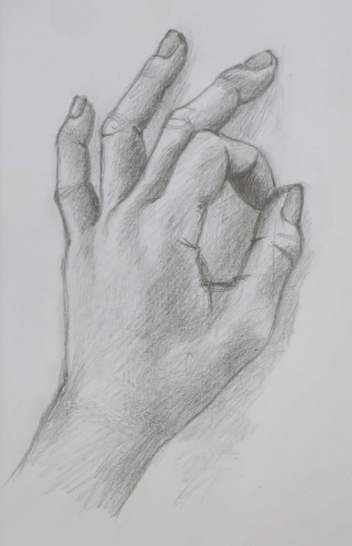
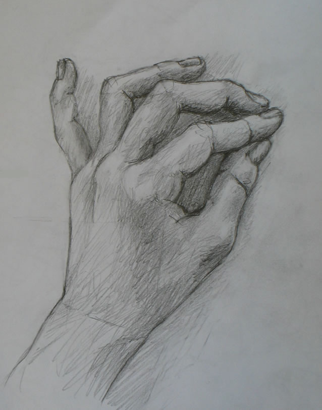
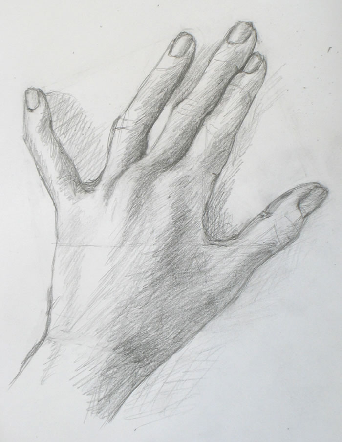
Hand demo #6 sketch

If you’re not familiar with the “right brain” in drawing, please look back at my earlier Why is Learning to Draw “So Hard?” which gives the basics.  And Me Against Da Vinci?  What’s the Right Way to Draw? describes the leap forward my own drawing took when I set aside all the artists’ anatomical information I had learned.  (The artists’ focus on anatomy is historically associated with Leonardo DaVinci.)

Instead, I learned to see in “right brain” mode.  That made all the difference to my drawing.  In right brain mode, the artist is able to see what they’re drawing as a series of angles and shapes that are much easier to draw than when their subject is seen “normally.”

So you can blissfully forget about all the complexities of drawing a hand.  Forget all the thoughts and associations you have with “handness.”  They will interfere with your being able to really see, and to sketch what you’re seeing.

Betty Edwards, who wrote the famous Drawing on the Right Side of the Brain, explained that

we often can’t draw because we’re blocked from seeing what’s right in front of us.  What blocks us is our preconceived notions about what a human hand or leg or eye should look like.  We struggle, trying to draw what we assume we’ll see – instead of seeing what’s actually there: how the specific hand in front of us looks….

My hand drawing tutorials are all about learning to forget you’re drawing a hand, while learning to see in a new way that makes drawing accurately much easier.

Setting up your work space and materials

Please refer back to the relevant sections of Demo #1 for materials you’ll need and how to set up your work space.

Placing your hand

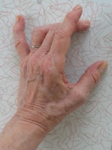
I chose today’s pose partly as an easier one than last week’s.  I wanted a pose in which we can again take advantage of  negative spaces between the fingers.  At the same time, I pushed us a bit ahead by including one finger (the pointer) that’s bent over, producing more of a challenge.

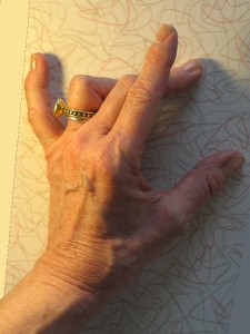
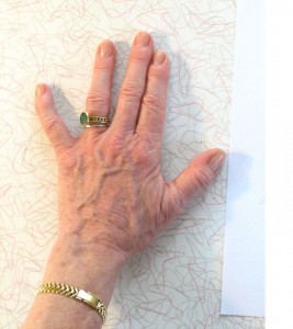
Place your hand with the thumb and forefinger forming an A-OK sign.  Separate the rest of the fingers so space appears between each.  As always, you don’t need to replicate my hand position exactly.

Techniques for engaging your right brain (and disengaging your left) while drawing

We’ve used these techniques before, including in my posts about the angle-abstraction game.  But it’s important to go through them again, because shifting to seeing in right-brain mode is so tricky for many people that a lot of practice is needed.  (Here I explain why the shift is often so difficult.)

One of the most used techniques for right-brain sketching is to draw negative space – that is, to draw the space around your subject, rather than your subject itself.

Another technique I use a lot is to figure out where I need to sketch in a line by noticing its relationship with other parts of the subject.  Your new line may begin at the same level as another part of the subject, for example.  Or it may lie at a particular angle to it.

These techniques sound esoteric and mind-numbing when you read about them.  But “on the ground,” what you’re doing is drawing simple lines and shapes instead of complex ones.  You begin by focusing in on a single simple area, then move quickly to the next one so you don’t get bogged down.  I’ll provide illustrations below to help you catch on to these tools.  (Frame numbers refer to those of the time-lapse video at the end of this post.)
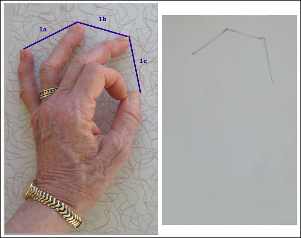
How I began this sketch - Frame 1. The image on the left is a photo of my hand in the approximate position I drew it. I later superimposed on this photo the purple lines which show how I envisioned these lines as I drew them (right).

Frame 1: I began by drawing guidelines connecting the tips of three fingers and my thumb.  Ignoring everything else about my hand, I focused only on judging the simple angles and lengths of imaginary lines between fingertips.

This may sound a bit mathematical and “left brained.”  But when you’re drawing smoothly in right-brain mode, all these judgments take place at lightening speed, without conscious calculation.
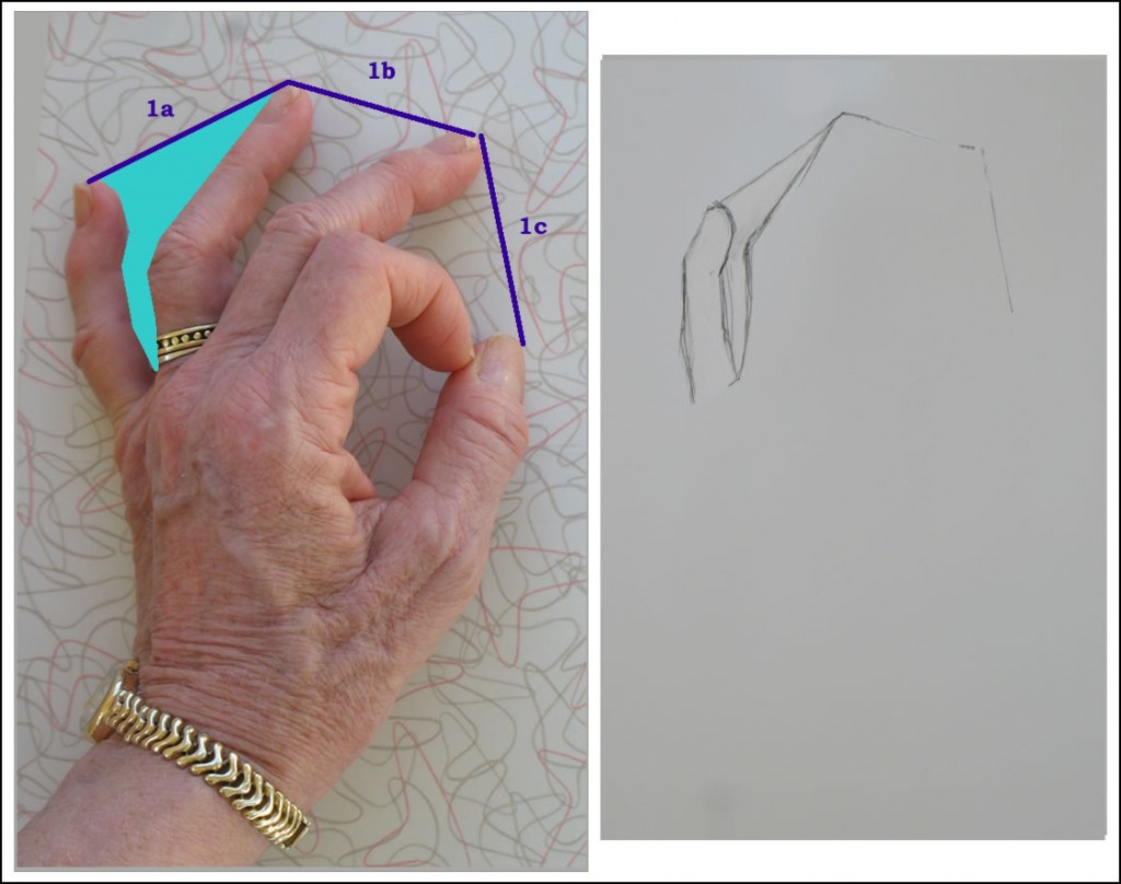
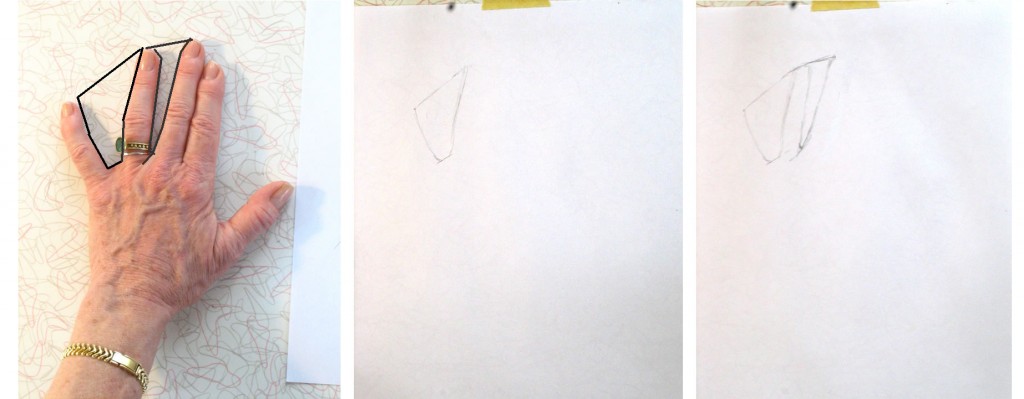
Frame 2: The negative space between the pinky and ring fingers is delineated in turquoise over the photo. The photo of my hand was taken at a different time than the sketch was done, so the negative shapes were slightly different. But you can hopefully get a sense of the technique in spite of this.

Frame 2: Next I drew the negative space between the pinky and middle finger (please note that the photo of my hand was taken at a different time than the sketch was done, so the shapes are slightly different.  You can hopefully get a sense of the technique in spite of the slight discrepancies).

I didn’t worry about how complicated the hand is.  I relaxed and focused only on drawing this fairly simple flat geometric space between two fingers.
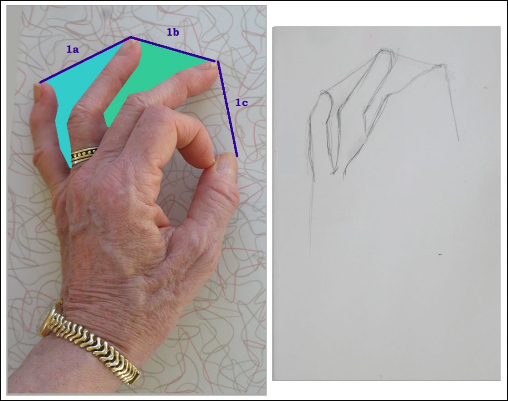
 

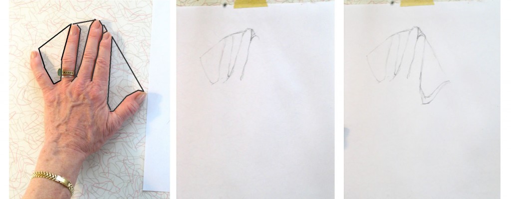
Frame 3: another negative space drawn, shown in green on the photo.


Frame 3: One tool I use to judge how to draw negative shapes between fingers is to notice where the bends of joints fall in relation to the finger on the other side of the space.  For example, the sharp bend in the middle finger occurs (horizontally) across from the middle of the middle knuckle of the ring finger.  This sounds crazy when you write it out, but noticing these relationships make drawing the shapes very simple.

While I was drawing this negative space, I noticed that the edge of the middle finger continued almost all the way across the bottom of the ring finger.  So I sketched that in, too.
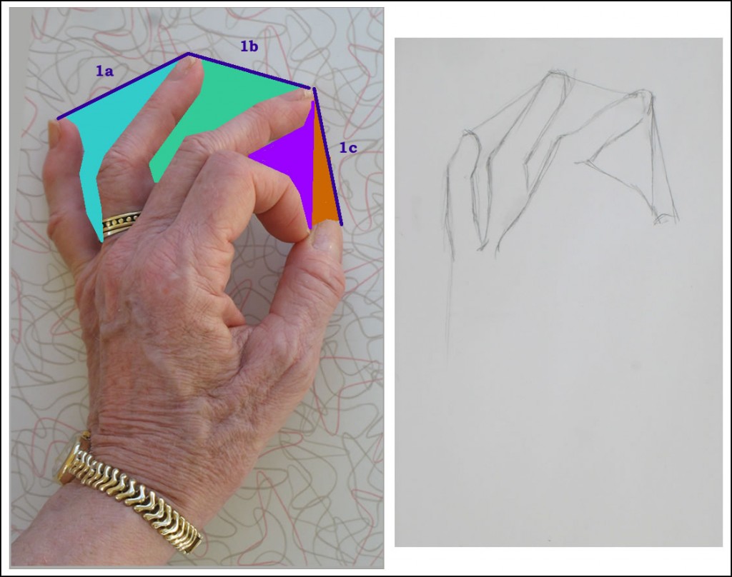
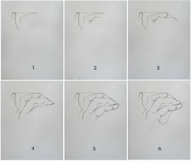
Frame 4: Drawing the negative space bounded by middle finger, bent-over pointer, and thumb top.

Frame 4: Bypass the complexities of the bent-over pointer between the middle finger and thumb top.  Instead, focus only on the negative shape their edges create.  One easy way to envision this negative space is as two triangles, one whose bottom point is where the forefinger meets the thumb, and the other whose bottom side crosses the thumbtop.

The shapes of the negative spaces aren’t actually perfect triangles, but it will help you draw the more complex shapes by noticing the simple shapes they resemble.
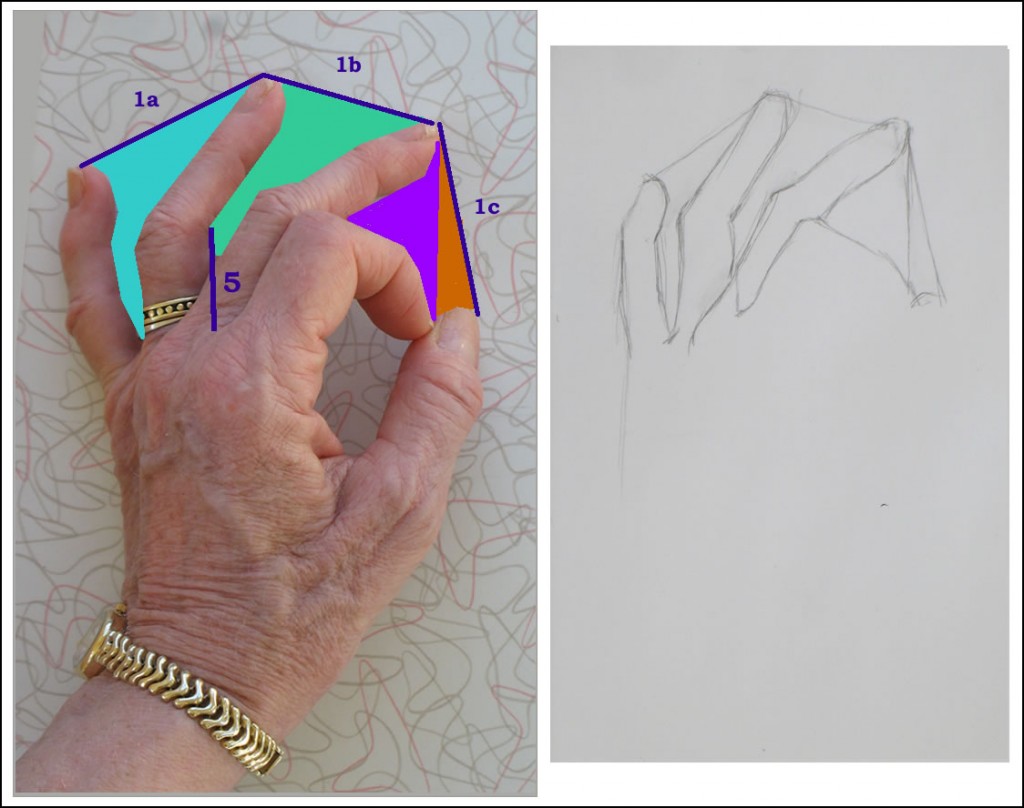
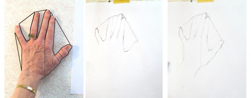
Frame #5: Line revealing placement for base of forefinger

Frame 5: To draw the bottom of the forefinger, I noticed that its base ended almost directly in line with the edge of the ring finger (you have to look closely at the photo to see this, but it was very evident in my actual hand as I was sketching).  I sketched in a vertical guideline to help me draw this (indicated in dark blue on the photo).
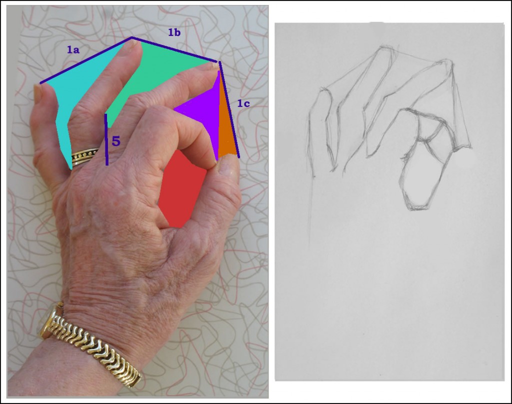
Frames 6-7: The negative space formed by thumb and forefinger.

Frame 6-7: Here I made the common error of drawing what should be the foreshortened middle joint of the forefinger too long.  If you watch the time-lapse video below, you’ll see me correcting this in later frames of the sketch.  In fact I never really got it right – but that’s fine!  The goal here is to keep practicing, not to produce a perfect drawing every time.
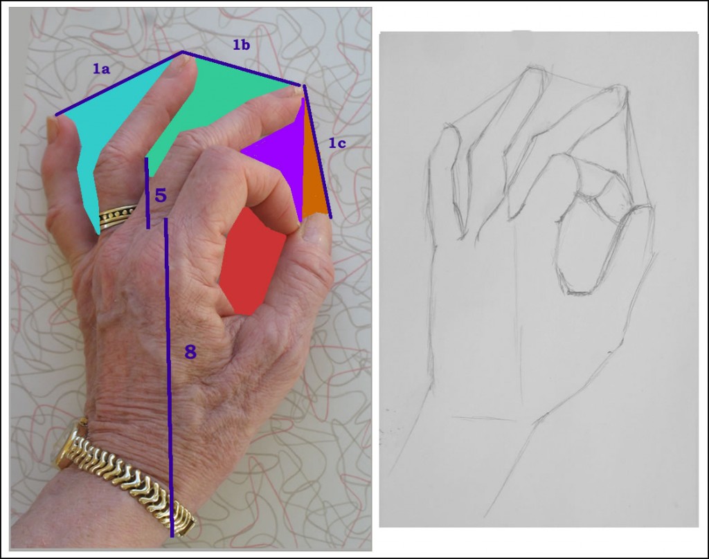
Frame 8: Vertical guideline to help draw the wrist.

Frame 8: Figuring out where to place the wrist, I noticed that it’s directly below the edge of the forefinger’s base.  I drew a vertical guideline here to help me draw the line of the outside of the thumb down to the wrist.

Frames 9-10: Making a correction using another vertical guideline.

Frames 9-10: By now I’m realizing my silly mistake with that foreshortened forefinger joint (see above, Frame 6-7).  Alas, this is the very joint this lesson is trying to teach you to draw properly!  Part of my error was due to my shifting perspective as I kept moving to snap photos of my sketches.  But that’s no excuse!  And because it’s a common error, it’s good for you to see the process of trying to correct it.  You’ll be able to see this more clearly in the time lapse video below.

*           *          *

As with all these lessons, this isn’t a hard and fast drawing sequence.  It’s very possible that if I drew this hand pose again, I’d do it in different steps, or envision angles and spaces differently.  If you notice other ways of seeing them, use whatever makes sense to you.

{"numImgs":"45","constrain":"height","cvalue":"450","shellcss":"width:290px;padding:4px;margin:14px auto 0;"}
Hand Drawing Demo #5: Partially Hidden Fingers

Thursday, December 2nd, 2010

This is the fifth in a series of online drawing lessons using your hand as your model. The first, most basic lesson is here.

This tutorial’s hand position is very similar to the one in  Hand demo #3 – but with the entire hand rotated onto its outside edge.  This demonstrates how a slight change in position can present an entirely new set of challenges in drawing the hand.

The challenge of drawing partially hidden fingers

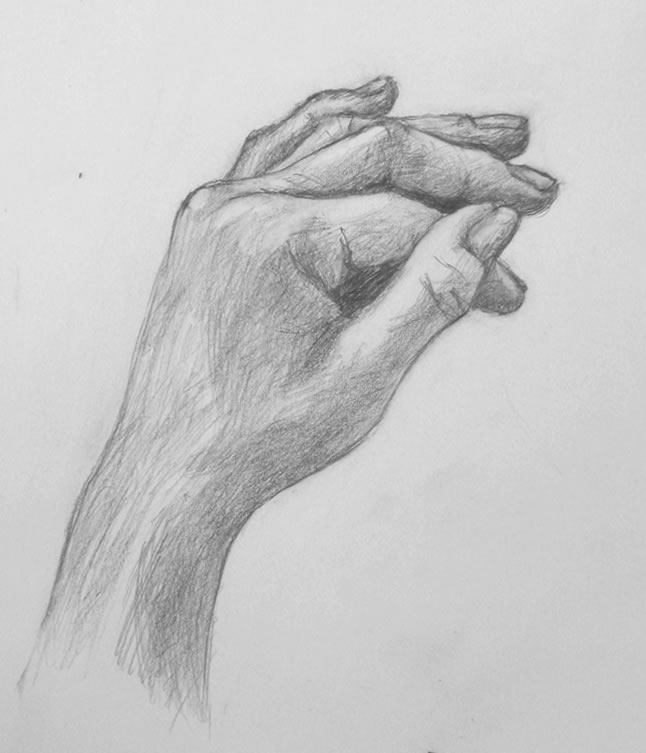
My sketch of #5 hand position.

As I began drawing today, I suddenly realized I’d probably chosen a hand position that’s a bit ahead of where we’ve gotten at this point.  Every finger in this pose except the the thumb is partially hidden by other fingers or knuckles.  And you’re seeing them all at odd angles as they emerge from the knuckles.

I promise to return to a simpler pose next week.  But meanwhile, give this position a try.  The approach to drawing it is the same as to drawing anything else.  You may discover that your skills are developed enough at this point to capture your hand in this pose.  And if not, head back to whatever earlier lesson you enjoyed the most.  Practice is the key to learning to draw.

Later in this series of Hand drawing tutorials, we’ll return to more drawing of hidden fingers as well as foreshortened ones.

Setting up your work space and materials

Please refer back to the relevant sections of Demo #1 for materials you’ll need and how to set up your work space

Positioning your hand

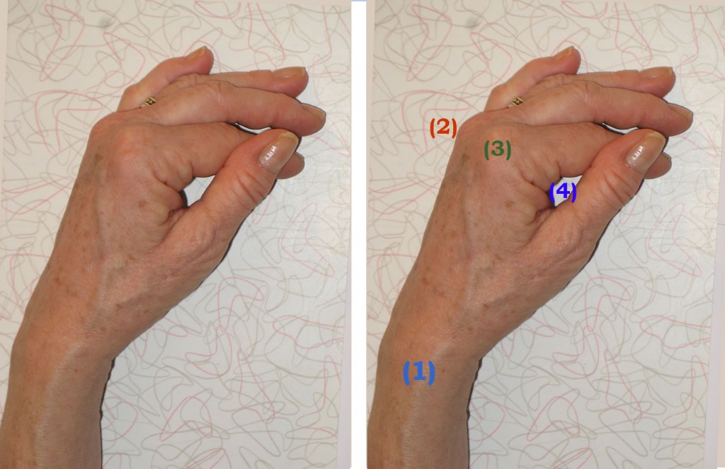
Rest your non-writing hand (your left hand if you’re right-handed and vice versa) on it’s outside edge. Your palm shouldn’t touch the table at all.  Your wrist (1) will be viewed from the side (see photo below).

The knuckles of your middle (2) and pointer (3) fingers will be the only knuckles visible, and they too will be seen from the side.

Place your thumb over the middle joint of your forefinger, creating a roughly teardrop-shape opening (4).

Approximate hand position for this week's drawing tutorial. This photo was taken with a flash, which dramatically changed the lighting from the way it was as I was drawing.

It’s OK if your hand position doesn’t look exactly like mine.  Your hand is probably a different size and shape.  And the important thing is to practice different hand placements, not this exact one.

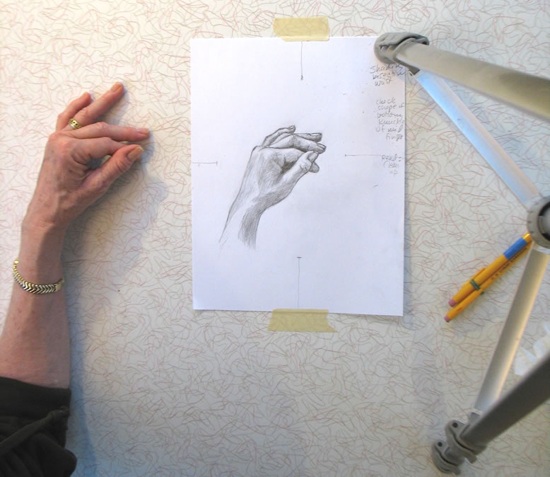
This photo of my setup (including my camera tripod to the right) shows more accurately the lighting of my hand while I was sketching (though my ring finger had moved out of correct position as I reached up to snap the photo).

Time lapse video demo: drawing the hand from the side, with fingers partially hidden

Below is a time lapse video of my sketching of this hand position.  I’ve numbered each frame so you can easily match it to my written commentary (beneath the video) of what I was doing in each frame.

You may want to open a second copy of this post in another window so that you can place video and text side by side.  You can press the Pause/Restart button to move through the images at your own pace.

My apologies for the inconsistency of lighting from one frame to another.  I’m a painter, not a photographer, and I’m not experienced in compensating for shifting light on a stormy day!

{"numImgs":"34","constrain":"height","cvalue":"450","shellcss":"width:386px;padding:4px;margin:14px auto 0;"}

Frame #1: As I often do when beginning to sketch, I scanned my eye over my entire hand looking for the easiest thing to draw first.  I decided it would be the angle of the back of my hand as it curves into my wrist.  I tried to accurately draw the tilt of this line as compared with an imaginary perfectly-vertical line.  I didn’t draw a vertical guideline, but I pictured it in my head.

Frame #2: I drew the angles on the other side of the wrist and sketched a rough guideline for the top of the knuckles.  My goal here was to sketch the overall geometric shape of my hand.

Frame #3: To check the accuracy of the line I’d just made for my wrist, I sketched a guideline encompassing the negative space next to it.  I noticed that this line was a continuation of the general angle of the first joint-segment of my thumb, so I used it to draw part of my thumb as well.  (For more on the all-important subject of negative space, see for example Hand drawing demo #3 and my post Me Against DaVinci?)

I then noticed that the top of my thumb ended at the same level as the top of the knuckles on the far side of my hand, so I drew a horizontal guideline between the two.  Finding relationships like this is all important to getting proportions accurate as you move ahead.

Frame #4: I sketched in the little teardrop-shaped negative space between my thumb and forefinger [see (4) in the photo of my hand above].  As I drew it, I scanned my eye over the geometric shape of my entire hand to be sure I was getting it placed and sized properly.

Here’s a classic example of where right-brained seeing helps you: if you envision your hand as a pure, flat shape encompassing another shape, it will be much easier to draw than if you get into long discussions with yourself about what a hand should look like when it’s in this particular position.

Frame #5: I decided to shade in the negative space to help me continue seeing it as an aid.  I also drew in the rough curve of the top of the knuckles as it transitioned into the top of my forefinger.  You can see how I’m using the horizontal guideline I drew in Frame #3 as an aid to placing this line correctly.  I haven’t made a distinction yet between the two knuckles because for now, I’m getting general shapes laid down.  Later on I’ll add more detail.

Frame #6: I drew in my thumbnail as a way of measuring whether I’ve got the proportions around it correctly.  I shaded in a bit of the triangular negative space between the pointer and middle finger.  I also began a little shading in the wrist area because this shadow’s edge was approximately halfway across my wrist, so I could use it as a guidepost for other shapes around it.

Frame #7: I was struggling a bit to see where the top edge of the middle finger would be.  So I drew a very rough line.  When in doubt, draw something in the right ballpark, so you can learn from that where a more accurate version will be (see the sailing analogy in my last hand demo.  As I wrote there, “each line you make will help you figure out what you need to do next.  Even if that line turns out to be wrong, making it will help you understand where the right one should be.”).

Frame #8: Sure enough, that crude line gave me more of a sense of where to draw a more accurate line.  I also used the small triangular negative space under this finger, along with a guideline I sketched between the two fingertips to help me accurately envision the negative space that formed the ends of the fingers.

Frame #9: I drew the little triangle-shaped first joint of my ring finger.  Notice how seeing it as a purely geometric shape – a triangle with one angle appearing to emerge near the base of the middle finger and another ending at its first joint – helped me capture this finger far better than would a brainy debate with myself about what a finger should look like from this angle.

Frame #10: I drew the rest of the ring finger, using a guideline to envision the triangular negative space between it and the middle finger.  I’m also adding fingernails as I go along, to help me check my sizes and proportions (this is similar to the way I used finger joints as measuring devices in this tutorial.  And see my diagram of fingernails as negative space for the finger tips around them in this lesson.)

Frame #11: I made a bizarre error here in shaping the bottom half of my pinky finger.  I can’t figure out how I managed this, except that maybe my hand moved while I was craning around to snap the previous photo with my camera.  But I never noticed my error until the very end of the drawing, so I can’t really use that as an excuse!  Anyway, it demonstrates that we all make mistakes as we sketch, and we just need to keep working at it till we get everything accurate.

Frame #13 onward: I began shading, even though I wasn’t sure I had all my proportions right.  You can learn more about what you’re drawing via sketching the shapes of its shadows and highlights.  At this point, I felt that shading would help me more than anything else to figure out improvements I needed to make in the drawing.  As I worked on lights and darks, I continued to hone the outlines of fingers and hand based on what I was learning.

As often happens, this sketch began to look worse before it started looking better.  When this happens, you need to simply keep calmly moving forward through the bad stuff to gradually figure things out and arrive at a drawing you can feel proud of.

I’d love to hear from you how this tutorial went for you.  Did you find this hand position difficult?  Were you able to make progress with it?  If you went back to an earlier lesson instead, which one did you choose?  Leave a comment below!

Hand Drawing Tutorial #4: What to Do When Everything’s Going Wrong

Friday, November 19th, 2010

I’m no sailor but I know that when you’re on the open seas and using the wind as your driving force, the problem isn’t going into a headwind – even energy going opposite to your desired trajectory can be channeled in a useful way. The problem is when there is no wind, no motion….  You can’t leverage stagnation, but a gust in any direction can help you discover what you’ve been looking for all along.

“Be the Wind: What to Do When Things Aren’t Working” by Nicky Hajal, Tumble blog

Final sketch for this week's drawing tutorial

I was not a happy camper while drawing today.  Nothing was going right.  It was a classic autumn day alternating dark clouds and  bright sun, so the light I need to photograph my sketches kept changing.  I couldn’t get my tripod positioned right.  Once I started sketching, I felt that I had begun wrong and should start over.  I fretted that this choice of hand position (right) was inappropriate for your fourth drawing tutorial.

So did I stop and start over?  No, I kept moving forward, trying every trick in my bag to get the drawing back on track.  And eventually it did improve – thanks not to a single brilliant insight, but to dozens of small steps as I slogged ahead.  I won’t be showing this drawing at the Metropolitan, but it works fine.

I’ve learned over my years of doing art that when things aren’t going well, I simply need to keep working, moving forward.  Eventually the drawing will get better.  It’s a matter of time and determination.

A few weeks ago, I read the sailing analogy quoted above and immediately resonated with it.  It’s absolutely true that sailors can move forward using wind in any direction, even a headwind.  The real problem is when they’re becalmed, when there’s no wind at all.

So, too, when you’re drawing: each line you make will help you figure out what you need to do next.  Even if that line turns out to be wrong, making it will help you understand where the right one should be.  If you make five or ten wrong lines, use each one to learn what the right one is.

Rough position of my hand for this sketch. The photo was taken in somewhat different light than when I was sketching my hand.

Materials you need and setting up your work space

Please refer back to the relevant sections of Hand drawing tutorial one for this info.

Positioning your hand

This hand position is somewhat similar to last week’s.  The main difference is that I’ve raised my forefinger so that it appears to cross over the middle finger (of course it doesn’t actually cross over).

My goal here was for you to try a hand pose that doesn’t have the series of small negative spaces between the fingers that we’ve had in every tutorial till now.  For this reason, this position will be more challenging than the first three we’ve sketched.

The many little steps I took to make this drawing work

I think it will be easiest for you to see how I worked on this drawing if you go through the time-lapse video while reading my commentary.  I’ve numbered each frame so you can easily match it to my description (beneath the video) of what I was doing.

You may want to open a second copy of this post in another window so that you can place video and text side by side.

{"numImgs":"35","constrain":"height","cvalue":"450","shellcss":"width:335px;padding:4px;margin:14px auto 0;"}
Frame #1: In earlier hand tutorials, I haven’t drawn this particular negative space – the flattened triangle formed by the edge of my finger and hand – till after sketching the spaces between each finger.  But in Demo #4’s hand position, the negative space between fingers is much larger, hence not as easy to draw.  So I start with an easier shape: the one at the left edge of my hand.

Approximate hand position for this sketch, in different light

There’s no rule about where you “should” start a drawing.  Just start it wherever you notice an easily-drawn shape.

Frame #2: I begin sketching in the negative space formed by the pinky and forefinger at either end; an imaginary line connecting these two fingertips at the top; and the two bent middle fingers at the bottom.

Frame #3: It’s hard to judge the correct size for a negative space this large.  So to check the size I sketched in frame 2, as a measuring device, I sketch in a few lines of the middle fingers.

Frame #6: By this time, it’s clear I’ve gone off somewhere.  The base of the hand I’ve drawn is much too wide.

Frame #7: So I check both sides of the hand and decide it was my Frame #1 triangle that was off.  I erase the old left side of my hand and sketch in a new one.

As I’m checking proportions, I realize I’ve also made the base of the middle finger too wide.  Compare my sketch with my actual hand (photo above right).  This error is in the very center of the drawing.  To correct it, I would have to erase either the entire left or the entire right side of the hand I’ve drawn.

Arghhh!  Should I chuck this drawing and start over?  How can I publish a drawing that’s this incorrect when I’m trying to teach the right way to draw?  But I’ve been having so much technical difficulty with the sun and camera equipment – it’s that part that I don’t want to struggle again with.

I decide to experiment with continuing this drawing.  It’s not going to be perfect, but I realize that you may learn as much from how I handle a somewhat out-of-whack drawing than how I handle a better one.

Frame #8: Rather than agonizing more, I move on to shading the drawing as it stands.

Frame #11: To help disguise my “fat” middle finger-base, shading will be key.  I’ll be paying close attention to it over the course of the rest of this drawing.

Frame #13: That darn bright sun suddenly appears from nowhere, sending a shaft of bright light across the middle of my sketch!

Frame #18: Here I make another mistake, which I didn’t notice till after I finished the drawing (so it’s still there in the “finished” sketch).  I didn’t trust my initial drawing of the length of the pointer, which I had made accurately in Frame #3.  Here I lengthen it slightly, and it gets too long.  Oh, well!

Frame #20: I erase the guidelines I drew early on to help me determine the relative length of the various fingers – or, more accurately, the shapes of the negative spaces between the fingers.  At some point during the shading of a drawing, these lines always become distracting, so I erase them.

Frames 21-35: I continue to try to make all the other proportions – wrist, thumb, middle finger tip – very accurate, to distract from that fat finger in the middle of everything.

I also work on fairly detailed shading, with a full range of darks to highlights.  This gives a sense of 3-dimensionality, hence reality, that can fool the viewer’s eye into overlooking awkward proportions.

*    *    *

So sail on, artists!  Keep moving through as many practice drawings as you can.  Over time, this “wind” is what will get you to the destination you seek.

Your feedback on most and least useful elements of these tutorials

Are there particular parts of these lessons that you find really helpful?  Others that you find a waste of verbiage?  Let me know what you’d like more and/or less of by leaving a reply or comment below.

Hand Drawing Tutorial #3

Friday, November 12th, 2010

This is the third in a series of online drawing lessons using your hand as your model. The first, most basic lesson is here.

The hand is so complicated visually, so able to move its parts in infinite ways relative to the various other parts, that a small movement creates new shapes and new challenges in drawing.  And your hand is always available to “pose” for you!

At the end of this lesson, you’ll find a time lapse photo sequence of my entire Tutorial #3 drawing process, from my first pencil line to the finished sketch.

Setting up

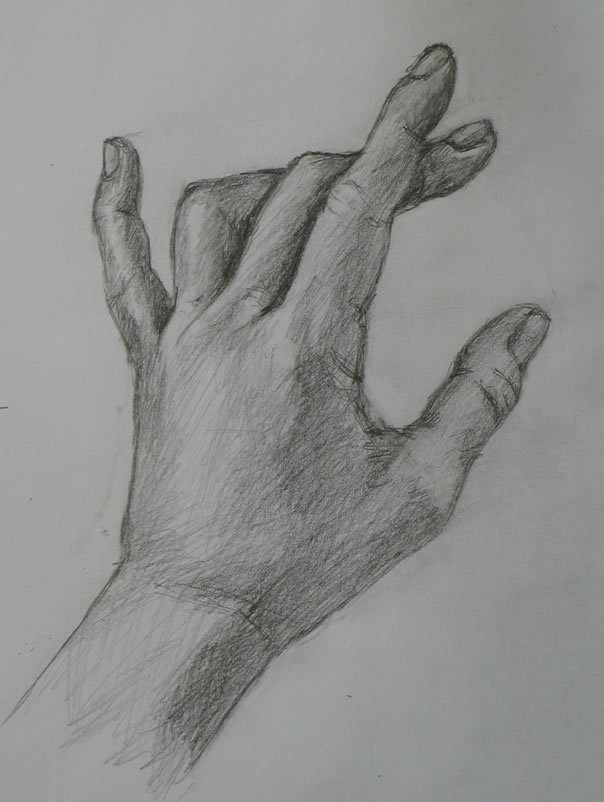
Hand sketch for Tutorial #3

Please refer back to the relevant sections of Tutorial #1 for materials you’ll need and how to set up your work space.

Placing your hand

I chose this rather odd position of my hand because it produces an interesting variation in the negative-space shapes (between the fingers) that we’ve been working with so far.

To place your own hand for this drawing, focus on the spaces between your fingers.  You may not be able to replicate the shapes of the spaces exactly as I did them, because your hand is probably a different size and shape than mine.  Just place your hand in a position close to this.  The goal is to create varying shapes in the spaces between your fingers.

That may seem like an odd goal.  But remember, I’m trying to get you to switch the way you’re seeing to a different mode – what Betty Edwards calls right-brained mode.

Right-brained seeing is all-important for many artists’ drawing process.  But the switch isn’t easy for the human brain to make, as I explain here.

Seeing the negative space between your fingers

To prime your brain to switch to seeing in right-brain mode, look at the different shapes between my fingers (below).  Between the ring and middle fingers is a small triangle.  Between middle and pointer fingers is a more elongated shape.  And between forefinger and thumb is something like a teardrop shape.  In addition, there are small triangles between the tips of the fingers.

Focus on the space between my fingers, indicated in green in the middle image. On the far right are the green "negative spaces" without a photo underneath. Note the variety in their shapes and positions. This is what you will draw first.

Now look carefully at the spaces between your own fingers.  What are the different shapes and sizes of the spaces your fingers create?  That’s what you’re going to draw first.

Drawing the negative space between your fingers

The sequence below shows how I began my drawing with the negative spaces between my fingers, moving from left to right.  It may also be helpful for you to watch this process in the time-lapse video at the end of this post.

This sequence shows how I first drew the negative spaces between my fingers.

To help you judge where you should draw each line, notice where the sharp angle of each finger “fits into” the previous finger.  For example, the sharp bend in the ring finger occurs opposite the middle of the top segment of the pinky (Image 1 above).  The sharp bend of the middle finger overlaps the ring finger halfway across the ring finger’s top, straight edge (Image 3 above).  The pointer’s sharp bend is very close in shape to the underside of the middle finger’s bend (Image 4 above).

Using finger joints as a measuring device

In this demo I draw more joint details of some fingers, compared to previous, simpler hand position negative-space sketches.  At this early stage in the sketch, you don’t want to put in too much detail.  You want to first sketch out the basic shapes of your hand.  So at this early point, I’m drawing the finger-segment details solely as a measuring device.  They help me judge the size and shape of the negative spaces I’m drawing.

Later in the drawing process (see Tutorial #3 video below), I will continue to draw in more of the tiny wrinkles that form each finger-joint.  Each time I did this in this particular drawing, my purpose was to use these lines as measuring devices that helped me check whether I was drawing everything around the joint to the appropriate size.

Artists always need ways of judging relative sizes of elements they’re drawing.  So with anything you draw, look for the smaller sub-units that make up the whole.  You can use them to measure and also to judge whether you’re drawing angles and shapes accurately.

Artists often use grids in drawing.  These are another form of measuring device, and they also help you judge whether you’re drawing angles and shapes correctly.  It’s always easier to judge the size and angle of a line when it’s short than when you’re trying to draw an entire object all at once.  This is exactly how I’m using the joints of the fingers in my drawing.

At the same time, it’s very important to remember that you must not get lost in detail at this stage.  Right now, you’re just blocking out very basic shapes.  Keep moving forward!  Don’t get stuck on one tiny part of the whole.  You will make adjustments and add details later.

Some tips on shading your drawing

As you begin shading your drawing (see the video at the end of this post), it’s often easiest to look for the very darkest areas and begin there.  As you can see, I use the loosest kind of pencil scribbles to shade these hand drawings.  This is fine – you’re practicing.  Don’t get too caught up in technique right now.

Squint your eyes to see the lights and darks of your hand.  If you’re lucky enough to have strong lighting on your hand, you may not need to squint much.  But if the light is more even, you’ll need to squint hard!

Sometimes you’ll find it difficult to see any but the darkest shadows on your hand.  To create a fully-rounded appearance, you’ll need to sketch in the more medium-toned shadows as well.  If you’re having trouble seeing these, look instead for the highlights on your hand – the very lightest areas.  Once you see the pattern of the lightest lights, it will be easier to recognize the paler shadows around them.

Final adjustments

The next day after I did this hand sketch, I noticed that I had made the base of the hand and the large thumb knuckle too wide.  So I got out my eraser and pencil and made some adjustments.  I also fiddled with the shading around my fingers.

You can continue “fixing” little bits of your drawing as long as you want.  But it’s often more helpful to just note where you want to improve next time, and then move on to a new drawing.  Keep practicing new drawings all the time!

Hand Drawing Demo #3

You can click through this demo at your own pace.  Stop it at frames you want to study longer and move fast through other sequences.

{"numImgs":"42","constrain":"height","cvalue":"450","shellcss":"width:353px;padding:4px;margin:14px auto 0;"}

Hand Drawing Tutorial #2

Wednesday, November 3rd, 2010

This is the second in a series of online drawing lessons using your hand as your model.  The first, most basic lesson is here.

The hand is so complicated visually, so able to move its parts in infinite ways relative to the various other parts, that a small movement creates new shapes and new challenges in drawing.

At the end of this lesson, you’ll find a time lapse photo sequence of my entire Tutorial #2 drawing process, from my first pencil line to the finished sketch.

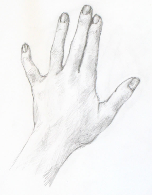
This lesson's hand sketch. You can still see a light line across the back of the hand, which I drew as a guide.

Materials you’ll need

You can use any paper and pencil or charcoal that you enjoy.  I’ve used the same paper, pencil, and tape for this lesson as I did in the first.  Please look back for specifics if you want them.

My Tutorial #2 drawing (right) appears darker than the first demo, even though I used the same simple pencil and other materials.  The reason is that this time, I made an effort to draw more heavily in order to make even the guidelines I sketched more visible to you.

Setting up to draw

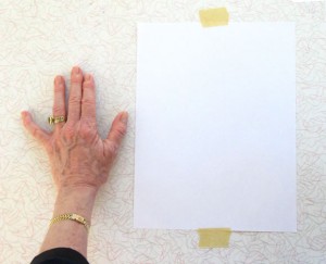
Tape a piece of paper to your drawing surface, leaving enough space to place your non-drawing hand next to the paper as your model.  For important explanation and a photo, please go here

Placing your hand

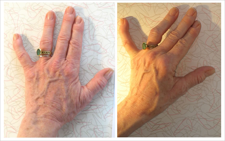
In this lesson, we’ll draw a slight variation of the hand “pose” from the first lesson.  In the first lesson, we drew the most simple version possible: the hand placed flat, viewed from the back.  For this lesson, I began by setting my hand and fingers in the exactly the same position as in Tutorial #1.  Then I made a single change:  I lifted my pointer-finger knuckle upward, well off the table.  (The lighting this time is also different.)

Compare the positions of the hand in Demo #1 (left) and Demo #2 (right). The fingers and bottom of the hand are similar. But I've raised the knuckle of my pointer finger off the table, creating a more complex subject for sketching.

I also placed a strong light source (a halogen lamp) to the left side of my hand.  This creates the intense lights and darks that help the artist create the illusion of three-dimensionality.

As always, start by drawing negative space

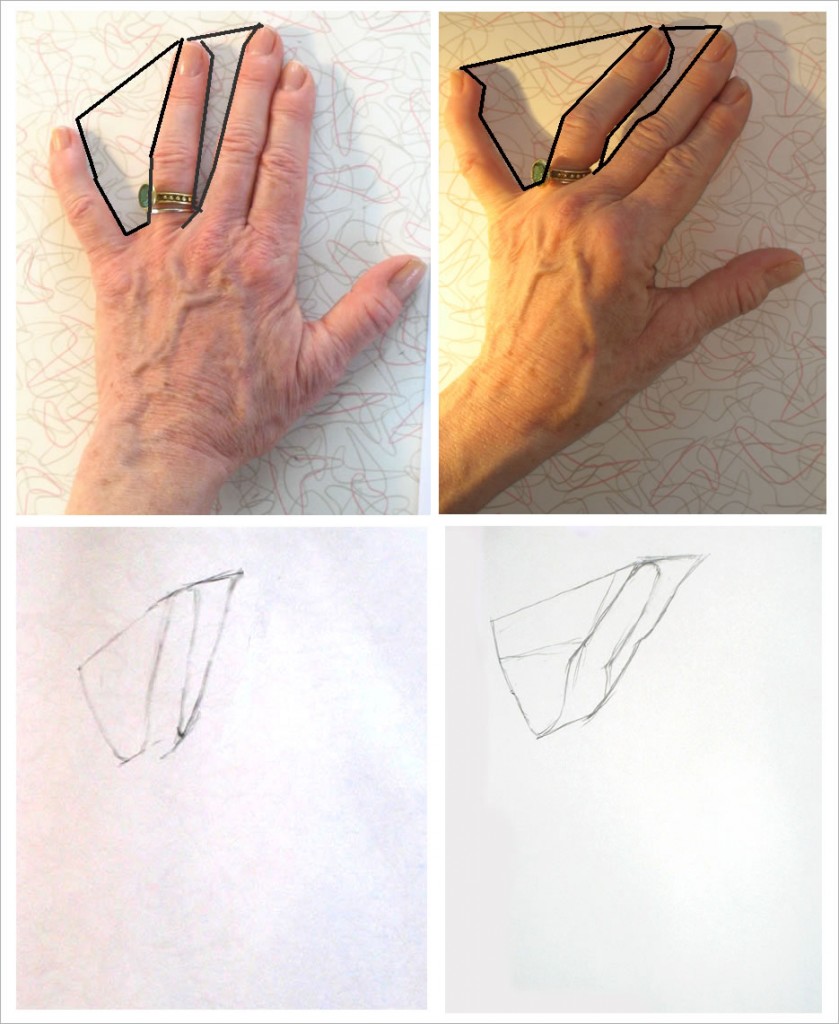
For me, the key to beginning drawing any subject matter is to find easily-drawn areas of negative space.  For our hand poses, the obvious basic negative spaces are those between three of the fingers. Look at the spaces between the pinky and ring finger, and between the ring and middle fingers in each pose:

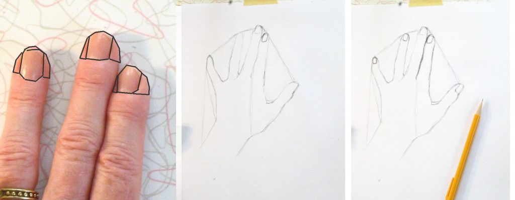
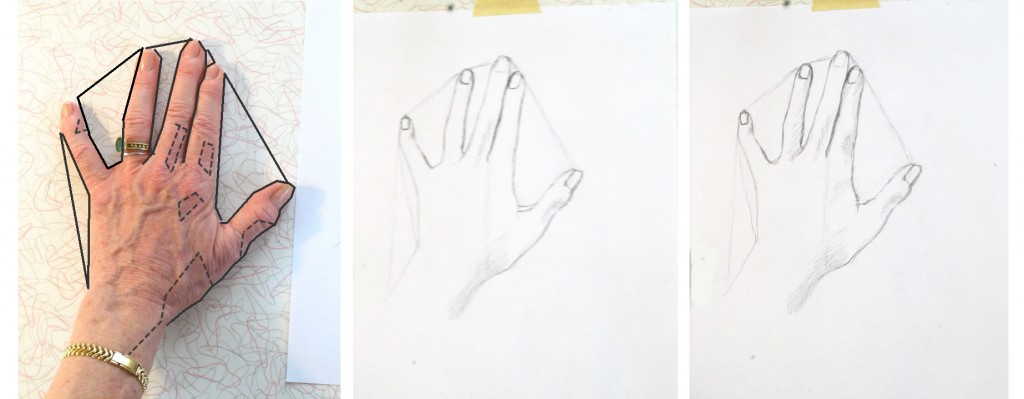
I've drawn black lines over the photos of each hand pose, outlining two spaces between fingers. Below each photo are the first lines in my drawing of the hand above it. Note that in the second drawing, I broke the negative space down into more geometric shapes (the sketched guidelines) than in the first drawing.

Continue “carving out” the negative space all around the hand to create its complete outline, as we did last lesson.

Making a course-correction by drawing guidelines

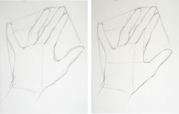
When I’d completed the outline of my hand, it looked really off (below, left).  The thumb was too large, and the entire hand seemed too stretched out to the right side.  I had clearly made a mistake somewhere along the way.  But what was it?  What had I done wrong, and how could I correct it?

Don’t worry, this kind of mistake happens all the time!  What you need to do now is to look over your hand to find relationships between lines you think are correct and the areas you feel you may have gotten wrong.

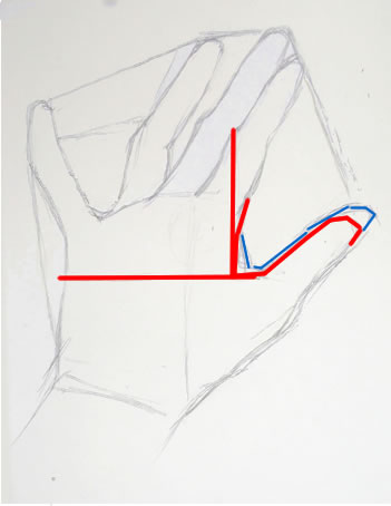
My first completed outline (above left) was clearly off. I corrected my drawing (above, right) using a horizontal guideline across the back of the hand and a vertical one intersecting it at the base of the thumb.

Following this method, I realized I had mis-placed the “scoop” of negative space between the forefinger and thumb.  To help you see this more easily, I’ve colored over the incorrect inner thumb line in blue (see right).

The edge of the hand between the forefinger and base of the thumb actually lies directly under the first joint of the forefinger (note my vertical guideline, right).

I figured out where the horizontal portion of the thumb-base should be by drawing a horizontal line from the point on the other side of the hand directly across from it (see horizontal guideline, right).  It may seem odd to figure out the placement of the thumb by looking at  its relationship to the far side of the hand.  But it works.  And it helps you check whether your entire drawing is shaping up properly in relation to the whole.

Now for the drawing demo

I think you’ve probably had enough technical verbiage for this lesson.   So just continue from here the same way we did in Tutorial #1.  It may help you to check out the time-lapse sequence of my drawing below. You can move through it at your own pace by clicking the “stop” button at the bottom when you’re ready to see the next image.

{"numImgs":"29","constrain":"height","cvalue":"450","shellcss":"width:348px;padding:4px;margin:14px auto 0;"}

A couple moments you may have noticed in the “video:”

First: at some point, I erased the negative-space guidelines I had drawn in the very beginning from each finger tip to the next.   It’s often fun seeing guidelines like this in a finished sketch, but they were distracting me as I was trying to evaluate lights and darks for the shading.  So I got rid of them.

Second: this time I decided to fill in the shadows my hand cast on the table.   I first considered doing this because the left side of the middle finger was so light (because of the halogen lamp) that I had nothing to define its edge.  I thought I’d try defining it by the shadow next to it.  Once I had started with that finger, of course I had to finish the entire shadow of my hand.  I wouldn’t always do this in a quick sketch.  But in this case it helped, and I liked the result.

Drawing Tutorial: A Simple Drawing of Your Hand

Friday, October 22nd, 2010

This is the first of a series of drawing lessons in which we’ll draw our hands.

Finished basic sketch of hand.

I chose hands because they are always available to “pose” for you!  And they can be placed in an infinite variety of simple or challenging positions.  The techniques you’ll learn from these lessons can be applied to drawing anything and everything else.

This first lesson is a simple drawing of the back of your hand.  This is the hand at its most basic, with no odd angles or foreshortening.  Future lessons will become more complex as we go along.

Materials you’ll need:

You can use any kind of paper.  I used plain printer paper and a Papermate “Sharpwriter” #2 pencil.  These are very unsophisticated materials, which I love using to practice drawing.   They’re easy to find, so you can do a quick sketch any time you have a bit of free time.

Set up your work area:

Set up for first simple drawing of the hand

First, tape a piece of paper to a table where you’ll have space to put your non-drawing hand next to it.

Place your non-writing hand (your left hand if you’re right-handed and vice versa) next to on the table very close to the paper.

You will need to stand up while you sketch so that you’re viewing your drawing (and your hand) from directly above.  If you sit down, you’ll be seeing your paper at an angle, which will make you distort your drawing.

Alternatively, you can use an easel, either a table easel or a free-standing one.  You will then need to place your hand vertically on the easel so you’re viewing it from the same angle as your paper.

Ideally you should stand up while you draw, whatever you’re using.  Standing will give you most perspective so you can do your best work.

Placing your hand

Place your fingers as I've done here: first two close together and the others separated by different amounts.

Place your hand with the first two fingers touching each other, really snuggled up together.  Your ring finger should be somewhat separated from the first two.  Your pinky should stretch out at a more distant angle.  Place your thumb with a good space between it and the rest of your fingers.

These differing amounts of space between your fingers will help you see the “negative space” between and around your fingers and hand.  You can read more on why this is true here.

To me, the ability to see negative space is the key to drawing anything.  Focusing on the space around what you’re trying to draw tricks your eye into seeing more accurately.  It’s an extremely important skill for you to develop!

Begin by drawing negative space

First, look carefully at the space between your pinky and ring fingers.  It’s roughly a triangle. The top of the “triangle” is created by an imaginary line connecting the tops of the two fingers (we’ll erase this line at the end of sketching the entire hand).  I’ve placed black lines on top of the photo of my hand to help you see this.

Don’t look at the fingers themselves!  Forget that you’re drawing fingers.  Focus on the space between the fingers and draw it, as I’ve done in the middle image below.  Form each angle of the shape as accurately as you can.  Then move on to the triangle between the next two fingers, as in the far right image below.

Begin by drawing the spaces between your fingers. Don't look at the fingers! Focus on the spaces between them.

The “triangles” are each tipped at a different angle.  Be sure to draw your “triangles” tipped just the way they are in your hand.

Between the next two fingers is a line (see below), not a space, because of the way we’ve placed the fingers.  Look at this line carefully and replicate it in your drawing.  At the top of the pointer finger is a little tiny triangle formed against the middle finger.

Between the first two fingers is a line. There's another large sort-of triangle formed by the thumb.

Now sketch the sort-of-triangle between the pointer and thumb.  You can see that I made a mistake in drawing my first line.  My second, lower line is more accurate, but for now I’m leaving both.  We want to keep moving forward quickly, and will erase mistakes later.

Next I formed the edge of the pinky finger (see below), again envisioning it as a triangle, this one long and almost flat.

I have an odd little crook in my pinky from slamming it in a hotel balcony door a few years ago.  It’s a bit sad, but I’m using all its angles to help in my drawing.

The outside edge of the pinky is formed by visualizing another triangle. The edge of the thumb uses reference lines (dashed), one of which I drew, others which I just envisioned.

Moving on to the bottom line of the thumb and hand: To help figure out where the line should cut in to form the wrist, I drew a faint vertical line from between the first two fingers downward.  You can see this very light line in my drawing (farthest right, above).  Because of the particular position of my hand, my wrist appears to emerge not from the center of my hand, but from the area beneath the ring finger and pinky.  Sketching the light vertical line helped me draw the wrist where it actually is.

I then captured the ins and outs of the bottom line of the thumb and hand by visualizing more imaginary reference lines forming right angles with the top of the thumb (drawn in dashed lined on the photo of my hand, left above).

Another time, I might have sketched this line using a triangle visualization, as I’ve been doing up to now.  There’s no right or wrong here.  The more of the hand you draw, the more reference points you have to judge where your next lines should go.   You should use whatever reference points enable you to see where the line is in reality, hence where you should draw it on your paper.

Positive space can be negative, too!

Now that we’ve completed the outline of the hand, are we finished with negative space?  Not at all!  Let’s take a look at what happens when we begin to sketch in fingernails.

Nails and finger tips can be envisioned as negative space for each other.

Here we’re repeating the same kind of process we used to draw the negative space between the fingers.  Here the fingers around the fingernails are the “negative space” of the nails.  Seen another way, the fingernails are the negative space of the tips of the fingers surrounding the nails.

Draw each nail carefully.  Observe how much finger appears on either side of each nail – they are all different!  If you draw them all the same, according to some idea of where the nails “belong,” you will miss an opportunity to make your drawing appear three-dimensional and real.

For example, the nail on my ring finger (above) has almost identical bits of finger tip around it.  But my middle fingernail has more finger tip on the right side than on the left.  And my pointer nail has hardly any skin showing on its left.

Notice the different angles and shapes of top and bottom lines of each nail. They are all different: my middle nail appears to have a shallower curve at the bottom, while my ring finger nail has a deeper curve at the bottom.  You need to draw each of them as they really are, not as you think they should be, if you want to create a realistic drawing.

Adding shading

The process of adding shading is very much the same as what we’ve been doing all along:  seeing shapes and areas in relation to each other.  The only new thing we’re adding now is learning to see values – which shadows are darkest?  Which are barely there?

The best way to judge where you should shade is to squint your eyes so that you see only the most basic areas of light and dark.  This is easiest when you have a strong light source that throws deep shadows.  But even minimal shading can be detected by squinting hard.

On the photo of my hand below, I’ve drawn dotted lines around areas of shade that I first noticed and shaded in with my pencil.

To see areas of light and dark, squint your eyes really hard.

As I shade in, I also continue to refine the outlines of each finger and the hand, adding the subtle variations to the rough “triangles” I sketched at the very beginning of the lesson.  Looking for shadow and light helps me see details of the outline as well.  You can see how I worked through this in the very short video below.  You’ll need to watch it through several times because the changes are subtle (next lesson I’ll use darker drawing tools so you can see more clearly).

{"numImgs":"14","constrain":"height","cvalue":"450","shellcss":"width:331px;padding:4px;margin:14px auto 0;"}

As you work, keep looking and looking at specific areas and at your entire hand as a whole, comparing dark and less dark shadows.  Pencil more heavily in areas – such as the line between the pointer and middle finger – which are very dark.  Use a lighter touch for lighter shadows.

Note super-light areas by squinting hard.  If they’ve gotten too dark, you can use the edge of your eraser to lighten them.

Even your nails have highlights and shadows.  Try to see and replicate them accurately.  Look at the nail beds – the skin touching the nails.  It’s shaded in some places and light in others.  I made all my nail beds too dark, so I lightened them at the very end.

I hope you’ve enjoyed and learned from this lesson!  We’ll do a different view of your hand next lesson.

Why is learning to draw “so hard?”

Thursday, July 29th, 2010

Why do our brains withhold from our conscious grasp a way of seeing that’s so useful?  Why aren’t we able to easily dip into that mode of seeing when we want it to draw?

Centrale Electrique de Zouk (Electric Station of Zouk), by Vanessa Gemeyal

Centrale Electrique de Zouk (Electric Station of Zouk), by Vanessa Gemeyal

When I posted a two-part online drawing lesson a couple of months ago, I received a response that got me wondering.

The response was from a wonderful young Lebanese artist, Vanessa Gemayel.   Vanessa paints luminously about today’s destruction of the beautiful  traditional architecture that gave Beirut its unique atmosphere, replaced by generic modern architecture that is sadly making Beirut look like every other city in the world.

Vanessa, after trying out my figure-drawing lessons, wrote to me that she found them “very cool and helpful.”  But, she added, “you make it seem a lot easier than it actually is.”  And of course Vanessa is saying outright what many people feel about drawing instruction.

That got me wondering what in the human brain makes drawing from life so not-easy to learn.

All jobs involve a learning curve, often long and hard to get through.  Drawing from life is in that sense no different from any other expertise.  Many skills, for example, require years of study before mastering them.  Others need endless practice.

I believe that the most important element of learning to draw, though, is an “aha moment” – or maybe a small series of such moments.  In those few moments, you suddenly start being able to see in a different way which enables you to draw realistically.  This alternate way of seeing is for me, and for many who draw, the single most basic and important tool we use.

True, endless practice must follow the aha.  But the practice isn’t what blocks most people who really want to learn to draw.

In learning to draw, I think what is elusive to many people is the “aha moment” when they begin to see in that all-important alternate way.

With that aha, you will be able to learn to draw easily.

What is the aha moment in learning to draw?

In my drawing-lesson posts, “Learning to Draw by Playing the Angle Abstraction Game,” I called the technique of seeing differently “angle abstraction.”  The artist is able to see what they’re drawing as a series of angles and shapes that are much easier to draw than when their subject is seen “normally.”

Other artists have given other names to their alternate way of seeing.  Betty Edwards has written two groundbreaking books in which she calls it “right-brain mode,” or “R-mode” (as distinct from left-brain mode, or L-mode).

L-mode is how we consciously think in our everyday lives.  It’s language-based.

R-mode – the one that enables us to draw – is non-verbal and does its work mostly outside our conscious awareness.

The “aha moment” happens when you are suddenly able to consciously access and use R-mode to see differently and draw.

One frame from my free online drawing lesson, "Learning to Draw by Playing the Angle Abstraction Game"

One frame from my free online drawing lesson, "Learning to Draw by Playing the Angle Abstraction Game"

But why would our brains withhold from our conscious grasp a way of seeing that can be so useful?  Why shouldn’t we all be able to easily dip into that mode of thinking when we want it to draw?

Why do our brains block our aha moments?

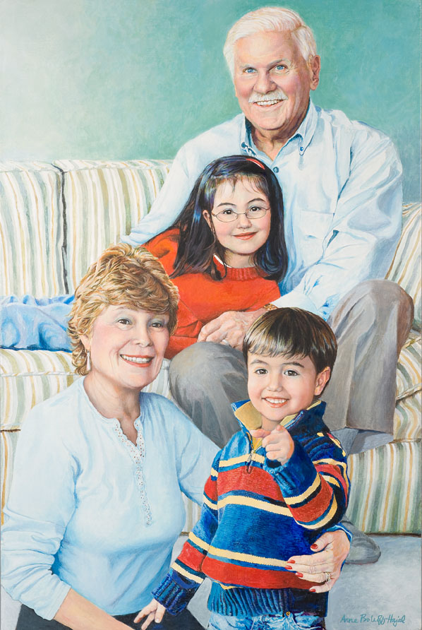
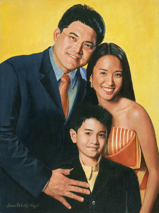
Portrait of the Steinbergs, by Anne Bobroff-Hajal.  Notice how different each of the hands looks.

Portrait of the Steinbergs, by Anne Bobroff-Hajal. Notice how different each of the hands looks.

I was pondering this question when I recently ran into a wonderful answer in one of Betty Edwards’ books, Drawing on the Artist Within (p. 208).

One way of conveying  Edwards’ explanation here  is through a group portrait I painted (right) of Bob and Gail Steinberg with their grandchildren, Riley and Alex.  This portrait illustrates one of the classic problems of drawing: how to draw parts of the human body when they are foreshortened – that is when they are coming straight at us, so they look very different from what we usually think of as an arm, a leg, a hand.

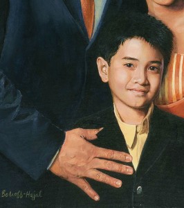
The most obvious foreshortened body part in this portrait is the hand of the Steinbergs’ grandson Alex, who is pointing directly at the viewer.  Everyone who sees this painting knows exactly what that hand is doing.  But in fact, it bears little resemblance to our standard concept of what a hand looks like.  Our conscious, rational L-mode brain typically thinks of a hand as something more like the father’s hand in another portrait (below).

Detail of Edwin Ermita and Two of His Children, by Anne Bobroff-Hajal

Detail of Edwin Ermita and Two of His Children, by Anne Bobroff-Hajal

That little pointing finger

Alex’s pointing finger appears on the canvas as a small circle, not the long tube shape we associate with fingers.  That’s strange enough.  But beyond that, the thumb seems bigger than the other fingers.  And it stretches out at an angle that we rarely think of thumbs taking on.  That thumb seemed so odd to me while I was painting it that I rechecked it multiple times to be sure I had it right.

In fact, it’s exactly because I allowed each finger to take on its actual shape – rather than what I might have consciously thought it should look like – that makes it possible for everyone who looks at the painting to know exactly what that strange conglomeration of flesh-colored blobs is.

Now for the other hands….

In addition to the little pointing finger, we can look at the other hands in the Steinberg portrait.  When we really study them, none of them is shaped like our standard concept of a hand.

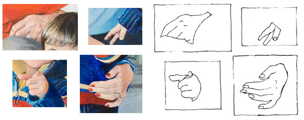
Detail of Steinbergs' hands along with tracing

Detail of Steinberg portrait hands, along with black ink outline of each

Bob Steinberg’s hand appears almost triangular, with only parts of four fingers visible.

Little Alex’s right hand is visible as only a thumb and two fingers.  And the index finger looks like it’s separated from the thumb by an interloping finger which in reality is farther away from the thumb.

Gail Steinberg’s fingers conform fairly well to our standard image of a hand.  But what about the back of the palm area?  It looks much smaller and less rectangular than it “should.”

It’s fine for us to view these shapes as being all different when we’re drawing.  But it’s also crucial for our daily functioning that we recognize all of them as the same – as hands.  It’s the job of our efficient, everyday L-mode, says Edwards, to quickly classify all these odd shapes under the general verbal rubric of “hand.”  And that verbal rubric is envisioned as in Edwin Ermita’s hand above, stretched flat, with five fingers roughly the same length as the palm.

If our brains had to go through a conscious, verbal process of debating whether each of a group of very dissimilar objects is or is not a hand from a different angle, we’d never get through our day.  We’d be mired in endless debating: “I see three of what look like fingers, two from the side and the third, a thumb, from more of a straight-on view.  But if they are fingers, why aren’t there five of them, and why aren’t they attached to a hand?  Is the hand out of my sight, or ….”

Our unconscious interpreter

It’s R-mode, says Edwards, that takes in all the differences in shape and size, and, with lightning speed, calculates from them where things are in space, what they are, and so on.  R-mode sees, for example, that the back of Gail Steinberg’s hand appears to be getting smaller not because it is smaller, but because it’s receding back from her fingers, curving around Alex’s body.  “It’s a hand, all right,” says R-mode, “it’s just shaped differently from a “standard” one because its wrist is farther away from us than its fingers.”

Edwards wrote (p. 178),

“R-mode apparently computes instantaneously and nonverbally….  This computation – and the size-change information that hits the retina – is somehow kept ‘secret’ from conscious awareness, perhaps in order not to interfere with or complicate the language system.”

I suspect this instantaneous computation is also “kept secret from conscious awareness” because language – the currency of L-mode – would slow down its lightning speed.  The rapidity with which our R-mode calculates that a flesh-colored circle is a finger pointing at us happens far faster than we could ever describe in words.

An analogy that might make this clearer is of an athlete hitting a ball.  The athlete’s R-mode brain is making calculations at phenomenal speed about how far away the ball is, how fast its moving, where its moving, and about how the athlete him/herself must move and react to all that information in order to successfully connect with the ball.  If the athlete had to bring all of this to consciousness and calculate it verbally – “the ball is now curving right and I can see it will bounce in this particular way, so I calculate that I should move this way – no, I now see that it had spin on it, so I need to redo my computations…”  – the athlete would never be able to hit the ball before it went whizzing past.

Bringing the aha to more readers

When artists draw, I believe they are making judgments and decisions at that same lightning speed as the athlete hitting a ball.  Their thought process has to be non-verbal because of the countless calculations made in a split-second’s time.

I think this is why it’s so difficult to convey drawing instruction in words.  The artist’s observations, judgments, and decisions happen in a split second of often-exciting non-verbal discovery.  But to convey to a reader that same thought process takes long paragraphs of verbiage.  That’s why I’m hoping to be able to get more video drawing demos up on this blog in future – along with text that tries to convey a small fraction of the artist’s split-second decision-making as he or she works.

We need language to communicate the artist’s process to other people.  But language is slower and more reductionist than some other processes in our brains.  Hopefully a combination of images, video, and language will bring the aha moment to more readers of this blog in the future.

Me against Da Vinci? What’s the best way to draw?

Thursday, May 6th, 2010

If you’ve ever taken art classes, you may wonder why I didn’t include information about the structure of the human body in my two life drawing lessons.  Aren’t figure-drawing teachers supposed to start by describing the internal skeleton, segments and joints of the body, standard proportions of head, legs, eyes, arms, mouth?

For example, Rebecca Alzofon began her online figure drawing lessons with wonderful animations of a skeleton, followed by the three ovals of “Head, Ribcage, Pelvis,” the “Pivot points” inside joints, “Long bones,” and so on.

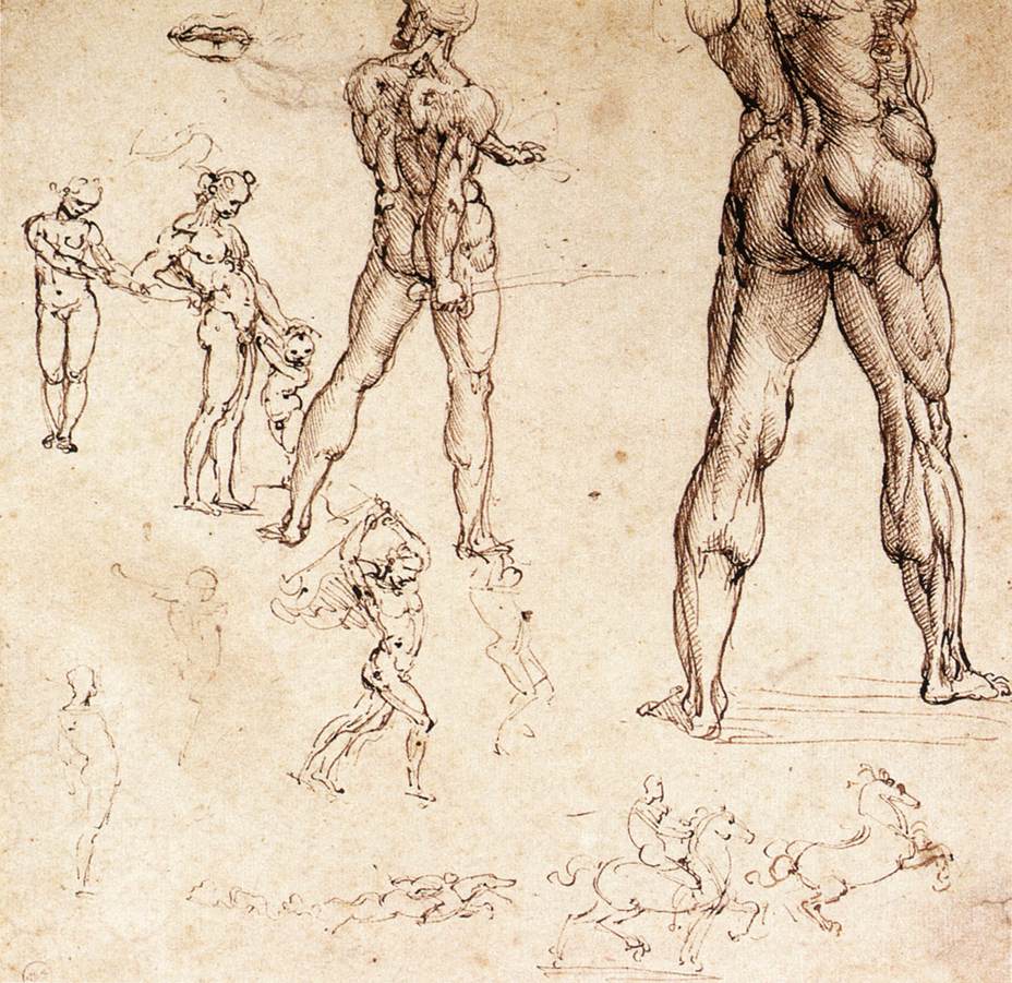
Drawing by Leonardo Da Vinci

Drawing by Leonardo Da Vinci

The early, great champion of the anatomical approach to life drawing was of course Leonardo Da Vinci.  Da Vinci,  one of the greatest artists who ever lived, did minutely detailed dissections of human corpses along with eyewitness drawings of human anatomy.

But the Angle-Abstraction Game I described in my life drawing lessons, on the other hand, is all about angles and shapes.  Isn’t that geometry, not human bone and flesh?  Where is the brilliant Da Vinci in that?

There are different ways to approach drawing.  I’ve linked to Alzofon here because I admire the care and thoroughness she devoted to her tutorial’s very detailed illustrations and text.  If you want to try out the life-drawing method she represents, I recommend working through her multi-paged lessons.  Her presentation is, I think, more helpful than some of the other briefer ones you can find online.  Above all, I love her use of animation.

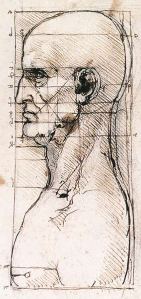
Da Vinci: Placement of features in the head

Da Vinci: Placement of features in the head

My own earliest drawing classes included anatomical information, standard proportions and focus on the body itself when drawing.  I learned, for example, that the crotch is the halfway point in the length of the human body – which, by the way, is 6-7 heads.  The nose ends halfway between the eyes and the bottom of the chin, and the mouth is one third down that same distance (you can see exactly this noted by Da Vinci in his drawing of the human head).  The pelvis tilts and turns independently of the chest, as do the shoulders, and so on.

But for me personally, it wasn’t until I put all that aside and looked simply at shapes and angles carved into space that I suddenly began to draw fluidly and with assurance.

In current parlance, I began to draw from my right brain instead of my left.  For me, that made all the difference.

But how could that be?  Where did I get off disagreeing with Da Vinci?

Betty Edwards is the pre-eminent teacher of the “right-brained” approach to drawing, made famous through her book Drawing on the Right Side of the Brain.  I had actually begun using my angle-abstraction game more than a decade before her book came out.  But the book explained to me why forgetting – or at least not focusing on – all that detailed information about the human body worked so well for me.  Edwards made me feel it was OK to diverge from Da Vinci.

In a nutshell, Edwards explains that we often can’t draw because we’re blocked from seeing what’s right in front of us.  What blocks us is our preconceived notions about what a human hand or leg or eye should look like.  We struggle, trying to draw what we assume we’ll see – instead of seeing what’s actually there: how the specific hand in front of us looks, for example, when its fingers point straight at us.

With this in mind, it now seems to me that all the detailed information about the human body’s standard proportions might get smack in the way of our drawing well, rather than helping us draw better.  “Standard proportions” provide more expectations of what we should see, rather than removing expectations so that we can see.  This is especially true when the model isn’t standing upright, but is bent or folded in more complex poses, where “standard” proportions get lost in the twists and turns of the person’s limbs.  And after all, it’s non-standard poses that express the body language of individual people whose personalities we want to capture along with their outward appearance.

Edwards’ great contribution to artists everywhere is that she teaches how to disengage our left brains while we draw, in order to enable us to see what’s actually there.  One very important way of doing this is to focus on “negative space” – the space around the figure, rather than on the figure itself.  Counter-intuitive though this may seem, focusing on the space around your subject is often the best way to capture your subject accurately.  This is because looking at the unexpected negative “turns off” the left brain and allows the right brain to do what it’s good at – drawing.

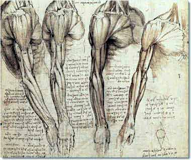
Da Vinci: Muscles of the neck and arm

Da Vinci: Muscles of the neck and arm

So all the focus on the body itself, and all the analysis of what’s going on inside it, for me at least, engages my analytic left brain and gets in the way of drawing.  Conversely, the more I forget I’m even drawing muscles, hair, and bones, the better I get at drawing muscles, hair, and bones.

I will never know what it would be like to draw without first having my early foundation of information about the body.  It’s very possible that this knowledge informs my drawing even though I never think about it consciously.  I also think I happen to be the kind of visually-oriented person who is always sponging in information about everything I see, like how babies’ knuckles look like dimples and how my own knuckles look as I sit here typing.  I think I may more quickly recognize and draw certain shapes because my mind is always noticing them in my everyday life.  So I’m undoubtedly not a pure test case of drawing from abstractions rather than awareness of the body.

I encourage experimentation with all kinds of approaches to drawing.  What works for me may not work for you.  But I’d also encourage you to strongly consider the possibility that emptying your conscious mind of analytic focus on the body may be the best way to draw the body beautifully.

Learn to Draw by Playing the Angle-Abstraction Game: Lesson 2

Sunday, April 25th, 2010

If you haven’t yet seen the first half of this life drawing lesson, you can get to it here.

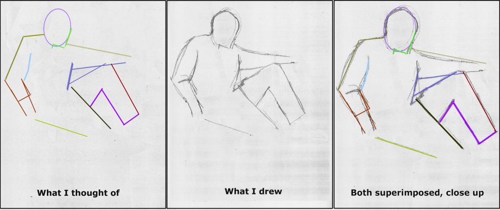
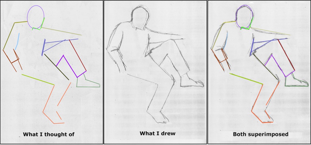
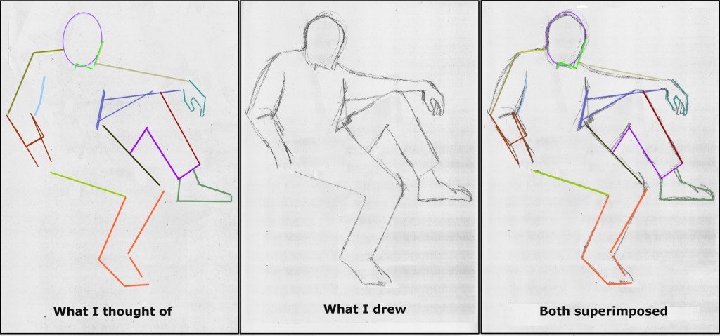
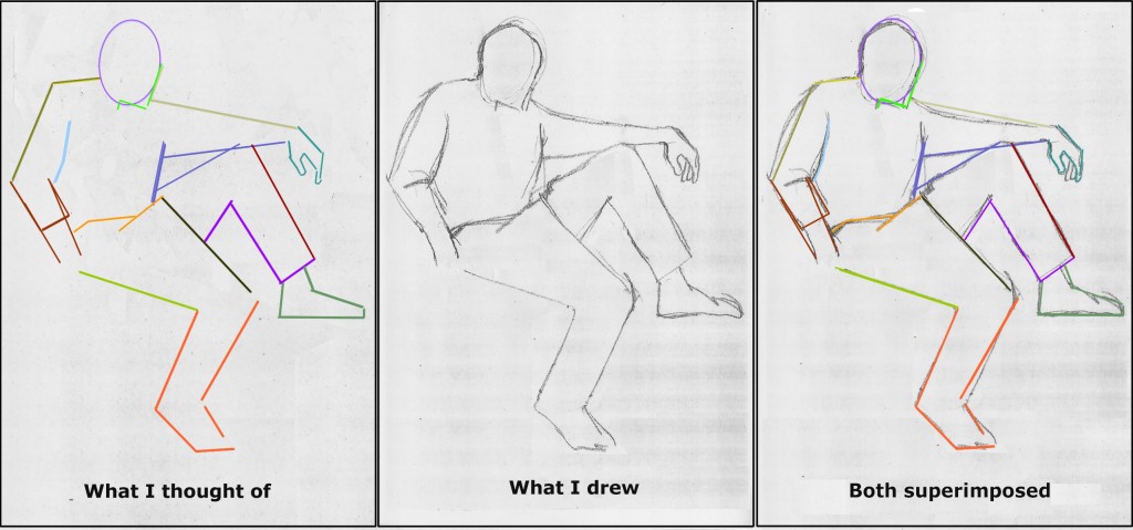
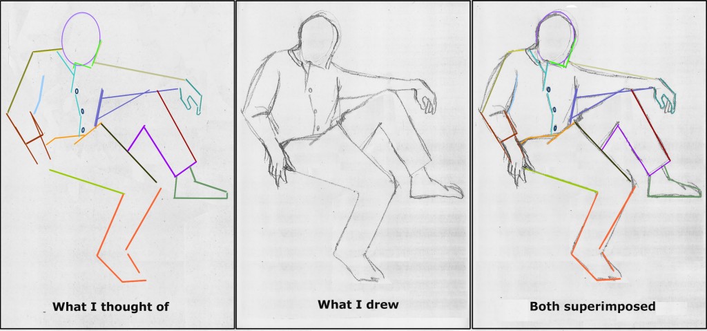
Briefly, my Angle-Abstraction Game drawing process begins with a simple shape, in this case an oval. Emerging from the oval, you draw lines corresponding to various elements of the body.  With each added line, you build exponentially more reference points from which to base your next lines and angles.

Astonishingly, from this mess of geometry, a human form will appear.  The magic moment when it suddenly does is the reward for forging through any difficulties that precede it.

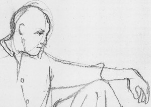
DonDugaSketchAlone

My 2-minute sketch of Don Duga

______

Beginning the second half of the life drawing lesson:

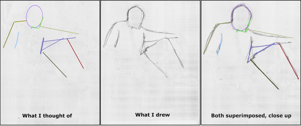
Next is the front of Don’s propped-up leg.  By now you have all kinds of reference lines to draw its angle and length accurately.  Which would you pick?

(To reiterate from Part 1, the sequence I’m following here is not preordained.  As you practice with other models, you should move through shapes and lines as you notice their relationships to what you’ve already drawn.  Try to cover the entire body very quickly using basic shapes.  Only after that should you go back to add as much detail as you have time for before your model shifts position.)

DonDugaColoredPathsStage9A

Don Duga sketch

2-minute sketch of Don Duga

The next line I drew may be the trickiest of the entire pose.  This is because our normal expectations about legs cloud our ability to see what’s actually in front of us.

If you rely only on your standard expectations about human bodies, you might assume that the inside line of each of Don’s legs would intersect the body at the crotch, the bottom center of the pelvis.  But in this case, the lower pant leg of Don’s baggy chinos is being pulled upward and way off center by the propped-up leg.

Drawing something this disoriented from our normal assumptions is very difficult.  The only way to achieve it is to abstract how you see it from all your expectations of what it should look like.

By now you know the angle-abstraction game routine:  Forget that you’re drawing a leg or pants.  Look only at the line formed by the top edge of Don’s lower pant leg.  Where does this line begin at the top?  Which line you’ve already drawn does it intersect, and where?  If you look carefully, you’ll realize that it intersects the top line of Don’s raised leg just about at the point where it meets his shirt front.

Once you’ve determined where this line begins at its top, ask yourself whether it descends tilting right or left of its starting point?  At what angle does it continue downward?

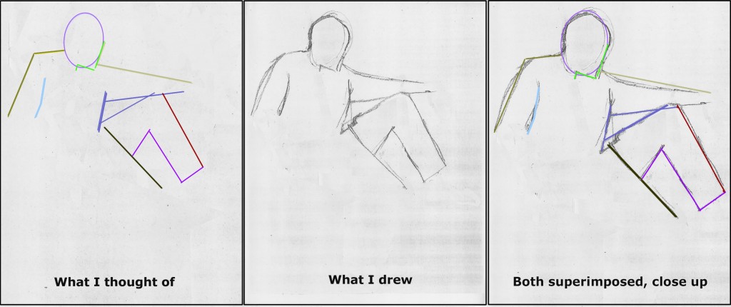
DonDugaColoredPathsStage10A

Don Duga 2 minute sketch

Don Duga 2 minute sketch

After I had sketched this line, I double checked its relationship to my already-drawn upper edge of Don’s other leg.  Note that the two are not quite parallel.  They slant slightly toward each other at the bottom.  If you don’t have this right, feel free to sketch in another more accurate line.

If all this reads like a jumble of geometry, it’s because right-brain processes are always very difficult to describe in words (left-brain).  I promise you that what may be tough to read here is a lot more fun in the doing. And the reward at the end is wonderful, when you suddenly realize you’ve created the image of a person from a maze of angles and lines.  So keep moving through this with that spirit in mind!

Let’s now outline the rest of Don’s upper pant leg.  Where does the bottom-of-the-pant-thigh line intersect with the line you just drew?  What angle does it form there? Where does it end?   I noticed that it ended at roughly the same level as the line just drawn for the other leg.

DonDugaColoredPathsStage11A

My 2-minute sketch of Don Duga

My 2-minute sketch of Don Duga

From this point on, completing the outline of Don’s propped up leg is easy because the back calf is almost parallel to the front calf line.

I then completed the bottom thigh line for the other leg, along with the lower arm on the left of the page.

I think you’ve probably grasped the angle-abstraction method well enough by now that it will be more fun for you to play the game on your own rather than reading more verbiage.  So I’ll let my images speak for themselves for the next couple of steps.

DonDugaColoredPathsStage12-13A

DonDugaColoredPathsStage14-15A

2-minute sketch of Don Duga

2-minute sketch of Don Duga

Next, I turned to the hand on the right side of the page.  Many people find hands very difficult.  But hands should be approached exactly the same way as any other part of the drawing.  The lines are short, but the process is exactly the same.

If it’s easier and/or quicker for you, you can abstract hands into their component shapes – triangles and parallelograms – rather than individual angles.  I do this all the time.

DonDugaColoredPathsStage16-17A

Now I drew in Don’s waist – or more accurately, the lines formed where the folds of his pants borders his shirt.  This is another series of those strange and complex lines that you can’t draw in any other way than by looking at the angles and forgetting all your standard expectations about what a waist should look like.

DonDugaColoredPathsStage18-19A

2-minute sketch of Don Duga

2-minute sketch of Don Duga

Last, I sketched in the opening of Don’s shirt along with its buttons.  You’re already used to seeing lines and angles.  For the buttons, look at them as pure ovals.  What is the shape and tilt of each oval?  Each is different from the others because each button is at a different place in the folds of Don’s shirt.  We’re seeing each button from a different perspective. So if you get each button-oval’s width and angle correctly, they will contribute a lot to conveying the shirt folds.  That in turn will begin to give your drawing the depth and detail that make it look 3-dimensional, even though you haven’t added any shading.

DonDugaColoredPathsStage20A

The hand on the left of the page is not my finest moment, so I haven’t described how I drew it.  It’s one of those details you leave for the end of your 2-minute sketch period, and time runs out.  This is a common occurrence in these quick sketches, one that only lots of practice helps you improve on.

You may be wondering about the detail in Don’s face and the folds of his clothing which is in my final sketch, but not discussed here.  This level of detail is the last phase of each life drawing.  I hope to get to talking about that soon.

Meanwhile, though, we’ve accomplished a solid, believable drawing of Don’s basic position!  Congratulations, and keep practicing!

Last but not at all least, I’d like to hear from users whether this lesson has been useful.  Are there parts that haven’t been clear?  Would more lessons like this be helpful, or does this one cover all the basics you need to know?  Are the visuals helpful as they’re done here, or can you think of another presentation that would make you feel the fun better?  Would more or less text work better for you?  Please let me know, preferably by clicking “Leave a Response” below to comment, or else by emailing me at abobroffhajal [at] gmail [dot] com.

Learn to Draw by Playing the Angle-Abstraction Game: Lesson 1

Friday, April 23rd, 2010

In this post, I’m going to begin to show you how I do quick life drawings.  If you’ve always wanted to learn to draw, or just to improve your drawing skills, playing this Angle-Abstraction Game will probably help you quite a bit.

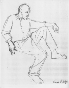
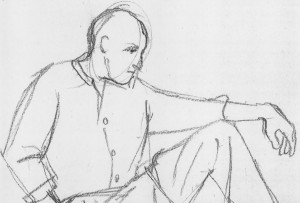
To demonstrate my process, I’ll use one of my 2-minute life drawings of Don Duga, of the School of Visual Arts in New York City.

My 2-minute sketch of Don Duga

My 2-minute sketch of Don Duga

Don used to run a monthly life drawing session for members of East-Coast ASIFA (the international animation society).  One night the model didn’t show up, so Don posed for us himself.

Since I can’t post the actual Don here to enable you to see the 3-dimensional model I was drawing from, we’ll have to do this lesson from my sketch alone.

The goal of quick life drawings is to learn to sketch  people within a few minutes or seconds, which is all the time artists often get in real life.  You’re not going for detail here.  You’re learning to make fast sketches that convey a solid body with limbs, head, and torso positioned in ways that are viable in real life.  (There are also more detailed life drawings – an example of one of mine is toward the end of this post.)

My personal key to success in life drawing has been learning to abstract the way I see.  I view the pose as a series of angles and shapes, either positive (the person) or “negative” (the space around the person).  I’ve named this the “Angle-Abstraction Game.”

It may sound technical and inhuman to focus on angles and shapes when drawing a living person.  But abstracting the way you see is paradoxically the best way to capture the unique posture of each very special human being.

Let’s get started with the lesson.  You might follow along step by step below with your own drawing to get a better feel for what I’m describing.  Boiled down, this process begins with drawing a simple shape, in this case an oval.  You are then able to draw lines emerging from this shape which correspond to various elements of the body.  With each added line, you build exponentially more reference points from which to base your next lines and angles.

Astonishingly, from this mess of geometry, a human form will appear.  The magic moment when it suddenly does is the reward for forging through any difficulties that precede it!

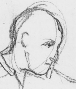
DonSketchHeadCloseup

Don Duga sketch detail

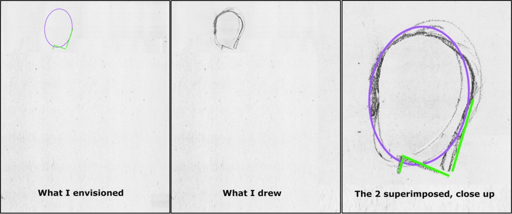
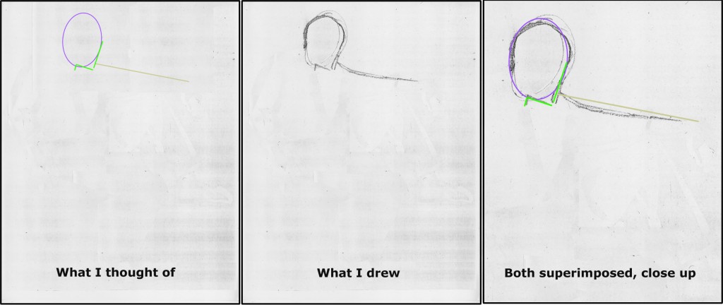
I often begin a life drawing with a rough egg-shape for the head.  For many poses, this is the easiest way to orient the rest of the piece.  (In the figures below, each line is color coded to match the text describing it.)

In the finished sketch of Don, you can see the lines of my egg faintly under the facial detail I added later.

The important thing with the egg is to set it at the correct angle.  Here’s your first moment of abstracting what you’re seeing.  Look at the head purely as an oval that’s tilted at some angle or other.  Forget hair, forget facial detail – forget even that this is a head.  Just play this game with yourself: Can you get that oval tilted properly?  What direction is it tilted?  Straight up and down?  Toward left or right?  Bent way over or only slightly bowed?

(Oh, and place the head on the paper roughly where it is in the pose, so you’ll have space on the page for the rest of the body.  In this case, Don’s head needed to be placed in the upper left of the page.)

Now quickly add a single line along the side of your oval, indicating the front plane of the profile.   Don’t worry yet about the nose or eyes or anything else that makes this a face.  Just look at the fundamental flat plane of the face and play the angle-abstraction game with yourself: what is the angle of the plane on the front your model’s oval? How closely can you replicate it on your paper?

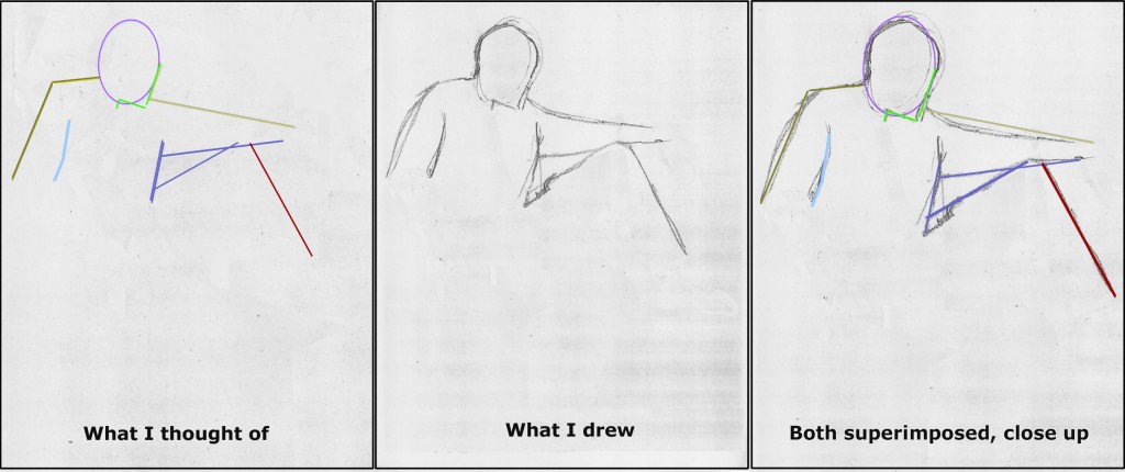
DonDugaColoredPathsStage1A

Now add a line indicating the underside of the chin, using the same angle-abstraction game.  Last, really look closely and add a quick line for the neck.  Forget that it’s a neck.  Just ask yourself: Where along the bottom of your model’s oval does that line emerge?  What angle does it slant at, and how long is it?  Getting these angles down accurately on your paper will help you accomplish the entire rest of the drawing.

Don Duga sketch detail

Don Duga sketch detail

Continuing to move as rapidly as you can, look at the top edge of the model’s outstretched arm.  Forget that it’s an arm.  See it as a line that emerges from the face-plane line.  Play your game:  Where along the face-plane does it emerge?  What angle does it form?

In this particular pose of Don’s, this line emerges at the level of the chin and moves to the right, slanting gradually downward.

How long should this line extend?  As you practice drawing, you’ll get better at sensing how long lines should be.  Meanwhile, you can use the head oval as a rough measuring unit: the line is about twice as long as the width of the oval it’s emerging from.

DonDugaColoredPathsStage2A

When I drew the line, I put a bit of a bend in it (where shoulder meets arm).  But fundamentally I knew where I should draw it because in my mind’s eye, I was seeing it as a line emerging from the face at an angle which I could easily replicate on the page.

Don sketch detail

Don sketch detail

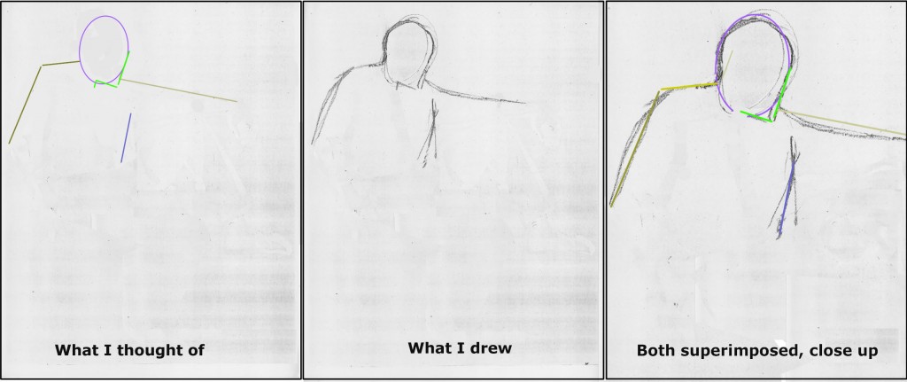
Now quickly move to the other shoulder.  Play the game with yourself:  Where does the line of that shoulder emerge from the other side of the head-egg?  At the same level as the first shoulder line?  Above it?  Below it?

And what angle does it form?  Does it slant up or down as it comes out of the egg?   Draw it.

Next, look at the outside line of the arm at the farthest left side of the pose.  What angle does that form with its shoulder line?  Draw it.

Here you may notice that I first sketched a straight line to help me get the angle accurately.  I then drew a second line, more bowed, to follow the curve of Don’s shirt sleeve.

DonDugaColoredPathsStage5A

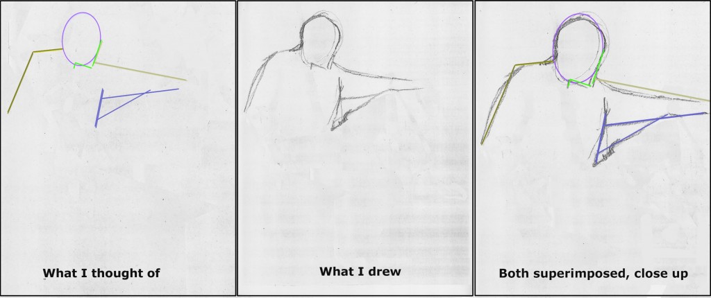
Things are really getting interesting now because you have so many reference lines built up!  From now on, you have a bunch of options for lines nearby to determine where each new one should be placed.

Next I moved to the line of the front of Don’s shirt.  First of all, ask yourself where the top of Don’s shirt front should begin.  Where is the top of that line in relation to the head oval, for example?  You can easily figure that out by imagining a plumb line dropped from the farthest-right point of the head-egg.  You can see that I first sketched in that “plumb line” exactly vertically.  But then I realized it shouldn’t be straight up and down.  It’s tilted.

So back to my game:  How could I quickly determine the proper tilt for Don’s shirt front?   I noticed that it’s the same as that of the face profile plane.  So I drew that line parallel to the face plane.

As you draw, you may choose other reference points than the ones I chose.  That’s great!  The important thing is that you are finding relationships in lines that have come before which make sense to you as guides for each new line you draw.

Don Duga sketch detail

Don Duga sketch detail

We’ve now reached a moment that’s always a lift to me: a negative space enclosed by the model’s body.  In this case, it’s a triangle.  (Can you find it in the sketch to the right?)  To me, a triangle is always easier to size up than a line because a triangle has volume.  A line is a wispy thing floating in emptiness, but a triangle has dimension!

(By the way, the order I’m following here is not preordained.  As you practice on your own with other models, you should move through shapes and lines as you notice their relationships to what you’ve already drawn.  Try to cover the entire body very quickly using basic shapes.  Only after that should you go back to add as much detail as you have time for before you model shifts position.)

Probably the easiest way to generate the triangle bounded by Don’s shirt, arm, and thigh is to first sketch the bottom edge of the arm.  Play the game with yourself:  At its left end, where on Don’s already-drawn shirt front does this line emerge?  Does it slant up or down?  What’s the rough angle of the slant?  At its right end, roughly how far from the upper edge of the sleeve should the lower line end (= how thick is Don’s wrist)?  Another way to check your drawing’s accuracy is:  If you envision the entire arm as a not-quite-complete cone lying on its side, what should its overall shape be?  How thick is the cone at its widest end, and how narrow at the other end?

DonDugaColoredPathsStage7Ab

Finally, complete the triangle by drawing the edge formed by the top of Don’s thigh.  Focus on the broad sweep of the long part of this line, ignoring for the time being the fact that folds in his pant leg create a dip in the line close to his shirt front.  Play the game with yourself: Where on Don’s shirt front does this line emerge on the left, how much does it slant, and where does it intersect with the bottom edge of Don’s sleeve?

Don Duga sketch detail

Don Duga sketch detail

Last, check your accuracy by looking at the overall volume of your triangle. Does it have the same rough size as the negative space bounded by Don’s arm, thigh, and shirt?  If not, check to see which of your angles or line-lengths is wrong and correct it.

Now let’s get the other side of Don’s torso marked.  I drew a quick curved line.  I used the shoulder on the left as one measure, and also checked whether I had placed this line so it divided the armtorso space accurately.  Would you use these same reference points?  What would help you draw this line accurately?

DonDugaColoredPathsStage8A

We’ve now formed a solid foundation of technique needed to achieve the first overall mapping of Don’s pose.   We’ll continue to apply this technique to complete the rough sketch in my next post, Learn to Draw by Playing the Angle-Abstraction Game: Lesson 2.