Archive for June, 2011

How I Painted and Composited Catherine the Great (and Stalin)

Wednesday, June 29th, 2011

You can find more about the images and ideas behind “Dress it Up” here.  Closeups of each of its images in sequence are here.

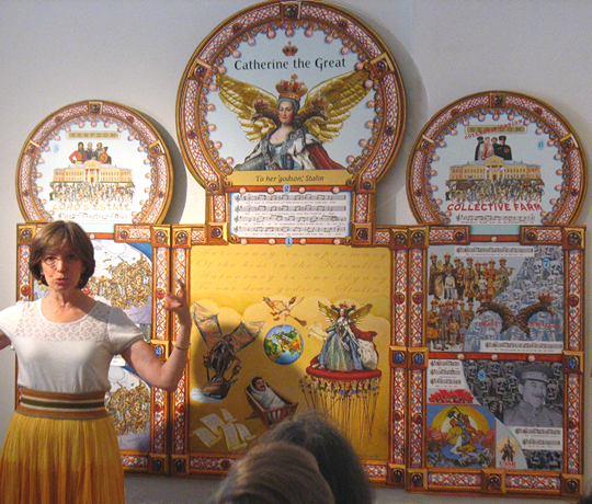
Virtually everyone who sees “Dress It Up in Resplendent Clothes,” my new 7-foot  triptych about Catherine the Great, asks me which parts are painted and which are digital.  The answer to this question is as complicated as the finished triptych looks.
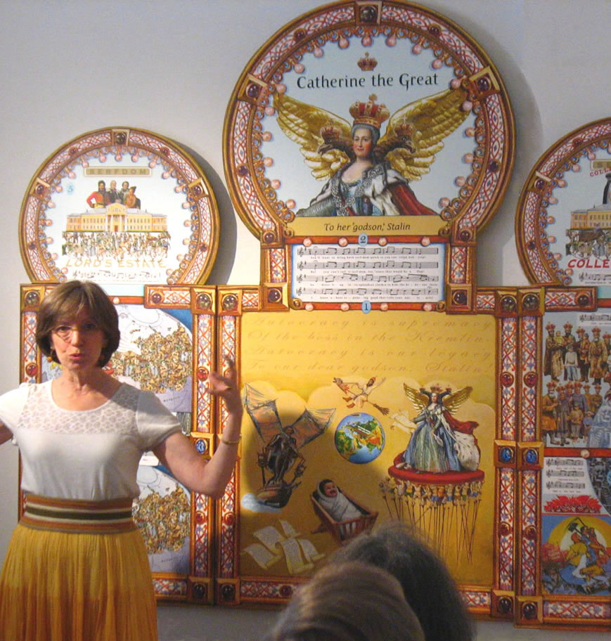
Anne Bobroff-Hajal: gallery talk about techniques used to create “Dress It Up in Resplendent Clothes,” partially visible in background.

So I’m going to use this post to describe my process, which involves a series of layers:

  1. First I paint the highly-detailed individual panels larger than they’ll be in the final triptych.
  2. Then I photograph what I’d painted and print it (on paper), combined with  digital photos of e. g. the Russian Imperial symbol (the double-headed eagle).
  3. I paint on top of this print, then have it photographed and reprinted, and paint again on the print.  I repeat this process as many times are needed to get the effect I want.
  4. Finally, I composite reduced-size versions of all these components into the final triptych and have it professionally printed on canvas.
  5. On the final triptych, I spend another month or two painting additional images and many adjustments on the canvas to balance the whole composition and get the effects I want.

“Dress It Up in Resplendent Clothes” took over a year to complete.

Why did I develop this layered work process?

An experience I had while painting my previous PLAYGROUND OF THE AUTOCRATS triptych moved me toward this process.
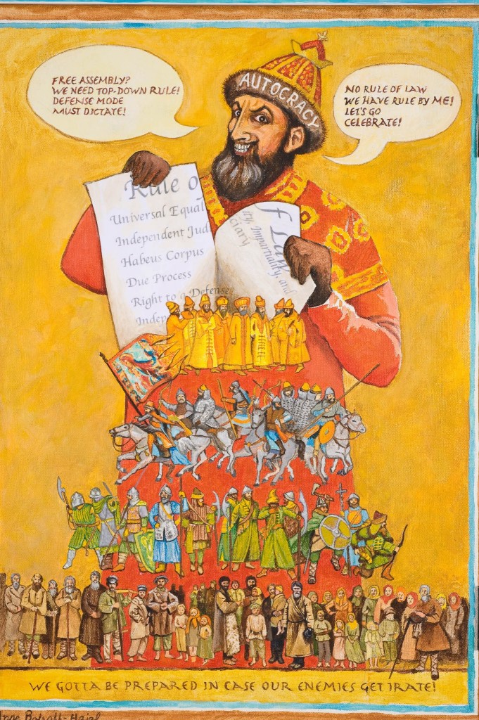
Detail of “Home Security at Any Crazy Price,” by Anne Bobroff-Hajal

In the detail (left) of that triptych, “Home Security at Any Crazy Price,” notice the row of peasants I painted along the bottom. As my “models” for these serfs, I had collected a lot of old, low resolution black and white photos of Russian peasants.  I was in love with their sheepskin coats and bast sandals – but most of all with their profoundly expressive faces.  I’d been looking forward to painting them.

But as it turned out, I was under time constraints preparing for an exhibit.  And I realized that the tiny size of the peasants (the tallest was under 3 inches high) in this triptych was going to make it impossible to paint them in any detail.

The less-complicated peasants actually work better in “Home Security” than a more detailed version would have.  The triptych was selected by curator Nan Rosenthal for her “Contemporary Confrontations” exhibit at the Katonah Art Museum and singled out in the NY Times review of the show.
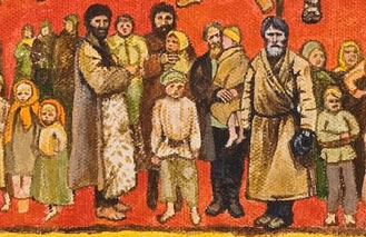
Detail of line of peasants from “Home Security at Any Crazy Price,” by Anne Bobroff-Hajal. The actual size of the tallest peasant painted is under 3 inches.

This made me wonder whether I should let go of my tendency to paint so precisely.  A freer interpretation is sometimes better.

But then I kept thinking of those faces gazing out of the past.

Haunted by faces from the past

So once the exhibit was over, I decided to paint the same row of peasants again, this time larger so I’d be able to convey their expressions and the textures of their clothing more fully.  I spent the next two months painting them (you can see and scroll over the entire row of peasants in the finished painting here.)

Three images demonstrate the difference size made.  First is the detail above from the the row of peasants as they appear in “Home Security.”

Next is a detail of the same peasants as I painted them roughly twice as large.
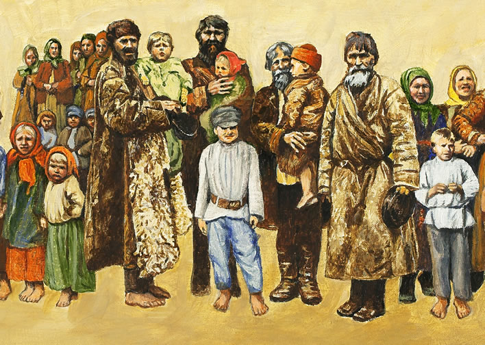
Detail of “Still With You,” by Anne Bobroff-Hajal. Actual painted size of tallest peasant is 6 inches.
Reduction of detailed peasants to size of those in “Home Security at Any Crazy Price” (small image with red background, above)


If I had then chosen to photograph and digitally reduce the larger painting to “Home Security” size, it would have looked like this (right).   As you can see, this way of working generates a lot more detail in small images.  It began to make me feel the possibilities of painting images larger and then reducing them digitally to fit into the final triptych.

Whether “looser” or more precise is better stylistically, I have to accept that as an artist, I’ll always tend to be attracted to finding ways to express more detail.

The influence of animation techniques on my process

Animation is created from hundreds or thousands of carefully-designed drawings passing in front of your eyes so quickly that they give the illusion of movement.  Whether at 24 frames per second or 12, animation requires huge numbers of drawings.

In the days before computer animation (and probably still today to some extent), animation artists cut down on their nearly-impossible drawing work load by using bits and pieces of previous drawings.  If Minnie Mouse’s hands moved from one moment to the next but the rest of her body didn’t, her body drawing could be reused and only the new hand position drawn.  In the next few frames, if her leg moved but not her hands, the old hand drawings would be merged with the new foot drawings.

In addition, backgrounds were reused through many frames, with characters drawn moving in the foreground.

My involvement with and love for animation as an art form brought this influence to bear on “Dress It Up,” as you’ll see below.

Catherine the Great and Stalin speechifying to the Russian people

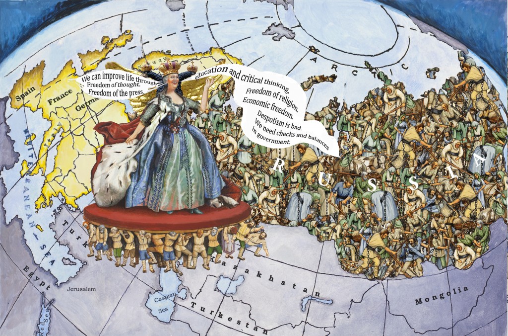
The left panel of “Dress It Up” portrays Catherine and then Stalin each sucking up lofty ideas from Europe and spouting them out over the Russian people in billows.  For Catherine, the European ideas were from the French Enlightenment; for Stalin they were Marxism (as the lyrics in the image describe).

The two images below are the final realization of what I saw in my imagination as I began working on visualizing this historical repetition.  (For a close-up of all those peasants, scroll down to the last image of this post.)

How did I realize my vision?
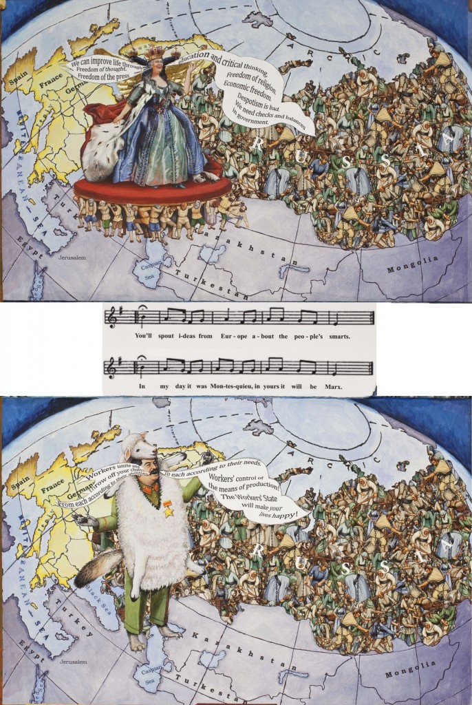
Detail of left panel of “Dress It Up in Resplendent Clothes,” by Anne Bobroff-Hajal.  Actual panel image is 18″ wide.
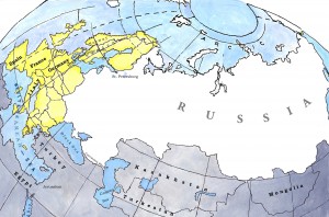
Map I created for left panel of “Dress It Up in Resplendent Clothes.”  Actual width: 18″

I began by painting a roughly globe-like map  focusing directly on Russia, with Europe visible around the curve of the earth.  Finding a map like this turned out to be impossible: most maps aren’t centered on Russia.  None have a peripheral Europe around the bend in the background.

So as my model, I ended up using my actual world globe placed in the position I wanted.

After painting it, I had it photographed so I’d have a digital image.

How could I portray a country full of peasants?

I pictured Catherine and Stalin speaking to untold numbers of peasants in Russia.  How could I convey the effect of so many peasants?

First I imported my digitalized painted map into my computer.  Then I began to experiment with various ways of using multiple copies of my paintings of peasants to fill the white “RUSSIA” space.  But I just could not get what I wanted.  I kept periodically coming back to this problem for almost an entire year, without success.

Finally, as I was playing with manipulating multiple, layered copies of another painting I had done of peasants (see below), I made one of those lucky mistakes – and suddenly had what I’d been struggling to find for so long.
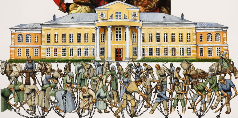
Detail of “Serfdom,” upper left (round) panel of “Dress It Up in Resplendent Clothes,” by Anne Bobroff-Hajal. This was my painting which I manipulated digitally to fill “Russia” on the map for the lower left panel.
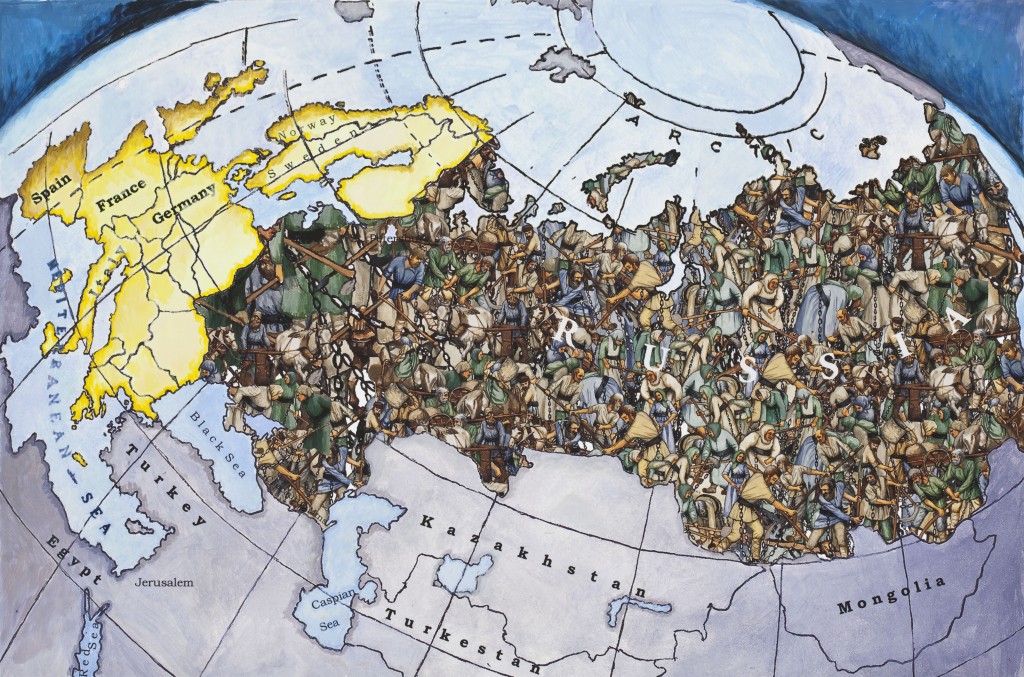
 

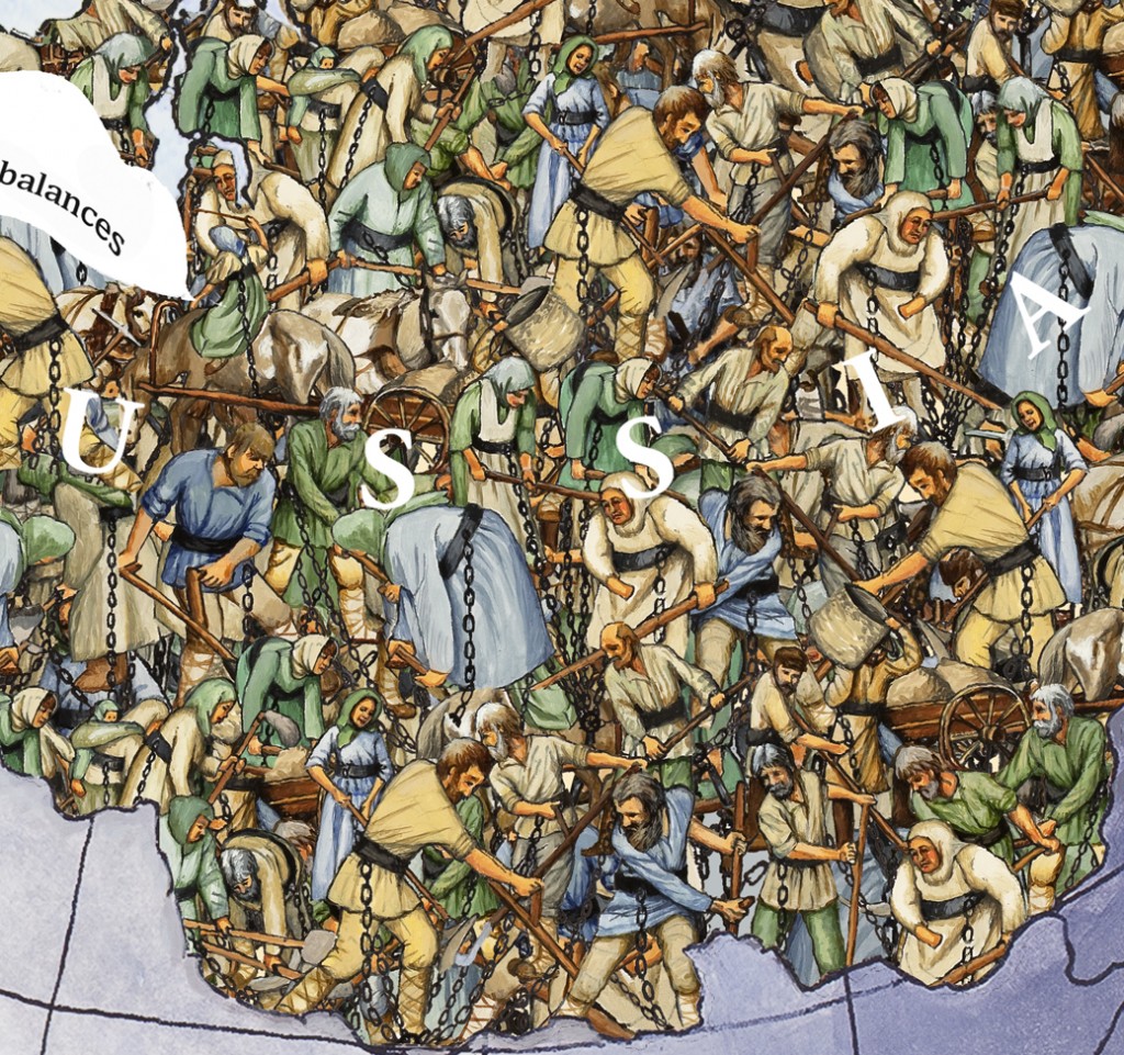
Map with digital images of my painted peasants composited in.

For a close-up look of the peasants in the map, scroll down to the last image of this post.

Why work digitally?  Why not paint everything the old-fashioned way?

Why didn’t I just paint those peasants, you might ask?  Why did I create this look digitally?

There are two reasons.  One is that painting these serfs the first time – finding models for the scythers and other field workers, drawing and arranging them to fit into the composition, working out all those chains (each serf has a chain attached to a specific point at the bottom of the image), and then painting the whole thing – took a couple of months.  Painting them all over again would have been prohibitive time-wise.  If I’d spent time doing that, I couldn’t have created other parts of “Dress It Up.”

The second reason I worked with my painted serfs digitally is that it enabled me to play around limitlessly with layering of copies of my painting, fades, and color changes.  This play is what eventually led me to the multi-layered look in the final triptych.

(Parenthetically, I do almost all the huge amount of planning for my triptychs in the computer.  Integrating all the bits and pieces of my artwork into a coherent whole would probably be impossible without this.)

Next, Catherine and Stalin

Now that I had my map complete, I needed to create Catherine and Stalin as orators speaking words from Europe to the Russian people.

My process here was similar to classic animation procedure: I used a single background twice, with two different characters in the foreground.  Again, the reason was the same as in animation: repainting this very complex background twice would have been prohibitive time-wise.

I had already designed my Catherine the Great character.  Now I needed to create a Catherine who looked the same but airily orating.  And she needed to face the opposite direction, toward Russia on my map and away from Europe.  Both her head and her arms needed to be different.

I created my orating Catherine the same way an animator might.  I began with my painted character.  I had her photographed so I could manipulate her digitally in my computer.  In Photoshop, I flipped her horizontally to make her face toward Russia and away from Europe.  I had this version printed.  Then I painted a new head and new arms on the print.
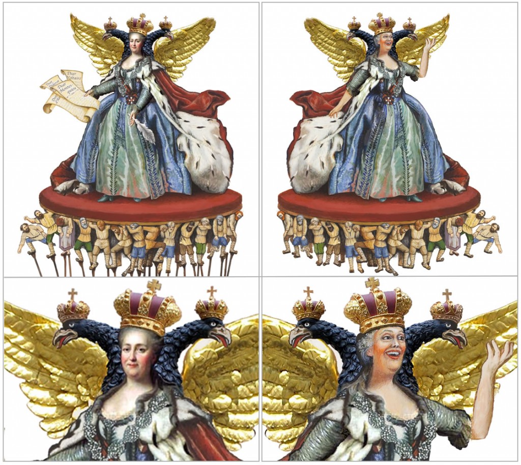
Upper left: my character design of Catherine the Great (head and wings are digital photos; I painted most of clothing and the serfs). Lower left: close up of character design face, taken from an actual portrait of Catherine the Great. Upper right: my 2nd version of Catherine, orating. Lower right: close up of face I painted, along with new arm.
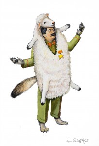
Stalin as an orating wolf in sheep’s clothing, by Anne Bobroff-Hajal

I created my orating Stalin as a wolf in sheep’s clothing.  This design went through a number of iterations along the way as I debated how wolf-like Stalin’s body and posture should be, how he should be clothed, and whether his face would be human or wolf.

A larger image of this design can be seen in this post.

Last, the speech bubbles

The last element needed for my “spout ideas from Europe” panel was speech bubbles.  In fact, the entire composition of map and orators was planned at every step to accommodate speech bubbles that would represent Catherine and Stalin sucking in ideas from Europe and spouting them out again over the Russian populace.  (Catherine’s bubble sucked in from France; Stalin’s from Marx’s Germany.)

Below is one of my many, many planning images.  In this one, I composited my pencil sketch of Stalin into my map and began to play with how I would shape and size the speech bubbles.  I did this to check whether all of Stalin’s parts would fit properly into the map without blocking any crucial bits of it.  I also needed to be sure that legibly phrase-filled bubbles could fit from Europe to Stalin’s mouth.
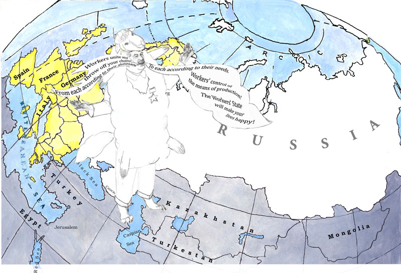
Planning image for Stalin’s speech bubbles, by Anne Bobroff-Hajal


I approached the other panels of “Dress It Up” in the same way.

Completing the final triptych

Once all the images for “Dress It Up” were completed by this process, I reduced their sizes to fit into the 7-foot width of the triptych.  I composited them and had them printed on canvas.  I then spent roughly six weeks doing additional painting on top of the canvas.  For example, I painted the large portrait of Catherine’s face in the center round top panel, replicating her historic portrait.  I painted Stalin as a baby directly on this canvas – that character doesn’t exist anywhere except on the final triptych.
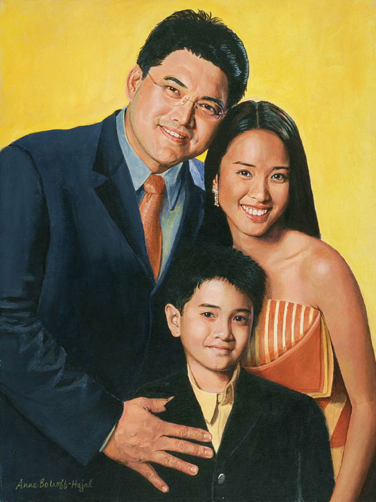
Catherine the Great: a Satirical Visualization of Russian History and Society

Tuesday, June 21st, 2011

My PLAYGROUND OF THE AUTOCRATS triptych’s bag of tricks….

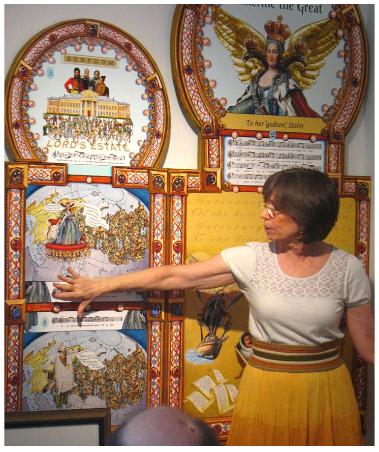
Anne Bobroff-Hajal gallery talk on “Dress It Up in Resplendent Clothes,” June 2011.

I don’t usually focus on my own artwork in this blog.  But for the moment, I’m throwing modesty to the monsoons to celebrate completing my latest satirical triptych about Russian culture and history.

My series of icon-like Russia triptychs is collectively called PLAYGROUND OF THE AUTOCRATS.  In them, Peter and Catherine the Greats, Ivan the Terrible and Stalin host viewers on romps through the wild and wooly forces that have shaped Russian history over the centuries since the Mongol invasions to the present day.  It’s a saga of Tsarism and Soviet Communism (more or less the same dictatorship by different names): the past as godparent to the present.

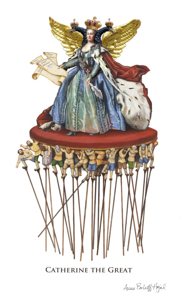
Below is the character I invented for Catherine the Great.  She’s the star of my newest, 7-foot wide visual/historical spectacle titled Dress It Up in Resplendent Clothes.


Dress It Up in Resplendent Clothes took me well over a year to complete (more on my process of creating it is here).  It’s currently being exhibited at the Blue Door Gallery in the Arts District of Yonkers, NY, just north of NYC.  (If you’re in NY and want to check out the exhibit, you can have a bite to eat nearby afterward – walk over to Peter Kelly’s X20 on the Hudson River pier, or to Zuppa the next block over from the gallery.)

(Continue reading below the image for more about Dress It Up.)

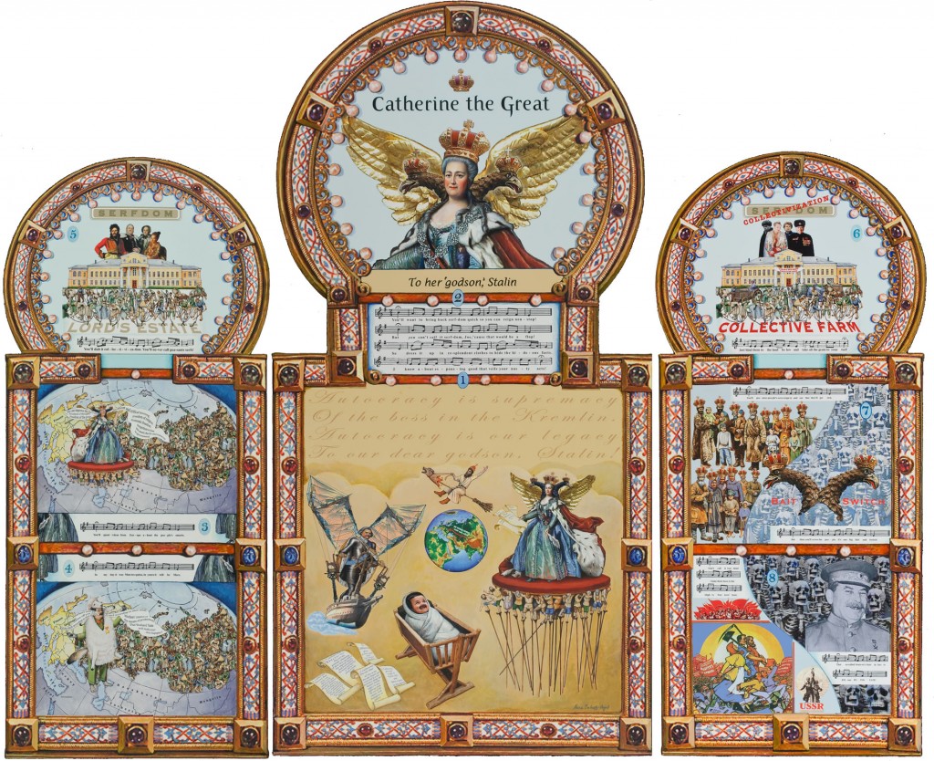
“Dress It Up in Resplendent Clothes”          .         7′ x 6′         .         Acrylic and digital images on canvas and board          .         2011

What do I hope you’ll find in these insanely-elaborate artworks?

My first goal with my triptych’s bag of tricks is to amuse and amaze you.

“Stalin in Sheep’s Clothing” . 12″ x 15″ . Acrylic on paper . 2010 . (Appears in lower left panel of “Dress It Up in Resplendent Clothes”)

But if you decide to keep gazing around the pageant I portray, I also want to horrify you, and make you cry, and show you some of the vast historical forces that sweep up hapless human beings in their powerful gales.

So #1, bring you a smile.  After all, Russia has fantastic history, a lush and glorious culture, enchanting and powerful characters.

If you choose to go deeper, I hope to enrich your experience and understanding of the extremes of the human condition.  Tragedy.  Joy.  War.  Deception.  Terror.

You’ll find War and Tragedy in my first triptych, The Most Exposed Terrain on Earth. The second triptych, Home Security at Any Crazy Price, features Terror and Manipulation.

In Dress It Up In Resplendent Clothes, Catherine brings Disguise and Deception.

All in the spirit of fun, mind you!

Catherine the Great, Our Heroine

Many Americans have several associations with Catherine the Great.  Tales of her sexual adventures.  Her fabulous art collections.  Her reputation as a beacon of the French enlightenment in “backward Russia.”

Anne Bobroff-Hajal gallery talk about “Dress It Up in Resplendent Clothes,” June, 2011.

She’s famous for having corresponded with the leading European thinkers of her time: Voltaire, Montesquieu, D’Alembert, Diderot (you’ll notice above that I’ve painted her holding letters she’s written to them with that feather pen in her other hand).

Less often noted are some very unenlightened policies Catherine enacted.  Every time she dumped a lover, she’d give him a new estate or two along with thousands of serfs to boost his wounded self-esteem.  She extended serfdom in general.  And she instituted the Jewish Pale of Settlement, which confined Russian Jews to living only in specified territories along the western border of her Empire.

How do I paint Russian history?

My triptychs use a technique common to icons, comic books, and animation story boards: they’re made up of a series of pictures that tell a story.  Below is one of the images I painted of Catherine the Great.  It forms the upper half of the left panel of the triptych.
Left panel detail of “Dress It Up in Resplendent Clothes,” by Anne Bobroff-Hajal:      Catherine speaks words of the French Enlightenment while the Russian peasants live in serfdom.   18″ x 12″ .  2011  

Below is a detail of Catherine’s captive audience, my depiction of her Russian serfs.

Detail of Russian serfs from “Dress It Up in Resplendent Clothes,” by Anne Bobroff-Hajal

There are many more scenes that make up the story I tell in Dress It Up in Resplendent Clothes, many more chapters to my tale.   Stalin is involved, as the inheritor of the tsarist system and the history of serfdom.  Oh, and the story is told in lyrics which I wrote to the well-known, beloved Russian folk tune KALINKA.  The music and lyrics are all in the tryptich, too.  You can see closeups of each panel here.

One Artist, Two Worlds

How did I get myself into the years of research, planning, writing of lyrics, and painting it takes to create each PLAYGROUND triptych?

I am an artist.  But for about a decade of my life, I was under the impression that I was an academic historian, so I went to grad school to earn a Ph. D. in Russian history.  The thrilling part was living for a year in the USSR, that great hall of crazy mirrors, doing dissertation research.  My dissertation was later published as a scholarly book, Working Women in Russia Under the Hunger Tsars.

But ultimately I became aware that I was seeing history in pictures that were more compelling to me than were academic debates.  I set off on a long and twisted journey to find a path combining my two worlds, art and history.

The result, finally, has been PLAYGROUND OF THE AUTOCRATS.

Closeups of each “Dress It Up” panel in sequence are here; more on my process of creating it is here.

Hand Drawing Tutorial #14: Creating a Custom Grid as You Draw

Sunday, June 12th, 2011

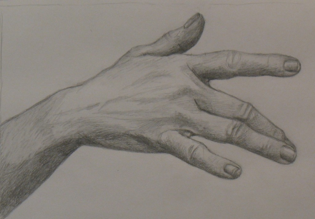
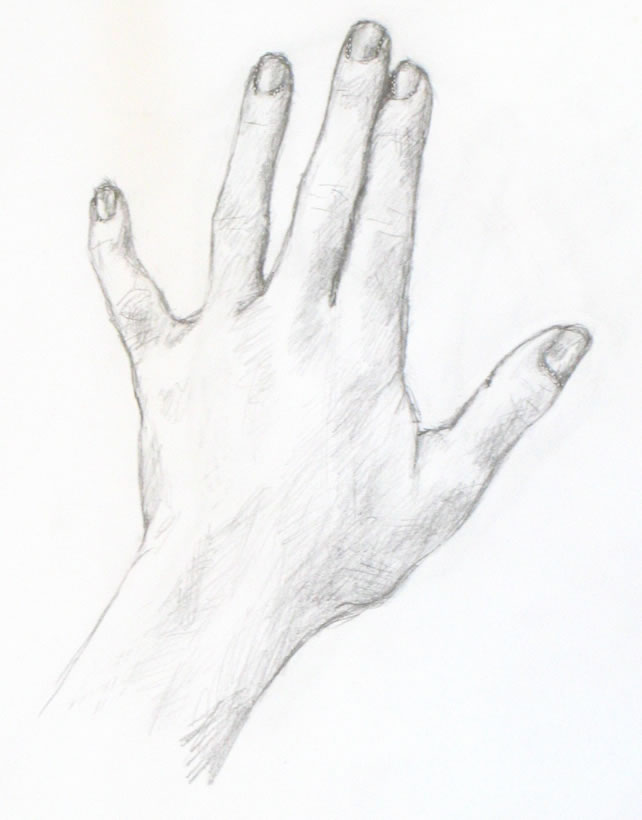
Hand Tutorial 14 Final Drawing


Artists often use grids to help them draw.  A common example is when an artist is re-drawing a small sketch they’ve completed onto a larger canvas or onto a wall for a mural.

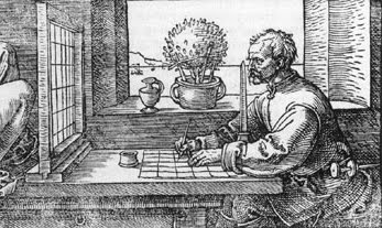
Albrecht Durer's grid. A physical grid made of wood and wires is placed between the artist and the subject he's drawing. He's sketched a corresponding grid on his paper. The vertical instrument in front of his nose is a guide to keep his head in the same position each time he looks through the wire grid, so he always sees the identical view through each grid square.

Grids are so helpful that historically, people have rigged up ways of applying physical grids to the real world when drawing from life.  See the picture to the right for Albrecht Durer’s set-up.  Betty Edwards says dozens of versions of such devices have been recorded in the US Patent Office (New Drawing on the Right Side of the Brain, p. 100).

Why are grids so helpful in drawing?

As I’ve said in previous tutorials: it’s always easier to draw a small, simple shape than to draw a large complex one.  Artists use grids to chop up complex images into small bits that are easier to draw.

In earlier tutorials, I’ve used the concepts of constructing a jigsaw puzzle and seeing with the “right brain” to help you “chop up” your drawing into little easily-drawn pieces,

I haven’t yet talked much about the fact that, while constructing the “jigsaw puzzle,” in my mind’s eye, I’m applying an imaginary grid to help me draw the pieces in their proper places, sizes, and shapes.  More accurately, I’m imagining bits of a grid only where and when I need them.

What is a “custom grid?”

What do I mean by drawing “a grid where and when I need” it?   I mean that each time I’m about to draw a new line in my sketch, I run my eye over other lines I’ve drawn, to see which might end or begin at the same level as the bit I’m about to draw, and so serve as a compass to guide me.  I look to see whether the hand-part I’m about to draw is, for example, at the same level as the middle of the joint on the finger I’ve just drawn.  Or which previous hand-part is directly above or beneath the bit I’m sketching next.

In my drawing for this tutorial, I’ve actually sketched many of the lines I usually just envision in my mind.  You’ll see that this technique helps me build up an imaginary web of lines and reference points that enable me to pinpoint where each new line of the hand should be drawn.  I don’t put a wire grid between me and my hand, nor do I pencil an entire grid on my paper.  But the effect is close to the same.  I’m imagining the pieces of a grid that I need at any given moment.

The video at the end of this post will demonstrate how I do this.

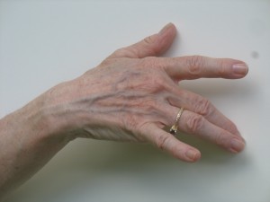
Tutorial 14 Hand Pose

This is the first tutorial in which we’re drawing our hands from the standpoint of some one facing us, instead of from our own viewpoint.  In my last post, I showed how to take photos to use for these poses if you have to do it entirely on your own.  If you haven’t taken photos that will work for this tutorial – or don’t have some one willing to pose for you – please go back to see how to do this.  Try to replicate roughly the same pose as the one above for your own drawing.

First hand tutorial pose "A Simple Drawing of the Hand"

Since this is the first drawing from “the outside,” I’m using the simplest pose of the group of photos I took in Tutorial 13.  This pose mirrors the simple pose from our own vantage point which began this series of hand tutorials.

Natural subtleties in photos

Interestingly, we’re adding one small complexity in this pose compared to that very first one, in which our hand rested on a table (see right).  All the fingers in the first tutorial relaxed onto the surface of the table, so all were supported in the same plane.

In Pose 14, though, I held my hand in the air as I took a photo.  As a result, my pinky was poised at a different angle than the rest of my fingers.  So I was drawing it from a slightly foreshortened perspective.

This hand pose looks relaxed and natural in a way many of the ones I’ve drawn from life don’t.  This is because it’s not easy to hold a relaxed pose for a long time while you draw (in addition to which I have to keep reaching around the tripod to take photos of my drawing in action).  It’s really tough to hold your hand in the air in a natural position for very long, so it’s easier to draw the hand resting on a table.  But that really limits the number of poses available to you.

What I love about working from photos is you can freeze fleeting poses that in life couldn’t be held naturally for very long (this is why life drawing teaches you to draw incredibly quickly, sometimes in 10-second or 30-second poses).

Work materials and set up

Refer back to the relevant sections of this tutorial for your work materials and set up.  When drawing from photos, use the vertical set up.  Drawing with your paper vertical always gives you a better angle; the only reason we’ve used a table in the past is as a place to rest the hand when drawing from life.

Be sure you’re seeing see both your drawing and your model straight on!  If you’re seeing either from an angle, shift your setup until you’re seeing them properly.

Stand up while you’re drawing!

Whatever your setup is, it’s always best to stand up while you’re drawing so you can move back and forth to see your work from different distances as it progresses.

Standing up also helps you see both your model and your drawing straight on.  When you sit down, you’re almost always seeing your drawing at a slant.  This will distort your work.  You’ll end up being very upset if you’ve produced something that looks gorgeous from your sitting position, but is skewed when you look at it from any other angle (e. g., when you display it on your wall).

Hand Tutorial #14 video

As you watch the video below, notice the guidelines I’m constantly sketching in.  (I usually don’t actually draw most of these guidelines; I simply picture them in my mind.)

{"numImgs":"58","constrain":"height","cvalue":"450","shellcss":"width:609px;padding:4px;margin:14px auto 0;"}

All of the vertical and horizontal lines I make are like a standard grid.  But early on, before I have many lines done that I can use for reference, I often begin by looking for triangular shapes at the top of the hand.  (The beginning of any drawing is always the most difficult part, because you have no anchors created yet.)  So at first my “grid” contains more slanted lines than straight ones.

Late in the drawing, I erase the guidelines.  By this point, I usually have the hand completely sketched in, so I can now see its parts in small enough pieces to continue without needing guidelines.

At one point (by Frame 24), you’ll see that I realized I’d made a mistake in my judgment of grids and shapes.  This happens all the time!  Don’t let it upset you.  Just correct your error and keep moving forward.

My hand in Tutorial 14 pose.

I realized in Frame 24 that I’d made a mistake somewhere because that pinky was going to be very fat!  I didn’t know right away where my error was – on the pinky side of the hand or the forefinger or where.  As always, I believe in continuing to move forward sketching other areas, in order to help orient myself to figure out where my mistake happened.

By Frame 37, I’ve decided I’ve placed my middle finger too high (in negative-space terms, I haven’t made the negative space between pointer and middle finger a wide enough triangle).  I corrected that, making a big erasure in Frame 39, and moved on to finish the drawing.

How did I figure out where I made my error?  In Frame 35, I drew in the bottom line of the pinky.  This line intersected the hand in a place that would have shaped the hand incorrectly.  I was going to have to do major surgery on my drawing!  In Frame 36, I used the shadow along the bottom of my hand to judge the proper placement of all the hand parts, then moved ahead with the surgery in Frames 37-42.

Have fun drawing!