Archive for December, 2010

“The Roundabout:” a portrait of Beirut, Lebanon, by Vanessa Gemayel

Wednesday, December 29th, 2010

A young Lebanese artist describes how she created her painting, “The Roundabout.”

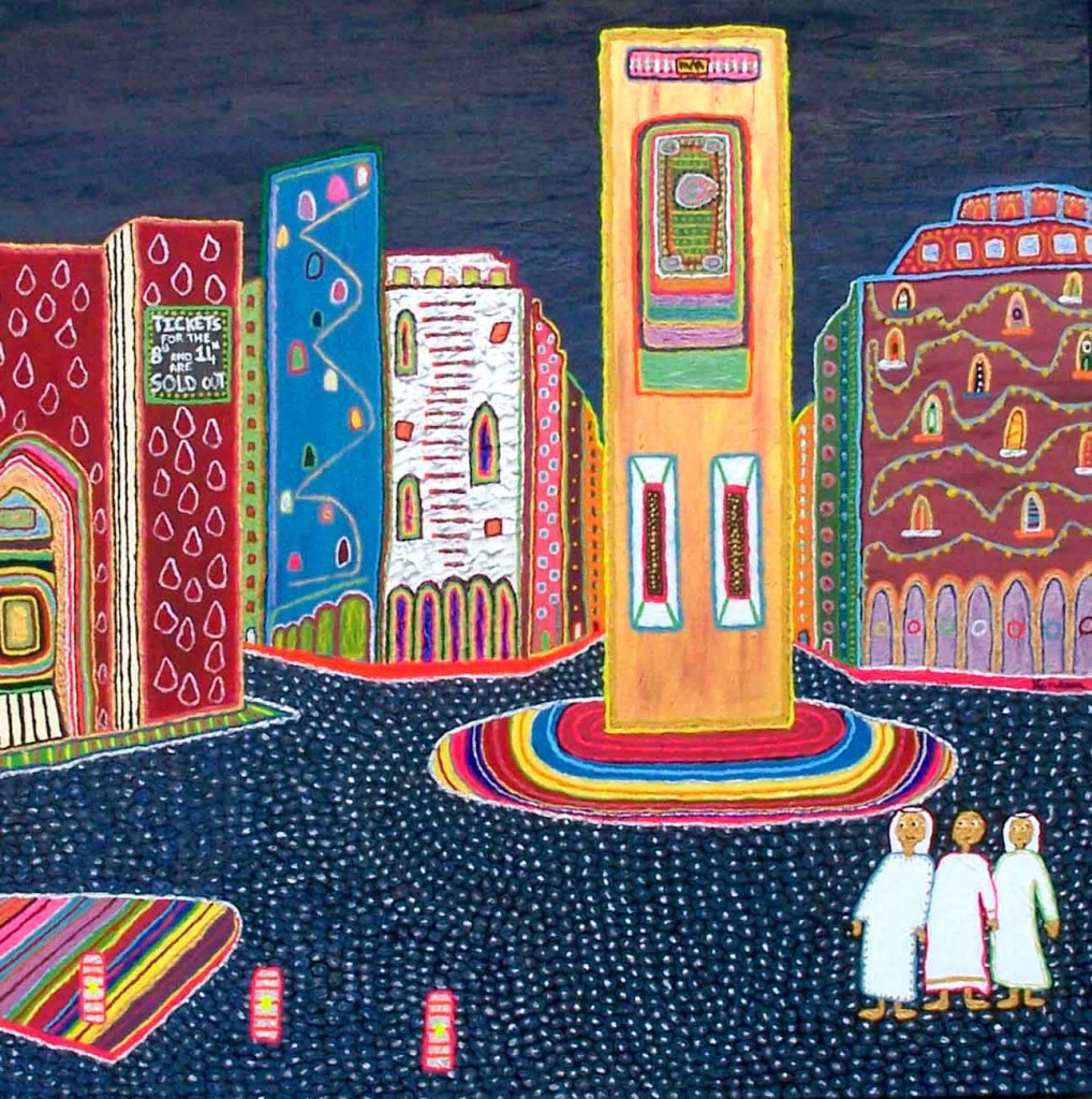
“Les Rois Mages,” by Vanessa Gemayel, depicts Beirut’s Central District.

Vanessa Gemayel: background

Vanessa Gemayel is a young Lebanese artist living in Beirut.  She combines a vibrant, gorgeous visual style with thoughtful political and social commentary about the middle eastern city where she’s spent much of her life.  (Vanessa was born in Paris and lived there before moving with her family to Liberia.  The family had to flee Liberia when war broke out; they then lived in the US for a number of years before returning to their homeland, Lebanon, after its civil war ended.)

One of Vanessa’s recurrent themes is the destruction of the beautiful traditional architecture that gave Beirut its unique atmosphere.  The old buildings are being replaced by generic modern buildings that could be anywhere in the world.

Another of her themes is the harmful impact on life in Lebanon of moneyed interests and social pressures for status and glamour.  She often uses words – written into her paintings or simply as their titles – to great satirical effect.

Vanessa earned a postgraduate diploma from Chelsea College of Art in London.  She has exhibited in Paris at the Centre Vendome pour les Arts Plastiques, and in Beirut.  Her “Les Rois Mages” (The Three Magi, above) was selected for the Sursock Museum’s Salon D’Automne exhibition in 2009.  Another of her paintings, “Rue à caractère traditionnel,” was shown in the 2010 International Art Exhibition: Lebanese Diaspora, at the Dome City Center in Beirut.

Vanessa writes so well about her work that I have little to do myself beyond formatting her text and photos of The Roundabout in process.  (A roundabout is what we in the US often call a traffic circle.)

You can see more of Vanessa’s paintings at the end of this post.

Vanessa’s description of how she created “The Roundabout”

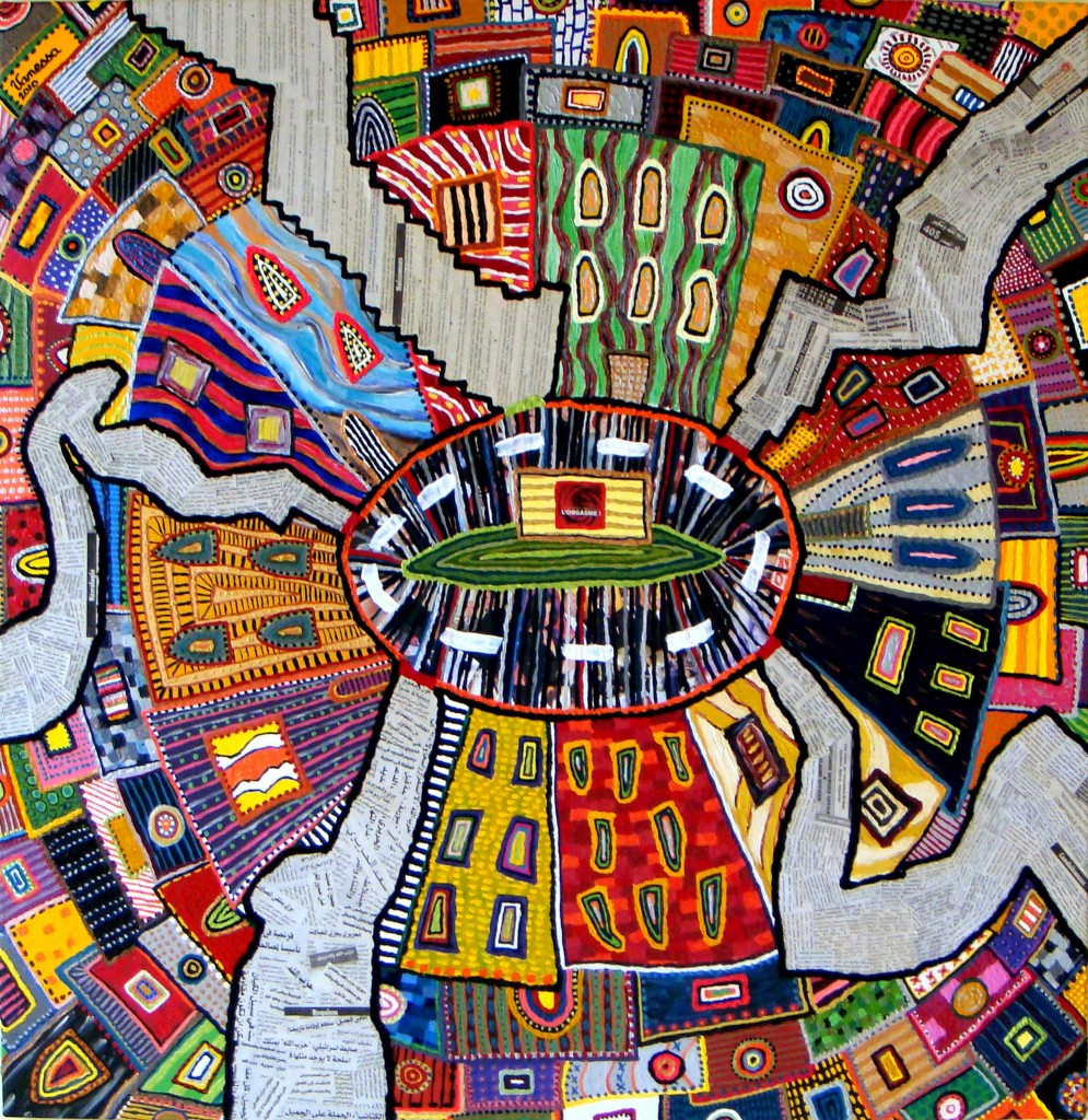
“I started this painting with the idea of depicting a roundabout. A friend remarked at the time that it illustrated very well the feeling of going around in circles that had been overwhelming me.
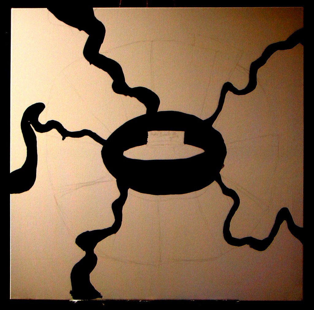
First stage of work on “The Roundabout,” by Vanessa Gemayel

“I drew the outlines of the roundabout and the roads (which I painted in black) then began work, in a circular way, on the buildings (using acrylic and oil). I left no spaces between them because I wanted to portray the city as I was seeing it at the time: crammed and devoid of life and nature.

“The painting was almost done except for the most important parts that I had left for last. I got the idea of using newspapers for the roads because I wanted to incorporate socio-political elements, as well as highlight certain aspects regarding urbanization and development.
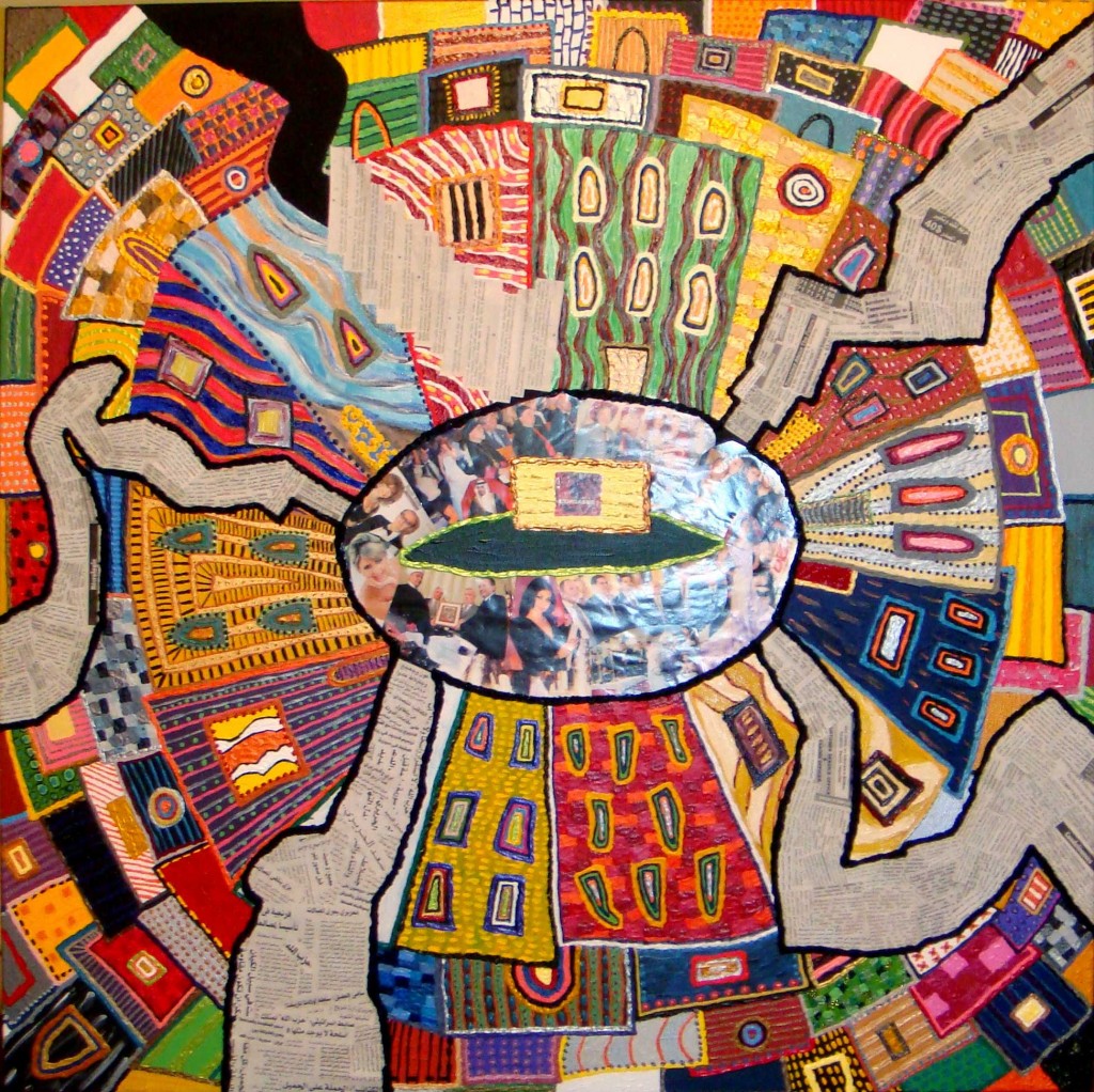
Second stage – creating “The Roundabout” by Vanessa Gemayel

“L’Orient Le Jour is a French newspaper that targets the intellectual French speaking community in Lebanon. Ironically, many people buy this newspaper just to read the section regarding classified ads, which mainly reports births, deaths and other socio-religious proceedings.

“I used the headlines of this section as themes for each of the roads, which I thought would be well suited to portray the importance of social obligations and social political correctness in this country.

Detail from “The Roundabout,” by Vanessa Gemayel

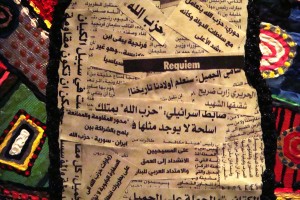
“Each road is made up of ads taken from different newspapers; all are mostly in French and English.  Only one road is made of political clippings entirely in Arabic, mainly highlighting names of the politicians who have been in power since the civil war (i.e. for the past 40 years!). This road is the one going straight downwards in the lower left-hand side. The headline from l’Orient I used is “Requiem” in reference to these politicians who keep the country from moving forward and to a language that is losing prevalence to French and English.
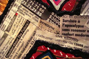
Detail from “The Roundabout,” by Vanessa Gemayel.

“The road in the lower right-hand corner, ‘Condolences’, is made up of ads relating to job employment; in view of all the people who are working with a minimum wage insufficient to cover living expenses, or who work (as I so often have) with the promise of a paycheck that never comes.

”Pensées Pieuses’ (Pious Thoughts) designates the road in the upper left-hand corner and is made up of miscellaneous ads such as the sale of nice telephone numbers for thousands of dollars, weather forecasts, civil wedding packages to Cyprus, the sale of high-end cars, designer wedding dresses etc.

“The road in the middle of the left-hand side, entitled ‘Nécrologie’ (Obituary) consists of ads concerning the rent and sale of apartments, buildings and properties. I used this title in reference to the wide scale constructions that are taking place in Beirut. The lack of ethicality, aesthetics, and concern for national patrimony has simply made this process of development synonymous with destruction, careless profit making, and loss of identity.

“Finally, the last road, going upwards, ‘Naissance’ (Birth) is meant to act as an element of hope. (For ethical reasons, I had to conceal the first and last names of the parents as well as dates, and only kept the first name of the child and place of birth).
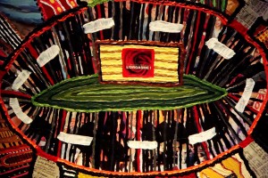
Detail from “The Roundabout,” by Vanessa Gemayel.

“The road surrounding the roundabout is made up of pictures of people taken from “people” magazines, which are very popular in hairdresser and cosmetology salons. The pictures include local celebrities, political and religious figures and normal people who have hired photographers from the magazine to publicize their birthday, dinner, lunch or whatever occasion fitting (or not), to raise public awareness of themselves, their surroundings and the people that are part of their circle. I then covered most of the pictures with lines and imprisoned them in the road.

‘Most green areas in Beirut are courtesy of some company or another. In this respect, nature is only a ploy to enhance the effect of the ad. For the center of the billboard, I used an ad I found on the cover of one of the magazines mentioned above. It’s a little square portraying the petals of a velvety red flower on which it is written ‘Vous connaitrez tout sur l’orgasme’ (You will find out all there is to know about orgasms).

”The initial title I wanted to use for this painting was ‘Le Bordel’, which, roughly translated, means ‘brothel’ but is commonly used in French to signify “mess.”  However I was told it could be a tad bit provocative and decided to stick to Roundabout.”

“The Roundabout,” by Vanessa Gemayel, completed.

More of Vanessa’s paintings

“View from My Room,” by Vanessa Gemayel

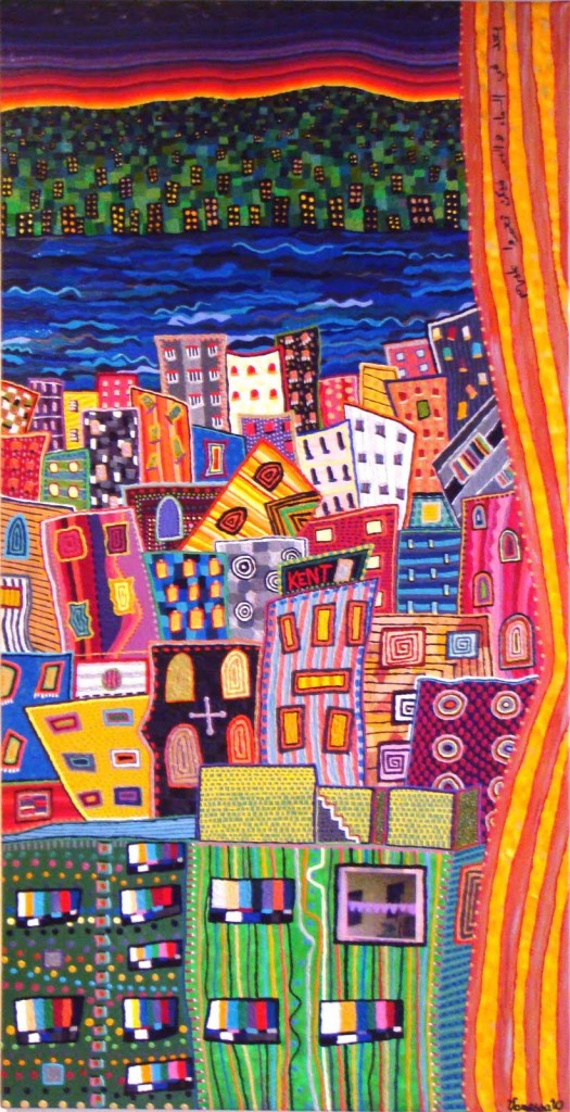
Vanessa’s paintings of Beirut are both highly personal and political.  Her “View from the Kitchen” and “View from My Room”  (left) portray what Vanessa sees outside her apartment windows.  I love the sense of personal engagement with the socio-political life of the city that, for example, her view from her bedroom window provides.

The foreground of this painting includes  a crammed jumble of  apartment buildings, only a few of which have traditional Lebanese arched windows  or tile roofs.  While the building shapes are Western, the feel of the city is still vibrant.  Beyond the peninsula on which Beirut is located, we see the Mediterranean.  And beyond that, plain, boxy, multi-storey apartment buildings march up the steep mountainsides, with no regard to either the spectacular landscape or middle-eastern architectural history.  In fact, this type of nondescript construction now covers the rugged, exquisitely beautiful Lebanese mountains all over the country.  The Arabic writing on Vanessa’s window curtain in the painting reads: “‘The sea and the sky are still left for you to build on.”

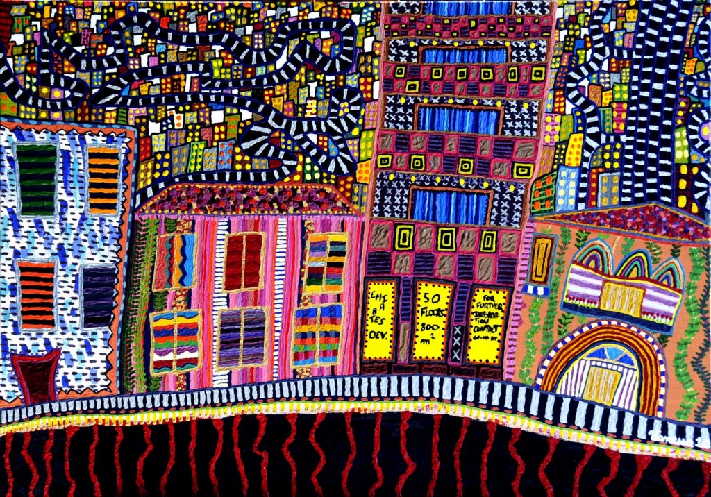
Because the Lebanese mountains rise so steeply out of the Mediterranean – to 10,000 feet only a few miles inland – almost all its roads are full of hairpin turns.  We can see these roads snaking crazily among multi-storey  buildings in the background of “Beirut?,” another of Vanessa’s paintings (below).

In “Beirut?” and in Vanessa’s art in general, she asks whether this is Beirut or some other random city anywhere in the world, since its architecture so closely resembles that which in the last half century has metastasized across the planet.

“Beirut?” by Vanessa Gemayel

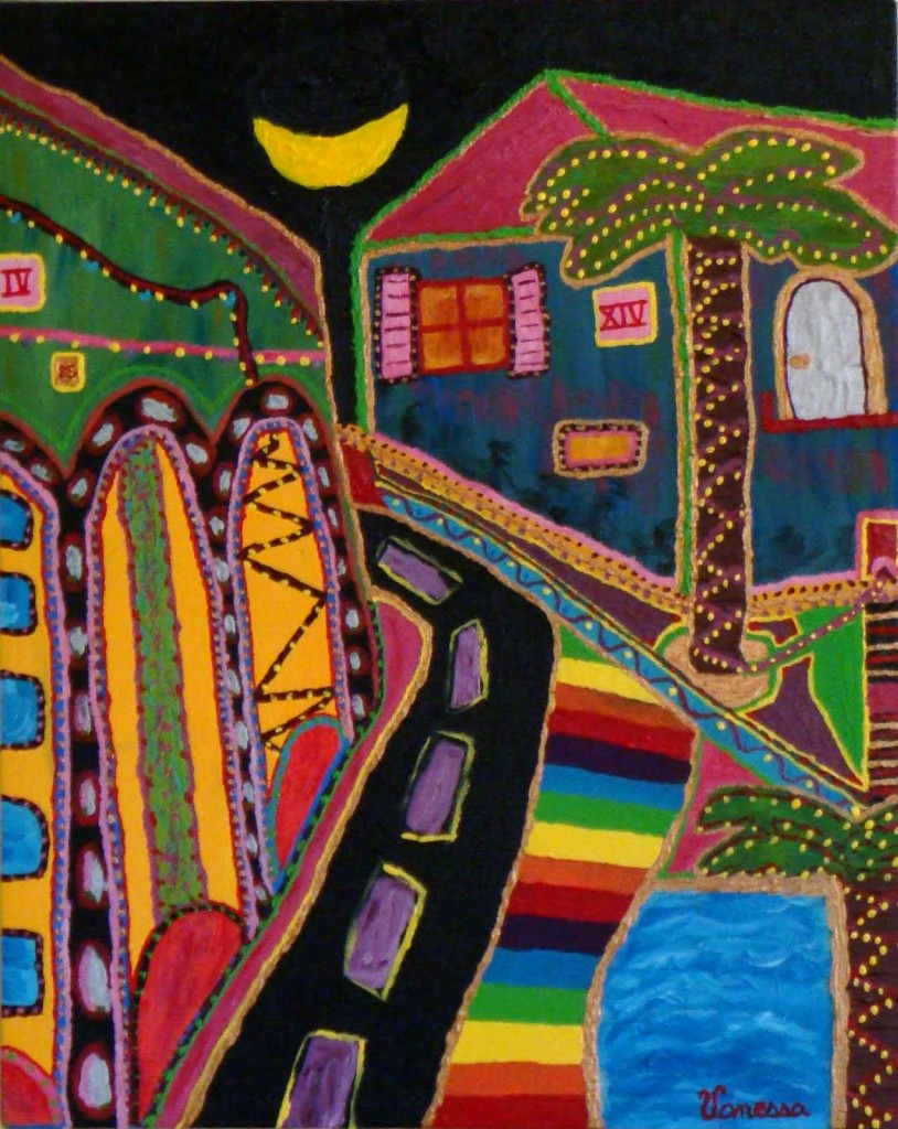
A last painting, “Jbeil” (below), shows another element of Vanessa’s work which I love: roads which take us on mysterious journeys.  Jbeil  is a small, ancient coastal city north of Beirut.  Here, under a crescent moon and palm trees, among low, traditional arch-windowed buildings, life feels relaxed and happy, with the promise of a bit of adventure if we follow the winding road up into the mountains when tomorrow dawns.

Another more recent version of Jbeil is here.
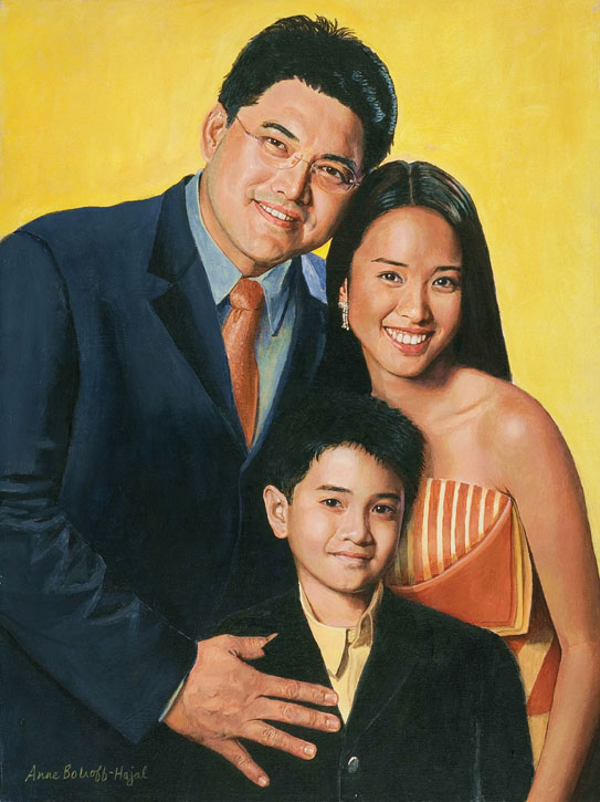
“Jbeil,” by Vanessa Gemayel

Hand Drawing Demo #6: Reviewing Left Brain/Right Brain

Thursday, December 9th, 2010

I’ve chosen hands as subject of these drawing lessons because they are so available to “pose” for you.  And you can position them in infinitely more interesting ways than your feet!

But my approach to drawing is the same whether your subject is hands, a landscape, flowers or a rocket ship.  I use a few techniques to enable my brain to see in “right brain” mode.  Once you are able to switch over to seeing this way, you’ll be able to draw anything.

Right brain / left brain in drawing

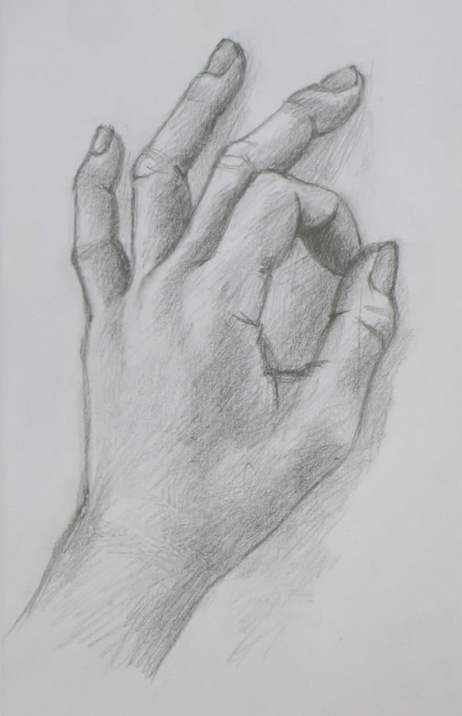
Hand demo #6 sketch

If you’re not familiar with the “right brain” in drawing, please look back at my earlier Why is Learning to Draw “So Hard?” which gives the basics.  And Me Against Da Vinci?  What’s the Right Way to Draw? describes the leap forward my own drawing took when I set aside all the artists’ anatomical information I had learned.  (The artists’ focus on anatomy is historically associated with Leonardo DaVinci.)

Instead, I learned to see in “right brain” mode.  That made all the difference to my drawing.  In right brain mode, the artist is able to see what they’re drawing as a series of angles and shapes that are much easier to draw than when their subject is seen “normally.”

So you can blissfully forget about all the complexities of drawing a hand.  Forget all the thoughts and associations you have with “handness.”  They will interfere with your being able to really see, and to sketch what you’re seeing.

Betty Edwards, who wrote the famous Drawing on the Right Side of the Brain, explained that

we often can’t draw because we’re blocked from seeing what’s right in front of us.  What blocks us is our preconceived notions about what a human hand or leg or eye should look like.  We struggle, trying to draw what we assume we’ll see – instead of seeing what’s actually there: how the specific hand in front of us looks….

My hand drawing tutorials are all about learning to forget you’re drawing a hand, while learning to see in a new way that makes drawing accurately much easier.

Setting up your work space and materials

Please refer back to the relevant sections of Demo #1 for materials you’ll need and how to set up your work space.

Placing your hand

I chose today’s pose partly as an easier one than last week’s.  I wanted a pose in which we can again take advantage of  negative spaces between the fingers.  At the same time, I pushed us a bit ahead by including one finger (the pointer) that’s bent over, producing more of a challenge.

Place your hand with the thumb and forefinger forming an A-OK sign.  Separate the rest of the fingers so space appears between each.  As always, you don’t need to replicate my hand position exactly.

Techniques for engaging your right brain (and disengaging your left) while drawing

We’ve used these techniques before, including in my posts about the angle-abstraction game.  But it’s important to go through them again, because shifting to seeing in right-brain mode is so tricky for many people that a lot of practice is needed.  (Here I explain why the shift is often so difficult.)

One of the most used techniques for right-brain sketching is to draw negative space – that is, to draw the space around your subject, rather than your subject itself.

Another technique I use a lot is to figure out where I need to sketch in a line by noticing its relationship with other parts of the subject.  Your new line may begin at the same level as another part of the subject, for example.  Or it may lie at a particular angle to it.

These techniques sound esoteric and mind-numbing when you read about them.  But “on the ground,” what you’re doing is drawing simple lines and shapes instead of complex ones.  You begin by focusing in on a single simple area, then move quickly to the next one so you don’t get bogged down.  I’ll provide illustrations below to help you catch on to these tools.  (Frame numbers refer to those of the time-lapse video at the end of this post.)

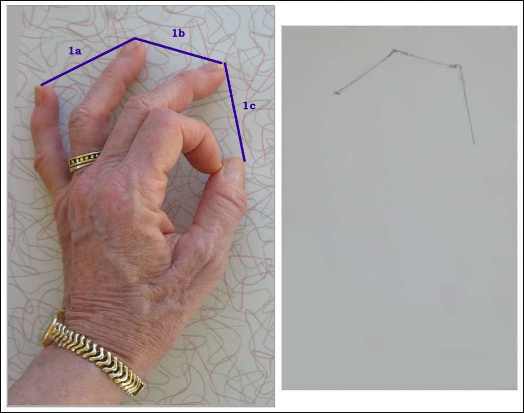
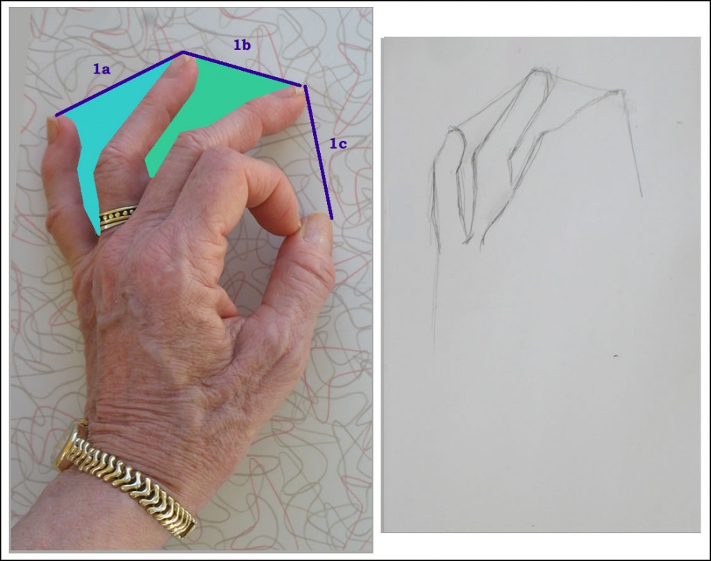
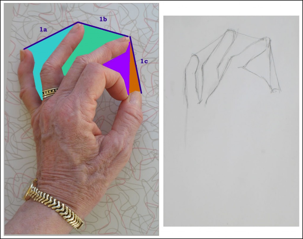
How I began this sketch - Frame 1. The image on the left is a photo of my hand in the approximate position I drew it. I later superimposed on this photo the purple lines which show how I envisioned these lines as I drew them (right).

Frame 1: I began by drawing guidelines connecting the tips of three fingers and my thumb.  Ignoring everything else about my hand, I focused only on judging the simple angles and lengths of imaginary lines between fingertips.

This may sound a bit mathematical and “left brained.”  But when you’re drawing smoothly in right-brain mode, all these judgments take place at lightening speed, without conscious calculation.

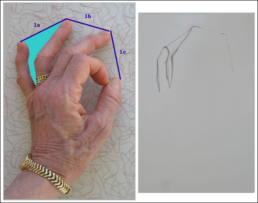
Frame 2: The negative space between the pinky and ring fingers is delineated in turquoise over the photo. The photo of my hand was taken at a different time than the sketch was done, so the negative shapes were slightly different. But you can hopefully get a sense of the technique in spite of this.

Frame 2: Next I drew the negative space between the pinky and middle finger (please note that the photo of my hand was taken at a different time than the sketch was done, so the shapes are slightly different.  You can hopefully get a sense of the technique in spite of the slight discrepancies).

I didn’t worry about how complicated the hand is.  I relaxed and focused only on drawing this fairly simple flat geometric space between two fingers.


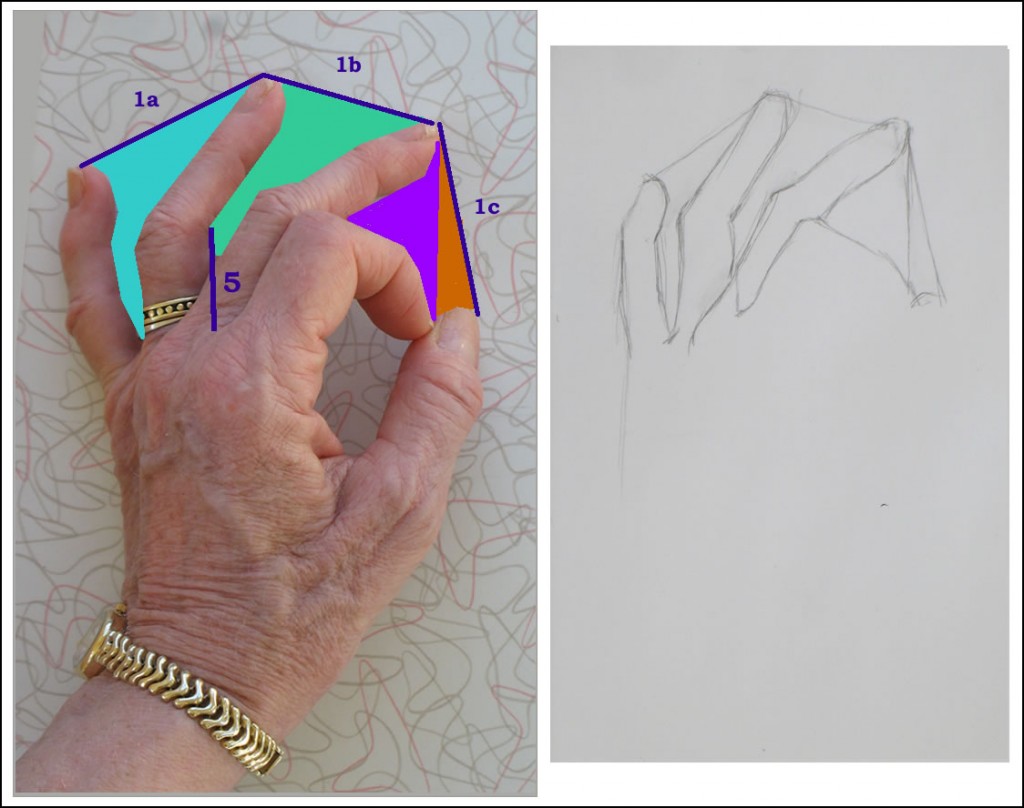
Frame 3: another negative space drawn, shown in green on the photo.


Frame 3: One tool I use to judge how to draw negative shapes between fingers is to notice where the bends of joints fall in relation to the finger on the other side of the space.  For example, the sharp bend in the middle finger occurs (horizontally) across from the middle of the middle knuckle of the ring finger.  This sounds crazy when you write it out, but noticing these relationships make drawing the shapes very simple.

While I was drawing this negative space, I noticed that the edge of the middle finger continued almost all the way across the bottom of the ring finger.  So I sketched that in, too.

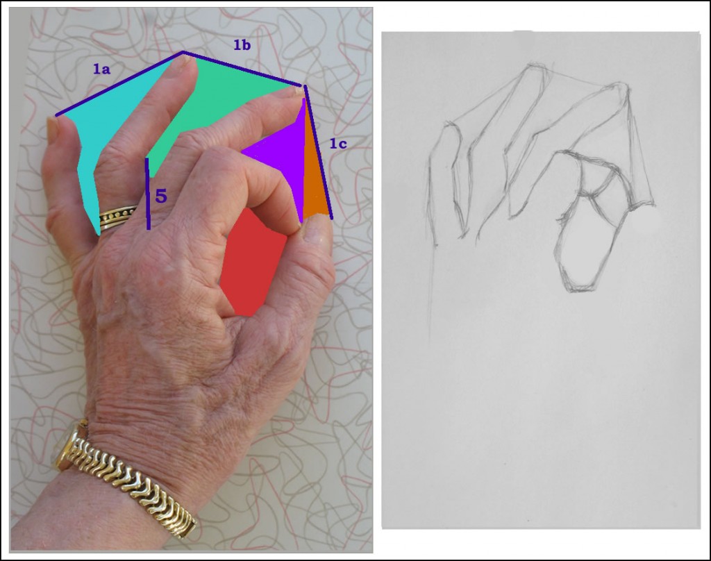
Frame 4: Drawing the negative space bounded by middle finger, bent-over pointer, and thumb top.

Frame 4: Bypass the complexities of the bent-over pointer between the middle finger and thumb top.  Instead, focus only on the negative shape their edges create.  One easy way to envision this negative space is as two triangles, one whose bottom point is where the forefinger meets the thumb, and the other whose bottom side crosses the thumbtop.

The shapes of the negative spaces aren’t actually perfect triangles, but it will help you draw the more complex shapes by noticing the simple shapes they resemble.

Frame #5: Line revealing placement for base of forefinger

Frame 5: To draw the bottom of the forefinger, I noticed that its base ended almost directly in line with the edge of the ring finger (you have to look closely at the photo to see this, but it was very evident in my actual hand as I was sketching).  I sketched in a vertical guideline to help me draw this (indicated in dark blue on the photo).

Frames 6-7: The negative space formed by thumb and forefinger.

Frame 6-7: Here I made the common error of drawing what should be the foreshortened middle joint of the forefinger too long.  If you watch the time-lapse video below, you’ll see me correcting this in later frames of the sketch.  In fact I never really got it right – but that’s fine!  The goal here is to keep practicing, not to produce a perfect drawing every time.

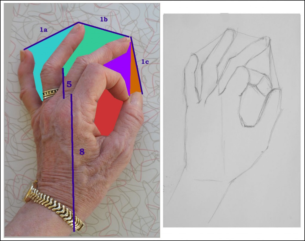
Frame 8: Vertical guideline to help draw the wrist.

Frame 8: Figuring out where to place the wrist, I noticed that it’s directly below the edge of the forefinger’s base.  I drew a vertical guideline here to help me draw the line of the outside of the thumb down to the wrist.

Frames 9-10: Making a correction using another vertical guideline.

Frames 9-10: By now I’m realizing my silly mistake with that foreshortened forefinger joint (see above, Frame 6-7).  Alas, this is the very joint this lesson is trying to teach you to draw properly!  Part of my error was due to my shifting perspective as I kept moving to snap photos of my sketches.  But that’s no excuse!  And because it’s a common error, it’s good for you to see the process of trying to correct it.  You’ll be able to see this more clearly in the time lapse video below.

*           *          *

As with all these lessons, this isn’t a hard and fast drawing sequence.  It’s very possible that if I drew this hand pose again, I’d do it in different steps, or envision angles and spaces differently.  If you notice other ways of seeing them, use whatever makes sense to you.

{"numImgs":"45","constrain":"height","cvalue":"450","shellcss":"width:290px;padding:4px;margin:14px auto 0;"}

Hand Drawing Demo #5: Partially Hidden Fingers

Thursday, December 2nd, 2010

This is the fifth in a series of online drawing lessons using your hand as your model. The first, most basic lesson is here.
This tutorial’s hand position is very similar to the one in  Hand demo #3 – but with the entire hand rotated onto its outside edge.  This demonstrates how a slight change in position can present an entirely new set of challenges in drawing the hand.
The challenge of drawing partially hidden fingers

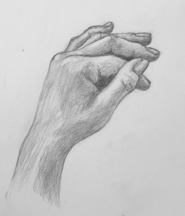
My sketch of #5 hand position.

As I began drawing today, I suddenly realized I’d probably chosen a hand position that’s a bit ahead of where we’ve gotten at this point.  Every finger in this pose except the the thumb is partially hidden by other fingers or knuckles.  And you’re seeing them all at odd angles as they emerge from the knuckles.

I promise to return to a simpler pose next week.  But meanwhile, give this position a try.  The approach to drawing it is the same as to drawing anything else.  You may discover that your skills are developed enough at this point to capture your hand in this pose.  And if not, head back to whatever earlier lesson you enjoyed the most.  Practice is the key to learning to draw.

Later in this series of Hand drawing tutorials, we’ll return to more drawing of hidden fingers as well as foreshortened ones.

Setting up your work space and materials

Please refer back to the relevant sections of Demo #1 for materials you’ll need and how to set up your work space

Positioning your hand

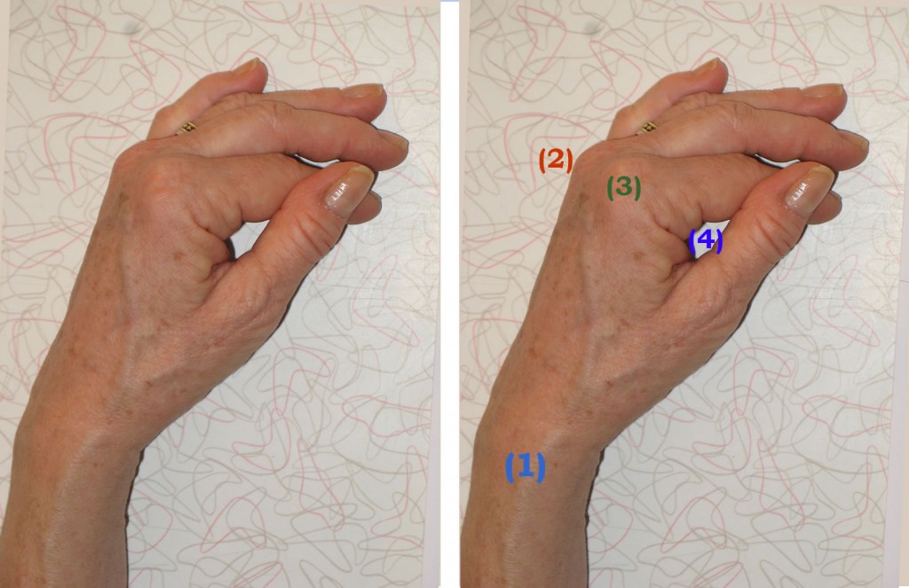
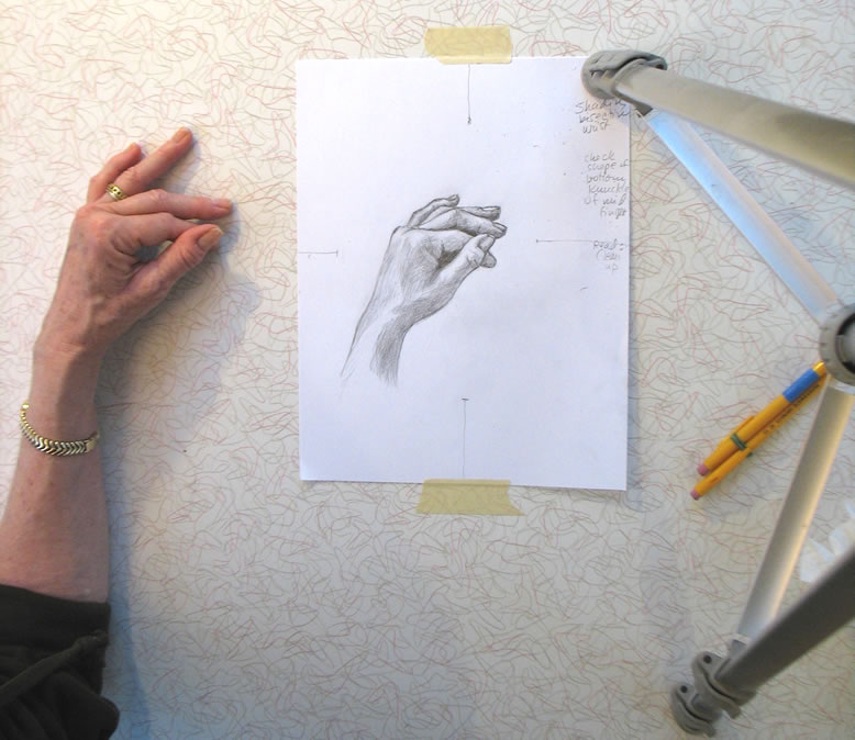
Rest your non-writing hand (your left hand if you’re right-handed and vice versa) on it’s outside edge. Your palm shouldn’t touch the table at all.  Your wrist (1) will be viewed from the side (see photo below).

The knuckles of your middle (2) and pointer (3) fingers will be the only knuckles visible, and they too will be seen from the side.

Place your thumb over the middle joint of your forefinger, creating a roughly teardrop-shape opening (4).

Approximate hand position for this week's drawing tutorial. This photo was taken with a flash, which dramatically changed the lighting from the way it was as I was drawing.

It’s OK if your hand position doesn’t look exactly like mine.  Your hand is probably a different size and shape.  And the important thing is to practice different hand placements, not this exact one.

This photo of my setup (including my camera tripod to the right) shows more accurately the lighting of my hand while I was sketching (though my ring finger had moved out of correct position as I reached up to snap the photo).

Time lapse video demo: drawing the hand from the side, with fingers partially hidden

Below is a time lapse video of my sketching of this hand position.  I’ve numbered each frame so you can easily match it to my written commentary (beneath the video) of what I was doing in each frame.

You may want to open a second copy of this post in another window so that you can place video and text side by side.  You can press the Pause/Restart button to move through the images at your own pace.

My apologies for the inconsistency of lighting from one frame to another.  I’m a painter, not a photographer, and I’m not experienced in compensating for shifting light on a stormy day!

{"numImgs":"34","constrain":"height","cvalue":"450","shellcss":"width:386px;padding:4px;margin:14px auto 0;"}

Frame #1: As I often do when beginning to sketch, I scanned my eye over my entire hand looking for the easiest thing to draw first.  I decided it would be the angle of the back of my hand as it curves into my wrist.  I tried to accurately draw the tilt of this line as compared with an imaginary perfectly-vertical line.  I didn’t draw a vertical guideline, but I pictured it in my head.

Frame #2: I drew the angles on the other side of the wrist and sketched a rough guideline for the top of the knuckles.  My goal here was to sketch the overall geometric shape of my hand.

Frame #3: To check the accuracy of the line I’d just made for my wrist, I sketched a guideline encompassing the negative space next to it.  I noticed that this line was a continuation of the general angle of the first joint-segment of my thumb, so I used it to draw part of my thumb as well.  (For more on the all-important subject of negative space, see for example Hand drawing demo #3 and my post Me Against DaVinci?)

I then noticed that the top of my thumb ended at the same level as the top of the knuckles on the far side of my hand, so I drew a horizontal guideline between the two.  Finding relationships like this is all important to getting proportions accurate as you move ahead.

Frame #4: I sketched in the little teardrop-shaped negative space between my thumb and forefinger [see (4) in the photo of my hand above].  As I drew it, I scanned my eye over the geometric shape of my entire hand to be sure I was getting it placed and sized properly.

Here’s a classic example of where right-brained seeing helps you: if you envision your hand as a pure, flat shape encompassing another shape, it will be much easier to draw than if you get into long discussions with yourself about what a hand should look like when it’s in this particular position.

Frame #5: I decided to shade in the negative space to help me continue seeing it as an aid.  I also drew in the rough curve of the top of the knuckles as it transitioned into the top of my forefinger.  You can see how I’m using the horizontal guideline I drew in Frame #3 as an aid to placing this line correctly.  I haven’t made a distinction yet between the two knuckles because for now, I’m getting general shapes laid down.  Later on I’ll add more detail.

Frame #6: I drew in my thumbnail as a way of measuring whether I’ve got the proportions around it correctly.  I shaded in a bit of the triangular negative space between the pointer and middle finger.  I also began a little shading in the wrist area because this shadow’s edge was approximately halfway across my wrist, so I could use it as a guidepost for other shapes around it.

Frame #7: I was struggling a bit to see where the top edge of the middle finger would be.  So I drew a very rough line.  When in doubt, draw something in the right ballpark, so you can learn from that where a more accurate version will be (see the sailing analogy in my last hand demo.  As I wrote there, “each line you make will help you figure out what you need to do next.  Even if that line turns out to be wrong, making it will help you understand where the right one should be.”).

Frame #8: Sure enough, that crude line gave me more of a sense of where to draw a more accurate line.  I also used the small triangular negative space under this finger, along with a guideline I sketched between the two fingertips to help me accurately envision the negative space that formed the ends of the fingers.

Frame #9: I drew the little triangle-shaped first joint of my ring finger.  Notice how seeing it as a purely geometric shape – a triangle with one angle appearing to emerge near the base of the middle finger and another ending at its first joint – helped me capture this finger far better than would a brainy debate with myself about what a finger should look like from this angle.

Frame #10: I drew the rest of the ring finger, using a guideline to envision the triangular negative space between it and the middle finger.  I’m also adding fingernails as I go along, to help me check my sizes and proportions (this is similar to the way I used finger joints as measuring devices in this tutorial.  And see my diagram of fingernails as negative space for the finger tips around them in this lesson.)

Frame #11: I made a bizarre error here in shaping the bottom half of my pinky finger.  I can’t figure out how I managed this, except that maybe my hand moved while I was craning around to snap the previous photo with my camera.  But I never noticed my error until the very end of the drawing, so I can’t really use that as an excuse!  Anyway, it demonstrates that we all make mistakes as we sketch, and we just need to keep working at it till we get everything accurate.

Frame #13 onward: I began shading, even though I wasn’t sure I had all my proportions right.  You can learn more about what you’re drawing via sketching the shapes of its shadows and highlights.  At this point, I felt that shading would help me more than anything else to figure out improvements I needed to make in the drawing.  As I worked on lights and darks, I continued to hone the outlines of fingers and hand based on what I was learning.

As often happens, this sketch began to look worse before it started looking better.  When this happens, you need to simply keep calmly moving forward through the bad stuff to gradually figure things out and arrive at a drawing you can feel proud of.

I’d love to hear from you how this tutorial went for you.  Did you find this hand position difficult?  Were you able to make progress with it?  If you went back to an earlier lesson instead, which one did you choose?  Leave a comment below!