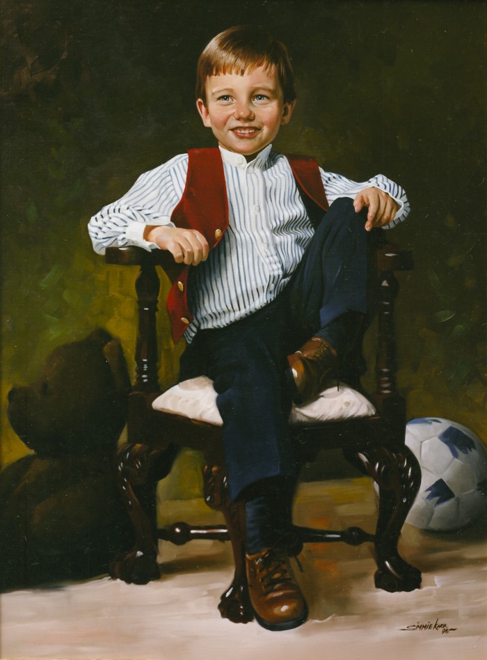

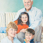

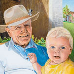


Stuart, by Jonathan Linton
This is the first of what I hope will be a series of posts featuring video demonstrations of artists drawing, together with their commentary about specific choices they make as they work. My goal in these posts is to provide insight into the moment-by-moment decisions made by artists during the flow of creating their art.
Drawing at its best is profoundly right-brained – which is to say non-verbal. So trying to translate the drawing process into words often ends up being deadly to read. What is experienced by the artist as highly pleasurable and out-of-time appears in print as tedious and endless.
So I’m beginning to explore how to convey the artist’s process in a way that’s both fun and helpful to readers wanting to learn more about what’s going on in artists’ minds as they work.
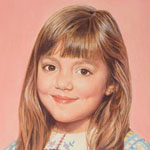
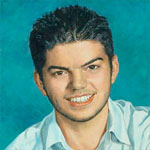
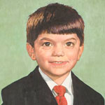
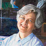
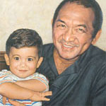
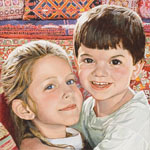
Jonathan Linton is a wonderful portrait artist who I’ve written about before. Two of my favorites among his portraits are Chad and Stuart (above). The boy’s facial expression in each of these portraits conveys his very soul. There’s no vacuous staring into the middle distance here. Each of the two boys is fully engaged with the viewer in a way that communicates multi-faceted expectations vis-à-vis the world he is growing into. And each painting is exquisitely rendered from a purely technical point of view.
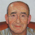
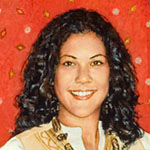
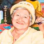
Jonathan has put some painting and drawing demos on YouTube. For my present post, he’s now written commentary, keyed to specific moments in his drawing video of Meg. He’s going to take us through how he moved from reference photo of Meg (below left) to his lovely, complex finished drawing (below right).

Reference photo and final drawing of Meg, by Jonathan Linton

Drawing materials used by Jonathan Linton in his drawing demo of "Meg"
Jonathan used a number of materials to create this drawing: vine charcoal, charcoal pencil, paint brush, three different types of erasers, a paint brush, and paper towels (for his complete list, see bottom of this post). You can trace Jonathan’s use of each during the video by referring to the photo (left) of materials he sent me. In the video, it’s especially easy to spot the red charcoal pencil and the silver eraser-pencil. The fat, rectangular Factis eraser is also distinctive.
I’ve embedded Jonathan’s video in this post. But an easier way to follow through his text explanation may be for you to open the YouTube video in a second window. Then scroll down to Jonathan’s text in my post below. Place it next to the YouTube video, and go through the two simultaneously side by side.
It’s fun to go through the video and commentary more than once, because you’ll pick up more of what Jonathan’s actually doing as you become more familiar with both text and video.
One interesting technique Jonathan used was frequent “wiping down” of the powdery-charcoal drawing. It may seem counter-intuitive to non-artists to repeatedly wipe out an entire drawing as you’re working, so we’ll talk a bit more about that later.
Jonathan began with watercolor-toned paper. This means that the paper has been covered with a layer of paint to provide color and texture to the background, and as the bottom-most layer of the drawing.
The first drawing implement Jonathan uses is vine charcoal, which is a very soft, light charcoal, easily erased or wiped nearly clean.
Jonathan Linton’s text commentary for YouTube video of drawing “Meg:”
Vine charcoal was used to place the face, mark the axis of the eyes and apply an initial tone.
0:18 In order to give a softer tone to the drawing, I often wiped the drawing with paper towels. I wasn’t worried about the awkward scribbles showing through to the final layers since the vine charcoal spreads easily.
After placing these rough indications with the vine charcoal, I used a charcoal pencil to feel out the shapes with more specificity. Since the charcoal pencil’s marks have a lot more sticking power than the vine charcoal, I tried to keep the lines interesting by varying their weight.
0:43 Cross hatching followed the turn of the form. The idea is that the drawing will end up having some texture in the shadow areas and I wanted that texture to give info as well as to provide interest.
1:15 Everything was wiped down to soften the drawing and unify the tones.
1:18 Back to the charcoal pencil – refining edges and adding tones.
1:50 Another wipe down.
1:52 The erasers lifted the rubbed charcoal off the lighter areas easily. (The Faber-Castell Perfection 7056 is a great tool, because you use it like a pencil – even to the point of cross-hatching.)
2:10 Back to the charcoal pencil for further restatement.
2:39 Another wipe down – then charcoal pencil.
2:46 Using the white Factis eraser, I made horizontal strokes across the drawing for macro texture.
After this I used the charcoal pencil, the pencil eraser and the paper towels in quick succession – attempting to refine the shapes and nail the tonal variations – trying to keep the lines interesting and decorating with final details.
Now back to me:
Jonathan uses two techniques in the video which involve removing charcoal rather than adding it. One of these techniques is erasing parts of the drawing in order to create highlights: the areas of the face and hair on which most light falls.
The second removal technique is wiping over with a paper towel the entire drawing he’s created to that point. The basis of this technique is that the charcoal is only partly erased by the paper towel, leaving a “ghost” image behind. The ghosts can pile up on top of each other, adding depth and texture to the drawing intermingled with more defined marks.
I recently ran into a description of this wiping technique on the very quirky and entertaining website of a wonderful artist, the 70-year-old Jack Spiegelman. Spiegelman wrote his description in the fictionalized voice of Otto Dix, the famous German painter. I’m including it here because there’s something in Spiegelman’s writing that captures the rhythm and highly-focused momentum of an artist’s process. As I said above, it’s very difficult to write about drawing in a way that captures – well, maybe a tad dramatically at the end of the quote below – the non-verbal state an artist can get into while working. So, in the “voice of Otto Dix” by Spiegelman:
“I draw and wipe out, draw and wipe out, draw and wipe out. Everything goes on the one piece of paper. The results can be interesting. An energy is produced in this way. Each sketch in some way evolves or is driven by the image that has preceded it. The erased images remain present as ghost images….
“I draw and wipe out, draw and wipe out, draw and wipe out. Once the drawing begins to happen you switch to a pencil with a harder lead and work in a little detail. I draw and erase and draw and erase. Its starting to happen. There is some energy. I slash away. I go back and forth from the soft stick to the hard pencil. I slash away. The charcoal is flying. I love this paper!”
Speaking of paper, for Meg Jonathan used Arches Hot Press.
And that brings us last but not least to Jonathan Linton’s materials list: Bounty paper towels, pencil sharpener, kneaded eraser, Factis eraser, Faber-Castell Perfection 7056 Eraser, vine charcoal, charcoal pencil, and paint brush.
For more online drawing demos, click here.