Archive for June, 2008

The problem of low-contrast lighting in some snapshots

Sunday, June 22nd, 2008

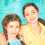
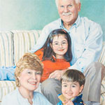
The heart of my portrait style is capturing human connection. Because portraiture is a visual medium, this means portraying how people communicate with each other visually: through facial expression and body language. The truest “recording” of these often-fleeting expressions is frequently family snapshots (to read more on my unorthodox view of snapshots, scroll down to my last post, or click here.)

Using a family snapshot as the basis for a fine art portrait can present artistic challenges that wouldn’t come up with photographs taken under controlled conditions (the procedure usually followed by portrait painters today). One of the most common elements of snapshot images is the flash, which often creates seemingly unpromising lighting for portraiture.

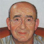
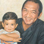
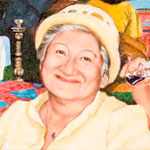
The snapshot below, a quick candid taken of Chief Maurice Zard as he relaxed after an enjoyable family outing, was the basis for my portrait of him. It provides a perfect example of the technical challenge of flash lighting. It also illustrates perfectly why I am committed to finding bold artistic solutions for problems raised by cherished snapshots

Chief Maurice Zard, of the Zard Group of Companies in Nigeria, is a highly successful businessman who is continually absorbed by his many commercial, manufacturing, and philanthropic concerns. He did not want to sit still for even a few minutes to have his photograph taken under good lighting conditions, let alone sit for his portrait!

Meanwhile, the family had this snapshot, which his daughter felt captured the gentle smile that is most profoundly her father in his relationship with her. Because of her feelings, I felt it was important to base Maurice Zard’s portrait on this snapshot, and to turn to artistic advantage the challenges posed by the flattening effects of the flash.

Classic portrait lighting

In classic portraiture, the use of pronounced shadowing of some substantial portion of the face is considered crucial to creating the illusion of three-dimensionality on a two dimensional canvas. Tom Edgerton has expressed this view very well in the Artists’ Forum of portraitartist.com:

“I want to stress how really important shadow shape is. Accurately painting the … shape of the shadows, goes more toward capturing and defining form on a two-dimensional surface than anything else….  Anywhere in the general area [of] a roughly three-quarter direction off of center is the optimum placement for the light to describe form and mass. More shadow on the face [than given by the three-quarter lighting placement] diminishes the available contrast range to describe form, as does light coming directly from the viewer’s point of view–in other words, flash-lit photos…. The flat lighting from the camera-mounted flash kills all available shadow, and the contrast range available for describing form drops to nil.”
— Tom Edgerton, two-time finalist in the Portrait Society of America’s national competition
http://forum.portraitartist.com/showthread.php?t=4355

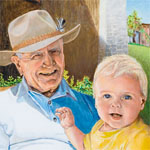
Below is an example of strong shadow cast by classic three-quarter lighting – both on the face and on the wall behind the subject – creating a wonderful portrait of Charles Volkers by Sandra Lawrence.

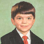
Jonathan Linton’s portrait of Chad in my first post is another beautiful example of classic portrait lighting.

Pam Powell, another portraitist, agreed with Edgerton in the portraitartist.com forum: “The use of all-over ambient light makes it much harder to create the appearance of three dimensions, as it tends to flatten the form, so you have to be very subtle and diligent with the value changes. My examples here are William Merritt Chase (ambient light) and Zhaoming Wu (strong single light source).”

Powell’s examples of the difference between low- and high-contrast lighting make the point so perfectly that I’ll include them here:

The focus of the high-contrast-lit painting on the left is the different shapes and forms – hip, leg, arm, breast – that make up the woman’s body. The background in this painting is secondary. The fabrics surrounding the woman’s body produce an airy quality which is perceived peripherally.

Flash solution ideas gleaned from ambient-light paintings

In the low-contrast-lit nude painting on the right, in contrast, the body appears as more of a two dimensional shape that interplays rhythmically with the other shapes around it: flowered fabrics of various colors. Although the nude is portrayed in full realistic detail, its lack of 3-dimensional modeling makes it easy to experience it as an abstract form among other abstract forms that are almost as central to the painting as it is.

Thus, this low-contrast-lit painting – while not itself lit by flash – gives us a clue as to how fine art portraitists might make an artistic strength of the flatness that results from flash photography. The face of the portrait subject may be treated, at least in part, as one abstract element among several in the painting.

(Of course, paintings in high contrast lighting can also be analyzed as being made up of abstract forms interacting with each other. But it’s likely less the point of the painting than may be so in low-contrast light.)

Interestingly, a number of British portraitists, members of the Royal Society of Portrait Painters, sometimes choose low-contrast lighting on their subjects’ faces. Often these paintings also have patterned backgrounds or other important, complex elements against which the subjects’ flat-lit faces play. While none of these paintings are based on flash snapshots, their low-contrast, often frontal lighting can provide more ideas for how to handle artistically the flattening effects of flash. Below are several portraits by masters of this type of painting.

The first painting, by Graham Jones (who has painted portraits of British political figures in the House of Commons permanent collection), is of Lord Howe standing before elaborate patterned wallpaper.

A preeminent American portraitist, Ned Bittinger, has also used low-contrast lighting for some of his many major government and military commissions.

Here we see the effectiveness of flat, frontal facial lighting playing off elaborate military uniforms. In these paintings, the focus is not on surface form of the men’s faces. It’s on the visual interaction between the faces and the medals, which describe the subjects’ life work, not simply their appearance. The comparative lack of three-dimensional modeling in the faces gives the medals more importance in the paintings.

The painting of Debora Lehr, below, is unusual in that its low-contrast-lit face is in complete shadow rather than complete light. Again, the flatness of the lighting on the face reduces the centrality of its purely-surface appearance. The fact that it’s in shadow brings forward the more brightly-lit Chinese buildings viewed through the octagonal window, conveying Lehr’s work as US State Department Negotiator for Trade with China.

Two more British portraits, by Keith Breeden (who has painted many public officials, academics, and business figures), are of David McMurray, Headmaster of Oundle School, and Major General Adrian Lyons.
In each of these portraits, the multiple vivid colors Breeden used to paint the faces – in the almost total absence of shadow – relate to and play beautifully off the backgrounds of, respectively, military insignia and carved lettering. In each painting, the men’s clothing brings in a large, bold area of contrasting color. These are two spectacular, unusual portraits, great examples of flat frontal lighting.

A last low-contrast-lit painting with multiple complex elements is by Derek Clarke (an elected member of the Royal Society of Portrait Painters for almost 60 years). The subject is Dr. Aileen Low.

Again, the clothing and background elements play almost as important a role in the painting as the face does. And as in Breeden’s paintings, Clarke has used vivid color in the flesh tones – very discernable pinks, yellows, green and lavender – to define and enliven the face in the almost total absence of shadow. I don’t think anyone would doubt the three-dimensional quality of Dr. Low’s face in this painting, in spite of its almost total lack of shadow.

So both in this portrait and two by Breeden, we’ve observed another idea for how we might artistically define three-dimensionality of faces in portraits based on flash snapshots: the use of heightened color in place of shadow.

The last low contrast face I’ll look at is different from all the rest in that it has little surrounding pattern playing off the flat-lit face. What this painting has instead is the most intriguing, highly specific facial expression of any of the portraits we’ve looked at so far. Its subject is Theater Manager Mathew Russel, painted by Graham Jones.

While the subjects of the other portraits we’ve looked at have little expression, this subject is highly involved with the viewer. The central message of this painting is not its subject’s three-dimensional form or an interplay of shapes, but Russel’s unique, very intriguing way of connecting with people.

Beck’s summary

Portraitist Clayton J. Beck III, another PSOA award winner, wrote a portraitartist.com entry that very briefly summarizes – without grinding any one lighting axe – the uses of various types of portrait lighting. (The emphasis is my own):

“As for lighting a subject, you must first understand what… you’re trying to bring out. If you’re interested in the solidity and the form of the object, [then the three-quarter] type lighting is probably very good. If you’re more interested in color or expression or any of a number of other things that we try to bring out of our subjects, other lighting make more sense.

“A flat lighting, that which comes from behind the painter, such as with Nicolai Fechin or Holbein, emphasizes an overall color design. Other times available light, such as we see in “snapshot” photography, gives a life and spontaneity to the subject that is gotten no other way.”

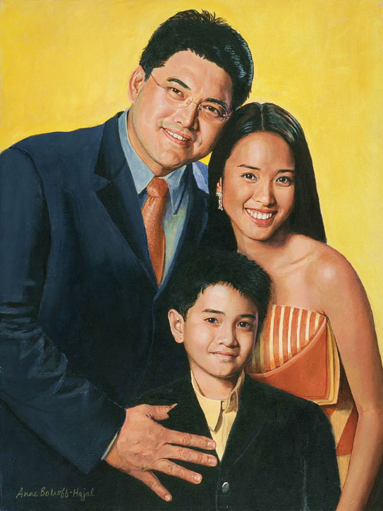
Painting Chief Maurice Zard

The artistic solutions I found for Maurice Zard’s portrait evolved organically as I painted. I eventually used all the strategies mentioned above.

As every artist knows, one of our most important right-brain skills is to know how to recognize a lucky accident when it happens, and to take full advantage of it. From the early planning stage, I knew I would change Chief Zard’s shirt color, because it would not enhance his flesh tones in the painting. I began by simply painting the shirt gray (it later evolved to a more nuanced blue-gray with raw umber-based stripes). I suddenly realized that the interplay between the abstract areas of warm color (the flesh tones and the leather chair) and cool (the shirt and wall) would form the basic rhythmic structure of the painting. While the patterns around Chief Zard are not as complex as those in some of the paintings we looked at above, the stripes of his shirt and the way the areas of warm and cool color dance around each other provided a similar effect.

As I focused in on painting Chief Zard’s face, I confronted the full challenge of the flat lighting. One of my strategies was to heighten every color nuance I could find in his flesh tones, using tiny brushes with bits of different colors. Greens, lavenders, yellows, pinks – all can be seen in this close-up.

At the same time, I wanted this painting to “read” from across the very large room in which it would be hung. For this, the best technique would have been that missing commodity, form-defining shadow. As Tom Edgerton described the delicious, almost miraculous effect of deepening shadow in his Artist Forum entry, “As a result of this discussion, I walked over and incrementally deepened and simplified the shadow under a subject’s nose, and everything in the painting suddenly became a lot deeper and more three-dimensional.” I also incrementally darkened all the shadows that existed in the Zard portrait, pushing each as far as I could without creating something that looked false. After countless layers of adjustments, taking care to balance every change with all other elements of the face, this portrait reads from a surprising distance across a large room, through the door and out into the entry hall of the Zard home.

In the end, I felt I had achieved my goal of creating a portrait of Chief Zard that was both pleasing to the eye, and captured his unique, appealing expression, by which he relates to his family and others around him.

Images in this post can be found online at:

Portrait Artist forum entries:http://forum.portraitartist.com/printthread.php?t=4355&pp=40

Ned Bittinger’s portraits: http://www.portraitartist.com/bittinger

Keith Breeden’s portraits: http://www.therp.co.uk/pages/artists_cvs/breeden.asp?art=5

http://www.commissionaportrait.com/artistsportfolio.asp?id=10

Graham Jones’ portraits: http://www.therp.co.uk/pages/artists_cvs/jones.asp?art=15

http://www.commissionaportrait.com/artistsportfolio.asp?id=42

Derek Clarke’s portraits: http://www.therp.co.uk/pages/artists_cvs/clarke.asp?art=7

Sandra Lawrence’s portrait: http://www.sandralawrence.co.uk/Portraits.htm


Fine art from snapshots? (part 2)

Monday, June 9th, 2008

(Haven’t read Part 1? Click here.)

As I said at the end of my last post, I’d like to bring a new perspective to personal snapshots as the basis for portraits. I believe that, treated properly, a client’s snapshots can indeed be the core of a terrific work of art. This post will explain why. (Future installments will talk about how.)

A caveat: I believe snapshots can be used successfully only by an artist who has a huge bank of visual knowledge of how the 3-dimensional world works, together with lots of experience drawing and painting from life. Some one who never paints from anything except photos is unlikely – I would think – to have the skills and experience they need to create fine art portraits from snapshots.

But why even bother with snapshots? If an artist is using photos, why not just use technically perfect ones taken by the artist under controlled conditions?

Well, sometimes photos taken by the artist can make wonderful portraits. There are some subjects who “come alive” in front of any camera. These people produce captivating expressions no matter who’s taking the photo. But often that’s not the case.

To explain why I feel that capturing personal expression is so important, I need first to describe my personal artistic goals in portraiture.

I am passionate about painting how my subjects relate to other people. To me, painting an expressionless face for its physical characteristics alone is to paint a person isolated from human contact. It makes me lonely just to think about it.

To connect with other people, human beings use words, the voice, touch, body language, facial expression, and so on. But portraiture is a visual medium. We can’t paint sound or touch. So if we want to paint the way a person engages other people, we need to paint their facial expression and body language. These are how we visually communicate our needs and emotions to each other.

I recently took two nearly-identical snapshots of my grown daughter. The first shows the serene smile of the young woman my daughter has become. In the second photo, underneath her grown-up smile I can see the breathless, excited smile she had as a little girl. The differences between the expressions in these two photos are very subtle. If I were commissioning a portrait of her, I would want that very particular expression in the second photo: the one in which I see both the mischievous, merry little girl and the self-confident young woman. But I doubt that an artist who didn’t know her could have elicited that expression so personal to her while posing her in artificially perfect conditions.

Snapshots taken by family or friends are often more likely to capture expressions like this. Such expressions are frequently intimate, brought forth only in particular surroundings and situations. That is why I would rather work from a defective snapshot that captures the subject’s unique expression and surroundings than work from a technically perfect but impersonal photo I’ve taken myself.

Human expressions are very complex and subtle. It requires great skill to capture them in paint. How does an artist paint a relaxed smile differently from a smile that looks forced? What makes eyes appear to twinkle? What are the facial changes that take a face from routine sadness to the most profound grief?

What subtle changes in line and shadow gave one photo of my daughter the additional layer of childish excitement under the young woman’s smile? How would an artist paint the second expression differently from the first?

The ability to capture expressions in paint is partly built on understanding the human language of expression. A relaxed smile, for example, is conveyed partly by the lower eyelids moving up over the pupil as the cheek muscles contract to pull the corners of the mouth upward. Painting a smiling mouth without this effect on the lower eyelid will create a false-looking smile.

So to paint expression, the artist needs to be able to analyze the effects of subtle changes in the shading and shape of facial flesh and muscle while forming the brush strokes that portray them.

My daughter’s mouth, chin, and lower eyelids in the first photo are very relaxed, expressing adult self-confidence. In the second photo, her lower lip, chin, and lower eyelids are all pushed very slightly higher on her face by the muscular tension of suppressed childish excitement. These subtle changes in the various parts of the face are the language in which humans communicate visually with each other.

Even beyond being able to paint expression, I would argue that creating a work of art from a snapshot requires at least as much artistry as does a photograph over which the artist has had control of lighting, pose, clothing, and so on. Snapshots are often faulty in multiple ways. Making up for a snapshot’s deficiencies requires tremendous technical skill. It also requires that the artist make constant artistic evaluations of the snapshot’s challenges as the painting develops. The painter must make continual artistic decisions about how to turn the snapshot’s deficiencies into artistic strengths.

Creating art from a client’s snapshot requires a lot of artistic skill precisely because the artist begins with an element so out of their control. It’s somewhat similar to using found objects to create sculpture. How the artist puts all the elements together determines whether something awful or something wonderful results.

In short, beginning a portrait with some one else’s snapshot creates all kinds of artistic issues that don’t occur when the artist begins with a photograph they’ve taken themselves under perfect conditions. In coming posts, I’ll describe a number of these issues that I’ve run into and how I’ve dealt with them technically and artistically.

(Haven’t read Part 1? Click here.)

Fine art from photos, OK. But fine art from snapshots?

Monday, June 2nd, 2008

(Already read Part 1? Here’s Part 2)

So you’re going to have your portrait painted. That means you’ll sit in a studio for hours on end while the artist paints you, right?

Well, it used to mean that. But click “Procedure” on almost any portrait artist’s website – including those who get $10,000 and up for a portrait. You’ll find that these days the “portrait sitting” is commonly a photo shoot that happens before the artist’s brush ever strokes canvas. After the shoot, the client and the artist select a photograph on which to base the portrait. Then the client can disappear while the lengthy work of the actual painting is accomplished.

“Assuming that a portrait created from photo reference is intrinsically inferior to one painted from life is putting the responsibility on the process rather than the artist. If only it were that simple. You can paint from life until the next millennium and never do anything worthwhile.

I’ve seen incredible paintings done from life and beautiful paintings done from photos too. However, the vast majority of portraits I’ve seen are poorly thought out and ineptly handled regardless of whether from life or photo reference.

I believe that injecting the quality of life into a painting comes from the artist’s heart, intent, knowledge and talent.”

Marvin Mattelson, Portrait artist, permanent collection of the Metropolitan Museum of Art and the National Portrait Gallery. (http://forum.portraitartist.com/showthread.php?t=8582)

There are still a few portrait artists – such as Mary Minifie in Boston – who insist on the importance of working only from life. Some other portraitists accompany their photo sessions with quick, one-time studies (sketches) from life. Afterwards, they paint the portrait itself without the subject present.

Portrait by Jonathan Linton, full size at: http://www.jonathanlinton.com/painting-pages/chad_big.htmlWhen the painter is a terrific artist to begin with, painting from photographs can create exquisite portraits, the kind of art you want to gaze at forever. Look at this beautiful little boy (Full size portrait by Jonathan Linton here).  His eyes speak to you, appealing to you emotionally. Every detail of the background creates a very unusual atmosphere. The boy, chair, hangings, and window all hint at a mysterious story that engages us and makes us wish we could know more.

There are many good reasons why portraitists have shifted to using photos. Clients don’t want to take time or energy to travel repeatedly to the artist’s studio and sit motionless for the endless hours it takes to paint a portrait. A subject who poses usually gets tired and bored as time passes. The head droops, shadows shift, angles change, new wrinkles appear in clothing. All make painting problematic. So artists have always seized on technological tools as fast as they’re invented, to develop new ways of capturing their subjects in paint.

Of course, portraitists who successfully use photographs are able to do so because they have trained endlessly in drawing from life. They have a vast bank of experience observing and painting the myriad elements of color, line, human physique, and so on. When portrait artists paint from photographs, they are drawing on this store of knowledge and practice.

Copying a photo will not make a great painting, but neither will copying from life. It is the understanding that the artist brings to his work that makes it something more. How to strategize the construction of a painting is the commonality I believe that distinguishes the work of all great artists.

I think that if the old masters were alive today they would absolutely take full advantage of today’s technology and couple it with their extraordinary knowledge. Great artists are always looking to utilize whatever will make themselves more effective. Vermeer used optical devices. Bouguereau and Gerome both took full advantage of photography, and look how they raised the bar.

Marvin Mattelson

But how can art grow from snapshots?

Many in the art world insist that portraitists who paint from photographs use only photos the artist takes him or herself. Many portrait competitions stipulate this. The reason is to prove that the artist isn’t using some one else’s vision, some one else’s composition, lighting, color choices, and so on. Rather, the artist must make all these choices, based on their own artistry and technical skill.

It’s easy to understand the perspective that a painting based on a photo taken by some one else – or worse, some magazine photo of a well-known person – isn’t art. Online portrait factories (“send me your family snapshot and I’ll turn it into a portrait and mail it back to you”) have proliferated. You can have a $100 copy painted of your own photo without even meeting the painter. I would not argue that such an approach produces great art.

At the same time, I’d like to bring another perspective to personal snapshots. I believe that, treated properly, they can indeed be central to a work of art. I’ll write more about this out-of-the-box approach next post.

(All done with Part 1? Here’s Part 2)

You have to find something to say before you can say it

Monday, June 2nd, 2008

It’s not easy to figure out what might give readers a sense of knowing a bit about the person behind the blog, but here’s a start: I grew up in what was then a relatively rural town of 13,000 people, Sudbury, Massachusetts. I’ve been drawing and painting constantly since I could hold a pencil, and always got great pleasure from it.

I went to Sarah Lawrence College, studying art and history, and then on to graduate school in Russian history at the University of Michigan (in what? What’s an artist doing getting a Ph. D. in history? – more on that another time). I lived in the Soviet Union – St. Petersburg (then Leningrad) and Moscow – for a year doing research for my degree.

I married a man from Lebanon and had two children. Traveling to Lebanon to visit family has been one of the most enriching experiences of my life.

Through everything, I continued painting. I became very interested in art that moves, and got involved with film and animation (click on “About the Artist” for specifics).

To me, there’s nothing more captivating than the human face and the myriad expressions by which it communicates with other people. Not surprisingly, then, portraiture is among my passions.

That’s the skeletal outline. Here’s a more philosophical point:

For me – as for many artists – painting isn’t a purely visual experience. Yes, we want to create canvases that are beautiful in some way, to rivet and pleasure the eye. But we also want to engage thought, and to create emotional communication among our subjects, ourselves, and anyone who looks at the artwork.

As I was growing up, my father was proud of my artistic accomplishments and supported my artistic development in every way. While I was still too young to get into art classes, he arranged watercolor lessons for me with a local artist. Later he and my mother sent me to life drawing and other classes.

But when it came time to apply to college, my father advised me not to go to art school. “You have to find something to say before you can say it,” he said. He didn’t believe that by focusing purely on learning art techniques could I become an artist with something of value to communicate. He felt I’d more likely find something important to say through a wider knowledge of human experience.

There are, of course, many paths to creating wonderful art. Many great artists do go to art school. This blog will describe my own path, to begin with in the field of portraiture.