Archive for the ‘Technique in portraiture’ Category

To paint smiles or not to paint smiles: Where do you stand?

Thursday, June 4th, 2009

“…the truth is, it’s hard to suggest freedom of choice for artists and [then to] advocate hard and fast rules.”
Timothy C. Tyler

___________________________________________________

One rule many portrait artists follow is to never paint their subjects smiling, especially if the smile is wide enough to reveal their teeth.  These artists generally feel that since a smile involves muscle contraction, it produces uncomfortable tension in the portrait.  A fully relaxed face, they feel, allows the viewer’s gaze to wander over and appreciate the subject’s features.  Some portraitists contend that only the unsmiling face can have lasting appeal across many years.  The wonderful contemporary Dutch portrait painter Rene Tweehuysen wrote, “A broad smile (showing of teeth) is not really to be recommended, and in the long term can lose its appeal.”  American Bart Lindstrom said: “Great art is about subtlety. That’s why, when I paint portraits, I prefer the quiet, timeless expressions of a relaxed face over one with a large smile.”

The historic development of photography has made it much more possible for artists to paint fleeting facial expressions, including smiles. Some top portrait artists are now painting smiles full of character.
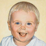
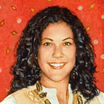
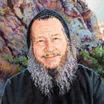
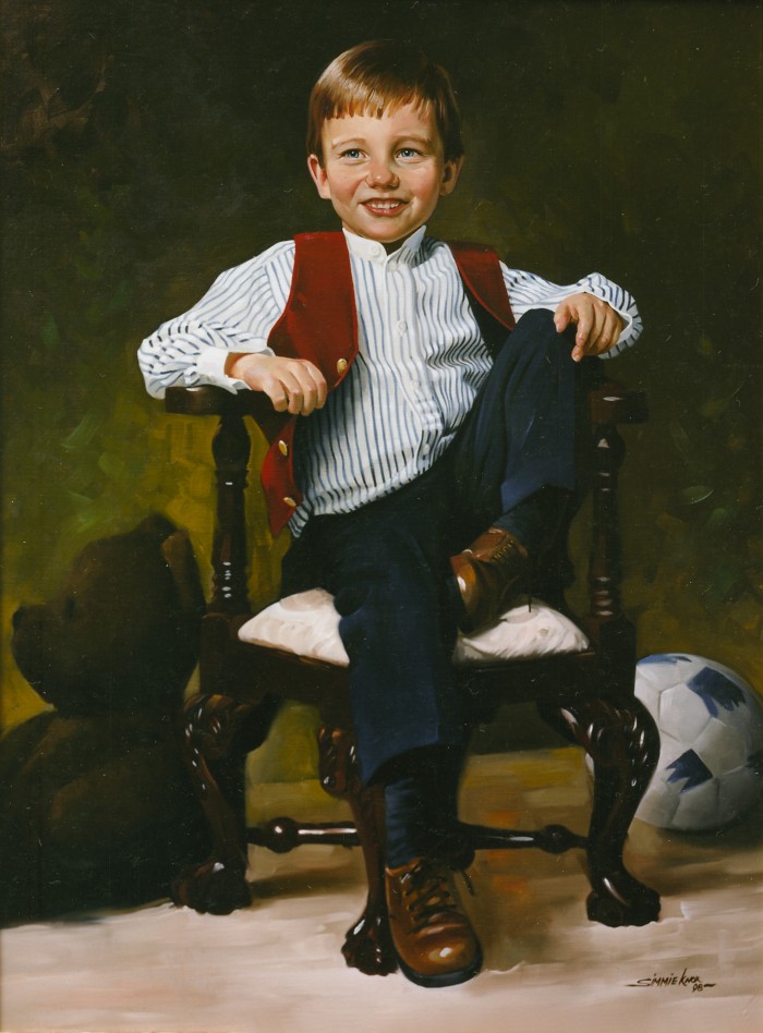
portrait

Will by Simmie Knox

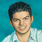
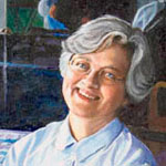
Catia Chapin by Everett Raymond Kinstler

Today’s portraitists’ widespread use of photos as reference tools has added a new twist to the debate over whether portraitists should paint smiling subjects.  Margaret Carter Baumgaertner, a leading American portraitist, has provided a quintessential description of the limited role traditional portraitists feel photography should play:

Clare

Clare by Margaret Carter Baumgaertner

“My policy is to work from life as much as possible. In the event that one needs to work from photographs, the photographs should represent life. When taking photographs, I place the subject in a pose that they could hold for 40 hours if they had to. Some people I paint with a pleasant smile. But the photographic “Say cheese” smile is actually a fairly recent phenomena. You want to stay away from the candid shot. Something that obviously came from a camera.

“What do you do if the client insists that there be a big grin?  I talk them out of it. I explain, in a very nice way, that we are making a painting not a photograph. I bring a big book of masterful portraits (Sargent, the Early Portraits is a very nice volume) as well as my portfolio, and ask them to envision what their painting will look like. I explain that if we do a big grin, we can’t see their child’s beautiful eyes. I explain that in time they might become tired of seeing this toothy grin, while if we have a more pleasant smile or contemplative look, that they will be drawn into the eyes, the mood, the moment of the painting. I explain that we are creating something that their great grandchildren will cherish, that we are together producing a work of art that might someday hang in a museum.”

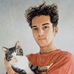
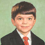
Mary by Linda Nelson

A lively debate over portrait smiles and teeth has taken place on the online Portrait Artist Forum, marshalling the best arguments on each side.  It’s very worthwhile reading through this thread because whichever type of portraits we paint, we can learn something from “the other side” to apply to our own work.

For example, Alexandra Tyng feels that wide, toothy smiles often appear static, while other artists note that smiles distort some facial features, e. g. making the eyes smaller.  On the one hand, I personally feel that the “distortions” caused by smiles, looked at from another perspective, are actually our language of emotional communication.  At the same time, the Forum discussion reminds me that however we paint, we need to be sure our subjects’ faces don’t appear static, and that their features, especially their eyes, aren’t obscured by facial expressions.

One Forum participant gave an intriguing, insightful explanation of why some artists might feel broad smiles cause unease in the viewer:

“Subconsciously, we know that a photo was taken in a fraction of a moment, and so smiling that long is normal….  A painting, however is not done in a fraction of a moment. It takes hours of work to complete. So a big smile is “unnatural,” as it would logically be impossible for the sitter to have sustained it. [W]e’re subconsciously bothered by the logic.”

Other portraitists in the Forum point out that many famous paintings portray positions that could not have been held for more than a fleeting moment.  These paintings, wrote Michele Rushworth,

Saint George and the Dragon by Rubens

were meant to convey a transitory moment.  I was studying Rubens’ Saint George and the Dragon the other day, which I have attached as one example.  I wouldn’t avoid painting smiles simply because people can’t hold one for thirty hours. The model for Saint George didn’t hold his arm in the air for thirty hours either.

Leslie Ficcaglia observes,

No one can sustain a natural-looking closed mouth smile for very long either; it ends up looking forced and stiff….  The same argument … could be applied to many classical paintings, including Degas’ ballet series…; no one maintains a ballet stance that long either.  Brueghel … attempted to capture complex activities … as though they were frozen in time.  Eakins has a woman with her mouth open in song and a man in mid-leap at a swimming hole.

And there are those classic paintings of ships on roiling seas, yet waves can’t hold a pose.  Other Forum artists point out that Van Hals and even Sargent painted fleeting expressions, including smiles and teeth; examples are posted by Tyng and Mike Dodson here.

Leonardo Da Vinci wrote, “Try to be a calm spectator of how people laugh and weep, hate and love, blanch from horror and cry out in pain; look, learn, investigate, observe, in order that thou mayst come to know the expression of all human emotions.”  He dissected facial muscles of corpses, and the annotations he wrote to his anatomical diagrams reveal that he was trying to understand which muscles helped to create certain emotional expressions: “h [Lateral portion of the frontalis] is the muscle of anger; p [median portion of frontalis] is the muscle of sadness; … o t [procerus] is the muscle of anger.”  (You can see one of his facial muscle diagrams here.)

Rembrandt studied and drew himself with a variety of facial expressions: fear, anger, laughter.  You can see these sketches here (scroll up slightly to see the drawings).

There’s no question that in the days before photography, it was extremely difficult for artists to study their subjects’ fleeting expressions, including smiles, in order to paint them.  The time required to observe and capture them would have been prohibitive for many artists.

So in the centuries before photography, artists painted many more “holdable” expressions (or non-expressions) than fleeting ones.  I’ve written about this in previous posts, so I was delighted to discover that others in the Portrait Forum have had the same thought.  Rushworth wrote:

It seems to me that the reason the “old masters” painted more subdued expressions (no teeth) is because they didn’t have photographs to work from that captured those brief flashing smiles. We think of these traditional old portraits and that’s what has created the aesthetic we often try to emulate today.

Ficcaglia agrees: “if the masters had had Nikons we’d see a lot more teeth in their paintings.”

Another likely factor was observed by Michael Georges: in “‘Olden Tymes’ people generally lost their teeth quite early on. Those teeth that remained were not always the nicest to look upon.  George Washington was particularly known to have very bad teeth. In the civil war, the requirement for being a soldier was that you have two good front teeth to bite the paper casing off the bullet cartridge.”  Marvin Mattelson concurred: “The old masters probably didn’t paint smiles because most of their subjects were missing their teeth.”

So when today’s portraitists strive to emulate the look of masterpieces over a century old, their painting must appear to be created entirely from live sittings.  There can be no teeth or real smiles because a broad smile is a giveaway that photos were used.

I suspect that another reason portraiture in the US often tends to have a conservative esthetic is that many Americans commissioning portraits want to present themselves within an old world ethos.  They are striving to establish “aristocratic” credentials in a country too young and individualistic to have a centuries-old hereditary aristocracy.

By Andrew Tift

By Andrew Tift

Ironically, parts of the world with centuries of antique portraits on their manor walls are the most adventurous today in experimenting with new forms of portraiture (see Portrait Composition: Old World vs New? below). A British example by Andrew Tift takes toothy smiles beyond what I’ve ever seen by any serious portrait artist in the US.  I personally feel Tift’s portrait utterly captures the joyous, free quality of childhood.  (Tift is a winner of multiple British National Portrait Gallery awards, including first place in 2006.)

One of my favorite portraits of children was created by the Canadian David Goatley.  These boys’ fleeting expressions are highly specific to each child and to this moment. Generic smiles these are not.  The boy on the left has a gentle warm smile above his blue sports shirt.  His oldest brother nurtures the impish youngest one in an embrace.

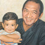
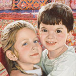
Brothers, West Vancouver by David Goatley

To me, the very specificity of these boys’ expressions conveys far more understanding of their characters than would a standardized slack gaze.  This painting gives me a rich sense not just of who these boys are now, but also of what they may become as they grow up.  They are completely “at home in their skins” – a combination of masculine-sports-blue and warm caring for each other.  The way these boys are painted gives me a sense that they will grow up to be – well, the kind of men I would want my daughter to marry!

So for me, the decision about whether to paint a subject smiling – broadly or slightly, with or without teeth revealed – should be based not on a general rule, but on the character of that particular human being.  Every good portraitist seeks to reveal character as well as superficial appearance.  And I think people’s characters are visually revealed through their facial expressions more than in any other way.  The smile – including the toothy grin – is part of human beings’ infinite repertoire of emotional expression, so I would never want to rule it out as appropriate in portraits.

The smile may even be the expression most particular to each individual over their lifetime.  According to Gary Faigin, author of The Artist’s Complete Guide to Facial Expression, the smile is the second expression that appears in the human newborn (crying is the first).  And it’s “the expression that we carry the most intact from infancy to old age.”

The smile is also the expression of nuance.  There are more, and more subtle emotional shadings possible with a smile than with any other expression.  Smiles can contain elements of other expressions like sadness or anger, creating faces of fascinating ambiguity and complexity.

Like sadness, smiles can register as a powerful expression even when just barely visible on the face.  (Faigin p. 188)

*       *       *

As I think of my own artistic passion for human expression, it occurs to me that portraitists who favor unsmiling subjects often use the word “introspective” to explain their preference.  These artists find more truth revealed in the face of a person looking inward rather than connecting outward.  For example, Baumgaertner wrote, “most of my own favorite portraits are contemplative, reflective, and, at times, introspective.”

I happen to be a person who needs a lot of time alone to listen to and follow my own brain’s inner workings.  I can happily spend three or four workdays at a stretch alone painting, researching, or writing.  I wonder whether my need for aloneness during work time is part of what results in my personal preference for subjects who are engaging and connecting with other people.

Conversely, I wonder whether artists and clients who need to be out and about in public more than I do prefer quieter, more contemplative subjects.  After being around the hustle and bustle of life, perhaps these extroverts are looking for some quiet introspection.  It would be interesting to hear from different portraitists about whether their underlying values regarding extroversion or introversion in their portraits relate in any way to their own basic temperaments.

*        *        *

While I can find wisdom in most of the arguments in favor of unsmiling portraits, the one rationale that makes no sense to me is the idea that only an unsmiling face can withstand the test of time.  I’ve never seen any evidence provided for this claim (please write a comment if you have some!).  What I know is that the portraits I’ve painted of my own children all involve very characteristic smiles – toothy or subtle – that have never ceased to enchant me over the years.  The two photos of my son and daughter that I would run back into a burning house to rescue each have joyous, toothy grins that capture the entire essence of their childhood in a single image.

*        *        *

Because smiles still appear in a minority of portraits, I’ll close this post with a few more images of them (click on these images to go to the artists’ websites, where you can find more of their smiling portraits).

Mabel Caruth by Everett Raymond Kinstler

Margaux

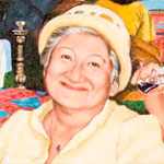
Margaux by a Portraits, Inc artist

portrait

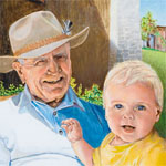
Jonathan by David Beal

Louis W. Sullivan, MD Chair, National Health Museum, by Everett Raymond Kinstler

Sumantra Ghoshal by Laurence Kell.  Commissioned by London Business School

Sumantra Ghoshal by Laurence Kell. Commissioned by London Business School

portrait

Robert Guriton by Dean Paules

portrait

By Tom Donahue

portrait

Ben by Dean Paules

Mrs. Tony Bennett by Everett Raymond Kinstler

I feel all these subjects convey a sense of warm engagement.  I feel invited to interact with these very appealing people.  I’d like to spend a nice chunk of my non-alone time with each of them.

NOTE: Since I wrote this post a couple of years ago, a controversy has erupted over the 2012 portrait of Kate Middleton, in which she’s painted with a subtle smile.  This has brought a lot of new readers to this page.  I’d  like to steer readers to two discussions of the topic on other websites.  One is by the artist Katherine Tyrrell, on the British blog Making a Mark.  The other is on the facebook page of the portraitist Sophie Ploeg.  Each includes a lively discussion by portraitists such as Alexandra Tyng and others.

Portrait composition: Old World vs New?

Monday, July 21st, 2008

A client requested a portrait of her son’s family based on snapshots taken in a New York City park (click here for my earlier posting on painting from snapshots). In the photos, the family was surrounded by the park’s enclave of greenery. My client hoped I could also include the city street beyond the park, which appeared in another photo. Her son and his family might move out of the city some day, so she wanted their portrait to capture this urban chapter of their lives.

I resonated with the client’s feelings. I’m always eager to portray my subjects’ worlds in the backgrounds of their portraits. Additionally I wanted to include the cityscape because it was a complex, atmospheric visual element to play off the human subjects.

It also created an interesting challenge in the composition of the painting: In order to fit the street and buildings into the background, the family would have to be placed relatively low on the canvas. The city street would appear above them. And because they were sitting amidst a lot of very green foliage, the cityscape could easily end up looking almost like a separate painting stuck incongruously onto the top of the family portrait. Was it possible to create a unified painting with these disparate horizontal areas?

Subject placement in portraits today

The vast majority of portraits place the subjects’ head/s above the horizontal midline of the painting, often close to the top of the canvas. (Heads are most often centered from side to side.) The head is almost always the top-most visual element in the painting. This positioning leaves no doubt as to what is the most important element of the painting: the face and head of the subject.

This type of composition has of course generated many wonderful paintings over the centuries. Here are some terrific contemporary examples. Please click on any image to see a larger version on the artist’s website.

portrait

Portrait by Patricia Wilkes

Portrait by Jiawei Shen

Portrait by Ron Hales

Portrait by Ron Hales

holder

Portrait by Fanny Rush

http://www.artrenewal.org/articles/2007/Salon/hires/F-403.jpg

Portrait by Scott Tallman Powers

Portrait by Ying-He Liu

Portrait by Christopher Alexander French

Portrait by Toby Wiggins

But is this the only composition that can create a successful portrait? The internet allows a survey of composition in contemporary portraiture in the United States and Britain. Four major portrait websites, among others, provide images of many artists’ work:

  • For the US, PortraitArtist.com, and PortraitsInc.com.
  • For England, The Royal Society of Portrait Painters (therp.co.uk) and CommissionAPortrait.com. (These include artists from other European countries who are represented by these two British agencies.)

In my endless prowl for visual ideas, I’ve surfed through the work of hundreds of portraitists on both sides of the Atlantic (and some in Australia, China, etc). The more I’ve looked, the more I’ve perceived a pattern that I find surprising, intriguing – and puzzling. While it’s true that most portraits on both sides of the pond follow the compositional rules outlined above, our Old World colleagues seem to venture “outside the box,” as it were, more often than we do. Here are some of the many examples of portraits by British artists (and portraitists from other European countries represented in England) in which major visual elements appear above the head of the subjects. As everywhere in this post, click on any image to see a larger version on the artist’s website.

Portrait by Sergei Pavlenko

Title: Maria Cabanas and Maggie Maguire Size: 18 x 14 inches Medium: Oil Year Painted: 1990 Collection: Private

Portrait by Jason Sullivan

Title: Nicky Clifton Brown Medium: Oil Year Painted: 2005 Collection: Private

Portrait by Susan Ryder

Title: Dame Sandra Burslem Medium: Oil

Portrait by Alastair Adams

Portrait by Heidi Harrington

Portrait by Dick Smyly

Title: Professor Sir Peter Lachmann FRS Size: 107 x 71 cm Medium: Oil Year Painted: 2003 Collection: Academy of Medical Sciences

Portrait by Jeff Stultiens

Portrait by Rene Tweehuysen

holder

Portrait by Fanny Rush

In fact, there are many portraits by British painters (or Europeans represented in England) in which the heads of all subjects are placed on or below the midline of the painting, with other major visual elements above the heads.

Portrait by Alastair Adams

Portrait by Rene Tweehuysen

Title: Homan Potterton, Director of the National Gallery, Dublin Size: 30 x 40 inches Medium: Oil Year Painted: 1987 Collection: Private

Portrait by Andrew Festing

Portrait by Tom Wood

Portrait by Vincent Yorke

Portrait by Oisin Roche

British-represented European artists are also unafraid to allow vast space above their subjects’ heads. They are able to do this without diminishing the importance of the subject, but adding to it.

Portrait by Heidi Harrington

Portrait by Laurence Kell

Portrait by Heidi Harrington

Yuqi Wang, represented by British CommissionAPortrait.com, trained in China and now based in New York, is a master of this technique.

Portrait by Yuqi Wang

Another very effective British/European variant allots a lot of space above the subject’s head, with another dramatic visual element off to the upper side.

Title: Sir Eric Anderson, Kt, Provost of Eton Size: 152 x 107 cm Medium: Oil Year Painted: 2004 Collection: Eton College

Portrait by Paul Brason

Portrait by Marilyn Bailey

Portrait by Rene Tweehuysen

Portrait by Andrew Tift

Title: Simone Size: 74 x 61 cm Medium: Oil Year Painted: 2004 Collection: Private

Portrait by Michael Reynolds

Title: Richard King, Sculptor Size: 102 x 76 cm Medium: Oil Year Painted: 2002 Collection: Private

Portait by Jeff Stultiens

In contrast, I’ve come across very few American portraitists who place all the subjects in a given painting low on the canvas. Yet when they do, they are as likely to produce magnificent paintings as the Europeans do. These two, of J. Lindsay Embrey and William Paley, are by Portraits, Inc artists (artists are not identified on this website).

J. Lindsay Embrey and William Paley by Portraits, Inc. artists

June Allard-Berte is a rare American portraitist who has done a number of portraits with major visual elements in the upper half of the canvas, above subjects’ heads that are on or close to the midline. In general, Allard-Berte gives an unusual amount of attention to composition: “Her sense of composition is superb; it is endlessly inventive, elegant, and nearly always strikes just the right balance with subject. It neither over nor underpowers the strength of the person.” http://www.portraitartist.com/berte/bio.htm Allard-Berte’s talent for composition is very special.

Portraits by June Allard-Berté

American Bart Lindstrom rose to the challenge of a high space over a fireplace with a wonderful composition placing his subjects low on the canvas with a brook flowing through a forest above them. Yet Lindstrom doesn’t seem to have used this type of composition elsewhere.

The American Alexandra Tyng has used it several times to create paintings that are real gems:

Portraits by Alexandra Tyng

But these examples are few and far between among portraitists in the United States. Interestingly, it seems that American portrait painters who venture outside standard centered composition are much more likely to place the subject to one side of the canvas or the other than they are to place new visual elements above subjects’ heads. Here are some terrific American examples of placing the subject off-center horizontally:

Portrait by Portraits, Inc. artist

Portrait by Marvin Mattelson

Portrait by Garth Herrick

I don’t know for certain what causes this cultural difference between England and the US (which I believe extends to other issues besides composition). But it’s interesting to speculate. Is it because a country with centuries-old self-confidence in its aristocratic bona fides feels eager to venture outside the confines of traditional portraiture? Is it because Americans see themselves as needing to dominate their surroundings, while the English are either more humble or more secure, so they feel free to allow their surroundings to appear higher than they are? Perhaps the tradition was begun by British aristocrats who felt their stature was enhanced by their chandeliers, high ceilings, and walls covered with paintings and tapestries. Perhaps they saw such finery above their heads as metaphoric crowns that proved their wealth and nobility rather than belittling them. And perhaps from there, the British became used to portrait composition with other kinds of important elements above the heads.

Portrait by Andrew Festing

Portrait by Richard Foster, no longer available on the internet

Title: The Royal Family; A Centenary Portrait Size: 366 x 249 cm Medium: Oil Year Painted: 2000 Collection: The National Portrait Gallery

Portrait by John Wonnacott

Title: The Goold Brothers Medium: Oil

Portrait by Alastair Adams

Last, here is my own portrait with the cityscape as the highest element.

Integrating the city street into the background was complicated because, although in reality it had been behind the family, it didn’t appear in the photos I used for them. I had to make judgments about the cityscape’s scale, placement, angle, etc, in comparison with the park foliage, trees, and people. I eliminated certain components from the street photo: a car and several pedestrians. I had hoped to find a way to keep these in the painting, but ultimately they were distracting and not such attractive elements for the eye to wander over. So in the end they got painted out, and I had to extrapolate street shadows and sidewalk to fill their places.

There are several vertical elements that bind the park to the city street: the yellow and gray traffic light, greenery on the left edge, ivy-covered tree trunk, and street light pole. I carefully adjusted each of these so together they would all help ground the street behind the park.

Color also ties the layers together: I altered the actual clothing colors in order to echo the building colors, thus binding the uppermost and lowermost components of the painting. In other areas of the painting, green foliage, working from the very bottom of the canvas up to the trees along the street, also pulls the disparate elements together.

Looking at “out of the box” composition by both Americans and Europeans has enticed me to think more about placing subjects lower on the canvas than other complex visual elements. Given the magnificent paintings that have been achieved by others, I hope it will add to my repertoire and result in unique, rich portraits.

The problem of low-contrast lighting in some snapshots

Sunday, June 22nd, 2008

The heart of my portrait style is capturing human connection. Because portraiture is a visual medium, this means portraying how people communicate with each other visually: through facial expression and body language. The truest “recording” of these often-fleeting expressions is frequently family snapshots (to read more on my unorthodox view of snapshots, scroll down to my last post, or click here.)

Using a family snapshot as the basis for a fine art portrait can present artistic challenges that wouldn’t come up with photographs taken under controlled conditions (the procedure usually followed by portrait painters today). One of the most common elements of snapshot images is the flash, which often creates seemingly unpromising lighting for portraiture.

The snapshot below, a quick candid taken of Chief Maurice Zard as he relaxed after an enjoyable family outing, was the basis for my portrait of him. It provides a perfect example of the technical challenge of flash lighting. It also illustrates perfectly why I am committed to finding bold artistic solutions for problems raised by cherished snapshots

Chief Maurice Zard, of the Zard Group of Companies in Nigeria, is a highly successful businessman who is continually absorbed by his many commercial, manufacturing, and philanthropic concerns. He did not want to sit still for even a few minutes to have his photograph taken under good lighting conditions, let alone sit for his portrait!

Meanwhile, the family had this snapshot, which his daughter felt captured the gentle smile that is most profoundly her father in his relationship with her. Because of her feelings, I felt it was important to base Maurice Zard’s portrait on this snapshot, and to turn to artistic advantage the challenges posed by the flattening effects of the flash.

Classic portrait lighting

In classic portraiture, the use of pronounced shadowing of some substantial portion of the face is considered crucial to creating the illusion of three-dimensionality on a two dimensional canvas. Tom Edgerton has expressed this view very well in the Artists’ Forum of portraitartist.com:

“I want to stress how really important shadow shape is. Accurately painting the … shape of the shadows, goes more toward capturing and defining form on a two-dimensional surface than anything else….  Anywhere in the general area [of] a roughly three-quarter direction off of center is the optimum placement for the light to describe form and mass. More shadow on the face [than given by the three-quarter lighting placement] diminishes the available contrast range to describe form, as does light coming directly from the viewer’s point of view–in other words, flash-lit photos…. The flat lighting from the camera-mounted flash kills all available shadow, and the contrast range available for describing form drops to nil.”
— Tom Edgerton, two-time finalist in the Portrait Society of America’s national competition
http://forum.portraitartist.com/showthread.php?t=4355

Below is an example of strong shadow cast by classic three-quarter lighting – both on the face and on the wall behind the subject – creating a wonderful portrait of Charles Volkers by Sandra Lawrence.

Jonathan Linton’s portrait of Chad in my first post is another beautiful example of classic portrait lighting.

Pam Powell, another portraitist, agreed with Edgerton in the portraitartist.com forum: “The use of all-over ambient light makes it much harder to create the appearance of three dimensions, as it tends to flatten the form, so you have to be very subtle and diligent with the value changes. My examples here are William Merritt Chase (ambient light) and Zhaoming Wu (strong single light source).”

Powell’s examples of the difference between low- and high-contrast lighting make the point so perfectly that I’ll include them here:

The focus of the high-contrast-lit painting on the left is the different shapes and forms – hip, leg, arm, breast – that make up the woman’s body. The background in this painting is secondary. The fabrics surrounding the woman’s body produce an airy quality which is perceived peripherally.

Flash solution ideas gleaned from ambient-light paintings

In the low-contrast-lit nude painting on the right, in contrast, the body appears as more of a two dimensional shape that interplays rhythmically with the other shapes around it: flowered fabrics of various colors. Although the nude is portrayed in full realistic detail, its lack of 3-dimensional modeling makes it easy to experience it as an abstract form among other abstract forms that are almost as central to the painting as it is.

Thus, this low-contrast-lit painting – while not itself lit by flash – gives us a clue as to how fine art portraitists might make an artistic strength of the flatness that results from flash photography. The face of the portrait subject may be treated, at least in part, as one abstract element among several in the painting.

(Of course, paintings in high contrast lighting can also be analyzed as being made up of abstract forms interacting with each other. But it’s likely less the point of the painting than may be so in low-contrast light.)

Interestingly, a number of British portraitists, members of the Royal Society of Portrait Painters, sometimes choose low-contrast lighting on their subjects’ faces. Often these paintings also have patterned backgrounds or other important, complex elements against which the subjects’ flat-lit faces play. While none of these paintings are based on flash snapshots, their low-contrast, often frontal lighting can provide more ideas for how to handle artistically the flattening effects of flash. Below are several portraits by masters of this type of painting.

The first painting, by Graham Jones (who has painted portraits of British political figures in the House of Commons permanent collection), is of Lord Howe standing before elaborate patterned wallpaper.

A preeminent American portraitist, Ned Bittinger, has also used low-contrast lighting for some of his many major government and military commissions.

Here we see the effectiveness of flat, frontal facial lighting playing off elaborate military uniforms. In these paintings, the focus is not on surface form of the men’s faces. It’s on the visual interaction between the faces and the medals, which describe the subjects’ life work, not simply their appearance. The comparative lack of three-dimensional modeling in the faces gives the medals more importance in the paintings.

The painting of Debora Lehr, below, is unusual in that its low-contrast-lit face is in complete shadow rather than complete light. Again, the flatness of the lighting on the face reduces the centrality of its purely-surface appearance. The fact that it’s in shadow brings forward the more brightly-lit Chinese buildings viewed through the octagonal window, conveying Lehr’s work as US State Department Negotiator for Trade with China.

Two more British portraits, by Keith Breeden (who has painted many public officials, academics, and business figures), are of David McMurray, Headmaster of Oundle School, and Major General Adrian Lyons.
In each of these portraits, the multiple vivid colors Breeden used to paint the faces – in the almost total absence of shadow – relate to and play beautifully off the backgrounds of, respectively, military insignia and carved lettering. In each painting, the men’s clothing brings in a large, bold area of contrasting color. These are two spectacular, unusual portraits, great examples of flat frontal lighting.

A last low-contrast-lit painting with multiple complex elements is by Derek Clarke (an elected member of the Royal Society of Portrait Painters for almost 60 years). The subject is Dr. Aileen Low.

Again, the clothing and background elements play almost as important a role in the painting as the face does. And as in Breeden’s paintings, Clarke has used vivid color in the flesh tones – very discernable pinks, yellows, green and lavender – to define and enliven the face in the almost total absence of shadow. I don’t think anyone would doubt the three-dimensional quality of Dr. Low’s face in this painting, in spite of its almost total lack of shadow.

So both in this portrait and two by Breeden, we’ve observed another idea for how we might artistically define three-dimensionality of faces in portraits based on flash snapshots: the use of heightened color in place of shadow.

The last low contrast face I’ll look at is different from all the rest in that it has little surrounding pattern playing off the flat-lit face. What this painting has instead is the most intriguing, highly specific facial expression of any of the portraits we’ve looked at so far. Its subject is Theater Manager Mathew Russel, painted by Graham Jones.

While the subjects of the other portraits we’ve looked at have little expression, this subject is highly involved with the viewer. The central message of this painting is not its subject’s three-dimensional form or an interplay of shapes, but Russel’s unique, very intriguing way of connecting with people.

Beck’s summary

Portraitist Clayton J. Beck III, another PSOA award winner, wrote a portraitartist.com entry that very briefly summarizes – without grinding any one lighting axe – the uses of various types of portrait lighting. (The emphasis is my own):

“As for lighting a subject, you must first understand what… you’re trying to bring out. If you’re interested in the solidity and the form of the object, [then the three-quarter] type lighting is probably very good. If you’re more interested in color or expression or any of a number of other things that we try to bring out of our subjects, other lighting make more sense.

“A flat lighting, that which comes from behind the painter, such as with Nicolai Fechin or Holbein, emphasizes an overall color design. Other times available light, such as we see in “snapshot” photography, gives a life and spontaneity to the subject that is gotten no other way.”

Painting Chief Maurice Zard

The artistic solutions I found for Maurice Zard’s portrait evolved organically as I painted. I eventually used all the strategies mentioned above.

As every artist knows, one of our most important right-brain skills is to know how to recognize a lucky accident when it happens, and to take full advantage of it. From the early planning stage, I knew I would change Chief Zard’s shirt color, because it would not enhance his flesh tones in the painting. I began by simply painting the shirt gray (it later evolved to a more nuanced blue-gray with raw umber-based stripes). I suddenly realized that the interplay between the abstract areas of warm color (the flesh tones and the leather chair) and cool (the shirt and wall) would form the basic rhythmic structure of the painting. While the patterns around Chief Zard are not as complex as those in some of the paintings we looked at above, the stripes of his shirt and the way the areas of warm and cool color dance around each other provided a similar effect.

As I focused in on painting Chief Zard’s face, I confronted the full challenge of the flat lighting. One of my strategies was to heighten every color nuance I could find in his flesh tones, using tiny brushes with bits of different colors. Greens, lavenders, yellows, pinks – all can be seen in this close-up.

At the same time, I wanted this painting to “read” from across the very large room in which it would be hung. For this, the best technique would have been that missing commodity, form-defining shadow. As Tom Edgerton described the delicious, almost miraculous effect of deepening shadow in his Artist Forum entry, “As a result of this discussion, I walked over and incrementally deepened and simplified the shadow under a subject’s nose, and everything in the painting suddenly became a lot deeper and more three-dimensional.” I also incrementally darkened all the shadows that existed in the Zard portrait, pushing each as far as I could without creating something that looked false. After countless layers of adjustments, taking care to balance every change with all other elements of the face, this portrait reads from a surprising distance across a large room, through the door and out into the entry hall of the Zard home.

In the end, I felt I had achieved my goal of creating a portrait of Chief Zard that was both pleasing to the eye, and captured his unique, appealing expression, by which he relates to his family and others around him.

Images in this post can be found online at:

Portrait Artist forum entries:http://forum.portraitartist.com/printthread.php?t=4355&pp=40

Ned Bittinger’s portraits: http://www.portraitartist.com/bittinger

Keith Breeden’s portraits: http://www.therp.co.uk/pages/artists_cvs/breeden.asp?art=5

http://www.commissionaportrait.com/artistsportfolio.asp?id=10

Graham Jones’ portraits: http://www.therp.co.uk/pages/artists_cvs/jones.asp?art=15

http://www.commissionaportrait.com/artistsportfolio.asp?id=42

Derek Clarke’s portraits: http://www.therp.co.uk/pages/artists_cvs/clarke.asp?art=7

Sandra Lawrence’s portrait: http://www.sandralawrence.co.uk/Portraits.htm


Fine art from photos, OK. But fine art from snapshots?

Monday, June 2nd, 2008

(Already read Part 1? Here’s Part 2)

So you’re going to have your portrait painted. That means you’ll sit in a studio for hours on end while the artist paints you, right?

Well, it used to mean that. But click “Procedure” on almost any portrait artist’s website – including those who get $10,000 and up for a portrait. You’ll find that these days the “portrait sitting” is commonly a photo shoot that happens before the artist’s brush ever strokes canvas. After the shoot, the client and the artist select a photograph on which to base the portrait. Then the client can disappear while the lengthy work of the actual painting is accomplished.

“Assuming that a portrait created from photo reference is intrinsically inferior to one painted from life is putting the responsibility on the process rather than the artist. If only it were that simple. You can paint from life until the next millennium and never do anything worthwhile.

I’ve seen incredible paintings done from life and beautiful paintings done from photos too. However, the vast majority of portraits I’ve seen are poorly thought out and ineptly handled regardless of whether from life or photo reference.

I believe that injecting the quality of life into a painting comes from the artist’s heart, intent, knowledge and talent.”

Marvin Mattelson, Portrait artist, permanent collection of the Metropolitan Museum of Art and the National Portrait Gallery. (http://forum.portraitartist.com/showthread.php?t=8582)

There are still a few portrait artists – such as Mary Minifie in Boston – who insist on the importance of working only from life. Some other portraitists accompany their photo sessions with quick, one-time studies (sketches) from life. Afterwards, they paint the portrait itself without the subject present.

Portrait by Jonathan Linton, full size at: http://www.jonathanlinton.com/painting-pages/chad_big.htmlWhen the painter is a terrific artist to begin with, painting from photographs can create exquisite portraits, the kind of art you want to gaze at forever. Look at this beautiful little boy (Full size portrait by Jonathan Linton here).  His eyes speak to you, appealing to you emotionally. Every detail of the background creates a very unusual atmosphere. The boy, chair, hangings, and window all hint at a mysterious story that engages us and makes us wish we could know more.

There are many good reasons why portraitists have shifted to using photos. Clients don’t want to take time or energy to travel repeatedly to the artist’s studio and sit motionless for the endless hours it takes to paint a portrait. A subject who poses usually gets tired and bored as time passes. The head droops, shadows shift, angles change, new wrinkles appear in clothing. All make painting problematic. So artists have always seized on technological tools as fast as they’re invented, to develop new ways of capturing their subjects in paint.

Of course, portraitists who successfully use photographs are able to do so because they have trained endlessly in drawing from life. They have a vast bank of experience observing and painting the myriad elements of color, line, human physique, and so on. When portrait artists paint from photographs, they are drawing on this store of knowledge and practice.

Copying a photo will not make a great painting, but neither will copying from life. It is the understanding that the artist brings to his work that makes it something more. How to strategize the construction of a painting is the commonality I believe that distinguishes the work of all great artists.

I think that if the old masters were alive today they would absolutely take full advantage of today’s technology and couple it with their extraordinary knowledge. Great artists are always looking to utilize whatever will make themselves more effective. Vermeer used optical devices. Bouguereau and Gerome both took full advantage of photography, and look how they raised the bar.

Marvin Mattelson

But how can art grow from snapshots?

Many in the art world insist that portraitists who paint from photographs use only photos the artist takes him or herself. Many portrait competitions stipulate this. The reason is to prove that the artist isn’t using some one else’s vision, some one else’s composition, lighting, color choices, and so on. Rather, the artist must make all these choices, based on their own artistry and technical skill.

It’s easy to understand the perspective that a painting based on a photo taken by some one else – or worse, some magazine photo of a well-known person – isn’t art. Online portrait factories (“send me your family snapshot and I’ll turn it into a portrait and mail it back to you”) have proliferated. You can have a $100 copy painted of your own photo without even meeting the painter. I would not argue that such an approach produces great art.

At the same time, I’d like to bring another perspective to personal snapshots. I believe that, treated properly, they can indeed be central to a work of art. I’ll write more about this out-of-the-box approach next post.

(All done with Part 1? Here’s Part 2)