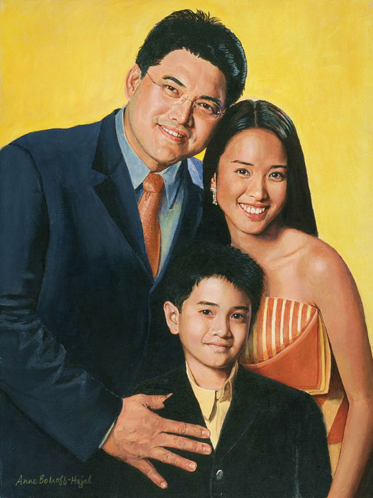
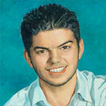
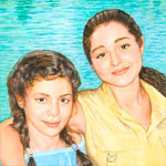
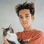
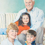
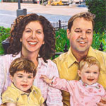
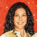
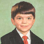
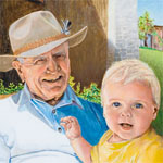
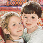
The heart of my portrait style is capturing human connection. Because portraiture is a visual medium, this means portraying how people communicate with each other visually: through facial expression and body language. The truest “recording” of these often-fleeting expressions is frequently family snapshots (to read more on my unorthodox view of snapshots, scroll down to my last post, or click here.)
Using a family snapshot as the basis for a fine art portrait can present artistic challenges that wouldn’t come up with photographs taken under controlled conditions (the procedure usually followed by portrait painters today). One of the most common elements of snapshot images is the flash, which often creates seemingly unpromising lighting for portraiture.
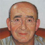
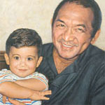
The snapshot below, a quick candid taken of Chief Maurice Zard as he relaxed after an enjoyable family outing, was the basis for my portrait of him. It provides a perfect example of the technical challenge of flash lighting. It also illustrates perfectly why I am committed to finding bold artistic solutions for problems raised by cherished snapshots
Chief Maurice Zard, of the Zard Group of Companies in Nigeria, is a highly successful businessman who is continually absorbed by his many commercial, manufacturing, and philanthropic concerns. He did not want to sit still for even a few minutes to have his photograph taken under good lighting conditions, let alone sit for his portrait!
Meanwhile, the family had this snapshot, which his daughter felt captured the gentle smile that is most profoundly her father in his relationship with her. Because of her feelings, I felt it was important to base Maurice Zard’s portrait on this snapshot, and to turn to artistic advantage the challenges posed by the flattening effects of the flash.
Classic portrait lighting
In classic portraiture, the use of pronounced shadowing of some substantial portion of the face is considered crucial to creating the illusion of three-dimensionality on a two dimensional canvas. Tom Edgerton has expressed this view very well in the Artists’ Forum of portraitartist.com:
“I want to stress how really important shadow shape is. Accurately painting the … shape of the shadows, goes more toward capturing and defining form on a two-dimensional surface than anything else…. Anywhere in the general area [of] a roughly three-quarter direction off of center is the optimum placement for the light to describe form and mass. More shadow on the face [than given by the three-quarter lighting placement] diminishes the available contrast range to describe form, as does light coming directly from the viewer’s point of view–in other words, flash-lit photos…. The flat lighting from the camera-mounted flash kills all available shadow, and the contrast range available for describing form drops to nil.”
— Tom Edgerton, two-time finalist in the Portrait Society of America’s national competition
http://forum.portraitartist.com/showthread.php?t=4355
Below is an example of strong shadow cast by classic three-quarter lighting – both on the face and on the wall behind the subject – creating a wonderful portrait of Charles Volkers by Sandra Lawrence.
Jonathan Linton’s portrait of Chad in my first post is another beautiful example of classic portrait lighting.
Pam Powell, another portraitist, agreed with Edgerton in the portraitartist.com forum: “The use of all-over ambient light makes it much harder to create the appearance of three dimensions, as it tends to flatten the form, so you have to be very subtle and diligent with the value changes. My examples here are William Merritt Chase (ambient light) and Zhaoming Wu (strong single light source).”
Powell’s examples of the difference between low- and high-contrast lighting make the point so perfectly that I’ll include them here:
The focus of the high-contrast-lit painting on the left is the different shapes and forms – hip, leg, arm, breast – that make up the woman’s body. The background in this painting is secondary. The fabrics surrounding the woman’s body produce an airy quality which is perceived peripherally.
Flash solution ideas gleaned from ambient-light paintings
In the low-contrast-lit nude painting on the right, in contrast, the body appears as more of a two dimensional shape that interplays rhythmically with the other shapes around it: flowered fabrics of various colors. Although the nude is portrayed in full realistic detail, its lack of 3-dimensional modeling makes it easy to experience it as an abstract form among other abstract forms that are almost as central to the painting as it is.
Thus, this low-contrast-lit painting – while not itself lit by flash – gives us a clue as to how fine art portraitists might make an artistic strength of the flatness that results from flash photography. The face of the portrait subject may be treated, at least in part, as one abstract element among several in the painting.
(Of course, paintings in high contrast lighting can also be analyzed as being made up of abstract forms interacting with each other. But it’s likely less the point of the painting than may be so in low-contrast light.)
Interestingly, a number of British portraitists, members of the Royal Society of Portrait Painters, sometimes choose low-contrast lighting on their subjects’ faces. Often these paintings also have patterned backgrounds or other important, complex elements against which the subjects’ flat-lit faces play. While none of these paintings are based on flash snapshots, their low-contrast, often frontal lighting can provide more ideas for how to handle artistically the flattening effects of flash. Below are several portraits by masters of this type of painting.
The first painting, by Graham Jones (who has painted portraits of British political figures in the House of Commons permanent collection), is of Lord Howe standing before elaborate patterned wallpaper.
A preeminent American portraitist, Ned Bittinger, has also used low-contrast lighting for some of his many major government and military commissions.
Here we see the effectiveness of flat, frontal facial lighting playing off elaborate military uniforms. In these paintings, the focus is not on surface form of the men’s faces. It’s on the visual interaction between the faces and the medals, which describe the subjects’ life work, not simply their appearance. The comparative lack of three-dimensional modeling in the faces gives the medals more importance in the paintings.
The painting of Debora Lehr, below, is unusual in that its low-contrast-lit face is in complete shadow rather than complete light. Again, the flatness of the lighting on the face reduces the centrality of its purely-surface appearance. The fact that it’s in shadow brings forward the more brightly-lit Chinese buildings viewed through the octagonal window, conveying Lehr’s work as US State Department Negotiator for Trade with China.
Two more British portraits, by Keith Breeden (who has painted many public officials, academics, and business figures), are of David McMurray, Headmaster of Oundle School, and Major General Adrian Lyons.
In each of these portraits, the multiple vivid colors Breeden used to paint the faces – in the almost total absence of shadow – relate to and play beautifully off the backgrounds of, respectively, military insignia and carved lettering. In each painting, the men’s clothing brings in a large, bold area of contrasting color. These are two spectacular, unusual portraits, great examples of flat frontal lighting.
A last low-contrast-lit painting with multiple complex elements is by Derek Clarke (an elected member of the Royal Society of Portrait Painters for almost 60 years). The subject is Dr. Aileen Low.
Again, the clothing and background elements play almost as important a role in the painting as the face does. And as in Breeden’s paintings, Clarke has used vivid color in the flesh tones – very discernable pinks, yellows, green and lavender – to define and enliven the face in the almost total absence of shadow. I don’t think anyone would doubt the three-dimensional quality of Dr. Low’s face in this painting, in spite of its almost total lack of shadow.
So both in this portrait and two by Breeden, we’ve observed another idea for how we might artistically define three-dimensionality of faces in portraits based on flash snapshots: the use of heightened color in place of shadow.
The last low contrast face I’ll look at is different from all the rest in that it has little surrounding pattern playing off the flat-lit face. What this painting has instead is the most intriguing, highly specific facial expression of any of the portraits we’ve looked at so far. Its subject is Theater Manager Mathew Russel, painted by Graham Jones.
While the subjects of the other portraits we’ve looked at have little expression, this subject is highly involved with the viewer. The central message of this painting is not its subject’s three-dimensional form or an interplay of shapes, but Russel’s unique, very intriguing way of connecting with people.
Beck’s summary
Portraitist Clayton J. Beck III, another PSOA award winner, wrote a portraitartist.com entry that very briefly summarizes – without grinding any one lighting axe – the uses of various types of portrait lighting. (The emphasis is my own):
“As for lighting a subject, you must first understand what… you’re trying to bring out. If you’re interested in the solidity and the form of the object, [then the three-quarter] type lighting is probably very good. If you’re more interested in color or expression or any of a number of other things that we try to bring out of our subjects, other lighting make more sense.
“A flat lighting, that which comes from behind the painter, such as with Nicolai Fechin or Holbein, emphasizes an overall color design. Other times available light, such as we see in “snapshot” photography, gives a life and spontaneity to the subject that is gotten no other way.”
Painting Chief Maurice Zard
The artistic solutions I found for Maurice Zard’s portrait evolved organically as I painted. I eventually used all the strategies mentioned above.
As every artist knows, one of our most important right-brain skills is to know how to recognize a lucky accident when it happens, and to take full advantage of it. From the early planning stage, I knew I would change Chief Zard’s shirt color, because it would not enhance his flesh tones in the painting. I began by simply painting the shirt gray (it later evolved to a more nuanced blue-gray with raw umber-based stripes). I suddenly realized that the interplay between the abstract areas of warm color (the flesh tones and the leather chair) and cool (the shirt and wall) would form the basic rhythmic structure of the painting. While the patterns around Chief Zard are not as complex as those in some of the paintings we looked at above, the stripes of his shirt and the way the areas of warm and cool color dance around each other provided a similar effect.
As I focused in on painting Chief Zard’s face, I confronted the full challenge of the flat lighting. One of my strategies was to heighten every color nuance I could find in his flesh tones, using tiny brushes with bits of different colors. Greens, lavenders, yellows, pinks – all can be seen in this close-up.
At the same time, I wanted this painting to “read” from across the very large room in which it would be hung. For this, the best technique would have been that missing commodity, form-defining shadow. As Tom Edgerton described the delicious, almost miraculous effect of deepening shadow in his Artist Forum entry, “As a result of this discussion, I walked over and incrementally deepened and simplified the shadow under a subject’s nose, and everything in the painting suddenly became a lot deeper and more three-dimensional.” I also incrementally darkened all the shadows that existed in the Zard portrait, pushing each as far as I could without creating something that looked false. After countless layers of adjustments, taking care to balance every change with all other elements of the face, this portrait reads from a surprising distance across a large room, through the door and out into the entry hall of the Zard home.
In the end, I felt I had achieved my goal of creating a portrait of Chief Zard that was both pleasing to the eye, and captured his unique, appealing expression, by which he relates to his family and others around him.
Images in this post can be found online at:
Portrait Artist forum entries:http://forum.portraitartist.com/printthread.php?t=4355&pp=40
Ned Bittinger’s portraits: http://www.portraitartist.com/bittinger
Keith Breeden’s portraits: http://www.therp.co.uk/pages/artists_cvs/breeden.asp?art=5
http://www.commissionaportrait.com/artistsportfolio.asp?id=10
Graham Jones’ portraits: http://www.therp.co.uk/pages/artists_cvs/jones.asp?art=15
http://www.commissionaportrait.com/artistsportfolio.asp?id=42
Derek Clarke’s portraits: http://www.therp.co.uk/pages/artists_cvs/clarke.asp?art=7
Sandra Lawrence’s portrait: http://www.sandralawrence.co.uk/Portraits.htm
