Archive for the ‘Drawing and painting’ Category

Learn to Draw by Playing the Angle-Abstraction Game: Lesson 1

Friday, April 23rd, 2010

In this post, I’m going to begin to show you how I do quick life drawings.  If you’ve always wanted to learn to draw, or just to improve your drawing skills, playing this Angle-Abstraction Game will probably help you quite a bit.

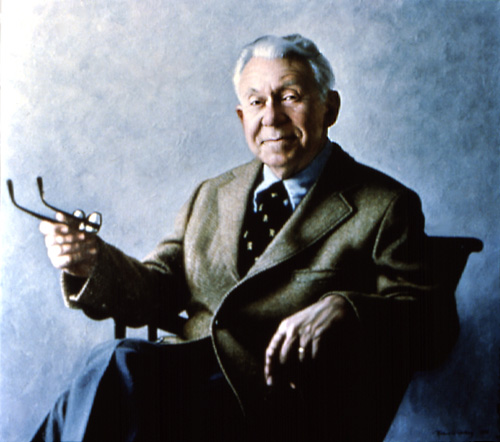
To demonstrate my process, I’ll use one of my 2-minute life drawings of Don Duga, of the School of Visual Arts in New York City.

My 2-minute sketch of Don Duga

My 2-minute sketch of Don Duga

Don used to run a monthly life drawing session for members of East-Coast ASIFA (the international animation society).  One night the model didn’t show up, so Don posed for us himself.

Since I can’t post the actual Don here to enable you to see the 3-dimensional model I was drawing from, we’ll have to do this lesson from my sketch alone.

The goal of quick life drawings is to learn to sketch  people within a few minutes or seconds, which is all the time artists often get in real life.  You’re not going for detail here.  You’re learning to make fast sketches that convey a solid body with limbs, head, and torso positioned in ways that are viable in real life.  (There are also more detailed life drawings – an example of one of mine is toward the end of this post.)

My personal key to success in life drawing has been learning to abstract the way I see.  I view the pose as a series of angles and shapes, either positive (the person) or “negative” (the space around the person).  I’ve named this the “Angle-Abstraction Game.”

It may sound technical and inhuman to focus on angles and shapes when drawing a living person.  But abstracting the way you see is paradoxically the best way to capture the unique posture of each very special human being.

Let’s get started with the lesson.  You might follow along step by step below with your own drawing to get a better feel for what I’m describing.  Boiled down, this process begins with drawing a simple shape, in this case an oval.  You are then able to draw lines emerging from this shape which correspond to various elements of the body.  With each added line, you build exponentially more reference points from which to base your next lines and angles.

Astonishingly, from this mess of geometry, a human form will appear.  The magic moment when it suddenly does is the reward for forging through any difficulties that precede it!

DonSketchHeadCloseup

Don Duga sketch detail

I often begin a life drawing with a rough egg-shape for the head.  For many poses, this is the easiest way to orient the rest of the piece.  (In the figures below, each line is color coded to match the text describing it.)

In the finished sketch of Don, you can see the lines of my egg faintly under the facial detail I added later.

The important thing with the egg is to set it at the correct angle.  Here’s your first moment of abstracting what you’re seeing.  Look at the head purely as an oval that’s tilted at some angle or other.  Forget hair, forget facial detail – forget even that this is a head.  Just play this game with yourself: Can you get that oval tilted properly?  What direction is it tilted?  Straight up and down?  Toward left or right?  Bent way over or only slightly bowed?

(Oh, and place the head on the paper roughly where it is in the pose, so you’ll have space on the page for the rest of the body.  In this case, Don’s head needed to be placed in the upper left of the page.)

Now quickly add a single line along the side of your oval, indicating the front plane of the profile.   Don’t worry yet about the nose or eyes or anything else that makes this a face.  Just look at the fundamental flat plane of the face and play the angle-abstraction game with yourself: what is the angle of the plane on the front your model’s oval? How closely can you replicate it on your paper?

DonDugaColoredPathsStage1A

Now add a line indicating the underside of the chin, using the same angle-abstraction game.  Last, really look closely and add a quick line for the neck.  Forget that it’s a neck.  Just ask yourself: Where along the bottom of your model’s oval does that line emerge?  What angle does it slant at, and how long is it?  Getting these angles down accurately on your paper will help you accomplish the entire rest of the drawing.

Don Duga sketch detail

Don Duga sketch detail

Continuing to move as rapidly as you can, look at the top edge of the model’s outstretched arm.  Forget that it’s an arm.  See it as a line that emerges from the face-plane line.  Play your game:  Where along the face-plane does it emerge?  What angle does it form?

In this particular pose of Don’s, this line emerges at the level of the chin and moves to the right, slanting gradually downward.

How long should this line extend?  As you practice drawing, you’ll get better at sensing how long lines should be.  Meanwhile, you can use the head oval as a rough measuring unit: the line is about twice as long as the width of the oval it’s emerging from.

DonDugaColoredPathsStage2A

When I drew the line, I put a bit of a bend in it (where shoulder meets arm).  But fundamentally I knew where I should draw it because in my mind’s eye, I was seeing it as a line emerging from the face at an angle which I could easily replicate on the page.

Don sketch detail

Don sketch detail

Now quickly move to the other shoulder.  Play the game with yourself:  Where does the line of that shoulder emerge from the other side of the head-egg?  At the same level as the first shoulder line?  Above it?  Below it?

And what angle does it form?  Does it slant up or down as it comes out of the egg?   Draw it.

Next, look at the outside line of the arm at the farthest left side of the pose.  What angle does that form with its shoulder line?  Draw it.

Here you may notice that I first sketched a straight line to help me get the angle accurately.  I then drew a second line, more bowed, to follow the curve of Don’s shirt sleeve.

DonDugaColoredPathsStage5A

Things are really getting interesting now because you have so many reference lines built up!  From now on, you have a bunch of options for lines nearby to determine where each new one should be placed.

Next I moved to the line of the front of Don’s shirt.  First of all, ask yourself where the top of Don’s shirt front should begin.  Where is the top of that line in relation to the head oval, for example?  You can easily figure that out by imagining a plumb line dropped from the farthest-right point of the head-egg.  You can see that I first sketched in that “plumb line” exactly vertically.  But then I realized it shouldn’t be straight up and down.  It’s tilted.

So back to my game:  How could I quickly determine the proper tilt for Don’s shirt front?   I noticed that it’s the same as that of the face profile plane.  So I drew that line parallel to the face plane.

As you draw, you may choose other reference points than the ones I chose.  That’s great!  The important thing is that you are finding relationships in lines that have come before which make sense to you as guides for each new line you draw.

Don Duga sketch detail

Don Duga sketch detail

We’ve now reached a moment that’s always a lift to me: a negative space enclosed by the model’s body.  In this case, it’s a triangle.  (Can you find it in the sketch to the right?)  To me, a triangle is always easier to size up than a line because a triangle has volume.  A line is a wispy thing floating in emptiness, but a triangle has dimension!

(By the way, the order I’m following here is not preordained.  As you practice on your own with other models, you should move through shapes and lines as you notice their relationships to what you’ve already drawn.  Try to cover the entire body very quickly using basic shapes.  Only after that should you go back to add as much detail as you have time for before you model shifts position.)

Probably the easiest way to generate the triangle bounded by Don’s shirt, arm, and thigh is to first sketch the bottom edge of the arm.  Play the game with yourself:  At its left end, where on Don’s already-drawn shirt front does this line emerge?  Does it slant up or down?  What’s the rough angle of the slant?  At its right end, roughly how far from the upper edge of the sleeve should the lower line end (= how thick is Don’s wrist)?  Another way to check your drawing’s accuracy is:  If you envision the entire arm as a not-quite-complete cone lying on its side, what should its overall shape be?  How thick is the cone at its widest end, and how narrow at the other end?

DonDugaColoredPathsStage7Ab

Finally, complete the triangle by drawing the edge formed by the top of Don’s thigh.  Focus on the broad sweep of the long part of this line, ignoring for the time being the fact that folds in his pant leg create a dip in the line close to his shirt front.  Play the game with yourself: Where on Don’s shirt front does this line emerge on the left, how much does it slant, and where does it intersect with the bottom edge of Don’s sleeve?

Don Duga sketch detail

Don Duga sketch detail

Last, check your accuracy by looking at the overall volume of your triangle. Does it have the same rough size as the negative space bounded by Don’s arm, thigh, and shirt?  If not, check to see which of your angles or line-lengths is wrong and correct it.

Now let’s get the other side of Don’s torso marked.  I drew a quick curved line.  I used the shoulder on the left as one measure, and also checked whether I had placed this line so it divided the armtorso space accurately.  Would you use these same reference points?  What would help you draw this line accurately?

DonDugaColoredPathsStage8A

We’ve now formed a solid foundation of technique needed to achieve the first overall mapping of Don’s pose.   We’ll continue to apply this technique to complete the rough sketch in my next post, Learn to Draw by Playing the Angle-Abstraction Game: Lesson 2.

Isn’t an artist some one who can draw?

Monday, April 5th, 2010

Non-artists often admire artists’ ability to draw.  They wish they could learn how.   Many assume being an artist is mainly having the skill to draw realistically.

My sister Ellen

My sister Ellen

It is a lot of fun to be able to draw.  It’s fun to capture the reality of different shapes, textures, surfaces.  I especially love the moment of finally succeeding in capturing some one doing some activity.

But thinking that drawing is the main role of an artist is like assuming that the main role of a professional mathematician is adding and subtracting.   There’s a vast range of other skills that must be built atop the foundation of drawing, along with natural talent and a vision of what you want to create.

Like arithmetic for a mathematician, drawing is my most basic tool, the thing I’ve been doing since I was a little kid.  I grew up drawing all the time.  I used to pester my sisters endlessly to pose for me.  Here’s a drawing of my sister Ellen.  You can see she wouldn’t stay still long enough for me to add shading – I could only do a quick sketch before she’d run off and play outdoors.   

Fancy doll and ragged Raggedy Ann

Fancy doll and ragged Raggedy Ann

So I’d look for inanimate things to draw.  Here are two of my dolls.  They stayed still long enough for me to add detail to the sketch.

I’d set up still lifes using objects with different types of surfaces in order to figure out how to draw a shiny thing so it looked shiny, a furry thing so it looked look furry.  I would puzzle over how you could make a candle flame look as bright in your drawing as it does in reality.  How could I draw a transparent bottle to make it look transparent?

I drew in art classes in school – my ability in portraiture actually first emerged in a portrait I drew of a classmate.  I drew the kids I babysat for.  Their mother, thrilled with the likenesses, bought the portraits for what was for me a huge sum.

Actually, I drew in all my school classes, not just the art ones.  It was a great way to alleviate boredom.  My sketch book is full of drawings of the backs of classmates sitting at their desks, because that was all I could see in front of me.  Though in study hall I could draw them from other angles.  Below are a couple.  Again, these had to be quick sketches before my fellow study hallers shifted position.  I had minimal time for shading.

Two kids in my high school study hall

Two kids in my high school study hall

The most fun of all is life drawing classes.  I got a scholarship to attend a life drawing class when I was about 15 (I was the only kid in the class.  I had to get special permission from my parents because of the nude models).  In life drawing, you’re given varying amounts of time to draw the model in different poses.  Commonly, the amount of time is 5 minutes ranging down to 30 or even 10 seconds.  The idea is to train the artist to be able to capture the essence of a person’s position very quickly, because in reality people don’t hold the same position for very long – as I’d discovered with my sisters and the kids in study halls.

The second classic life drawing challenge is to practice realistically drawing a hand or foot that’s coming straight at you instead of being seen from the side.  Artists need to figure out how to draw people from all kinds of common but difficult angles without ending up with something that looks completely misshapen.

Below is the last drawing of the life drawing class I took in high school.  As a reward at the end of the course, we were given 45 minutes to do this drawing. Next to that is one of my quick crayon sketches of a rare male life model.  (Unfortunately, most life models are women.  I find that sexist.)

A couple of my life drawings

A couple of my life drawings

In short, drawing for me, and for many other artists, is the thing we started doing as far back as we can remember.   We need to keep doing it all our lives, just as mathematicians have to keep adding and subtracting.

But as in any field, there are many skills beyond the basics which the layperson may be unaware of.  In art, these other skills and talents, not just drawing, distinguish great artists from mediocre ones.  Many of my blog posts are about the range of these other skills and talents.  Many involve artistic sensibility as well as knowledge, such as choice of color palette, medium, style, and subject matter; which elements of a scene you will include; the weight of each element compared all the others; lighting issues (the direction of the lighting, whether multiple light sources or one, quality of the light); and countless others.

Here is one example among the infinite number I could give of artistry over and above drawing.  Alexandra Tyng, a highly successful portraitist, has written on the PortraitArtist.com Forum about her  sophisticated method of thinking about and painting backgrounds:

The most important thing to keep in mind about backgrounds is that they are not actually separate from the figure. The background … is actually the air around the figure. It is three-dimensional space! It envelops the figure, surrounds it on all sides, and recedes from the picture plane to varying degrees….

Whether the background is plain or complex, the … figure emerges from the ground….

The key to achieving the illusion of “emergence” is to understand the roundness of the head (or figure) and the colors of the light in relation to the shadow. The side of the face in direct light gives the feeling of solidity and opacity. As the form turns away from the direct light, it picks up the indirect light or ambient light in the atmosphere. This indirect light is slightly redder than direct light. Crossing over the line into the shadow areas, the complement of the indirect light will predominate…..

An artist who uses Tyng’s approach to backgrounds will create a very different painting than an artist who approaches backgrounds differently.

The online Portrait Artist forum gives some idea of the many, many elements of artistry beyond simple drawing.  And keep in mind, this forum covers representational portraiture.  There are many other forms of art, and many, many other issues that artists must be skilled at in order to produce terrific art.

So if you’ve always wanted to improve your ability to draw, don’t view it as an end point, but as something to play with and experience.  Play with drawing every chance you get.  Draw different types of things – animate and inanimate, shiny and dull, smooth and rough.  See if your friends or loved ones will pose for you.  Set up your own still lifes to challenge yourself with different types of objects.  Go to a park, beach, sports or music event and practice very quick sketches of people doing different activities.  Take a life drawing class if you can and if it seems appealing.

And view drawing as one fun stepping stone on your path as an artist.

To paint smiles or not to paint smiles: Where do you stand?

Thursday, June 4th, 2009

“…the truth is, it’s hard to suggest freedom of choice for artists and [then to] advocate hard and fast rules.”
Timothy C. Tyler

___________________________________________________

One rule many portrait artists follow is to never paint their subjects smiling, especially if the smile is wide enough to reveal their teeth.  These artists generally feel that since a smile involves muscle contraction, it produces uncomfortable tension in the portrait.  A fully relaxed face, they feel, allows the viewer’s gaze to wander over and appreciate the subject’s features.  Some portraitists contend that only the unsmiling face can have lasting appeal across many years.  The wonderful contemporary Dutch portrait painter Rene Tweehuysen wrote, “A broad smile (showing of teeth) is not really to be recommended, and in the long term can lose its appeal.”  American Bart Lindstrom said: “Great art is about subtlety. That’s why, when I paint portraits, I prefer the quiet, timeless expressions of a relaxed face over one with a large smile.”

The historic development of photography has made it much more possible for artists to paint fleeting facial expressions, including smiles. Some top portrait artists are now painting smiles full of character.

portrait

Will by Simmie Knox

Catia Chapin by Everett Raymond Kinstler

Today’s portraitists’ widespread use of photos as reference tools has added a new twist to the debate over whether portraitists should paint smiling subjects.  Margaret Carter Baumgaertner, a leading American portraitist, has provided a quintessential description of the limited role traditional portraitists feel photography should play:

Clare

Clare by Margaret Carter Baumgaertner

“My policy is to work from life as much as possible. In the event that one needs to work from photographs, the photographs should represent life. When taking photographs, I place the subject in a pose that they could hold for 40 hours if they had to. Some people I paint with a pleasant smile. But the photographic “Say cheese” smile is actually a fairly recent phenomena. You want to stay away from the candid shot. Something that obviously came from a camera.

“What do you do if the client insists that there be a big grin?  I talk them out of it. I explain, in a very nice way, that we are making a painting not a photograph. I bring a big book of masterful portraits (Sargent, the Early Portraits is a very nice volume) as well as my portfolio, and ask them to envision what their painting will look like. I explain that if we do a big grin, we can’t see their child’s beautiful eyes. I explain that in time they might become tired of seeing this toothy grin, while if we have a more pleasant smile or contemplative look, that they will be drawn into the eyes, the mood, the moment of the painting. I explain that we are creating something that their great grandchildren will cherish, that we are together producing a work of art that might someday hang in a museum.”

Mary by Linda Nelson

A lively debate over portrait smiles and teeth has taken place on the online Portrait Artist Forum, marshalling the best arguments on each side.  It’s very worthwhile reading through this thread because whichever type of portraits we paint, we can learn something from “the other side” to apply to our own work.

For example, Alexandra Tyng feels that wide, toothy smiles often appear static, while other artists note that smiles distort some facial features, e. g. making the eyes smaller.  On the one hand, I personally feel that the “distortions” caused by smiles, looked at from another perspective, are actually our language of emotional communication.  At the same time, the Forum discussion reminds me that however we paint, we need to be sure our subjects’ faces don’t appear static, and that their features, especially their eyes, aren’t obscured by facial expressions.

One Forum participant gave an intriguing, insightful explanation of why some artists might feel broad smiles cause unease in the viewer:

“Subconsciously, we know that a photo was taken in a fraction of a moment, and so smiling that long is normal….  A painting, however is not done in a fraction of a moment. It takes hours of work to complete. So a big smile is “unnatural,” as it would logically be impossible for the sitter to have sustained it. [W]e’re subconsciously bothered by the logic.”

Other portraitists in the Forum point out that many famous paintings portray positions that could not have been held for more than a fleeting moment.  These paintings, wrote Michele Rushworth,

Saint George and the Dragon by Rubens

were meant to convey a transitory moment.  I was studying Rubens’ Saint George and the Dragon the other day, which I have attached as one example.  I wouldn’t avoid painting smiles simply because people can’t hold one for thirty hours. The model for Saint George didn’t hold his arm in the air for thirty hours either.

Leslie Ficcaglia observes,

No one can sustain a natural-looking closed mouth smile for very long either; it ends up looking forced and stiff….  The same argument … could be applied to many classical paintings, including Degas’ ballet series…; no one maintains a ballet stance that long either.  Brueghel … attempted to capture complex activities … as though they were frozen in time.  Eakins has a woman with her mouth open in song and a man in mid-leap at a swimming hole.

And there are those classic paintings of ships on roiling seas, yet waves can’t hold a pose.  Other Forum artists point out that Van Hals and even Sargent painted fleeting expressions, including smiles and teeth; examples are posted by Tyng and Mike Dodson here.

Leonardo Da Vinci wrote, “Try to be a calm spectator of how people laugh and weep, hate and love, blanch from horror and cry out in pain; look, learn, investigate, observe, in order that thou mayst come to know the expression of all human emotions.”  He dissected facial muscles of corpses, and the annotations he wrote to his anatomical diagrams reveal that he was trying to understand which muscles helped to create certain emotional expressions: “h [Lateral portion of the frontalis] is the muscle of anger; p [median portion of frontalis] is the muscle of sadness; … o t [procerus] is the muscle of anger.”  (You can see one of his facial muscle diagrams here.)

Rembrandt studied and drew himself with a variety of facial expressions: fear, anger, laughter.  You can see these sketches here (scroll up slightly to see the drawings).

There’s no question that in the days before photography, it was extremely difficult for artists to study their subjects’ fleeting expressions, including smiles, in order to paint them.  The time required to observe and capture them would have been prohibitive for many artists.

So in the centuries before photography, artists painted many more “holdable” expressions (or non-expressions) than fleeting ones.  I’ve written about this in previous posts, so I was delighted to discover that others in the Portrait Forum have had the same thought.  Rushworth wrote:

It seems to me that the reason the “old masters” painted more subdued expressions (no teeth) is because they didn’t have photographs to work from that captured those brief flashing smiles. We think of these traditional old portraits and that’s what has created the aesthetic we often try to emulate today.

Ficcaglia agrees: “if the masters had had Nikons we’d see a lot more teeth in their paintings.”

Another likely factor was observed by Michael Georges: in “‘Olden Tymes’ people generally lost their teeth quite early on. Those teeth that remained were not always the nicest to look upon.  George Washington was particularly known to have very bad teeth. In the civil war, the requirement for being a soldier was that you have two good front teeth to bite the paper casing off the bullet cartridge.”  Marvin Mattelson concurred: “The old masters probably didn’t paint smiles because most of their subjects were missing their teeth.”

So when today’s portraitists strive to emulate the look of masterpieces over a century old, their painting must appear to be created entirely from live sittings.  There can be no teeth or real smiles because a broad smile is a giveaway that photos were used.

I suspect that another reason portraiture in the US often tends to have a conservative esthetic is that many Americans commissioning portraits want to present themselves within an old world ethos.  They are striving to establish “aristocratic” credentials in a country too young and individualistic to have a centuries-old hereditary aristocracy.

By Andrew Tift

By Andrew Tift

Ironically, parts of the world with centuries of antique portraits on their manor walls are the most adventurous today in experimenting with new forms of portraiture (see Portrait Composition: Old World vs New? below). A British example by Andrew Tift takes toothy smiles beyond what I’ve ever seen by any serious portrait artist in the US.  I personally feel Tift’s portrait utterly captures the joyous, free quality of childhood.  (Tift is a winner of multiple British National Portrait Gallery awards, including first place in 2006.)

One of my favorite portraits of children was created by the Canadian David Goatley.  These boys’ fleeting expressions are highly specific to each child and to this moment. Generic smiles these are not.  The boy on the left has a gentle warm smile above his blue sports shirt.  His oldest brother nurtures the impish youngest one in an embrace.

Brothers, West Vancouver by David Goatley

To me, the very specificity of these boys’ expressions conveys far more understanding of their characters than would a standardized slack gaze.  This painting gives me a rich sense not just of who these boys are now, but also of what they may become as they grow up.  They are completely “at home in their skins” – a combination of masculine-sports-blue and warm caring for each other.  The way these boys are painted gives me a sense that they will grow up to be – well, the kind of men I would want my daughter to marry!

So for me, the decision about whether to paint a subject smiling – broadly or slightly, with or without teeth revealed – should be based not on a general rule, but on the character of that particular human being.  Every good portraitist seeks to reveal character as well as superficial appearance.  And I think people’s characters are visually revealed through their facial expressions more than in any other way.  The smile – including the toothy grin – is part of human beings’ infinite repertoire of emotional expression, so I would never want to rule it out as appropriate in portraits.

The smile may even be the expression most particular to each individual over their lifetime.  According to Gary Faigin, author of The Artist’s Complete Guide to Facial Expression, the smile is the second expression that appears in the human newborn (crying is the first).  And it’s “the expression that we carry the most intact from infancy to old age.”

The smile is also the expression of nuance.  There are more, and more subtle emotional shadings possible with a smile than with any other expression.  Smiles can contain elements of other expressions like sadness or anger, creating faces of fascinating ambiguity and complexity.

Like sadness, smiles can register as a powerful expression even when just barely visible on the face.  (Faigin p. 188)

*       *       *

As I think of my own artistic passion for human expression, it occurs to me that portraitists who favor unsmiling subjects often use the word “introspective” to explain their preference.  These artists find more truth revealed in the face of a person looking inward rather than connecting outward.  For example, Baumgaertner wrote, “most of my own favorite portraits are contemplative, reflective, and, at times, introspective.”

I happen to be a person who needs a lot of time alone to listen to and follow my own brain’s inner workings.  I can happily spend three or four workdays at a stretch alone painting, researching, or writing.  I wonder whether my need for aloneness during work time is part of what results in my personal preference for subjects who are engaging and connecting with other people.

Conversely, I wonder whether artists and clients who need to be out and about in public more than I do prefer quieter, more contemplative subjects.  After being around the hustle and bustle of life, perhaps these extroverts are looking for some quiet introspection.  It would be interesting to hear from different portraitists about whether their underlying values regarding extroversion or introversion in their portraits relate in any way to their own basic temperaments.

*        *        *

While I can find wisdom in most of the arguments in favor of unsmiling portraits, the one rationale that makes no sense to me is the idea that only an unsmiling face can withstand the test of time.  I’ve never seen any evidence provided for this claim (please write a comment if you have some!).  What I know is that the portraits I’ve painted of my own children all involve very characteristic smiles – toothy or subtle – that have never ceased to enchant me over the years.  The two photos of my son and daughter that I would run back into a burning house to rescue each have joyous, toothy grins that capture the entire essence of their childhood in a single image.

*        *        *

Because smiles still appear in a minority of portraits, I’ll close this post with a few more images of them (click on these images to go to the artists’ websites, where you can find more of their smiling portraits).

Mabel Caruth by Everett Raymond Kinstler

Margaux

Margaux by a Portraits, Inc artist

portrait

Jonathan by David Beal

Louis W. Sullivan, MD Chair, National Health Museum, by Everett Raymond Kinstler

Sumantra Ghoshal by Laurence Kell.  Commissioned by London Business School

Sumantra Ghoshal by Laurence Kell. Commissioned by London Business School

portrait

Robert Guriton by Dean Paules

portrait

By Tom Donahue

portrait

Ben by Dean Paules

Mrs. Tony Bennett by Everett Raymond Kinstler

I feel all these subjects convey a sense of warm engagement.  I feel invited to interact with these very appealing people.  I’d like to spend a nice chunk of my non-alone time with each of them.

NOTE: Since I wrote this post a couple of years ago, a controversy has erupted over the 2012 portrait of Kate Middleton, in which she’s painted with a subtle smile.  This has brought a lot of new readers to this page.  I’d  like to steer readers to two discussions of the topic on other websites.  One is by the artist Katherine Tyrrell, on the British blog Making a Mark.  The other is on the facebook page of the portraitist Sophie Ploeg.  Each includes a lively discussion by portraitists such as Alexandra Tyng and others.

Postscript to Portrait composition: Old World vs. New?

Monday, September 22nd, 2008

When the portraitist begins by focusing simply on the subject’s surface image, of course the tendency is to place it front and center. When one begins by thinking about the subject’s other qualities and other objects central to his or her life, a more complex composition may naturally evolve.

_____________________________________________________________________

In the Comments following my blog entry “Portrait Composition: Old World vs. New?” portraitist Alexandra Tyng provided a link to a portraitartist.com forum description of her process in painting her mother, the architect Anne Tyng (see Comments below). I followed up with a further question to Tyng on the portraitartist.com forum. My question related to both her portrait of her mother and that of the artist Edna Andrade:

“How did you make the decision to include an element that would necessitate placing the subject’s head relatively low on the canvas, with the element extending substantially above the head?”

Portraits of Anne Tyng and Edna Andrade, by Alexandra Tyng.  See earlier post for larger image.

Portraits of Anne Tyng and Edna Andrade, by Alexandra Tyng. See earlier post for larger image.

Tyng wrote such an interesting response that I asked her permission to quote it here. She agreed. Here it is:

“To answer your question, I don’t ever think, ‘I’m going to try a portrait with the head placed lower in the composition.’ The placement of the figure comes about on an individual basis, and is a direct result of what I want to say in that particular portrait.

“In the portrait of my mother [an architect], I wanted to emphasize that she is a very small woman with large (great) ideas. I started imagining what a portrait of her would look like, and ideas came to me. She always made a lot of geometrical models that hung from the ceiling of her studio. She also designed some unbuilt structures, my favorite being the Philadelphia city tower project. I played around with ways to arrange these elements in the composition, which led to deciding on the dimensions and size and placement of her figure.

“With the portrait of Edna Andrade, it just naturally happened that she had a very large painting in her living room that I wanted to use for a background. To give a sense of the size and impact of the painting I needed to move it close to the picture plane. She had Victorian furniture (inherited from family) whose shapes echoed the shapes in the painting, and I thought it was an interesting play between her traditional Southern background and her very contemporary work. She wanted to be seated in the portrait so it just worked out that way. The way I arrange compositions is mostly intuitive. A lot of times I see something that will work, that says what I want to say. There are limitless possibilities for placing the figure in a composition.”

I felt it was instructive that Tyng started the process of determining the composition for these portraits by thinking through the more abstract qualities of her subjects, not just their physical appearance. I suspect many portrait artists – myself included – tend to begin with the surface image of the subject, rather than right-brain associations with other qualities of the subject – the small woman with great ideas building models she hangs from her studio ceiling. When the portraitist begins by focusing simply on the subject’s surface image, of course the tendency is to place it front and center. When one begins by thinking about the subject’s other qualities and other objects central to his or her life, a more complex composition may naturally evolve.

For Edna Andrade’s portrait, Tyng began with shape components first – their similarity in the modern painting in the background and Andrade’s Victorian furniture. This then became a reference to the more abstract qualities of Andrade’s traditional Southern background and her very contemporary style of painting. The complex associations between shapes generated a wonderful composition and portrait.

Postscript to The engaged subject Part 1: Expression of emotions

Wednesday, September 17th, 2008
Portrait of Olivia by Judith Dickinson. See post below for larger image and discussion of painting.

Portrait of Olivia by Judith Dickinson. See post below for larger image and discussion of painting.

After posting my last blog entry, I emailed Judith Dickinson, who I’d never met or talked to before. I asked her how she had decided to include the large empty space around Olivia, the little girl whose portrait I analyzed in “Expression of emotions”.

Judith emailed back such a perfect description of her intent in the painting that I asked her permission to add it here, which she readily gave. What she wrote to me expresses clearly and easily what I had struggled to find words for:

“I wanted to convey this small little girl alone in this long hallway and yet she is not distressed; in fact she is intently and comfortably aware of the bigness of life around her. [I wanted to portray] her courage and peaceful contemplation in such a “lonely” surrounding.”

So the feelings Dickinson sought to convey in Olivia’s portrait were exactly what I received in viewing it. The fact that such emotions are visible even in her small, 72 dpi website image of the painting tells me how successful Dickinson was in conveying what she wanted. She used every element of the portrait – Olivia’s face, body, and clothing, and the overall composition of the painting – to express her meaning.

Interestingly, Dickinson’s painting merges the two subjects I’ve written about in recent posts: the expression of emotion in portraits, and the use of very large space around the subject. The way Olivia relates to the empty hallway around her – her facial expression and the way she holds her body in the space – adds to the emotional impact of the painting.

By the way, looking at the painting again, I’ve realized the importance of the distance between Olivia’s uplifted chin and her hands in expressing her openness to life. While her arms are relaxed, they’re also stretched out as far as possible in pleasure, framing her little torso. The chin, raised as distant as doable from her hands, exposes her torso maximally, leaving her little body entirely, self-confidently open to whatever will come.

The engaged portrait subject Part 1: Expression of emotions

Saturday, August 30th, 2008

“The face is the primary signal system for showing the emotions”

Portrait of Mrs. Irondell & granddaughter, by Simmie Knox

Portrait of Mrs. Irondell & granddaughter, by Simmie Knox

portrait

Detail of Mrs. Irondell

This spectacular painting by American portraitist Simmie Knox (most famous for painting the official Presidential portraits of Bill and Hillary Clinton) is, to me, one of the ultimate role models for the creation of profoundly humanistic portraits. The expression of pride and suppressed merriment in Mrs. Irondell’s face conveys so much more than if she had been painted in a traditional pose gazing into the middle distance. Her clothing and surroundings express elegance and wealth as well as any more formal portrait, but the look on her face – and that of her mischievous granddaughter – raises this portrait far above the standard pose.

To capture this kind of expression in a painting is no easy matter. To begin with, it’s impossible for a subject to produce an expression like this on demand while an artist paints. I don’t know how Knox created this portrait, but it’s hard to imagine he didn’t look at photographs to help. (To read my earlier entries on photography, click here.)

In addition to photos, there’s another resource that can help in painting human expression. The human face generates expressions via many different muscles functioning together under the particular flesh of each person. So for an artist to paint expressions, it’s important to have a working knowledge of the basic facial movements that create them.

Because my own central aspiration in portraiture is to learn ever more about how to fully convey human expression, I’ve relied on THE ARTIST’S COMPLETE GUIDE TO FACIAL EXPRESSION, by Gary Faigin. This book analyses the myriad movements of facial muscles which construct the expressions we recognize as joy, fear, anger, disgust, surprise, sadness, and various nuances of these emotions. In a future blog post, I’ll describe the crucial role Faigin’s book played, for example, when I faced the challenge of painting an impish little boy based on a terribly over-exposed family photograph.

In addition to my trusty copy of Faigin, my daughter Nastassia Hajal, a Ph. D. student in Child Clinical Psychology at Penn State, recently introduced me to another book about facial expression: UNMASKING THE FACE, A GUIDE TO RECOGNIZING EMOTIONS FROM FACIAL EXPRESSIONS, by Paul Ekman and Wallace Friesen. It’s used by psychologists researching e. g. mothers’ emotional responses to their babies. (I later discovered that Faigin himself had utilized Ekman and Friesen’s work in his ARTIST’S COMPLETE GUIDE.) Ekman and Friesen’s roughly 45 years of research on human expression have been funded by the National Institute of Mental Health.

But why should portraitists bother studying movements of muscle or flesh or anything else? Isn’t portraiture about stillness? Don’t portraitists almost always paint their subjects in repose, sitting as motionless as humanly possible for the painter? Why not leave facial expression to other kinds of artists who deal with that sort of thing?

My emphasis on human expression in portraiture is not the traditional view, nor is it widely accepted today as the primary goal of portraiture. Much of the accepted “wisdom” about expressionless portrait subjects is based on our collective image of a person posing immobile for hours while an artist paints them – an image which is no longer generally true because most portraitists nowadays work from photographs. But one way or another, there are portraits created which – like the ones we will look at below – capture uniquely wonderful facial expressions.

To me, the most miraculous aspect of the individual human face isn’t its surface appearance, but its capacity to convey true human emotion as nothing else can – not words, not any other part of the body. Ekman and Friesen note that many professionals such as trial lawyers must learn to focus on visual signals from the face because words can lie while faces usually cannot.

Both facial expression and words, wrote Ekman and Friesen, are used for communicating information among people.

“Words are best for most messages, particularly factual ones. If you are trying to tell someone where the museum is, who played the lead in that movie, whether you are hungry, or how much the meal costs, you use words….

“Words can also be used to describe feelings…. Here, however, the advantage is with the visual channel, because the rapid facial signals are the primary system for expression of emotions. It is the face you search to know whether some one is angry, disgusted, afraid, sad, etc. Words cannot always describe the feelings people have…. If some one tells you…he is angry and shows no evidence facially, you are suspicious. If the reverse occurs and he looks angry but doesn’t mention anger feelings in his words, you doubt the words but not the anger.” (18)

If emotion is better expressed visually than through words, how about the rest of the human body? Do we see emotion expressed through movements of the body’s muscles?

Ekman and Friesen’s research shows that emotions “are shown primarily in the face, not in the body. The body instead shows how people are coping with emotion.” The body might be tense, constrained, withdrawn; it may attack physically. But none of these body postures are unique to particular emotions. Ekman and Friesen wrote, “The face is the key for understanding people’s emotional expression, and it is sufficiently important, complicated, and subtle to require a book to itself.” (7)

Well, if facial expression is the primary locus of the most truthful emotional communication among people, shouldn’t it be the territory of portraitists? The human face is our turf! Now that photos help make it possible to paint fleeting expressions, we portraitists can move into this territory and stake our claim to it. The face holds the key to the highest peak of human experience. Why should portraitists – specialists in the face – cede its expression to other artists?

Now that I’ve vented on that subject, let’s see what insights Ekman and Friesen give us into Knox’s portrait. Here is is again:

portrait

What do the body positions of each subject in Knox’s portrait convey about how they will handle the emotion expressed in their faces? As we’ve said, Mrs. Irondell’s face conveys delight and pride, a sense of fulfillment in a life well lived. And what does her body tell us she will do about those emotions? Well, her arms quietly dominate the chair as they rest there. And her completely relaxed, non-erect body posture tells us she’s not going to do – doesn’t have to do – a damn thing but enjoy herself! This relaxed yet dominant body posture conveys a sense of life achievement as much as do her rich surroundings and expensive clothes.

Her granddaughter doesn’t yet dominate the piece of furniture she rests her arm on – it’s almost bigger than she is. But her mischievousness as she hides behind her grandmother clearly dominates Mrs. Irondell’s heart. The smile on the little girl’s face tells us she’s having fun sneaking up behind her grandmother. Mrs. Irondell is having a ball knowing perfectly well she’s there. The two people are fully aware of each other, able to relate intensely even though they aren’t facing, because they know each other so well. (Their close relationship is conveyed also by their hats, identical except for color.)

In this painting, Knox has captured expressions that may be fleeting, but in so doing, he has expressed the profound essence of the relationship between Mrs. Irondell and her granddaughter.

Let’s look at another portrait, this one by Colorado portraitist Judith Dickinson, which also captures a delightful facial expression combined with unique body posture.

Portrait by Judith Dickinson

Portrait of Olivia, by Judith Dickinson

Detail of Olivia by Judith Dickinson

Detail of Olivia by Judith Dickinson

This is one of the most charming portraits I’ve ever seen of a child. It captures something deeply true about childhood. The little girl’s eyes are somehow both dreamy and alert. Her chin is tilted up with gentle expectation and an unassuming sense that good things are ahead in her life.

What can we read in Olivia’s body about what she will do about the emotional expectations we see in her face? The very specific position of her arms, hands, and body gives me the sense that she has just sighed with contentment before settling into this pose. She is very relaxed, suggesting that she will move at her own pace and in her own time toward life’s pleasures. She is oblivious to the fact that her pretty dress is slightly twisted, in the way all children’s clothing is. Her feet don’t reach the ground, but she’s not wriggling to get them there.

(And harking back to my earlier post, Portrait Composition: Old World vs. New? – click here – the use of empty space above and beside the little girl adds tremendously to the feeling both of her smallness in the world, and of her sense that good things will come in their own time. They aren’t here yet – the space is empty for now – but her relaxed expectation tells us she feels they will come and make her life good.)

Portrait of Dean of Women Students, University College Dublin, by Conor Walton

Even official portraits can have wonderful facial expression. In this portrait of Carmel O’Sullivan, Dean of Women Students at University College Dublin, the face radiates intelligent warmth. The twinkle in O’Sullivan’s eyes makes me feel she’s the adult I’d want turn to if I were a student with a problem. One could imagine no better quality than this in a portrait of a college dean.

What is O’Sullivan’s body showing about how she will deal with the emotion her face exudes? She is opening the door into her office, welcoming us in. Facing us all the while in her cheery outfit, she’s alert and ready to help. She’s holding a couple of books in her hand, including one about Rembrandt, conveying the sense that she will bring intellect and culture to bear.

To me, this painting expresses so much more about the relationships this Dean has with her students and peers than would a formal portrait in a traditional official pose.

Below are several more portraits that accomplish beautifully the portrayal of unique personal facial expression. You can click on any image to see a larger version on the artist’s website. I’ll leave the fun of analyzing these to you!

For myself, I hope that looking at these unusual and very special examples will help me learn to portray ever more complex and singular expressions in my own paintings.

Note: Please see Postscript for a wonderful interchange I had with Judith Dickenson on her painting of Olivia (above) after completing this post.

© Richard Whitney, Buster Navins.

Portrait of Buster Navins, by Richard Whitney

Ann, Countess of Yarborough, by John Ward

Portrait of Jordan, by Susan Strauss

Portrait of Olivia and Oscar, by Paul Brason, Royal Society of Portrait Painters


Adding to the drama of the sport

Sunday, August 10th, 2008

“Pleasing others is not a limitation unless one lacks imagination and personal integrity….”

I was very sorry to hear recently that Tim Allen-Wise has stopped painting portraits. For one thing, he created  one of the most unusual and elegant portraits I’ve seen:

Tim Allen-Wise, Untitled

I had looked forward to seeing more of his work.

In addition, Allen-Wise wrote one of the most intriguing portrait artist’s statements I’ve found (www.commissionaportrait.com/pdfs/213.pdf).

Before I get to that, though, a few words about his bio. Born in 1962, British Allen-Wise earned a BA in Psychology and Philosophy from the University of Exeter. He is a practicing Buddhist (I wonder whether that has something to do with his unusual artist statement). He studied at the West Surrey College of Art and Design, but considers himself largely self-taught. Among his portrait commissions are Irish Prime Minister Bertie Ahearne, Richard Branson, Lady McKearney, Lord Derwent, various Oxford types, and the Amir of Bahrain.

In his artist statement, Allen-Wise addressed a couple of issues that have niggled at me for a while. One is the opinion held by some in the art world that portraits painted by commission aren’t really art. Allen-Wise wrote: “To imagine that working for commissions is necessarily limiting is mistaken. Indeed, the achievements of commissioned artists such as Velazquez and Sargent disprove this misconception.”

Another of my niggly issues is the relationship between painter and client, also addressed with rare wisdom by Allen-Wise, as we’ll see below.

The background against which Allen-Wise wrote his artist statement is the widely-held view that portraitists must be careful to maintain control over artistic decision-making in the creation of a portrait. I’ve heard portraitists say it’s their role to explain to clients that certain standards – e. g. the slack, unsmiling face when the client asks for a smile – are imperative in creating a portrait that will stand the test of time. Some sign paintings with only their initials if they feel they have had to compromise their art to please a client in order to pay their bills via a commission. That way, the reasoning goes, artistic posterity will know that the portraitist did not consider such paintings to be art, only commerce.

This view seems to define art as separate from the client’s wishes.

Allen-Wise, in contrast, turned this perspective inside out. His artist statement defines artistry in a way that doesn’t involve artists’ control:

“The profound and skillful artist can please themselves and others without compromising either. To please oneself in ones painting and simultaneously to please a client is an interesting discipline. It is no limitation – it only adds to the drama of the sport. To do this well is not easy….

“I also disagree with those who say that any interests an artist has beyond pleasing himself are corrupting. Pleasing others is not a limitation unless one lacks imagination and personal integrity….”

In other words, says Allen-Wise, it takes greater artistic profundity, discipline, imagination, and integrity to create a work of art that meets all the client’s wishes along with the artist’s. The creative agility and versatility needed to please both involves far more artistry than does the artist insisting their own training trump the client’s sense of what is meaningful to them.

Allen-Wise’s view reminds me of the idea that poets can find more liberation within the constraints of the sonnet form than when they take complete control over a poem’s structure. The sonnet form’s rigors spur the poet to greater heights of imagination to express what he or she wants to say within the given number of lines and rhyme scheme. In the same way, I believe that the wishes of a client can spur an artist to greater heights of artistry and imagination in order to embrace them.

There are, after all, infinite ways a beautiful portrait can be created, if one has the imagination to envision them. I don’t believe there are formulas that a portrait must always follow. To me, constant adherence to artistic rules is the death of artistry, not the manifestation of it.

I’ve always tended to feel the client may have their own pretty good sense of what will please them in the long run. I think that, if I enter into the clients’ heart and soul, I will find my way toward artistic solutions that will meet a client’s deeply-held wishes.

Allen-Wise has made me think more directly about vague ideas that have been floating through my brain for a while. These days, I’m beginning to wonder whether – at least for me – the work of art might include the web of connection between artist, client, and subject: the human desires of the subject as well as of the artist. As Allen-Wise says, he disagrees with “the many artists and commentators who wish to separate art from the straightforwardness of human feelings.”

So it seems the concept of “artistry” in my mind may be expanding beyond the physical canvas to embrace the relationship between artist and client. What is art? Is it paint on canvas alone? Or might artistry also include the artist’s skill in interweaving and merging the varying strands of human desire that precipitate into a painting?

Perhaps in my own view of what art encompasses, I’m becoming a bit Buddhist myself.


Portrait composition: Old World vs New?

Monday, July 21st, 2008

A client requested a portrait of her son’s family based on snapshots taken in a New York City park (click here for my earlier posting on painting from snapshots). In the photos, the family was surrounded by the park’s enclave of greenery. My client hoped I could also include the city street beyond the park, which appeared in another photo. Her son and his family might move out of the city some day, so she wanted their portrait to capture this urban chapter of their lives.

I resonated with the client’s feelings. I’m always eager to portray my subjects’ worlds in the backgrounds of their portraits. Additionally I wanted to include the cityscape because it was a complex, atmospheric visual element to play off the human subjects.

It also created an interesting challenge in the composition of the painting: In order to fit the street and buildings into the background, the family would have to be placed relatively low on the canvas. The city street would appear above them. And because they were sitting amidst a lot of very green foliage, the cityscape could easily end up looking almost like a separate painting stuck incongruously onto the top of the family portrait. Was it possible to create a unified painting with these disparate horizontal areas?

Subject placement in portraits today

The vast majority of portraits place the subjects’ head/s above the horizontal midline of the painting, often close to the top of the canvas. (Heads are most often centered from side to side.) The head is almost always the top-most visual element in the painting. This positioning leaves no doubt as to what is the most important element of the painting: the face and head of the subject.

This type of composition has of course generated many wonderful paintings over the centuries. Here are some terrific contemporary examples. Please click on any image to see a larger version on the artist’s website.

portrait

Portrait by Patricia Wilkes

Portrait by Jiawei Shen

Portrait by Ron Hales

Portrait by Ron Hales

holder

Portrait by Fanny Rush

http://www.artrenewal.org/articles/2007/Salon/hires/F-403.jpg

Portrait by Scott Tallman Powers

Portrait by Ying-He Liu

Portrait by Christopher Alexander French

Portrait by Toby Wiggins

But is this the only composition that can create a successful portrait? The internet allows a survey of composition in contemporary portraiture in the United States and Britain. Four major portrait websites, among others, provide images of many artists’ work:

  • For the US, PortraitArtist.com, and PortraitsInc.com.
  • For England, The Royal Society of Portrait Painters (therp.co.uk) and CommissionAPortrait.com. (These include artists from other European countries who are represented by these two British agencies.)

In my endless prowl for visual ideas, I’ve surfed through the work of hundreds of portraitists on both sides of the Atlantic (and some in Australia, China, etc). The more I’ve looked, the more I’ve perceived a pattern that I find surprising, intriguing – and puzzling. While it’s true that most portraits on both sides of the pond follow the compositional rules outlined above, our Old World colleagues seem to venture “outside the box,” as it were, more often than we do. Here are some of the many examples of portraits by British artists (and portraitists from other European countries represented in England) in which major visual elements appear above the head of the subjects. As everywhere in this post, click on any image to see a larger version on the artist’s website.

Portrait by Sergei Pavlenko

Title: Maria Cabanas and Maggie Maguire Size: 18 x 14 inches Medium: Oil Year Painted: 1990 Collection: Private

Portrait by Jason Sullivan

Title: Nicky Clifton Brown Medium: Oil Year Painted: 2005 Collection: Private

Portrait by Susan Ryder

Title: Dame Sandra Burslem Medium: Oil

Portrait by Alastair Adams

Portrait by Heidi Harrington

Portrait by Dick Smyly

Title: Professor Sir Peter Lachmann FRS Size: 107 x 71 cm Medium: Oil Year Painted: 2003 Collection: Academy of Medical Sciences

Portrait by Jeff Stultiens

Portrait by Rene Tweehuysen

holder

Portrait by Fanny Rush

In fact, there are many portraits by British painters (or Europeans represented in England) in which the heads of all subjects are placed on or below the midline of the painting, with other major visual elements above the heads.

Portrait by Alastair Adams

Portrait by Rene Tweehuysen

Title: Homan Potterton, Director of the National Gallery, Dublin Size: 30 x 40 inches Medium: Oil Year Painted: 1987 Collection: Private

Portrait by Andrew Festing

Portrait by Tom Wood

Portrait by Vincent Yorke

Portrait by Oisin Roche

British-represented European artists are also unafraid to allow vast space above their subjects’ heads. They are able to do this without diminishing the importance of the subject, but adding to it.

Portrait by Heidi Harrington

Portrait by Laurence Kell

Portrait by Heidi Harrington

Yuqi Wang, represented by British CommissionAPortrait.com, trained in China and now based in New York, is a master of this technique.

Portrait by Yuqi Wang

Another very effective British/European variant allots a lot of space above the subject’s head, with another dramatic visual element off to the upper side.

Title: Sir Eric Anderson, Kt, Provost of Eton Size: 152 x 107 cm Medium: Oil Year Painted: 2004 Collection: Eton College

Portrait by Paul Brason

Portrait by Marilyn Bailey

Portrait by Rene Tweehuysen

Portrait by Andrew Tift

Title: Simone Size: 74 x 61 cm Medium: Oil Year Painted: 2004 Collection: Private

Portrait by Michael Reynolds

Title: Richard King, Sculptor Size: 102 x 76 cm Medium: Oil Year Painted: 2002 Collection: Private

Portait by Jeff Stultiens

In contrast, I’ve come across very few American portraitists who place all the subjects in a given painting low on the canvas. Yet when they do, they are as likely to produce magnificent paintings as the Europeans do. These two, of J. Lindsay Embrey and William Paley, are by Portraits, Inc artists (artists are not identified on this website).

J. Lindsay Embrey and William Paley by Portraits, Inc. artists

June Allard-Berte is a rare American portraitist who has done a number of portraits with major visual elements in the upper half of the canvas, above subjects’ heads that are on or close to the midline. In general, Allard-Berte gives an unusual amount of attention to composition: “Her sense of composition is superb; it is endlessly inventive, elegant, and nearly always strikes just the right balance with subject. It neither over nor underpowers the strength of the person.” http://www.portraitartist.com/berte/bio.htm Allard-Berte’s talent for composition is very special.

Portraits by June Allard-Berté

American Bart Lindstrom rose to the challenge of a high space over a fireplace with a wonderful composition placing his subjects low on the canvas with a brook flowing through a forest above them. Yet Lindstrom doesn’t seem to have used this type of composition elsewhere.

The American Alexandra Tyng has used it several times to create paintings that are real gems:

Portraits by Alexandra Tyng

But these examples are few and far between among portraitists in the United States. Interestingly, it seems that American portrait painters who venture outside standard centered composition are much more likely to place the subject to one side of the canvas or the other than they are to place new visual elements above subjects’ heads. Here are some terrific American examples of placing the subject off-center horizontally:

Portrait by Portraits, Inc. artist

Portrait by Marvin Mattelson

Portrait by Garth Herrick

I don’t know for certain what causes this cultural difference between England and the US (which I believe extends to other issues besides composition). But it’s interesting to speculate. Is it because a country with centuries-old self-confidence in its aristocratic bona fides feels eager to venture outside the confines of traditional portraiture? Is it because Americans see themselves as needing to dominate their surroundings, while the English are either more humble or more secure, so they feel free to allow their surroundings to appear higher than they are? Perhaps the tradition was begun by British aristocrats who felt their stature was enhanced by their chandeliers, high ceilings, and walls covered with paintings and tapestries. Perhaps they saw such finery above their heads as metaphoric crowns that proved their wealth and nobility rather than belittling them. And perhaps from there, the British became used to portrait composition with other kinds of important elements above the heads.

Portrait by Andrew Festing

Portrait by Richard Foster, no longer available on the internet

Title: The Royal Family; A Centenary Portrait Size: 366 x 249 cm Medium: Oil Year Painted: 2000 Collection: The National Portrait Gallery

Portrait by John Wonnacott

Title: The Goold Brothers Medium: Oil

Portrait by Alastair Adams

Last, here is my own portrait with the cityscape as the highest element.

Integrating the city street into the background was complicated because, although in reality it had been behind the family, it didn’t appear in the photos I used for them. I had to make judgments about the cityscape’s scale, placement, angle, etc, in comparison with the park foliage, trees, and people. I eliminated certain components from the street photo: a car and several pedestrians. I had hoped to find a way to keep these in the painting, but ultimately they were distracting and not such attractive elements for the eye to wander over. So in the end they got painted out, and I had to extrapolate street shadows and sidewalk to fill their places.

There are several vertical elements that bind the park to the city street: the yellow and gray traffic light, greenery on the left edge, ivy-covered tree trunk, and street light pole. I carefully adjusted each of these so together they would all help ground the street behind the park.

Color also ties the layers together: I altered the actual clothing colors in order to echo the building colors, thus binding the uppermost and lowermost components of the painting. In other areas of the painting, green foliage, working from the very bottom of the canvas up to the trees along the street, also pulls the disparate elements together.

Looking at “out of the box” composition by both Americans and Europeans has enticed me to think more about placing subjects lower on the canvas than other complex visual elements. Given the magnificent paintings that have been achieved by others, I hope it will add to my repertoire and result in unique, rich portraits.

The problem of low-contrast lighting in some snapshots

Sunday, June 22nd, 2008

The heart of my portrait style is capturing human connection. Because portraiture is a visual medium, this means portraying how people communicate with each other visually: through facial expression and body language. The truest “recording” of these often-fleeting expressions is frequently family snapshots (to read more on my unorthodox view of snapshots, scroll down to my last post, or click here.)

Using a family snapshot as the basis for a fine art portrait can present artistic challenges that wouldn’t come up with photographs taken under controlled conditions (the procedure usually followed by portrait painters today). One of the most common elements of snapshot images is the flash, which often creates seemingly unpromising lighting for portraiture.

The snapshot below, a quick candid taken of Chief Maurice Zard as he relaxed after an enjoyable family outing, was the basis for my portrait of him. It provides a perfect example of the technical challenge of flash lighting. It also illustrates perfectly why I am committed to finding bold artistic solutions for problems raised by cherished snapshots

Chief Maurice Zard, of the Zard Group of Companies in Nigeria, is a highly successful businessman who is continually absorbed by his many commercial, manufacturing, and philanthropic concerns. He did not want to sit still for even a few minutes to have his photograph taken under good lighting conditions, let alone sit for his portrait!

Meanwhile, the family had this snapshot, which his daughter felt captured the gentle smile that is most profoundly her father in his relationship with her. Because of her feelings, I felt it was important to base Maurice Zard’s portrait on this snapshot, and to turn to artistic advantage the challenges posed by the flattening effects of the flash.

Classic portrait lighting

In classic portraiture, the use of pronounced shadowing of some substantial portion of the face is considered crucial to creating the illusion of three-dimensionality on a two dimensional canvas. Tom Edgerton has expressed this view very well in the Artists’ Forum of portraitartist.com:

“I want to stress how really important shadow shape is. Accurately painting the … shape of the shadows, goes more toward capturing and defining form on a two-dimensional surface than anything else….  Anywhere in the general area [of] a roughly three-quarter direction off of center is the optimum placement for the light to describe form and mass. More shadow on the face [than given by the three-quarter lighting placement] diminishes the available contrast range to describe form, as does light coming directly from the viewer’s point of view–in other words, flash-lit photos…. The flat lighting from the camera-mounted flash kills all available shadow, and the contrast range available for describing form drops to nil.”
— Tom Edgerton, two-time finalist in the Portrait Society of America’s national competition
http://forum.portraitartist.com/showthread.php?t=4355

Below is an example of strong shadow cast by classic three-quarter lighting – both on the face and on the wall behind the subject – creating a wonderful portrait of Charles Volkers by Sandra Lawrence.

Jonathan Linton’s portrait of Chad in my first post is another beautiful example of classic portrait lighting.

Pam Powell, another portraitist, agreed with Edgerton in the portraitartist.com forum: “The use of all-over ambient light makes it much harder to create the appearance of three dimensions, as it tends to flatten the form, so you have to be very subtle and diligent with the value changes. My examples here are William Merritt Chase (ambient light) and Zhaoming Wu (strong single light source).”

Powell’s examples of the difference between low- and high-contrast lighting make the point so perfectly that I’ll include them here:

The focus of the high-contrast-lit painting on the left is the different shapes and forms – hip, leg, arm, breast – that make up the woman’s body. The background in this painting is secondary. The fabrics surrounding the woman’s body produce an airy quality which is perceived peripherally.

Flash solution ideas gleaned from ambient-light paintings

In the low-contrast-lit nude painting on the right, in contrast, the body appears as more of a two dimensional shape that interplays rhythmically with the other shapes around it: flowered fabrics of various colors. Although the nude is portrayed in full realistic detail, its lack of 3-dimensional modeling makes it easy to experience it as an abstract form among other abstract forms that are almost as central to the painting as it is.

Thus, this low-contrast-lit painting – while not itself lit by flash – gives us a clue as to how fine art portraitists might make an artistic strength of the flatness that results from flash photography. The face of the portrait subject may be treated, at least in part, as one abstract element among several in the painting.

(Of course, paintings in high contrast lighting can also be analyzed as being made up of abstract forms interacting with each other. But it’s likely less the point of the painting than may be so in low-contrast light.)

Interestingly, a number of British portraitists, members of the Royal Society of Portrait Painters, sometimes choose low-contrast lighting on their subjects’ faces. Often these paintings also have patterned backgrounds or other important, complex elements against which the subjects’ flat-lit faces play. While none of these paintings are based on flash snapshots, their low-contrast, often frontal lighting can provide more ideas for how to handle artistically the flattening effects of flash. Below are several portraits by masters of this type of painting.

The first painting, by Graham Jones (who has painted portraits of British political figures in the House of Commons permanent collection), is of Lord Howe standing before elaborate patterned wallpaper.

A preeminent American portraitist, Ned Bittinger, has also used low-contrast lighting for some of his many major government and military commissions.

Here we see the effectiveness of flat, frontal facial lighting playing off elaborate military uniforms. In these paintings, the focus is not on surface form of the men’s faces. It’s on the visual interaction between the faces and the medals, which describe the subjects’ life work, not simply their appearance. The comparative lack of three-dimensional modeling in the faces gives the medals more importance in the paintings.

The painting of Debora Lehr, below, is unusual in that its low-contrast-lit face is in complete shadow rather than complete light. Again, the flatness of the lighting on the face reduces the centrality of its purely-surface appearance. The fact that it’s in shadow brings forward the more brightly-lit Chinese buildings viewed through the octagonal window, conveying Lehr’s work as US State Department Negotiator for Trade with China.

Two more British portraits, by Keith Breeden (who has painted many public officials, academics, and business figures), are of David McMurray, Headmaster of Oundle School, and Major General Adrian Lyons.
In each of these portraits, the multiple vivid colors Breeden used to paint the faces – in the almost total absence of shadow – relate to and play beautifully off the backgrounds of, respectively, military insignia and carved lettering. In each painting, the men’s clothing brings in a large, bold area of contrasting color. These are two spectacular, unusual portraits, great examples of flat frontal lighting.

A last low-contrast-lit painting with multiple complex elements is by Derek Clarke (an elected member of the Royal Society of Portrait Painters for almost 60 years). The subject is Dr. Aileen Low.

Again, the clothing and background elements play almost as important a role in the painting as the face does. And as in Breeden’s paintings, Clarke has used vivid color in the flesh tones – very discernable pinks, yellows, green and lavender – to define and enliven the face in the almost total absence of shadow. I don’t think anyone would doubt the three-dimensional quality of Dr. Low’s face in this painting, in spite of its almost total lack of shadow.

So both in this portrait and two by Breeden, we’ve observed another idea for how we might artistically define three-dimensionality of faces in portraits based on flash snapshots: the use of heightened color in place of shadow.

The last low contrast face I’ll look at is different from all the rest in that it has little surrounding pattern playing off the flat-lit face. What this painting has instead is the most intriguing, highly specific facial expression of any of the portraits we’ve looked at so far. Its subject is Theater Manager Mathew Russel, painted by Graham Jones.

While the subjects of the other portraits we’ve looked at have little expression, this subject is highly involved with the viewer. The central message of this painting is not its subject’s three-dimensional form or an interplay of shapes, but Russel’s unique, very intriguing way of connecting with people.

Beck’s summary

Portraitist Clayton J. Beck III, another PSOA award winner, wrote a portraitartist.com entry that very briefly summarizes – without grinding any one lighting axe – the uses of various types of portrait lighting. (The emphasis is my own):

“As for lighting a subject, you must first understand what… you’re trying to bring out. If you’re interested in the solidity and the form of the object, [then the three-quarter] type lighting is probably very good. If you’re more interested in color or expression or any of a number of other things that we try to bring out of our subjects, other lighting make more sense.

“A flat lighting, that which comes from behind the painter, such as with Nicolai Fechin or Holbein, emphasizes an overall color design. Other times available light, such as we see in “snapshot” photography, gives a life and spontaneity to the subject that is gotten no other way.”

Painting Chief Maurice Zard

The artistic solutions I found for Maurice Zard’s portrait evolved organically as I painted. I eventually used all the strategies mentioned above.

As every artist knows, one of our most important right-brain skills is to know how to recognize a lucky accident when it happens, and to take full advantage of it. From the early planning stage, I knew I would change Chief Zard’s shirt color, because it would not enhance his flesh tones in the painting. I began by simply painting the shirt gray (it later evolved to a more nuanced blue-gray with raw umber-based stripes). I suddenly realized that the interplay between the abstract areas of warm color (the flesh tones and the leather chair) and cool (the shirt and wall) would form the basic rhythmic structure of the painting. While the patterns around Chief Zard are not as complex as those in some of the paintings we looked at above, the stripes of his shirt and the way the areas of warm and cool color dance around each other provided a similar effect.

As I focused in on painting Chief Zard’s face, I confronted the full challenge of the flat lighting. One of my strategies was to heighten every color nuance I could find in his flesh tones, using tiny brushes with bits of different colors. Greens, lavenders, yellows, pinks – all can be seen in this close-up.

At the same time, I wanted this painting to “read” from across the very large room in which it would be hung. For this, the best technique would have been that missing commodity, form-defining shadow. As Tom Edgerton described the delicious, almost miraculous effect of deepening shadow in his Artist Forum entry, “As a result of this discussion, I walked over and incrementally deepened and simplified the shadow under a subject’s nose, and everything in the painting suddenly became a lot deeper and more three-dimensional.” I also incrementally darkened all the shadows that existed in the Zard portrait, pushing each as far as I could without creating something that looked false. After countless layers of adjustments, taking care to balance every change with all other elements of the face, this portrait reads from a surprising distance across a large room, through the door and out into the entry hall of the Zard home.

In the end, I felt I had achieved my goal of creating a portrait of Chief Zard that was both pleasing to the eye, and captured his unique, appealing expression, by which he relates to his family and others around him.

Images in this post can be found online at:

Portrait Artist forum entries:http://forum.portraitartist.com/printthread.php?t=4355&pp=40

Ned Bittinger’s portraits: http://www.portraitartist.com/bittinger

Keith Breeden’s portraits: http://www.therp.co.uk/pages/artists_cvs/breeden.asp?art=5

http://www.commissionaportrait.com/artistsportfolio.asp?id=10

Graham Jones’ portraits: http://www.therp.co.uk/pages/artists_cvs/jones.asp?art=15

http://www.commissionaportrait.com/artistsportfolio.asp?id=42

Derek Clarke’s portraits: http://www.therp.co.uk/pages/artists_cvs/clarke.asp?art=7

Sandra Lawrence’s portrait: http://www.sandralawrence.co.uk/Portraits.htm


Fine art from snapshots? (part 2)

Monday, June 9th, 2008

(Haven’t read Part 1? Click here.)

As I said at the end of my last post, I’d like to bring a new perspective to personal snapshots as the basis for portraits. I believe that, treated properly, a client’s snapshots can indeed be the core of a terrific work of art. This post will explain why. (Future installments will talk about how.)

A caveat: I believe snapshots can be used successfully only by an artist who has a huge bank of visual knowledge of how the 3-dimensional world works, together with lots of experience drawing and painting from life. Some one who never paints from anything except photos is unlikely – I would think – to have the skills and experience they need to create fine art portraits from snapshots.

But why even bother with snapshots? If an artist is using photos, why not just use technically perfect ones taken by the artist under controlled conditions?

Well, sometimes photos taken by the artist can make wonderful portraits. There are some subjects who “come alive” in front of any camera. These people produce captivating expressions no matter who’s taking the photo. But often that’s not the case.

To explain why I feel that capturing personal expression is so important, I need first to describe my personal artistic goals in portraiture.

I am passionate about painting how my subjects relate to other people. To me, painting an expressionless face for its physical characteristics alone is to paint a person isolated from human contact. It makes me lonely just to think about it.

To connect with other people, human beings use words, the voice, touch, body language, facial expression, and so on. But portraiture is a visual medium. We can’t paint sound or touch. So if we want to paint the way a person engages other people, we need to paint their facial expression and body language. These are how we visually communicate our needs and emotions to each other.

I recently took two nearly-identical snapshots of my grown daughter. The first shows the serene smile of the young woman my daughter has become. In the second photo, underneath her grown-up smile I can see the breathless, excited smile she had as a little girl. The differences between the expressions in these two photos are very subtle. If I were commissioning a portrait of her, I would want that very particular expression in the second photo: the one in which I see both the mischievous, merry little girl and the self-confident young woman. But I doubt that an artist who didn’t know her could have elicited that expression so personal to her while posing her in artificially perfect conditions.

Snapshots taken by family or friends are often more likely to capture expressions like this. Such expressions are frequently intimate, brought forth only in particular surroundings and situations. That is why I would rather work from a defective snapshot that captures the subject’s unique expression and surroundings than work from a technically perfect but impersonal photo I’ve taken myself.

Human expressions are very complex and subtle. It requires great skill to capture them in paint. How does an artist paint a relaxed smile differently from a smile that looks forced? What makes eyes appear to twinkle? What are the facial changes that take a face from routine sadness to the most profound grief?

What subtle changes in line and shadow gave one photo of my daughter the additional layer of childish excitement under the young woman’s smile? How would an artist paint the second expression differently from the first?

The ability to capture expressions in paint is partly built on understanding the human language of expression. A relaxed smile, for example, is conveyed partly by the lower eyelids moving up over the pupil as the cheek muscles contract to pull the corners of the mouth upward. Painting a smiling mouth without this effect on the lower eyelid will create a false-looking smile.

So to paint expression, the artist needs to be able to analyze the effects of subtle changes in the shading and shape of facial flesh and muscle while forming the brush strokes that portray them.

My daughter’s mouth, chin, and lower eyelids in the first photo are very relaxed, expressing adult self-confidence. In the second photo, her lower lip, chin, and lower eyelids are all pushed very slightly higher on her face by the muscular tension of suppressed childish excitement. These subtle changes in the various parts of the face are the language in which humans communicate visually with each other.

Even beyond being able to paint expression, I would argue that creating a work of art from a snapshot requires at least as much artistry as does a photograph over which the artist has had control of lighting, pose, clothing, and so on. Snapshots are often faulty in multiple ways. Making up for a snapshot’s deficiencies requires tremendous technical skill. It also requires that the artist make constant artistic evaluations of the snapshot’s challenges as the painting develops. The painter must make continual artistic decisions about how to turn the snapshot’s deficiencies into artistic strengths.

Creating art from a client’s snapshot requires a lot of artistic skill precisely because the artist begins with an element so out of their control. It’s somewhat similar to using found objects to create sculpture. How the artist puts all the elements together determines whether something awful or something wonderful results.

In short, beginning a portrait with some one else’s snapshot creates all kinds of artistic issues that don’t occur when the artist begins with a photograph they’ve taken themselves under perfect conditions. In coming posts, I’ll describe a number of these issues that I’ve run into and how I’ve dealt with them technically and artistically.

(Haven’t read Part 1? Click here.)