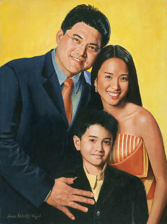


A client requested a portrait of her son’s family based on snapshots taken in a New York City park (click here for my earlier posting on painting from snapshots). In the photos, the family was surrounded by the park’s enclave of greenery. My client hoped I could also include the city street beyond the park, which appeared in another photo. Her son and his family might move out of the city some day, so she wanted their portrait to capture this urban chapter of their lives. 
I resonated with the client’s feelings. I’m always eager to portray my subjects’ worlds in the backgrounds of their portraits. Additionally I wanted to include the cityscape because it was a complex, atmospheric visual element to play off the human subjects.
It also created an interesting challenge in the composition of the painting: In order to fit the street and buildings into the background, the family would have to be placed relatively low on the canvas. The city street would appear above them. And because they were sitting amidst a lot of very green foliage, the cityscape could easily end up looking almost like a separate painting stuck incongruously onto the top of the family portrait. Was it possible to create a unified painting with these disparate horizontal areas?
Subject placement in portraits today
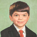
The vast majority of portraits place the subjects’ head/s above the horizontal midline of the painting, often close to the top of the canvas. (Heads are most often centered from side to side.) The head is almost always the top-most visual element in the painting. This positioning leaves no doubt as to what is the most important element of the painting: the face and head of the subject.
This type of composition has of course generated many wonderful paintings over the centuries. Here are some terrific contemporary examples. Please click on any image to see a larger version on the artist’s website.
 Portrait by Patricia Wilkes |
 Portrait by Jiawei Shen |
 Portrait by Ron Hales |
 Portrait by Fanny Rush |
 Portrait by Scott Tallman Powers |
 Portrait by Ying-He Liu |
 Portrait by Christopher Alexander French |
 Portrait by Toby Wiggins |
But is this the only composition that can create a successful portrait? The internet allows a survey of composition in contemporary portraiture in the United States and Britain. Four major portrait websites, among others, provide images of many artists’ work:
- For the US, PortraitArtist.com, and PortraitsInc.com.
- For England, The Royal Society of Portrait Painters (therp.co.uk) and CommissionAPortrait.com. (These include artists from other European countries who are represented by these two British agencies.)
In my endless prowl for visual ideas, I’ve surfed through the work of hundreds of portraitists on both sides of the Atlantic (and some in Australia, China, etc). The more I’ve looked, the more I’ve perceived a pattern that I find surprising, intriguing – and puzzling. While it’s true that most portraits on both sides of the pond follow the compositional rules outlined above, our Old World colleagues seem to venture “outside the box,” as it were, more often than we do. Here are some of the many examples of portraits by British artists (and portraitists from other European countries represented in England) in which major visual elements appear above the head of the subjects. As everywhere in this post, click on any image to see a larger version on the artist’s website.
 Portrait by Sergei Pavlenko |
 Portrait by Jason Sullivan |
 Portrait by Susan Ryder |
 Portrait by Alastair Adams |
 Portrait by Heidi Harrington |
 Portrait by Dick Smyly |
 Portrait by Jeff Stultiens |
 Portrait by Rene Tweehuysen |
 Portrait by Fanny Rush |
In fact, there are many portraits by British painters (or Europeans represented in England) in which the heads of all subjects are placed on or below the midline of the painting, with other major visual elements above the heads.
 Portrait by Alastair Adams |
 Portrait by Rene Tweehuysen |
 Portrait by Andrew Festing |
 Portrait by Tom Wood |
 Portrait by Vincent Yorke |
 Portrait by Oisin Roche |
British-represented European artists are also unafraid to allow vast space above their subjects’ heads. They are able to do this without diminishing the importance of the subject, but adding to it.
 Portrait by Heidi Harrington |
 Portrait by Laurence Kell |
 Portrait by Heidi Harrington |
Yuqi Wang, represented by British CommissionAPortrait.com, trained in China and now based in New York, is a master of this technique.

Portrait by Yuqi Wang
Another very effective British/European variant allots a lot of space above the subject’s head, with another dramatic visual element off to the upper side.
 Portrait by Paul Brason |
 Portrait by Marilyn Bailey |
 Portrait by Rene Tweehuysen |
 Portrait by Andrew Tift |
 Portrait by Michael Reynolds |
 Portait by Jeff Stultiens |
In contrast, I’ve come across very few American portraitists who place all the subjects in a given painting low on the canvas. Yet when they do, they are as likely to produce magnificent paintings as the Europeans do. These two, of J. Lindsay Embrey and William Paley, are by Portraits, Inc artists (artists are not identified on this website).

J. Lindsay Embrey and William Paley by Portraits, Inc. artists
June Allard-Berte is a rare American portraitist who has done a number of portraits with major visual elements in the upper half of the canvas, above subjects’ heads that are on or close to the midline. In general, Allard-Berte gives an unusual amount of attention to composition: “Her sense of composition is superb; it is endlessly inventive, elegant, and nearly always strikes just the right balance with subject. It neither over nor underpowers the strength of the person.” http://www.portraitartist.com/berte/bio.htm Allard-Berte’s talent for composition is very special.

Portraits by June Allard-Berté
American Bart Lindstrom rose to the challenge of a high space over a fireplace with a wonderful composition placing his subjects low on the canvas with a brook flowing through a forest above them. Yet Lindstrom doesn’t seem to have used this type of composition elsewhere.

The American Alexandra Tyng has used it several times to create paintings that are real gems:

Portraits by Alexandra Tyng
But these examples are few and far between among portraitists in the United States. Interestingly, it seems that American portrait painters who venture outside standard centered composition are much more likely to place the subject to one side of the canvas or the other than they are to place new visual elements above subjects’ heads. Here are some terrific American examples of placing the subject off-center horizontally:
 Portrait by Portraits, Inc. artist |
 Portrait by Marvin Mattelson |
 Portrait by Garth Herrick |
I don’t know for certain what causes this cultural difference between England and the US (which I believe extends to other issues besides composition). But it’s interesting to speculate. Is it because a country with centuries-old self-confidence in its aristocratic bona fides feels eager to venture outside the confines of traditional portraiture? Is it because Americans see themselves as needing to dominate their surroundings, while the English are either more humble or more secure, so they feel free to allow their surroundings to appear higher than they are? Perhaps the tradition was begun by British aristocrats who felt their stature was enhanced by their chandeliers, high ceilings, and walls covered with paintings and tapestries. Perhaps they saw such finery above their heads as metaphoric crowns that proved their wealth and nobility rather than belittling them. And perhaps from there, the British became used to portrait composition with other kinds of important elements above the heads.
 Portrait by Andrew Festing |
 Portrait by Richard Foster, no longer available on the internet |
 Portrait by John Wonnacott |
 Portrait by Alastair Adams |
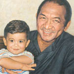
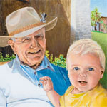
Last, here is my own portrait with the cityscape as the highest element.

Integrating the city street into the background was complicated because, although in reality it had been behind the family, it didn’t appear in the photos I used for them. I had to make judgments about the cityscape’s scale, placement, angle, etc, in comparison with the park foliage, trees, and people. I eliminated certain components from the street photo: a car and several pedestrians. I had hoped to find a way to keep these in the painting, but ultimately they were distracting and not such attractive elements for the eye to wander over. So in the end they got painted out, and I had to extrapolate street shadows and sidewalk to fill their places.
There are several vertical elements that bind the park to the city street: the yellow and gray traffic light, greenery on the left edge, ivy-covered tree trunk, and street light pole. I carefully adjusted each of these so together they would all help ground the street behind the park.
Color also ties the layers together: I altered the actual clothing colors in order to echo the building colors, thus binding the uppermost and lowermost components of the painting. In other areas of the painting, green foliage, working from the very bottom of the canvas up to the trees along the street, also pulls the disparate elements together.
Looking at “out of the box” composition by both Americans and Europeans has enticed me to think more about placing subjects lower on the canvas than other complex visual elements. Given the magnificent paintings that have been achieved by others, I hope it will add to my repertoire and result in unique, rich portraits.
Anne, I love reading through your blog! These topics you write upon are very enlightening and well thought out. You are welcome to utilize my portrait image you mentioned in your email.
Anne, thank you for starting this thoughtful blog on portraiture! I have bookmarked it. You are welcome to use the images of my portraits. I especially like your presentation of the topic of figure and head placement in the composition.
Anne, Your blog is both informative and inspiring. Your study of the placement of figures in the composition of portraits I find fascinating. You are more than welcome to use the image of my portrait in your blog.
I’m truly delighted to have such positive responses from all of you (along with others via email). If any of you feel like writing in more detail describing your artistic process in deciding to use an unusual portrait composition, I would love to read it. Did you base your choice on seeing your subject/s in the setting in which you painted him or her? Did you make a conscious decision not to center your subject? Do you feel it says something about the subject in relationship to his or her world?
Garth Herrick and Patricia McWilliams, it seems unusual – at least among paintings posted on your websites – for you to use off-center composition. I wonder what made you choose it for the two posted portraits.
Alexandra Tyng, I just discovered that on forum.portraitartist.com, you described your process of composition for your Philadephia university president portrait. http://forum.portraitartist.com/showthread.php?t=7475&highlight=background+color
I’d love to read something similar about the two portraits I posted of yours – either here or in the portraitartist.com forum. This would be especially true for the portrait of Anne Tyng, because the background arrangement of objects appears partly “imagined,” not based on a scene that was actually around her.
Cheers,
Anne
Very informative blog, and done tastefully. I am glad you mentioned it to me and will certainely let others know about it! Keep up the good work, we are proud of you!
I am the client for Anne’s portrait and am both touched and impressed by the intellectual effort that underlies the artistic production that has brought great joy to my family. The two little ones in the portrait are now a year and a half older than they were when the original photographs were taken (to be Mother’s Day gifts for an adoring Grandma who returned the gift with this painting). They love seeing themselves as they once were with their parents. They see this same corner looking west from their bedroom many stories up. To them, the portrait is a vivid interpretation of what is real in their lives — and isn’t that what “art” should be.
Anne, your well-written blog is a very interesting resource and I enjoyed this topic. Please do feel free to use my paintings as examples of portraiture. Composition also interests me greatly, as does the differences between British and American portraiture. (Incidentally, I am pretty sure that the first painting in your American section is a painting by the megatalented Australian Paul Newton.)
Linda, thanks so much, including for identifying the Portraits, Inc artist who painted the first portrait in my “American” section. So I should really remove that painting from this section! (Though adding and removing the huge numbers of images on my blog is very complicated, so I’ll probably let it go for now). I found Paul Newton’s website, and interestingly there’s a second very similar portrait of the same subject in the same clothing but a slightly different pose. It’s slightly more vertical than the one on PortraitsInc.com.
If you ever feel like writing your own impressions of differences between British and American portraiture, I’d be very interested in comparing notes with you.
Anne
Fascinating to read about the process of portraiture in the words of such a thoughtful writer.
Anne,
This is fascinating. I love the way you talk to the reader and communicate with words. Your portraits are marvelous and communicate with us visually about the spirit and soul of the person painted. You look deep inside the subject and translate what you see for us, your audience. You know I am a real fan!
Anne, you can find a link to the process of creating the portrait of my mother, Anne Tyng, at:
http://forum.portraitartist.com/showthread.php?t=6922
Alexandra, thanks for providing this link to your description of creating your mother’s official portrait. It’s fascinating to read such detail about your process. Anne
😀 thank you so much for this amazing internet site me and my household best-loved this satisfied and insight
tor darknet market tramadol dark web
darknet links how to access dark web
dark web link black internet
dark market darknet site
deep web search how to get on dark web
darknet seiten dark web site
deep web links dark web login
dark web markets dark web markets
deep dark web deep web sites
darknet markets darkwep
dark market free dark web
darknet search engine free dark web
dark websites dark web wiki
dark web site how to access dark web
dark web link dark web search engine
dark internet comment aller sur le dark web
dark web markets dark web access
free dark web how to get on dark web
dark website darknet links
dark web search engines dark web search engine
how to get on dark web dark web search engine
dark net deep dark web
blackweb official website darknet site
darknet markets blackweb official website
dark web login tor dark web
dark web search engines link bitcoin cash darknet markets
dark web site dark web access
deep web sites darknet site
blackweb dark websites
dark web search engine dark web login
the dark internet comment aller sur le dark web
how to access dark web dark web markets
darknet links dark web search engines
deep dark web blackweb official website
darknet wiki link Heineken Express url
dark web markets deep web links
dark web login comment aller sur le dark web