Archive for the ‘Free online drawing & painting tutorials’ Category

Hand Drawing Tutorial #2

Wednesday, November 3rd, 2010

This is the second in a series of online drawing lessons using your hand as your model.  The first, most basic lesson is here.

The hand is so complicated visually, so able to move its parts in infinite ways relative to the various other parts, that a small movement creates new shapes and new challenges in drawing.

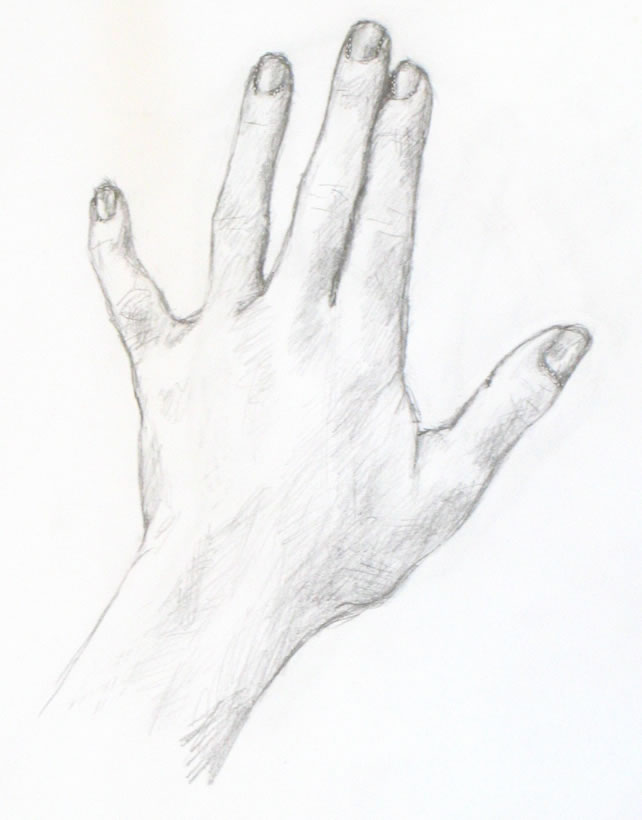
At the end of this lesson, you’ll find a time lapse photo sequence of my entire Tutorial #2 drawing process, from my first pencil line to the finished sketch.
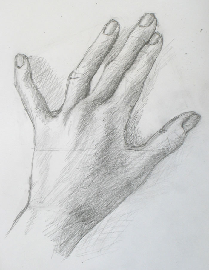
This lesson's hand sketch. You can still see a light line across the back of the hand, which I drew as a guide.

Materials you’ll need

You can use any paper and pencil or charcoal that you enjoy.  I’ve used the same paper, pencil, and tape for this lesson as I did in the first.  Please look back for specifics if you want them.

My Tutorial #2 drawing (right) appears darker than the first demo, even though I used the same simple pencil and other materials.  The reason is that this time, I made an effort to draw more heavily in order to make even the guidelines I sketched more visible to you.

Setting up to draw

Tape a piece of paper to your drawing surface, leaving enough space to place your non-drawing hand next to the paper as your model.  For important explanation and a photo, please go here

Placing your hand

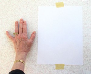
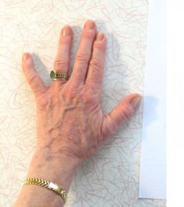
In this lesson, we’ll draw a slight variation of the hand “pose” from the first lesson.  In the first lesson, we drew the most simple version possible: the hand placed flat, viewed from the back.  For this lesson, I began by setting my hand and fingers in the exactly the same position as in Tutorial #1.  Then I made a single change:  I lifted my pointer-finger knuckle upward, well off the table.  (The lighting this time is also different.)
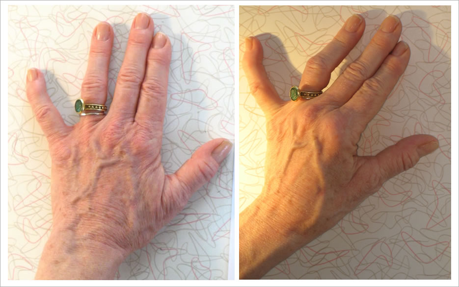
Compare the positions of the hand in Demo #1 (left) and Demo #2 (right). The fingers and bottom of the hand are similar. But I've raised the knuckle of my pointer finger off the table, creating a more complex subject for sketching.

I also placed a strong light source (a halogen lamp) to the left side of my hand.  This creates the intense lights and darks that help the artist create the illusion of three-dimensionality.

As always, start by drawing negative space

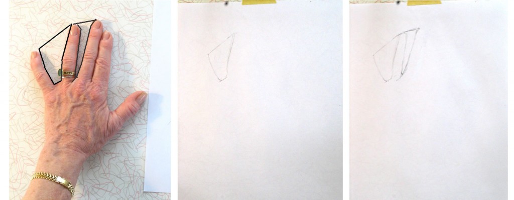
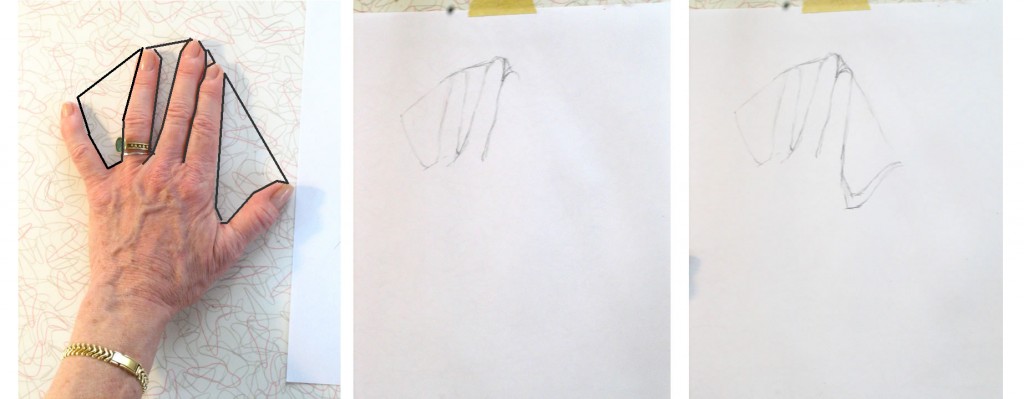
For me, the key to beginning drawing any subject matter is to find easily-drawn areas of negative space.  For our hand poses, the obvious basic negative spaces are those between three of the fingers. Look at the spaces between the pinky and ring finger, and between the ring and middle fingers in each pose:
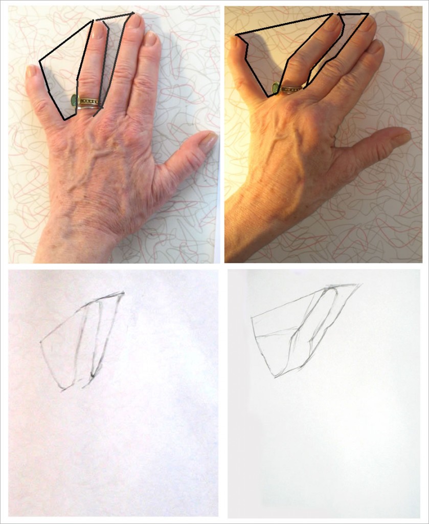
I've drawn black lines over the photos of each hand pose, outlining two spaces between fingers. Below each photo are the first lines in my drawing of the hand above it. Note that in the second drawing, I broke the negative space down into more geometric shapes (the sketched guidelines) than in the first drawing.

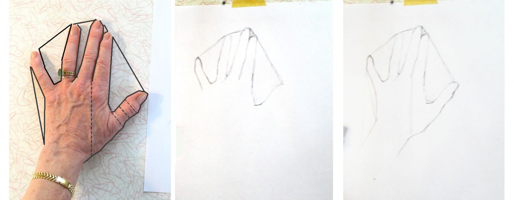
Continue “carving out” the negative space all around the hand to create its complete outline, as we did last lesson.

Making a course-correction by drawing guidelines

When I’d completed the outline of my hand, it looked really off (below, left).  The thumb was too large, and the entire hand seemed too stretched out to the right side.  I had clearly made a mistake somewhere along the way.  But what was it?  What had I done wrong, and how could I correct it?

Don’t worry, this kind of mistake happens all the time!  What you need to do now is to look over your hand to find relationships between lines you think are correct and the areas you feel you may have gotten wrong.
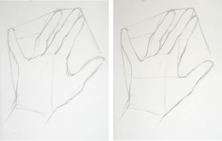
My first completed outline (above left) was clearly off. I corrected my drawing (above, right) using a horizontal guideline across the back of the hand and a vertical one intersecting it at the base of the thumb.
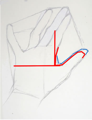
Following this method, I realized I had mis-placed the “scoop” of negative space between the forefinger and thumb.  To help you see this more easily, I’ve colored over the incorrect inner thumb line in blue (see right).

The edge of the hand between the forefinger and base of the thumb actually lies directly under the first joint of the forefinger (note my vertical guideline, right).

I figured out where the horizontal portion of the thumb-base should be by drawing a horizontal line from the point on the other side of the hand directly across from it (see horizontal guideline, right).  It may seem odd to figure out the placement of the thumb by looking at  its relationship to the far side of the hand.  But it works.  And it helps you check whether your entire drawing is shaping up properly in relation to the whole.

Now for the drawing demo

I think you’ve probably had enough technical verbiage for this lesson.   So just continue from here the same way we did in Tutorial #1.  It may help you to check out the time-lapse sequence of my drawing below. You can move through it at your own pace by clicking the “stop” button at the bottom when you’re ready to see the next image.

{"numImgs":"29","constrain":"height","cvalue":"450","shellcss":"width:348px;padding:4px;margin:14px auto 0;"}

A couple moments you may have noticed in the “video:”

First: at some point, I erased the negative-space guidelines I had drawn in the very beginning from each finger tip to the next.   It’s often fun seeing guidelines like this in a finished sketch, but they were distracting me as I was trying to evaluate lights and darks for the shading.  So I got rid of them.

Second: this time I decided to fill in the shadows my hand cast on the table.   I first considered doing this because the left side of the middle finger was so light (because of the halogen lamp) that I had nothing to define its edge.  I thought I’d try defining it by the shadow next to it.  Once I had started with that finger, of course I had to finish the entire shadow of my hand.  I wouldn’t always do this in a quick sketch.  But in this case it helped, and I liked the result.
Drawing Tutorial: A Simple Drawing of Your Hand

Friday, October 22nd, 2010

This is the first of a series of drawing lessons in which we’ll draw our hands.

Finished basic sketch of hand.

I chose hands because they are always available to “pose” for you!  And they can be placed in an infinite variety of simple or challenging positions.  The techniques you’ll learn from these lessons can be applied to drawing anything and everything else.

This first lesson is a simple drawing of the back of your hand.  This is the hand at its most basic, with no odd angles or foreshortening.  Future lessons will become more complex as we go along.

Materials you’ll need:

You can use any kind of paper.  I used plain printer paper and a Papermate “Sharpwriter” #2 pencil.  These are very unsophisticated materials, which I love using to practice drawing.   They’re easy to find, so you can do a quick sketch any time you have a bit of free time.

Set up your work area:

Set up for first simple drawing of the hand

First, tape a piece of paper to a table where you’ll have space to put your non-drawing hand next to it.

Place your non-writing hand (your left hand if you’re right-handed and vice versa) next to on the table very close to the paper.

You will need to stand up while you sketch so that you’re viewing your drawing (and your hand) from directly above.  If you sit down, you’ll be seeing your paper at an angle, which will make you distort your drawing.

Alternatively, you can use an easel, either a table easel or a free-standing one.  You will then need to place your hand vertically on the easel so you’re viewing it from the same angle as your paper.

Ideally you should stand up while you draw, whatever you’re using.  Standing will give you most perspective so you can do your best work.

Placing your hand

Place your fingers as I've done here: first two close together and the others separated by different amounts.

Place your hand with the first two fingers touching each other, really snuggled up together.  Your ring finger should be somewhat separated from the first two.  Your pinky should stretch out at a more distant angle.  Place your thumb with a good space between it and the rest of your fingers.

These differing amounts of space between your fingers will help you see the “negative space” between and around your fingers and hand.  You can read more on why this is true here.

To me, the ability to see negative space is the key to drawing anything.  Focusing on the space around what you’re trying to draw tricks your eye into seeing more accurately.  It’s an extremely important skill for you to develop!

Begin by drawing negative space

First, look carefully at the space between your pinky and ring fingers.  It’s roughly a triangle. The top of the “triangle” is created by an imaginary line connecting the tops of the two fingers (we’ll erase this line at the end of sketching the entire hand).  I’ve placed black lines on top of the photo of my hand to help you see this.

Don’t look at the fingers themselves!  Forget that you’re drawing fingers.  Focus on the space between the fingers and draw it, as I’ve done in the middle image below.  Form each angle of the shape as accurately as you can.  Then move on to the triangle between the next two fingers, as in the far right image below.

Begin by drawing the spaces between your fingers. Don't look at the fingers! Focus on the spaces between them.

The “triangles” are each tipped at a different angle.  Be sure to draw your “triangles” tipped just the way they are in your hand.

Between the next two fingers is a line (see below), not a space, because of the way we’ve placed the fingers.  Look at this line carefully and replicate it in your drawing.  At the top of the pointer finger is a little tiny triangle formed against the middle finger.

Between the first two fingers is a line. There's another large sort-of triangle formed by the thumb.

Now sketch the sort-of-triangle between the pointer and thumb.  You can see that I made a mistake in drawing my first line.  My second, lower line is more accurate, but for now I’m leaving both.  We want to keep moving forward quickly, and will erase mistakes later.

Next I formed the edge of the pinky finger (see below), again envisioning it as a triangle, this one long and almost flat.

I have an odd little crook in my pinky from slamming it in a hotel balcony door a few years ago.  It’s a bit sad, but I’m using all its angles to help in my drawing.

The outside edge of the pinky is formed by visualizing another triangle. The edge of the thumb uses reference lines (dashed), one of which I drew, others which I just envisioned.

Moving on to the bottom line of the thumb and hand: To help figure out where the line should cut in to form the wrist, I drew a faint vertical line from between the first two fingers downward.  You can see this very light line in my drawing (farthest right, above).  Because of the particular position of my hand, my wrist appears to emerge not from the center of my hand, but from the area beneath the ring finger and pinky.  Sketching the light vertical line helped me draw the wrist where it actually is.

I then captured the ins and outs of the bottom line of the thumb and hand by visualizing more imaginary reference lines forming right angles with the top of the thumb (drawn in dashed lined on the photo of my hand, left above).

Another time, I might have sketched this line using a triangle visualization, as I’ve been doing up to now.  There’s no right or wrong here.  The more of the hand you draw, the more reference points you have to judge where your next lines should go.   You should use whatever reference points enable you to see where the line is in reality, hence where you should draw it on your paper.

Positive space can be negative, too!

Now that we’ve completed the outline of the hand, are we finished with negative space?  Not at all!  Let’s take a look at what happens when we begin to sketch in fingernails.

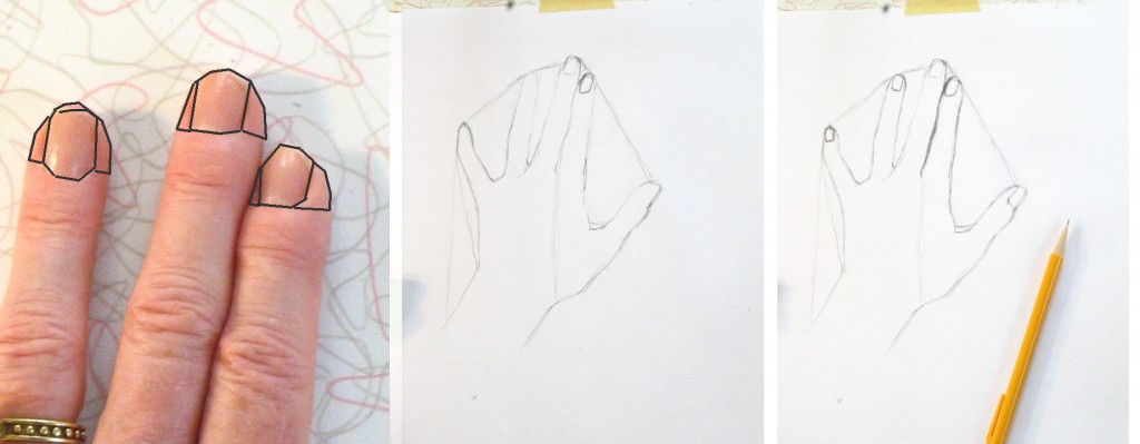
Nails and finger tips can be envisioned as negative space for each other.

Here we’re repeating the same kind of process we used to draw the negative space between the fingers.  Here the fingers around the fingernails are the “negative space” of the nails.  Seen another way, the fingernails are the negative space of the tips of the fingers surrounding the nails.

Draw each nail carefully.  Observe how much finger appears on either side of each nail – they are all different!  If you draw them all the same, according to some idea of where the nails “belong,” you will miss an opportunity to make your drawing appear three-dimensional and real.

For example, the nail on my ring finger (above) has almost identical bits of finger tip around it.  But my middle fingernail has more finger tip on the right side than on the left.  And my pointer nail has hardly any skin showing on its left.

Notice the different angles and shapes of top and bottom lines of each nail. They are all different: my middle nail appears to have a shallower curve at the bottom, while my ring finger nail has a deeper curve at the bottom.  You need to draw each of them as they really are, not as you think they should be, if you want to create a realistic drawing.

Adding shading

The process of adding shading is very much the same as what we’ve been doing all along:  seeing shapes and areas in relation to each other.  The only new thing we’re adding now is learning to see values – which shadows are darkest?  Which are barely there?

The best way to judge where you should shade is to squint your eyes so that you see only the most basic areas of light and dark.  This is easiest when you have a strong light source that throws deep shadows.  But even minimal shading can be detected by squinting hard.

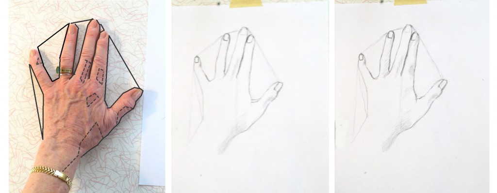
On the photo of my hand below, I’ve drawn dotted lines around areas of shade that I first noticed and shaded in with my pencil.

To see areas of light and dark, squint your eyes really hard.

As I shade in, I also continue to refine the outlines of each finger and the hand, adding the subtle variations to the rough “triangles” I sketched at the very beginning of the lesson.  Looking for shadow and light helps me see details of the outline as well.  You can see how I worked through this in the very short video below.  You’ll need to watch it through several times because the changes are subtle (next lesson I’ll use darker drawing tools so you can see more clearly).

{"numImgs":"14","constrain":"height","cvalue":"450","shellcss":"width:331px;padding:4px;margin:14px auto 0;"}

As you work, keep looking and looking at specific areas and at your entire hand as a whole, comparing dark and less dark shadows.  Pencil more heavily in areas – such as the line between the pointer and middle finger – which are very dark.  Use a lighter touch for lighter shadows.

Note super-light areas by squinting hard.  If they’ve gotten too dark, you can use the edge of your eraser to lighten them.

Even your nails have highlights and shadows.  Try to see and replicate them accurately.  Look at the nail beds – the skin touching the nails.  It’s shaded in some places and light in others.  I made all my nail beds too dark, so I lightened them at the very end.

I hope you’ve enjoyed and learned from this lesson!  We’ll do a different view of your hand next lesson.

J. Kirk Richards’ video painting demo

Sunday, October 3rd, 2010

My goal in my drawing and painting demo posts is to provide insight into the moment-by-moment decisions made by artists during the flow of creating their art.  You can follow their process step by step, and then try it yourself.

An example of J. Kirk Richards' evocative full-size landscapes. As in his demo paintings, the cows drawing nourishment from the peaceful earth bring emotion to the painting.

I recently asked Utah artist J. Kirk Richards to create a video demo for this blog.  He agreed and filmed the lovely plein air (outdoor) painting demonstration below.  He included sound commentary to explain the choices he made as he worked.

The two paintings in Kirk’s demo are very small – little jewels.  He painted them without drawing or extensive planning first, blocking out areas of color over a midtone background.  I’ll talk more below about why this initial midtone layer of paint adds so much to both finished paintings.

Try Kirk’s method yourself

Photo of scene from which Kirk Richards painted his demo. Note the row of trees, one of which Kirk included in the center of his first painting.

Kirk’s approach suggests a wonderful idea for you to experiment with.  See what you can do with a tiny canvas or panel a few inches on each side.  Begin by painting over the entire surface with a quick, uneven layer of color.  (See end of post for materials list and color palette.)

Kirk’s video demo

I want to draw your attention to a couple of the techniques Kirk draws on in his demo.  As you watch the video the first time, observe that he uses a palette knife at certain points rather than a paintbrush.  We’ll talk more about this and another technique after you watch the video.

Kirk explains that when he uses the palette knife, he’s applying thicker paint to make the tree and grass highlights more luminous, to give them texture and body.  The heavier, more intensely-colored bits of paint in these areas evoke leaves and the sheen of sunlight across the grass.

The all-important base: underpainting

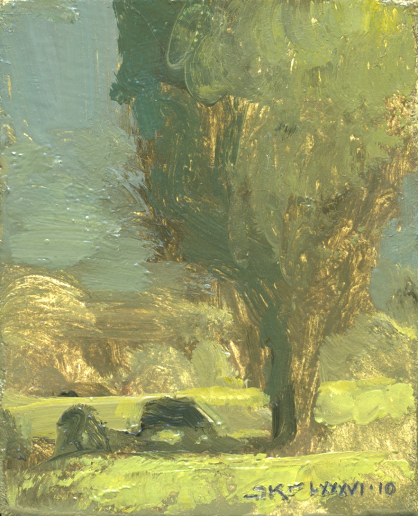
Still of "Morning Shade," painting #1 in J. Kirk Richards' video demo.

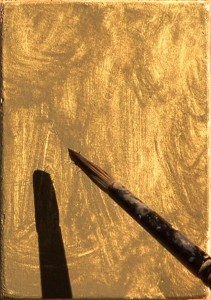
The second technique – a very important one for you to experiment with yourself – is the initial painting of the entire panel with a warm midtone.  Two elements of this base layer are vital to the finished painting: texture and color.

At first it may be easiest to detect the texture of the underpainting, especially in painting #1 (left).  Look at the area on the left side of the painting, between gray sky and yellowy-green grass, which has almost no overpainting at all.  The roughness of the warm brown midtone base layer suggests a bank of  foliage bathed in light.

Even more impressive is the way the scratchy underpainting captures the large central tree’s leaves, scraggy branches, and rough, sunlit bark.  Where the brownish brushstrokes are very light, they look like sun backlighting the tree.  Where the brushstrokes are dark, they look like shadows under leaves and bark.

Painting #1: Kirk applies the midtone base.

It’s part of the artist’s magic that Kirk’s first random brushstrokes seem to have fallen in exactly the right places to form both the large, detailed foreground tree and the hazier background foliage.

Color and underpainting

In my own realistic painting, layering of color is one of my two or three most important tools.  Even though my brushstrokes are generally very flat (never thick like Kirk’s palette knife application), the layering of color is what creates three-dimensional appearance.  While many viewers may not be aware that they’re seeing multiple colors visible through the top layer, this is what gives the optical illusion of vibrant three-dimensionality.

In the two paintings in Kirk’s video, the color of the initial layer of midtone paint creates depth and luminosity as it plays off layers added later.

Take a few minutes to carefully study demo-painting #1’s base layer (above).  Notice that it’s an ochre-y brown that appears rosy in its own midtones and cream in its lightest areas.  This range of color contrasts with all the layers of flatter color painted on top of it: gray, chartreuse, olive, yellow.

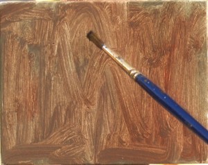
Painting #2: Kirk applies 2nd (reddish) layer of midtone base paint.

All the contrast in color and texture between the base layer and later layers are what give the painting depth and a feeling of sun skimming the grass.  The fact that the sky in the finished painting is gray, not blue, makes the yellow-green of the grass appear brighter, hence more sunny.

Now turn to demo-painting #2 (left).  It actually has two midtone base layers.  The first is a gray-brown.  Kirk then painted over this with a reddish midtone.

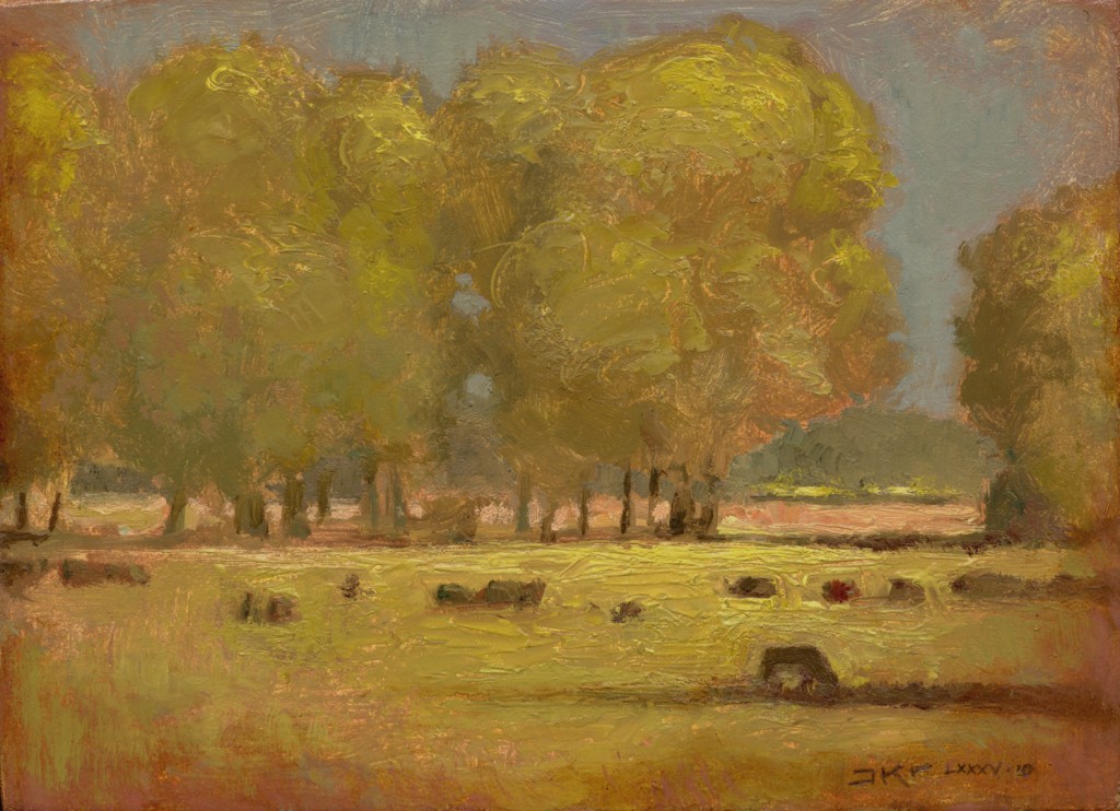
Look carefully at the completed painting #2 (below).  Scan your eyes over it in detail, observing all the areas where the rosy base layer shows through the gray-blue sky and chartreuses of later layers.  This rose color suffuses the finished painting with a warm, elegiac glow.  Without this perhaps unexpected rosiness, the painting would appear flat and boring.

J. Kirk Richards "Pasture in September" (demo painting #2)

Kirk’s materials list

If you’d like to try Kirk’s process step-by-step yourself, here is the list of materials he sent me: “All one needs is a gessoed panel, oil paint, a few brushes, a palette knife, a palette, and some sort of easel (I just used a board leaning up against my car with some sticky velcro).”

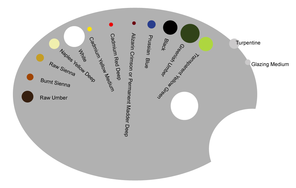
J. Kirk Richards' palette colors for his video demo.

Kirk’s palette

When I asked Kirk to email a list of colors he used in his demo, he sent the image to the right.  Colors from left to right are: Raw Umber, Burnt Sienna, Raw Sienna, Naples Yellow Deep, White, Cadmium Yellow Medium, Cadmium Red Deep, Alizarin Crimson or Permanent Madder Deep, Prussian Blue, Black, Greenish Umber, Transparent Yellow Green.

The size of each color in the graphic approximates the relative amounts Kirk used for the two paintings in his demo.

Postscript – A second lesson we can take from Kirk: The artist’s vocabulary

While working on this post, I ran into an interesting quote from Kirk which illustrates how artists can choose a visual vocabulary through which they express themselves.  Many of Kirk’s paintings are of religious or spiritual subjects.  What are the painting choices he makes that convey his themes?  He said,

“I have tried to make aesthetic and process choices to reinforce the tension between spiritual and physical: traditional materials versus mixed media, traditional glazing versus impasto paint application, representation versus textural surface, tight finish versus process marks,” Richards said. “I want all of these things to combine in a tension that echoes the sometimes difficult, sometimes triumphant spiritual journey of the human soul.”

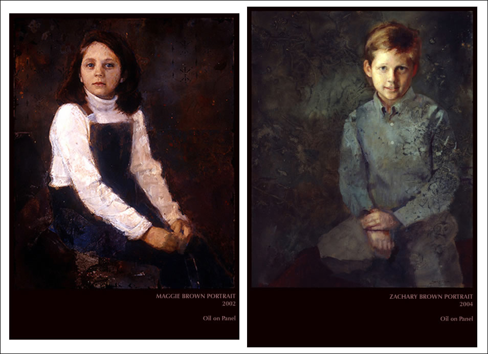
Kirk used some of this vocabulary in two lovely portraits.  Note in each – particularly the one of the boy – the face is rendered in a smoother, more detailed way than the rest of the painting.

Two portraits by J. Kirk Richards

I’m generally not a fan of portraits in which everything except the face is sketchily rendered.  But Kirk is doing something different here: he’s put as much thought and detail into the background and clothing as he has into the faces, even though they’re more roughly painted.  Kirk’s dark backgrounds and clothing don’t look flat.  They are rich, full, dimensional.

To me this conveys the feeling that darkness in our lives can be a fertile background from which light can develop.  Despair, handled properly, can eventually nurture growth and happiness.  Whether or not you’re religious, this is a deeply meaningful thought.

Last, I want to draw your attention to the facial expression of the girl, Maggie.  Anyone who has read my portraiture posts knows I feel facial expression is the single most important element of a portrait.  Kirk has painted Maggie with an intense, thoughtful expression that I find intriguing.  Although her gaze is slightly averted from the viewer, we can see that she’s highly engaged with thinking about something.  In fact, I almost feel she’s attending to a sound she’s heard.  As such, this is one of the only auditory portraits I’ve ever seen, in which the subject appears to be listening, not just seeing.

How to create models for drawing the imaginary

Thursday, September 16th, 2010

One of the biggest challenges in much of my personal artwork – and that of many artists –  is that I’m painting things that exist in my imagination rather than in the outside world.  So I invent “models” from which I draw the imagined scene.

Do you paint from the real…

When I paint a portrait, I’m painting a person who exists (or existed).  When I do life drawings (the most fun drawing of all), I sketch live models who pose.

When I was a kid, I used to set up still lifes and draw them.  In school (I don’t mean art class), I used to alleviate boredom by sketching classmates When I painted landscapes, I’d go out in the country, find an appealing scene, and paint what I saw.  I might make artistic changes in the scene, but it actually existed.

You may be the kind of artist who always paints real objects from the world around you.

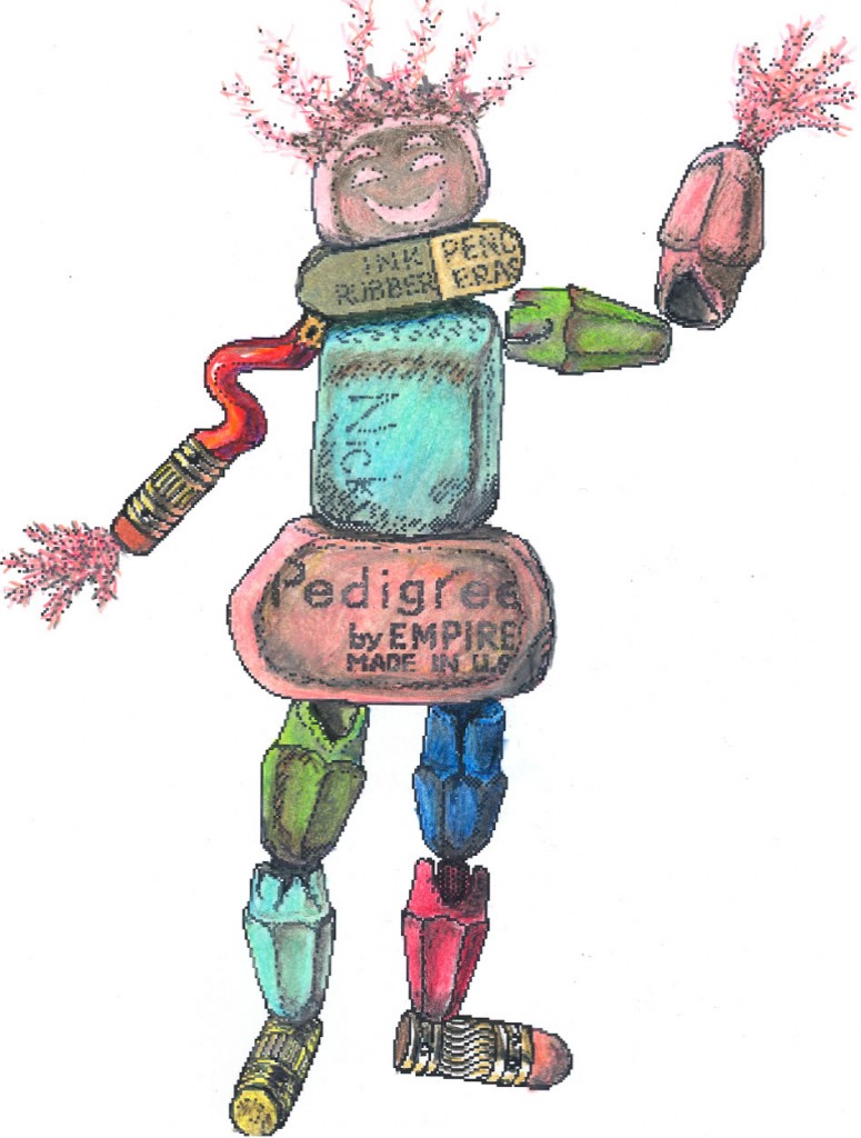
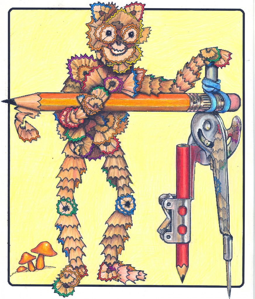
Mr. Pencil Shavings, by Anne Bobroff-Hajal (from ABBIE AND THE DESK DWELLERS)

… or from the imaginary?

Or you may want to paint images from your imagination.  If so, you may want to learn to invent “models” from which you can create the imagined scene.

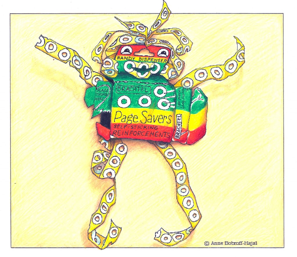
An example of this is animated character designs I created for a screenplay I wrote, called ABBIE AND THE DESK DWELLERS.  These characters were made of detritus from kids’ school desks – pencil shavings; dirty broken crayons; gum and candy wrappers and scraps of paper; grungy old erasers and eraser dust.

How would you approach drawing these characters?

Here’s my technique, which you might have fun trying:  I did things like grinding out pencil shavings using an old-fashioned pencil sharpener.  Then I shaped the pencil shavings – or the worn crayon stubs or the battered erasers  – as closely as I could to the character I imagined.

Slo Page Reinforcements, by Anne Bobroff-Hajal (from ABBIE AND THE DESK DWELLERS)

It can be hard because in the real world, things like shavings can’t hold their shape standing up as they can in your imagination.  Yet to make the character look real, you need to draw the shavings (or whatever you’re using) from the proper angles even if in actuality they couldn’t hold those positions for more than a split second.   So it involves a lot of adjusting the objects as you continue to draw.

Have you ever created models from real world materials to draw your own vision?  If so, leave a comment about your method and how it worked.  If not, give it a try!  It’s challenging and fun to experiment with.

Reflective surfaces

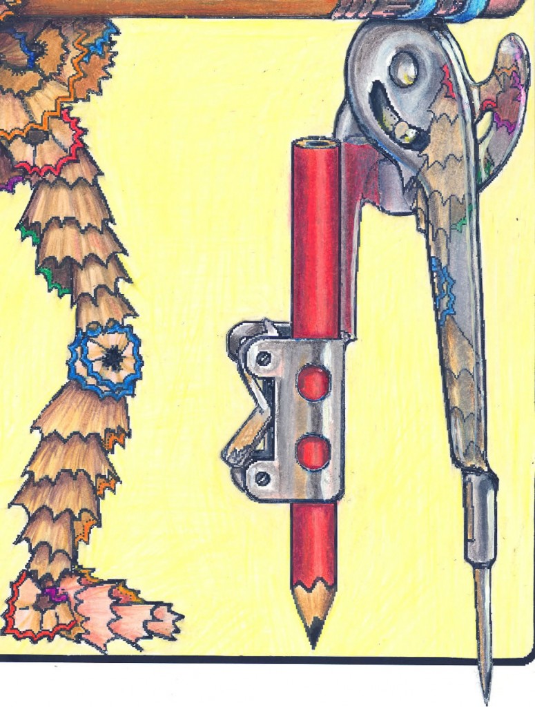
Detail of reflections in protractor (from Anne Bobroff-Hajal's ABBIE AND THE DESK DWELLERS)

Notice the reflection of pencil shavings in the shiny metal of the protractor. What makes any reflective surface look real is that images of nearby objects appear on their surfaces – but not just anywhere.

I carefully set up a pencil shaving “leg” at the distance and angle from the protractor that my character’s leg was positioned.

Notice that the reflections appear in both the upright metal support of the protractor, and the curly metal extension that almost reaches the pencil eraser.   Capturing that detail is what makes the protractor look real next to a little man made of pencil shavings.

You might enjoy practicing setting up some objects next to simple reflective surfaces.  Look at them really carefully and try to replicate in your drawing exactly what you see.

Don’t bring in preconceived notions of what you think a reflection should look like – its color or shape.  Any reflective shape – like the protractor’s – distorts the appearance of the object reflected in it.  So just draw exactly the oddities you see, and you will find you’ve drawn a realistic-looking reflection in an object that looks three-dimensional.

But why bother with models?  Why not just draw from memory?

Brenda Eraser Crumbs, by Anne Bobroff-Hajal (from ABBIE AND THE DESK DWELLERS)

Why bother with the hassle of setting up models?  Don’t a lot of artists draw purely from memory?  The answer is yes, many do.

For me, though, the everyday visual world is full of such surprises that I don’t want to just repeat from memory something I’ve drawn or seen in the past.  Drawing from my memory of “what an X looks like,” by definition means I’ve developed a somewhat standardized way of seeing and drawing X.  For me – and maybe for you – there’s nothing like the magical pleasure of discovering what’s unique about the particular “X” I’m drawing at that moment, and capturing that uniqueness on paper.

Reality is infinitely variable.  If I hadn’t set up my shavings next to the protractor, for example, I might not have guessed that the reflection would appear in the very particular way it does over several surfaces of it.  Scroll back up to the protractor closeup image above.  Note how the reflection of the shavings continues down the point at the bottom of the protractor as simply a beige stripe.  Notice also how the shading of the protractor itself – the grooves down its length, the white highlight at the top of its curve, the indentation around the grommet – all these intermingle with the shavings’ reflections.  This interplay is what makes the protractor appear reflective and three-dimensional.

What if your subject is too large to set up a model?

I wish I had human models on retainer who I could call on at any time to dress up in the appropriate costumes and assume the emotions and positions I need to draw!   I have a lot of books of models in hundreds of different positions, but I don’t recommend you spend much money on these books.  It’s rare to find the exact position you need to simulate  a particular activity you want to draw.

And the books don’t include the variations that come from the emotional intent of an action.  Any action – say swinging an axe – shapes the human body differently if it’s taken, for example, in anger than if it’s taken in pleasure.

Before the web existed, I used to prowl libraries and magazines for photos that could serve as my models.  The internet has provided a new wealth of relatively easily-found photos of people doing all kinds of activities, from shooting arrows on horseback to singing arias.  Of course I’d prefer to draw from a three-dimensional reenactment.  But I’ll never have a peasant chasing a soldier on horseback with a pitchfork in front of me – or an entire Mongol battle played out before me.

Next post, I’ll provide some tips on how to find images on the web that you can use as models for drawing scenes from your imagination.

Meanwhile, for Jonathan Linton’s popular video drawing demo and commentary, go here.

For a 2-part life drawing lesson, start Part 1 here.

Why is learning to draw “so hard?”

Thursday, July 29th, 2010

Why do our brains withhold from our conscious grasp a way of seeing that’s so useful?  Why aren’t we able to easily dip into that mode of seeing when we want it to draw?

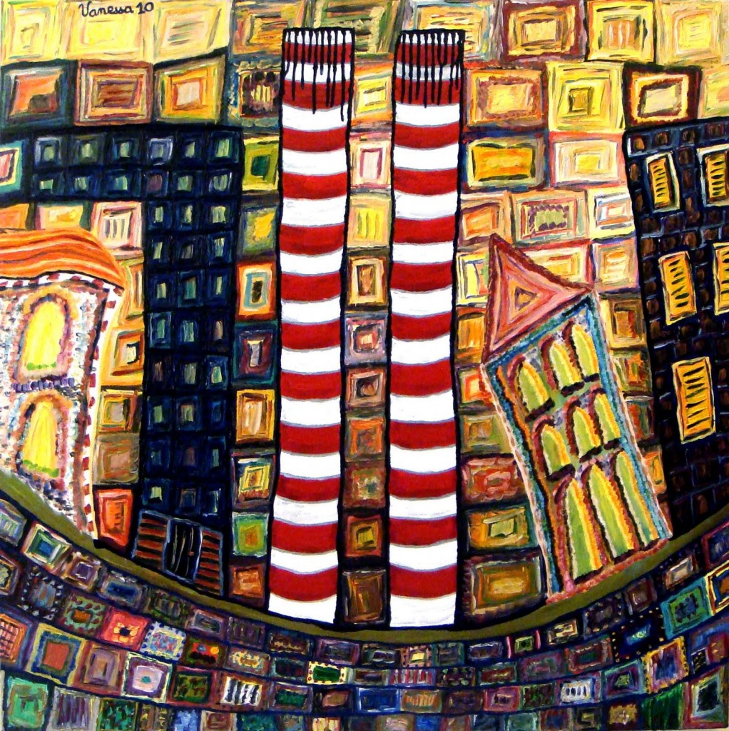
Centrale Electrique de Zouk (Electric Station of Zouk), by Vanessa Gemeyal

Centrale Electrique de Zouk (Electric Station of Zouk), by Vanessa Gemeyal

When I posted a two-part online drawing lesson a couple of months ago, I received a response that got me wondering.

The response was from a wonderful young Lebanese artist, Vanessa Gemayel.   Vanessa paints luminously about today’s destruction of the beautiful  traditional architecture that gave Beirut its unique atmosphere, replaced by generic modern architecture that is sadly making Beirut look like every other city in the world.

Vanessa, after trying out my figure-drawing lessons, wrote to me that she found them “very cool and helpful.”  But, she added, “you make it seem a lot easier than it actually is.”  And of course Vanessa is saying outright what many people feel about drawing instruction.

That got me wondering what in the human brain makes drawing from life so not-easy to learn.

All jobs involve a learning curve, often long and hard to get through.  Drawing from life is in that sense no different from any other expertise.  Many skills, for example, require years of study before mastering them.  Others need endless practice.

I believe that the most important element of learning to draw, though, is an “aha moment” – or maybe a small series of such moments.  In those few moments, you suddenly start being able to see in a different way which enables you to draw realistically.  This alternate way of seeing is for me, and for many who draw, the single most basic and important tool we use.

True, endless practice must follow the aha.  But the practice isn’t what blocks most people who really want to learn to draw.

In learning to draw, I think what is elusive to many people is the “aha moment” when they begin to see in that all-important alternate way.

With that aha, you will be able to learn to draw easily.

What is the aha moment in learning to draw?

In my drawing-lesson posts, “Learning to Draw by Playing the Angle Abstraction Game,” I called the technique of seeing differently “angle abstraction.”  The artist is able to see what they’re drawing as a series of angles and shapes that are much easier to draw than when their subject is seen “normally.”

Other artists have given other names to their alternate way of seeing.  Betty Edwards has written two groundbreaking books in which she calls it “right-brain mode,” or “R-mode” (as distinct from left-brain mode, or L-mode).

L-mode is how we consciously think in our everyday lives.  It’s language-based.

R-mode – the one that enables us to draw – is non-verbal and does its work mostly outside our conscious awareness.

The “aha moment” happens when you are suddenly able to consciously access and use R-mode to see differently and draw.

One frame from my free online drawing lesson, "Learning to Draw by Playing the Angle Abstraction Game"

One frame from my free online drawing lesson, "Learning to Draw by Playing the Angle Abstraction Game"

But why would our brains withhold from our conscious grasp a way of seeing that can be so useful?  Why shouldn’t we all be able to easily dip into that mode of thinking when we want it to draw?

Why do our brains block our aha moments?

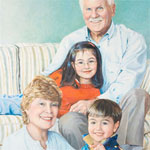
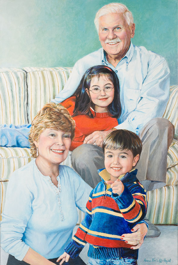
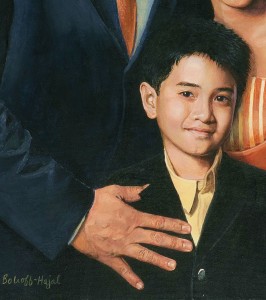
Portrait of the Steinbergs, by Anne Bobroff-Hajal.  Notice how different each of the hands looks.

Portrait of the Steinbergs, by Anne Bobroff-Hajal. Notice how different each of the hands looks.

I was pondering this question when I recently ran into a wonderful answer in one of Betty Edwards’ books, Drawing on the Artist Within (p. 208).

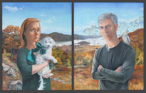
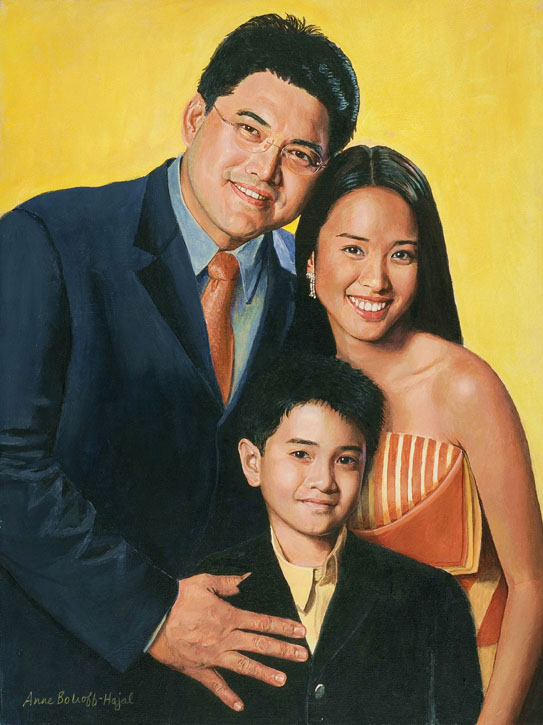
One way of conveying  Edwards’ explanation here  is through a group portrait I painted (right) of Bob and Gail Steinberg with their grandchildren, Riley and Alex.  This portrait illustrates one of the classic problems of drawing: how to draw parts of the human body when they are foreshortened – that is when they are coming straight at us, so they look very different from what we usually think of as an arm, a leg, a hand.

The most obvious foreshortened body part in this portrait is the hand of the Steinbergs’ grandson Alex, who is pointing directly at the viewer.  Everyone who sees this painting knows exactly what that hand is doing.  But in fact, it bears little resemblance to our standard concept of what a hand looks like.  Our conscious, rational L-mode brain typically thinks of a hand as something more like the father’s hand in another portrait (below).

Detail of Edwin Ermita and Two of His Children, by Anne Bobroff-Hajal

Detail of Edwin Ermita and Two of His Children, by Anne Bobroff-Hajal

That little pointing finger

Alex’s pointing finger appears on the canvas as a small circle, not the long tube shape we associate with fingers.  That’s strange enough.  But beyond that, the thumb seems bigger than the other fingers.  And it stretches out at an angle that we rarely think of thumbs taking on.  That thumb seemed so odd to me while I was painting it that I rechecked it multiple times to be sure I had it right.

In fact, it’s exactly because I allowed each finger to take on its actual shape – rather than what I might have consciously thought it should look like – that makes it possible for everyone who looks at the painting to know exactly what that strange conglomeration of flesh-colored blobs is.

Now for the other hands….

In addition to the little pointing finger, we can look at the other hands in the Steinberg portrait.  When we really study them, none of them is shaped like our standard concept of a hand.

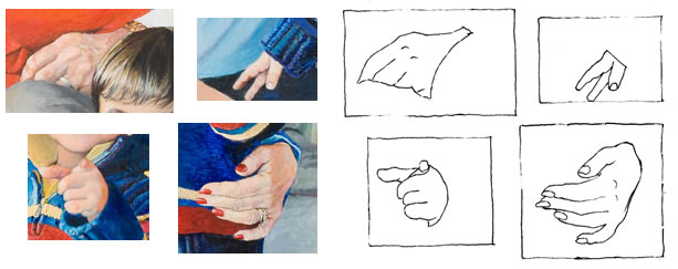
Detail of Steinbergs' hands along with tracing

Detail of Steinberg portrait hands, along with black ink outline of each

Bob Steinberg’s hand appears almost triangular, with only parts of four fingers visible.

Little Alex’s right hand is visible as only a thumb and two fingers.  And the index finger looks like it’s separated from the thumb by an interloping finger which in reality is farther away from the thumb.

Gail Steinberg’s fingers conform fairly well to our standard image of a hand.  But what about the back of the palm area?  It looks much smaller and less rectangular than it “should.”

It’s fine for us to view these shapes as being all different when we’re drawing.  But it’s also crucial for our daily functioning that we recognize all of them as the same – as hands.  It’s the job of our efficient, everyday L-mode, says Edwards, to quickly classify all these odd shapes under the general verbal rubric of “hand.”  And that verbal rubric is envisioned as in Edwin Ermita’s hand above, stretched flat, with five fingers roughly the same length as the palm.

If our brains had to go through a conscious, verbal process of debating whether each of a group of very dissimilar objects is or is not a hand from a different angle, we’d never get through our day.  We’d be mired in endless debating: “I see three of what look like fingers, two from the side and the third, a thumb, from more of a straight-on view.  But if they are fingers, why aren’t there five of them, and why aren’t they attached to a hand?  Is the hand out of my sight, or ….”

Our unconscious interpreter

It’s R-mode, says Edwards, that takes in all the differences in shape and size, and, with lightning speed, calculates from them where things are in space, what they are, and so on.  R-mode sees, for example, that the back of Gail Steinberg’s hand appears to be getting smaller not because it is smaller, but because it’s receding back from her fingers, curving around Alex’s body.  “It’s a hand, all right,” says R-mode, “it’s just shaped differently from a “standard” one because its wrist is farther away from us than its fingers.”

Edwards wrote (p. 178),

“R-mode apparently computes instantaneously and nonverbally….  This computation – and the size-change information that hits the retina – is somehow kept ‘secret’ from conscious awareness, perhaps in order not to interfere with or complicate the language system.”

I suspect this instantaneous computation is also “kept secret from conscious awareness” because language – the currency of L-mode – would slow down its lightning speed.  The rapidity with which our R-mode calculates that a flesh-colored circle is a finger pointing at us happens far faster than we could ever describe in words.

An analogy that might make this clearer is of an athlete hitting a ball.  The athlete’s R-mode brain is making calculations at phenomenal speed about how far away the ball is, how fast its moving, where its moving, and about how the athlete him/herself must move and react to all that information in order to successfully connect with the ball.  If the athlete had to bring all of this to consciousness and calculate it verbally – “the ball is now curving right and I can see it will bounce in this particular way, so I calculate that I should move this way – no, I now see that it had spin on it, so I need to redo my computations…”  – the athlete would never be able to hit the ball before it went whizzing past.

Bringing the aha to more readers

When artists draw, I believe they are making judgments and decisions at that same lightning speed as the athlete hitting a ball.  Their thought process has to be non-verbal because of the countless calculations made in a split-second’s time.

I think this is why it’s so difficult to convey drawing instruction in words.  The artist’s observations, judgments, and decisions happen in a split second of often-exciting non-verbal discovery.  But to convey to a reader that same thought process takes long paragraphs of verbiage.  That’s why I’m hoping to be able to get more video drawing demos up on this blog in future – along with text that tries to convey a small fraction of the artist’s split-second decision-making as he or she works.

We need language to communicate the artist’s process to other people.  But language is slower and more reductionist than some other processes in our brains.  Hopefully a combination of images, video, and language will bring the aha moment to more readers of this blog in the future.

Video drawing demo by artist Jonathan Linton

Tuesday, July 6th, 2010
Stuart, by Jonathan Linton

Stuart, by Jonathan Linton

This is the first of what I hope will be a series of posts featuring video demonstrations of artists drawing, together with their commentary about specific choices they make as they work.  My goal in these posts is to provide insight into the moment-by-moment decisions made by artists during the flow of creating their art.

Drawing at its best is profoundly right-brained – which is to say non-verbal. So trying to translate the drawing process into words often ends up being deadly to read.  What is experienced by the artist as highly pleasurable and out-of-time appears in print as tedious and endless.

So I’m beginning to explore how to convey the artist’s process in a way that’s both fun and helpful to readers wanting to learn more about what’s going on in artists’ minds as they work.

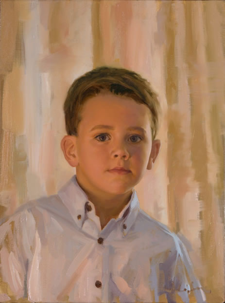
Jonathan Linton is a wonderful portrait artist who I’ve written about before.  Two of my favorites among his portraits are Chad and Stuart (above).  The boy’s facial expression in each of these portraits conveys his very soul.  There’s no vacuous staring into the middle distance here.  Each of the two boys is fully engaged with the viewer in a way that communicates multi-faceted expectations vis-à-vis the world he is growing into.  And each painting is exquisitely rendered from a purely technical point of view.

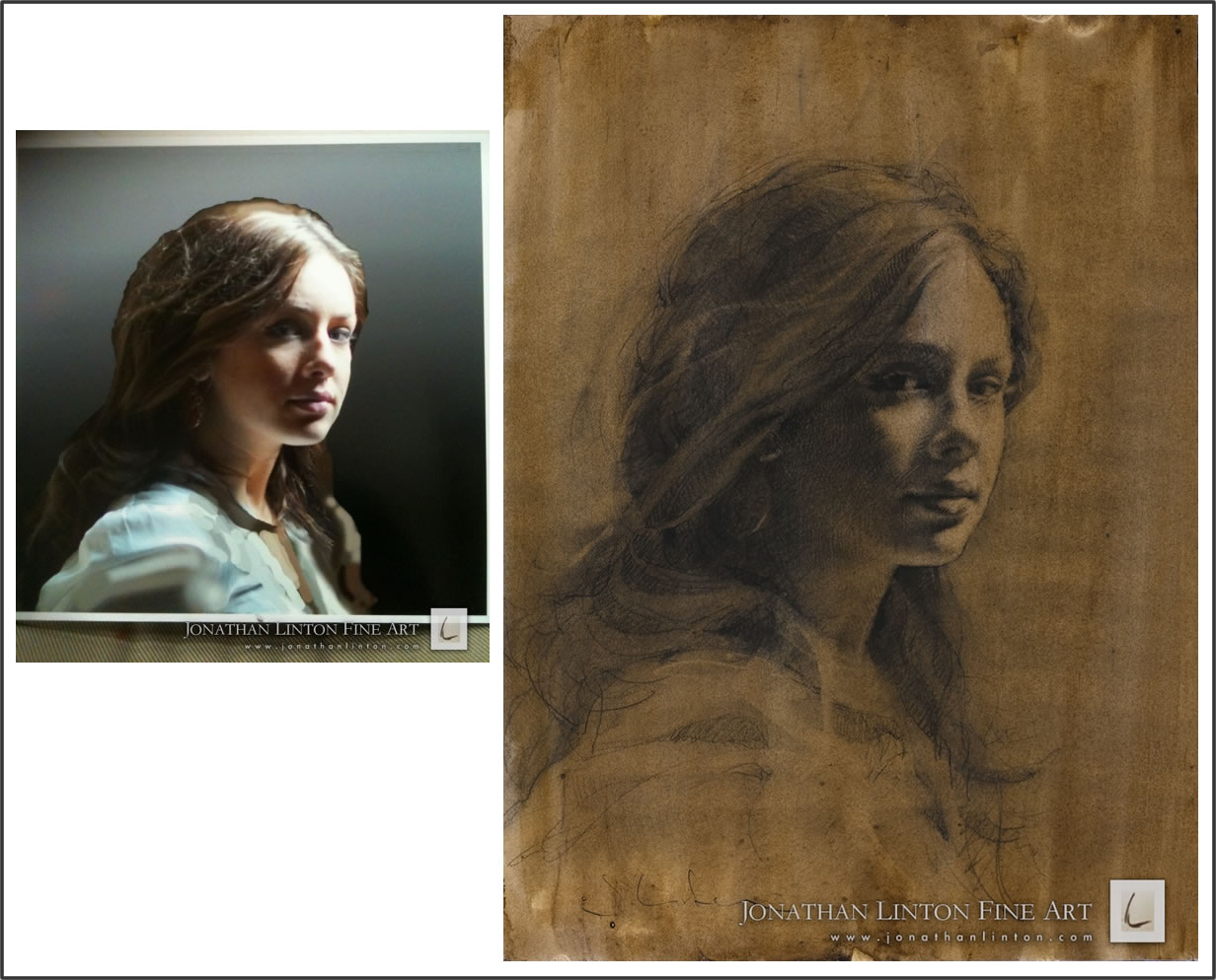
Jonathan has put some painting and drawing demos on YouTube.  For my present post, he’s now written commentary, keyed to specific moments in his drawing video of Meg.  He’s going to take us through how he moved from reference photo of Meg (below left) to his lovely, complex finished drawing (below right).

Reference photo and final drawing by Jonathan Linton

Reference photo and final drawing of Meg, by Jonathan Linton

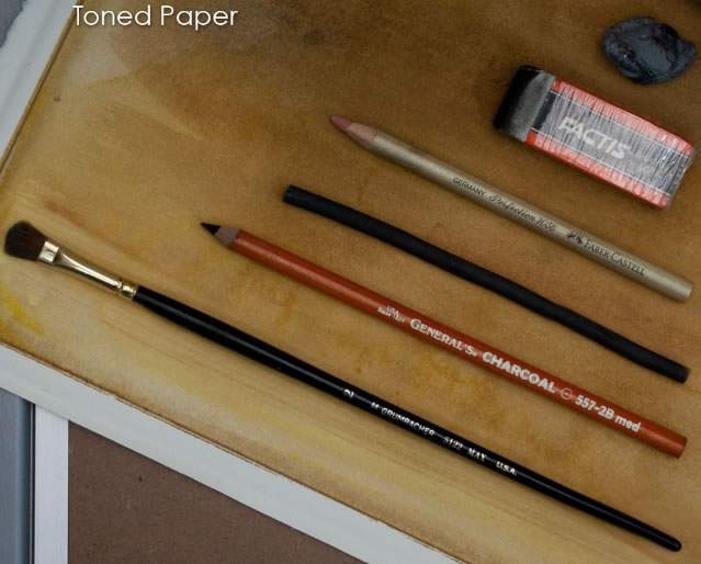
Drawing materials used by Jonathan Linton in his drawing demo of "Meg"

Drawing materials used by Jonathan Linton in his drawing demo of "Meg"

Jonathan used a number of materials to create this drawing: vine charcoal, charcoal pencil, paint brush, three different types of erasers, a paint brush, and paper towels (for his complete list, see bottom of this post).  You can trace Jonathan’s use of each during the video by referring to the photo (left) of materials he sent me.  In the video, it’s especially easy to spot the red charcoal pencil and the silver eraser-pencil.  The fat, rectangular Factis eraser is also distinctive.

I’ve embedded Jonathan’s video in this post.  But an easier way to follow through his text explanation may be for you to open the YouTube video in a second window.  Then scroll down to Jonathan’s text in my post below.  Place it next to the YouTube video, and go through the two simultaneously side by side.

It’s fun to go through the video and commentary more than once, because you’ll pick up more of what Jonathan’s actually doing as you become more familiar with both text and video.

One interesting technique Jonathan used was frequent “wiping down” of the powdery-charcoal drawing.  It may seem counter-intuitive to non-artists to repeatedly wipe out an entire drawing as you’re working, so we’ll talk a bit more about that later.

Jonathan began with watercolor-toned paper.  This means that the paper has been covered with a layer of paint to provide color and texture to the background, and as the bottom-most layer of the drawing.

The first drawing implement Jonathan uses is vine charcoal, which is a very soft, light charcoal, easily erased or wiped nearly clean.

Jonathan Linton’s text commentary for YouTube video of drawing “Meg:”

Vine charcoal was used to place the face, mark the axis of the eyes and apply an initial tone.

0:18            In order to give a softer tone to the drawing, I often wiped the drawing with paper towels.  I wasn’t worried about the awkward scribbles showing through to the final layers since the vine charcoal spreads easily.

After placing these rough indications with the vine charcoal, I used a charcoal pencil to feel out the shapes with more specificity.  Since the charcoal pencil’s marks have a lot more sticking power than the vine charcoal, I tried to keep the lines interesting by varying their weight.

0:43            Cross hatching followed the turn of the form.  The idea is that the drawing will end up having some texture in the shadow areas and I wanted that texture to give info as well as to provide interest.

1:15            Everything was wiped down to soften the drawing and unify the tones.

1:18            Back to the charcoal pencil – refining edges and adding tones.

1:50            Another wipe down.

1:52            The erasers lifted the rubbed charcoal off the lighter areas easily.  (The Faber-Castell Perfection 7056 is a great tool, because you use it like a pencil – even to the point of cross-hatching.)

2:10            Back to the charcoal pencil for further restatement.

2:39            Another wipe down – then charcoal pencil.

2:46            Using the white Factis eraser, I made horizontal strokes across the drawing for macro texture.

After this I used the charcoal pencil, the pencil eraser and the paper towels in quick succession – attempting to refine the shapes and nail the tonal variations – trying to keep the lines interesting and decorating with final details.

Now back to me:

Jonathan uses two techniques in the video which involve removing charcoal rather than adding it.  One of these techniques is erasing parts of the drawing in order to create highlights: the areas of the face and hair on which most light falls.

The second removal technique is wiping over with a paper towel the entire drawing he’s created to that point.  The basis of this technique is that the charcoal is only partly erased by the paper towel, leaving a “ghost” image behind.  The ghosts can pile up on top of each other, adding depth and texture to the drawing intermingled with more defined marks.

I recently ran into a description of this wiping technique on the very quirky and entertaining website of a wonderful artist, the 70-year-old Jack Spiegelman.  Spiegelman wrote his description in the fictionalized voice of Otto Dix, the famous German painter.  I’m including it here because there’s something in Spiegelman’s writing that captures the rhythm and highly-focused momentum of an artist’s process.  As I said above, it’s very difficult to write about drawing in a way that captures – well, maybe a tad dramatically at the end of the quote below – the non-verbal state an artist can get into while working.  So, in the “voice of Otto Dix” by Spiegelman:

“I draw and wipe out, draw and wipe out, draw and wipe out. Everything goes on the one piece of paper. The results can be interesting. An energy is produced in this way. Each sketch in some way evolves or is driven by the image that has preceded it.  The erased images remain present as ghost images….

“I draw and wipe out, draw and wipe out, draw and wipe out. Once the drawing begins to happen you switch to a pencil with a  harder lead and work in a little detail.  I draw and erase and draw and erase. Its starting to happen. There is some energy.  I slash away.  I go back and forth from the soft stick to the hard pencil.  I slash away.  The charcoal is flying.  I love this paper!”

Speaking of paper, for Meg Jonathan used Arches Hot Press.

And that brings us last but not least to Jonathan Linton’s materials list:  Bounty paper towels, pencil sharpener, kneaded eraser, Factis eraser, Faber-Castell Perfection 7056 Eraser, vine charcoal, charcoal pencil, and paint brush.

For more online drawing demos, click here.

Nicole Mone on the importance of drawing from life

Thursday, July 1st, 2010

This is part of a series of posts about drawing and how artists use drawing.  Others in this thread are here.

________________

Great works are not created with technical ability alone, but it is the starting line.  I like the quote from William Morris Hunt, “Imagination comes in after we have experience.”

Nicole Moné on why she believes constant sketching from life is important.

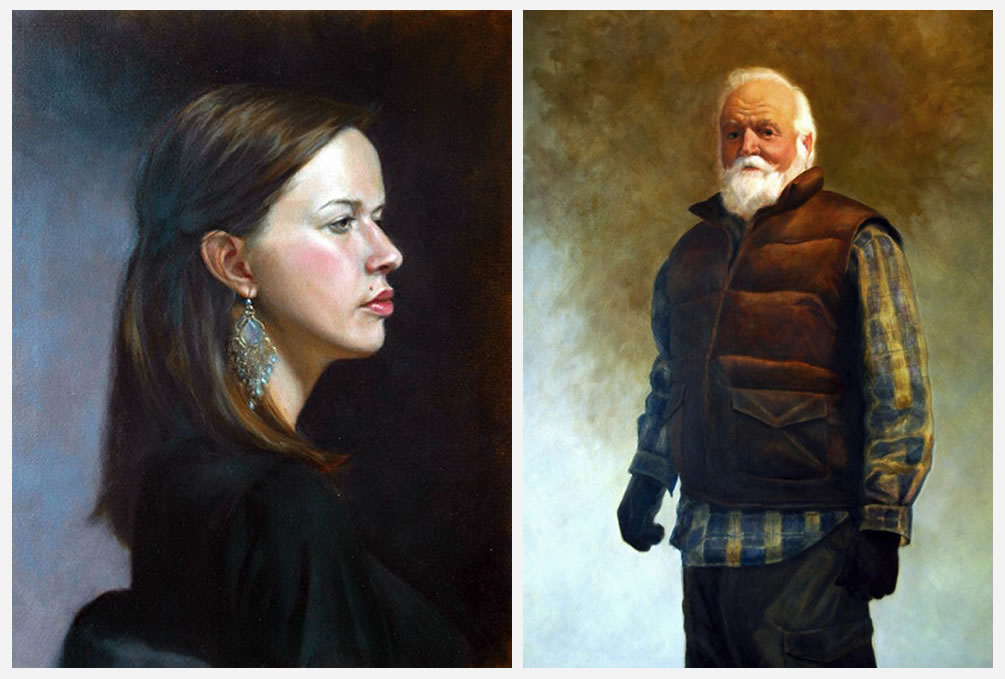
Maia (left) and Outdoorsman (right), by Nicole Moné

Maia in Profile (left) and Outdoorsman, Potrait of the Artist's Father (right), by Nicole Moné


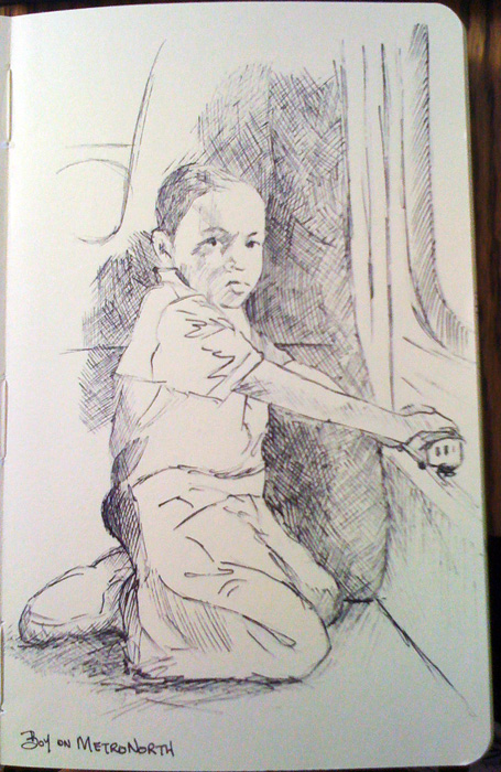
Nicole Mone's sketch of a boy on a Metronorth train

Nicole Moné's sketchbook: Drawing of a boy on a Metronorth train.

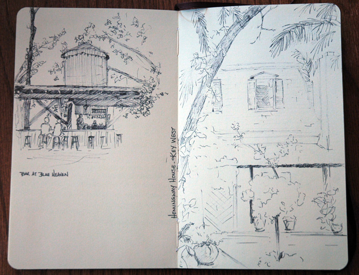
Nicole Moné almost always carries a sketchbook – usually a Moleskine – with her, to record her impressions of sights she sees in her travels both exotic and routine.  “In my opinion,” Nicole says, “you can never draw and sketch enough, nor will you ever reach a point where you no longer need to.  Continuous observation is essential” for artists.

For those wanting to draw the human figure, Nicole feels,

“a very important exercise is people-watching.  Studying people and the way they move, observing how arms relate to shoulders, how the back arches, how the pelvis tilts when legs move a certain way… When you train yourself to notice these things, you can more effectively translate your observations into your artwork.”

Nicole uses her sketches to record ideas for paintings or sculptures, and as studies for finished works.  Along with her sketchbook, her constant traveling companions include a camera.  “I always have a camera with me as well, and often use the photos in conjunction with my sketches to create a painting back in the studio….”

But if Nicole takes photos of something, you might ask, why bother sketching the same thing?  Nicole responds that drawing

“is important to me because, while sketching, even very quickly, I am more present in the moment than when I snap a photo and move on. Sketching teaches you to see better and remember more. You absorb so much more of your surroundings while sketching and you are listening, smelling & hearing the world around you in that moment….  Sometimes I only have a few minutes, or less, to capture a gesture or some intangible that I want to remember.  There is very limited information but I’ve gotten what I wanted.”

Nicole Mone's sketchbook: ink drawings of Key West

Nicole Moné's sketchbook: ink drawings of Key West

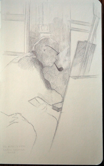
Nicole Moné's sketch of Aaron Shikler

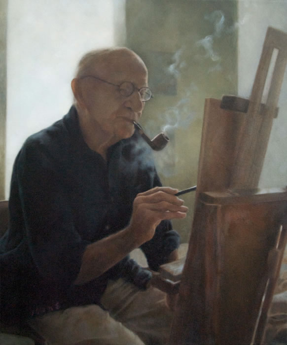
Let’s look at a painting Nicole created based on one of her sketches.  At the time she made the sketch (left), Nicole herself was being painted by portraitist Aaron Shikler.  Sitting for him gave her time to study him from a unique angle.  Being simultaneously a model and an artist, Nicole was able to create an unusual work of art, “The Model’s Perspective #2” (below).

I love the way Nicole’s finished painting of Shikler captures the contemplative, right-brained state that artists often enter while working “in the zone.”  As an artist, I deeply resonate with the mood of this painting.  And apparently a lot of other people are affected by it, also: The Model’s Perspective #2 has been selected for the “Inspiring Figures” Exhibition and Competition through the Portrait Society of America, hosted by the Butler Institute of American Art, following a New York showing this summer in the Salmagundi Club’s Painting and Sculpture Exhibition for Non-Members.

The Model's Perspective #2, by Nicole Moné

The Model's Perspective #2, by Nicole Moné

Nicole described her process of sketching Shikler, which ultimately resulted in her evocative painting of this mood:

“While I was sitting for a painting for my friend and mentor, Aaron Shikler, I was intrigued by the way he was silhouetted against the windows of his studio and the look of the pipe smoke in the light.  I had plenty of time to observe him as he painted.  I made the sketch to work in conjunction with a few photos that I took with my camera phone.

“As you can see, the sketch didn’t end up being the exact pose I used in the final painting, but it provided me with the memory of the scene as I wished to convey it.”

Nicole’s initial sketch is a lovely example of a drawing that stands on its own, independent of the painting for which it was made.  She used lines and shading based on artistic choice rather than strict realism.  While the sketched lines of Shikler’s body capture his position perfectly, the shaded area draws our attention to the lines of his head as he turns away to focus on filling his brush with paint from his (out-of-sight) palette.
.
This sketch also provides an excellent example of how an artist makes decisions about how to compose a final painting.  For the painting, Nicole made a major departure from her initial drawing.  She decided to paint Shikler in 3/4 view instead of the profile she had first sketched.  And Shikler’s hand is central in the final composition, not hidden as in the sketch.  Nicole made these choices because she wanted to show Shikler
“directly engaged with his work, instead of reaching past the easel to an unseen palette….  The 3/4 view also allowed me to convey some space and ‘air’ around the subject by playing with the smoke lingering between the pipe and his far shoulder.”

She began to make these decisions immediately after creating the sketch – while he was still painting her.

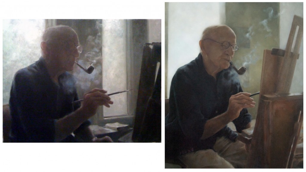
For comparison: The Model's Perspective #1 (left) and The Model's Perspective #2 (right), by Nicole Moné

For comparison: The Model's Perspective #1 (left) and The Model's Perspective #2 (right), by Nicole Moné

After Nicole returned to her own easel, in her first painted study (above), she began to experiment with the position of Shikler’s hand, the turn of his face, and the amount of shadow she wanted him in.

It’s interesting to compare # 1 and #2, in which Shikler is leaning father forward, his head slightly more tilted.  These slight changes in body position in #2 show him at a moment when he is more engaged in the act of painting.  Also in #2, Nicole has shifted her perspective to create less distance between Shikler and his easel: the window no longer separates them.  We see more detail in Shikler’s face, so the backlit lens of his glasses is no longer key.  To me, the first painting, while lovely, is more a study of light and smoke.  The changes Nicole made in #2 make it more about an artist’s process and mood while he paints.

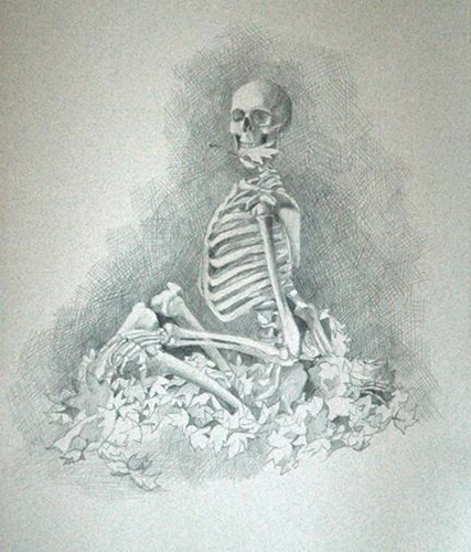
Autumn Leaves - Week 16 of The Skeleton Project, by Nicole Moné

Autumn Leaves - Week 16 of The Skeleton Project, by Nicole Moné

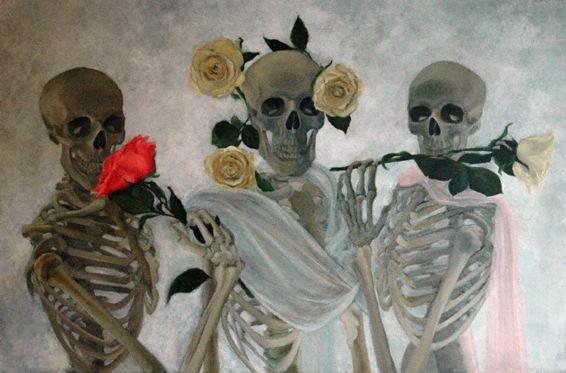
Another of Nicole’s artistic interests is the skeleton, inspiring her to begin the Skeleton Project.  She draws from her own life-sized male skeleton which she bought from a medical supplier.  For animal skulls, she uses friends’ specimen collections and gifts she’s been given of animal bones by friends and Skeleton Project fans.  Nicole wrote,

“I love skeletons; there is something deeply beautiful about the human skeleton. Drawing skeletons gives you a greater understanding for drawing the human figure. When you know the architecture underneath, drawing the figure makes more sense.”

Skeleton Project painting by Nicole Moné

Skeleton Project painting by Nicole Moné

In the Skeleton Project, Nicole is fulfilling the words of William Morris Hunt which she quoted (above): “Imagination comes in after we have experience.”  Her fantastical skeleton paintings grew out of her studies of skeletons.  Nicole has turned her drawings of “the architecture underneath” on their heads.  What were initially sketches –  tools to prepare her to paint the human figure – have taken on a life of their own in Nicole’s imagination.

________________

Note on Nicole’s sketch materials: She wrote, “I enjoy the spontaneity & line quality of drawing with ink pens (brands I like are Stadtler, Prismacolor and Faber-Castell PITT artist pens)  though I will often use pencil or a combination of both.”  She also sometimes uses a kneaded rubber eraser to “sketch” on a page toned with Conté crayon, removing color to reveal a drawing.

Reuben (left) and Andy (right), by Nicole Moné

Reuben (left) and Andy (right), by Nicole Moné

Artists’ drawing experiences: Marie McCann-Barab

Friday, May 21st, 2010

Lately I’ve been asking fellow artists about their approaches to drawing.  Having posted a tutorial about my own drawing method, I’ve become curious about what works for other artists.

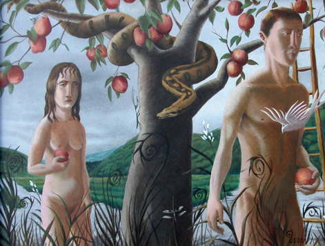
Before the Fall, by Marie McCann-Barab

Before the Fall, by Marie McCann-Barab

Marie McCann-Barab is a Westchester, NY, artist.  She has a gorgeous and unique style that often places human beings in an eerie state of tension within the natural world.  Marie attended art school at Parsons School of Design in New York City, and has also taught art for many years.

Marie recently described to me three drawing techniques taught by  different professors she studied with at Parsons.  Her description of each technique was so distinct and interesting that I thought I’d present them all here, along with some of her drawings illustrating each.

Attachments, by Marie McCann-Barab

Attachments, by Marie McCann-Barab

Skeletal technique

Marie wrote to me:

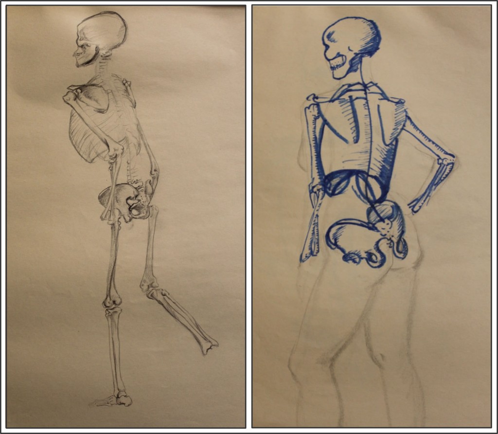
“In one class I had to copy drawings of the skeletal-muscular system as homework for a semester. It gave me a good basic understanding of how the body works. The instructor would very specifically hire models of dramatically varied body types. More than once we had a model who could be described as “skin and bones.” We could so clearly see her skeletal structure that it was like the anatomy drawings had come to life. Having that knowledge is incredibly helpful when drawing from the model, but even more so when drawing from imagination.”

Marie's Drawing of a skeleton and application to life drawing in similar pose

Marie's drawing of a skeleton and early application to life drawing

The live model’s position is similar to, but not exactly the skeleton’s (e. g. the skeleton’s back arm is less visible than the model’s because its upper body is more turned away than the model’s).  What amazes me in these drawings is the complexity and detail of Marie’s work, in particular of the pelvic bones, the various joints, the crossing of the two forearm bones, and so on.  I know from my own work how convoluted and difficult the pelvis in particular is to visualize.

Costume contour technique

Marie wrote:

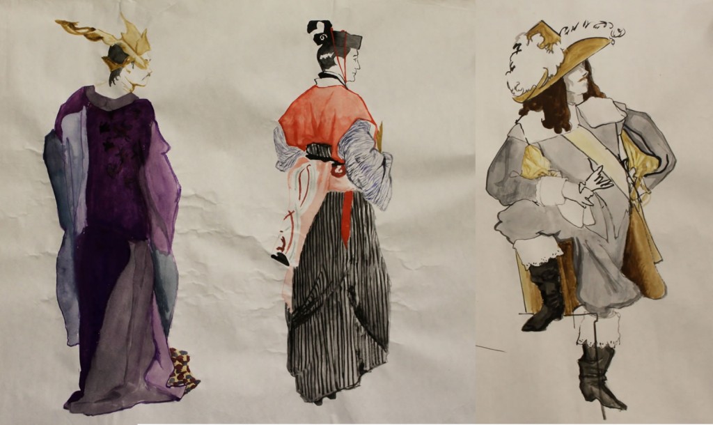
“Another teacher taught us to understand proportion and gesture by drawing the contour of a costumed model with brush and ink. No details, only the edge between the form and the space around it. If the model was wearing an 18th-Century costume, the overall shape had little to do with the actual figure. Hoop skirts and powdered wigs made it very challenging. This process really required right-brain thinking. However, understanding how the body counterbalances weight in any given pose helps an artist express the gesture when the architecture of the body isn’t seen. So the knowledge from the first class helped a lot here.”

The following are not simple contour drawings from this class; unfortunately Marie has lost them.  “I don’t have examples of the pure contour drawings in India Ink,” she wrote.  The costume drawings below are “the long poses at the end of class. We would start them in India ink and would also use gouache or watercolor. But you can see how the costume really obscured the figure.”

Three costume drawings by Marie McCann-Barab

Three costume drawings by Marie McCann-Barab

Perpendicular line technique

“A third instructor,” wrote Marie, taught a method which helped students understand the “architecture” of the human body.  Beginning with the point of the body closest to them, students had to

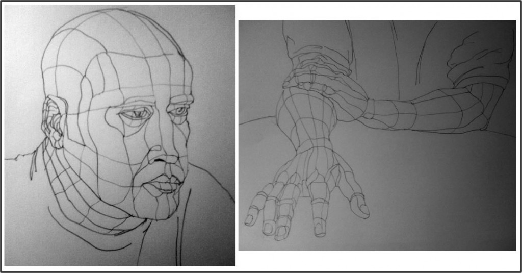
“draw the figure as if it were covered in a network of perpendicular lines… that described the expansion and contraction of limbs. The process demanded that we look very carefully at the forms. The resulting image became very architectural and really emphasized the perspective of the body in foreshortening. I didn’t enjoy drawing this way, but it was a great exercise in seeing.”

MarieGridDrawings

Perpendicular line grid drawings by Marie McCann-Barab

Marie wrote descriptions of this process:

“I start with the part of the form that is closest to me: a tip of a finger. Then I begin drawing backwards, defining those planes again: the top surface of the digit, the ridge of the knuckle, the side of the finger, the widening of the next portion. When the finger reaches the hand, I’m more aware of the depth and dimension of the hand than if had just approached this with a contour line.”

I find it extraordinary to imagine that this drawing, so accurate a portrayal especially of the finger positioning, was created by drawing “backward” from the tip of the finger closest to the artist.  Marie wrote that she did the same thing in drawing the head: first she drew the small almost-rectangle at the tip of the nose.  Then she worked “backward” in space from that point, just as she did with the hand.

Yin and/or Yang?

Marie added a little addendum about an exercise:

Another approach is to draw with the non-dominant hand. …This exercise is particularly beneficial to anyone who has developed facility and consequently has stopped REALLY looking at their subject. Our dominant hand seems to develop its calligraphy for expressing familiar forms. But when we use the non-dominant hand, we have to look more carefully, and communicate with that hand that holds the drawing instrument.

It’s not only artists who’ve been drawing a long time who have trouble allowing themselves to really see. Beginners who want to learn to draw also struggle with this.  Allowing the mind to cross over into right-brain mode is very difficult for most people learning to draw, and yet it’s basic to drawing well.  Betty Edwards Drawing on the Right Side of the Brain famously takes beginners through a series of exercises that help allow their right brains to take over while drawing.

Yin Yang symbol

Yin Yang symbol

We might think of this in terms of using yin (right-brain) techniques to draw yang (what is there in reality).

When I first read Marie’s description of her professor’s perpendicular lines technique, it seemed very analytic to me, meaning left-brained.  But when she described her step-by-step process of drawing for her head and hands (above), it sounded mesmerizing and dreamy.  Very yin, actually.  I could suddenly see how this technique might help the brain cross over into right-brain territory.

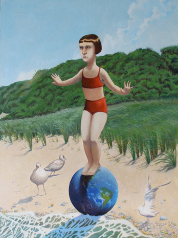
Balance, by Marie McCann-Barab

Balance, by Marie McCann-Barab

As for the skeleton technique Marie described, this still seems to me to be the antithesis of what would help the right brain step forward.  What I found really interesting, though, was the comment Marie made at the very end of her description:  that knowledge of the skeletal-muscular system “is incredibly helpful when drawing from the model, but even more so when drawing from imagination.”

The tension between drawing from what’s “out there” (yang) vs what’s inside the artist’s imagination (yin) interests me a great deal, so Marie’s statement really caught my attention.  It’s challenging enough to learn how to draw what’s in front of us in reality.  Even more challenging is learning how to paint a world that exists only inside the artist’s head, in a way that gives it a feeling of reality.

So – if this doesn’t sound too convoluted – it seemed to me that Marie was saying that her yang knowledge of the skeleton is crucial when she’s creating yin worlds of her imagination.

Well, if this yin-yang paradigm makes any sense at all, Marie’s painting entitled Balance is a wonderful illustration of it.  In Balance, we have Marie’s unique world of a human girl in uneasy tension in a natural setting.  But this is a natural setting of Marie’s imagination, in which the entire world rests on the tidal edge of a beach, the girl balanced on it.

How did Marie make the imaginary natural world of Balance feel real?  The girl’s position atop the globe is for the most part fairly uncomplicated.  What makes her precarious balance clear, though, is her left hand (on the right side as we face the painting).  It’s the hand of a person who has just been startled by being thrown slightly off-balance.  From what Marie wrote about using her knowledge of the skeletal system to draw from her imagination, I would guess she used it to draw that hand.

In short, it’s intriguing that yang knowledge is needed to portray the yin of the imagination, while the yin of the right brain is needed to draw reality (yang).  Food for thought for the future….

August, by Marie McCann-Barab

August, by Marie McCann-Barab

Me against Da Vinci? What’s the best way to draw?

Thursday, May 6th, 2010

If you’ve ever taken art classes, you may wonder why I didn’t include information about the structure of the human body in my two life drawing lessons.  Aren’t figure-drawing teachers supposed to start by describing the internal skeleton, segments and joints of the body, standard proportions of head, legs, eyes, arms, mouth?

For example, Rebecca Alzofon began her online figure drawing lessons with wonderful animations of a skeleton, followed by the three ovals of “Head, Ribcage, Pelvis,” the “Pivot points” inside joints, “Long bones,” and so on.

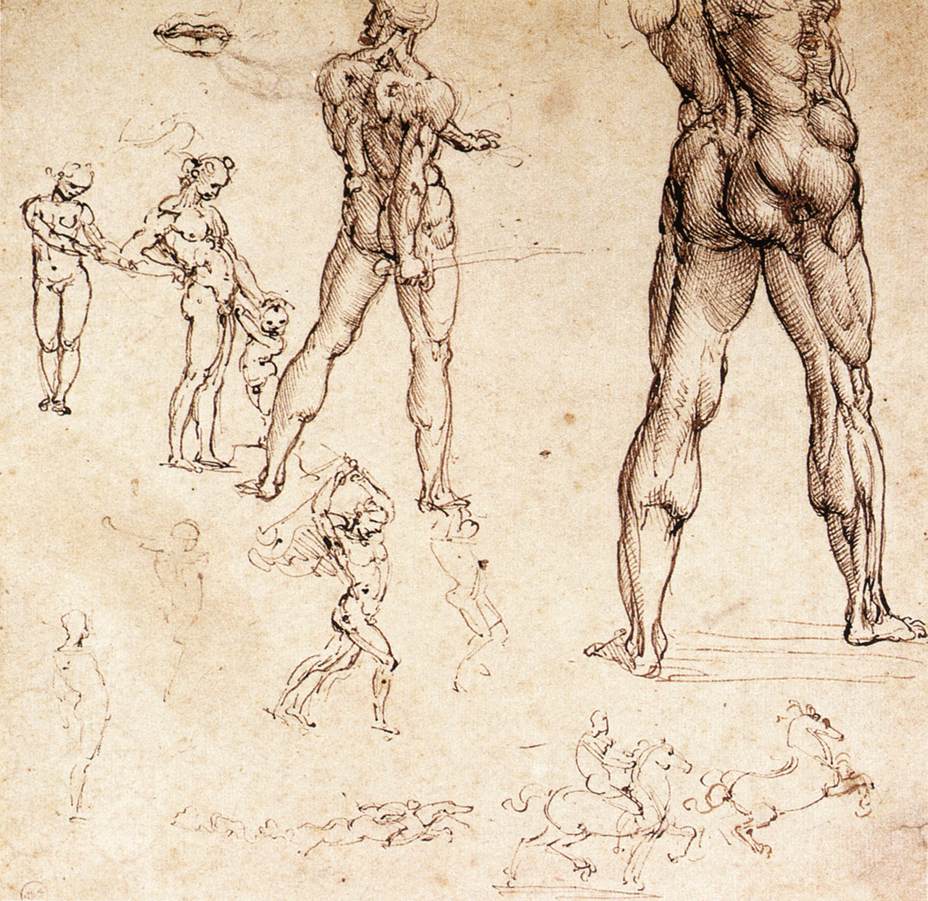
Drawing by Leonardo Da Vinci

Drawing by Leonardo Da Vinci

The early, great champion of the anatomical approach to life drawing was of course Leonardo Da Vinci.  Da Vinci,  one of the greatest artists who ever lived, did minutely detailed dissections of human corpses along with eyewitness drawings of human anatomy.

But the Angle-Abstraction Game I described in my life drawing lessons, on the other hand, is all about angles and shapes.  Isn’t that geometry, not human bone and flesh?  Where is the brilliant Da Vinci in that?

There are different ways to approach drawing.  I’ve linked to Alzofon here because I admire the care and thoroughness she devoted to her tutorial’s very detailed illustrations and text.  If you want to try out the life-drawing method she represents, I recommend working through her multi-paged lessons.  Her presentation is, I think, more helpful than some of the other briefer ones you can find online.  Above all, I love her use of animation.

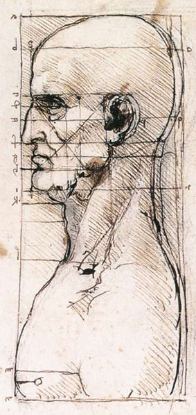
Da Vinci: Placement of features in the head

Da Vinci: Placement of features in the head

My own earliest drawing classes included anatomical information, standard proportions and focus on the body itself when drawing.  I learned, for example, that the crotch is the halfway point in the length of the human body – which, by the way, is 6-7 heads.  The nose ends halfway between the eyes and the bottom of the chin, and the mouth is one third down that same distance (you can see exactly this noted by Da Vinci in his drawing of the human head).  The pelvis tilts and turns independently of the chest, as do the shoulders, and so on.

But for me personally, it wasn’t until I put all that aside and looked simply at shapes and angles carved into space that I suddenly began to draw fluidly and with assurance.

In current parlance, I began to draw from my right brain instead of my left.  For me, that made all the difference.

But how could that be?  Where did I get off disagreeing with Da Vinci?

Betty Edwards is the pre-eminent teacher of the “right-brained” approach to drawing, made famous through her book Drawing on the Right Side of the Brain.  I had actually begun using my angle-abstraction game more than a decade before her book came out.  But the book explained to me why forgetting – or at least not focusing on – all that detailed information about the human body worked so well for me.  Edwards made me feel it was OK to diverge from Da Vinci.

In a nutshell, Edwards explains that we often can’t draw because we’re blocked from seeing what’s right in front of us.  What blocks us is our preconceived notions about what a human hand or leg or eye should look like.  We struggle, trying to draw what we assume we’ll see – instead of seeing what’s actually there: how the specific hand in front of us looks, for example, when its fingers point straight at us.

With this in mind, it now seems to me that all the detailed information about the human body’s standard proportions might get smack in the way of our drawing well, rather than helping us draw better.  “Standard proportions” provide more expectations of what we should see, rather than removing expectations so that we can see.  This is especially true when the model isn’t standing upright, but is bent or folded in more complex poses, where “standard” proportions get lost in the twists and turns of the person’s limbs.  And after all, it’s non-standard poses that express the body language of individual people whose personalities we want to capture along with their outward appearance.

Edwards’ great contribution to artists everywhere is that she teaches how to disengage our left brains while we draw, in order to enable us to see what’s actually there.  One very important way of doing this is to focus on “negative space” – the space around the figure, rather than on the figure itself.  Counter-intuitive though this may seem, focusing on the space around your subject is often the best way to capture your subject accurately.  This is because looking at the unexpected negative “turns off” the left brain and allows the right brain to do what it’s good at – drawing.

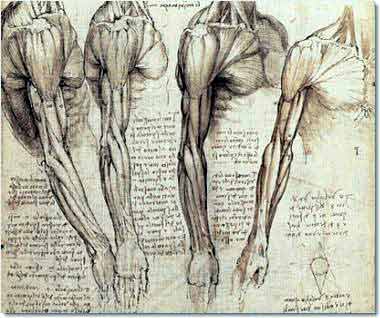
Da Vinci: Muscles of the neck and arm

Da Vinci: Muscles of the neck and arm

So all the focus on the body itself, and all the analysis of what’s going on inside it, for me at least, engages my analytic left brain and gets in the way of drawing.  Conversely, the more I forget I’m even drawing muscles, hair, and bones, the better I get at drawing muscles, hair, and bones.

I will never know what it would be like to draw without first having my early foundation of information about the body.  It’s very possible that this knowledge informs my drawing even though I never think about it consciously.  I also think I happen to be the kind of visually-oriented person who is always sponging in information about everything I see, like how babies’ knuckles look like dimples and how my own knuckles look as I sit here typing.  I think I may more quickly recognize and draw certain shapes because my mind is always noticing them in my everyday life.  So I’m undoubtedly not a pure test case of drawing from abstractions rather than awareness of the body.

I encourage experimentation with all kinds of approaches to drawing.  What works for me may not work for you.  But I’d also encourage you to strongly consider the possibility that emptying your conscious mind of analytic focus on the body may be the best way to draw the body beautifully.

Learn to Draw by Playing the Angle-Abstraction Game: Lesson 2

Sunday, April 25th, 2010

If you haven’t yet seen the first half of this life drawing lesson, you can get to it here.

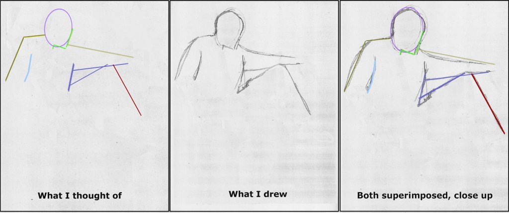
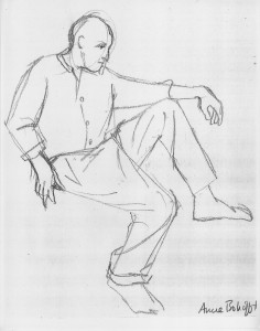
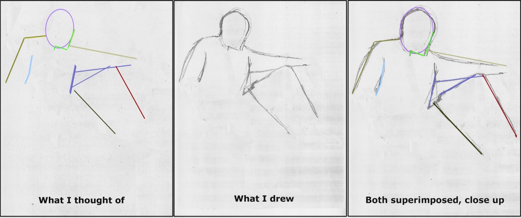
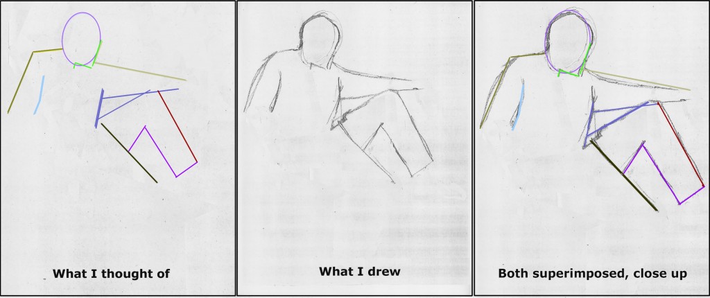
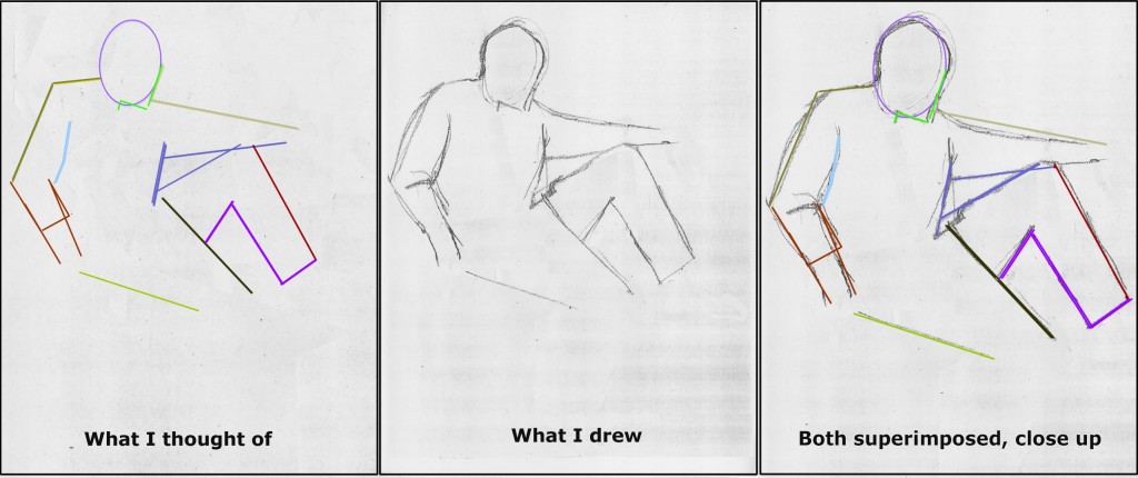
Briefly, my Angle-Abstraction Game drawing process begins with a simple shape, in this case an oval. Emerging from the oval, you draw lines corresponding to various elements of the body.  With each added line, you build exponentially more reference points from which to base your next lines and angles.

Astonishingly, from this mess of geometry, a human form will appear.  The magic moment when it suddenly does is the reward for forging through any difficulties that precede it.

DonDugaSketchAlone

My 2-minute sketch of Don Duga

______

Beginning the second half of the life drawing lesson:

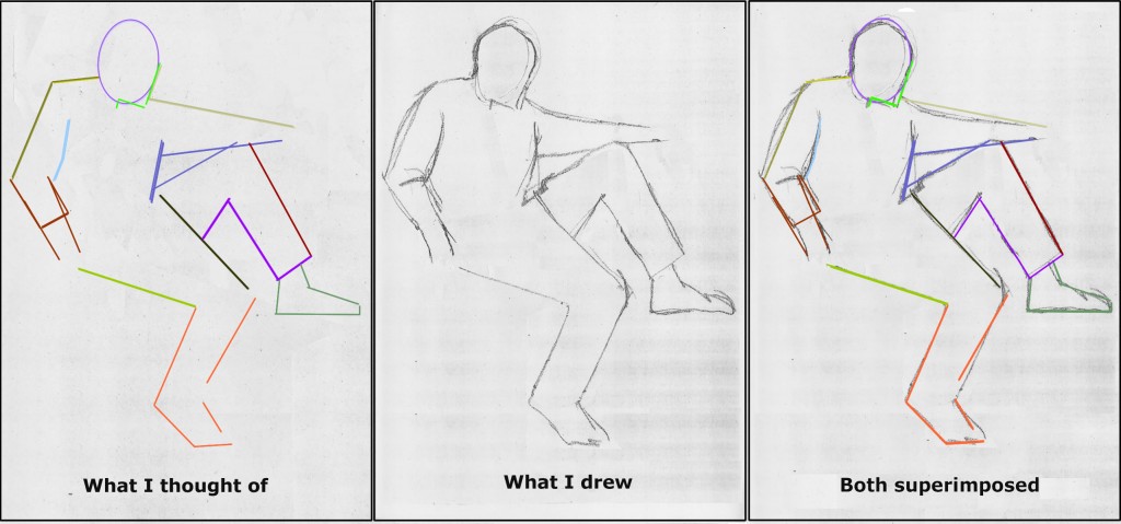
Next is the front of Don’s propped-up leg.  By now you have all kinds of reference lines to draw its angle and length accurately.  Which would you pick?

(To reiterate from Part 1, the sequence I’m following here is not preordained.  As you practice with other models, you should move through shapes and lines as you notice their relationships to what you’ve already drawn.  Try to cover the entire body very quickly using basic shapes.  Only after that should you go back to add as much detail as you have time for before your model shifts position.)

DonDugaColoredPathsStage9A

Don Duga sketch

2-minute sketch of Don Duga

The next line I drew may be the trickiest of the entire pose.  This is because our normal expectations about legs cloud our ability to see what’s actually in front of us.

If you rely only on your standard expectations about human bodies, you might assume that the inside line of each of Don’s legs would intersect the body at the crotch, the bottom center of the pelvis.  But in this case, the lower pant leg of Don’s baggy chinos is being pulled upward and way off center by the propped-up leg.

Drawing something this disoriented from our normal assumptions is very difficult.  The only way to achieve it is to abstract how you see it from all your expectations of what it should look like.
By now you know the angle-abstraction game routine:  Forget that you’re drawing a leg or pants.  Look only at the line formed by the top edge of Don’s lower pant leg.  Where does this line begin at the top?  Which line you’ve already drawn does it intersect, and where?  If you look carefully, you’ll realize that it intersects the top line of Don’s raised leg just about at the point where it meets his shirt front.

Once you’ve determined where this line begins at its top, ask yourself whether it descends tilting right or left of its starting point?  At what angle does it continue downward?

DonDugaColoredPathsStage10A

Don Duga 2 minute sketch

Don Duga 2 minute sketch

After I had sketched this line, I double checked its relationship to my already-drawn upper edge of Don’s other leg.  Note that the two are not quite parallel.  They slant slightly toward each other at the bottom.  If you don’t have this right, feel free to sketch in another more accurate line.

If all this reads like a jumble of geometry, it’s because right-brain processes are always very difficult to describe in words (left-brain).  I promise you that what may be tough to read here is a lot more fun in the doing. And the reward at the end is wonderful, when you suddenly realize you’ve created the image of a person from a maze of angles and lines.  So keep moving through this with that spirit in mind!

Let’s now outline the rest of Don’s upper pant leg.  Where does the bottom-of-the-pant-thigh line intersect with the line you just drew?  What angle does it form there? Where does it end?   I noticed that it ended at roughly the same level as the line just drawn for the other leg.

DonDugaColoredPathsStage11A

My 2-minute sketch of Don Duga

My 2-minute sketch of Don Duga

From this point on, completing the outline of Don’s propped up leg is easy because the back calf is almost parallel to the front calf line.

I then completed the bottom thigh line for the other leg, along with the lower arm on the left of the page.

I think you’ve probably grasped the angle-abstraction method well enough by now that it will be more fun for you to play the game on your own rather than reading more verbiage.  So I’ll let my images speak for themselves for the next couple of steps.

DonDugaColoredPathsStage12-13A

DonDugaColoredPathsStage14-15A

2-minute sketch of Don Duga

2-minute sketch of Don Duga

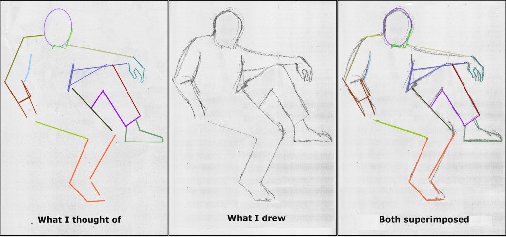
Next, I turned to the hand on the right side of the page.  Many people find hands very difficult.  But hands should be approached exactly the same way as any other part of the drawing.  The lines are short, but the process is exactly the same.
If it’s easier and/or quicker for you, you can abstract hands into their component shapes – triangles and parallelograms – rather than individual angles.  I do this all the time.

DonDugaColoredPathsStage16-17A

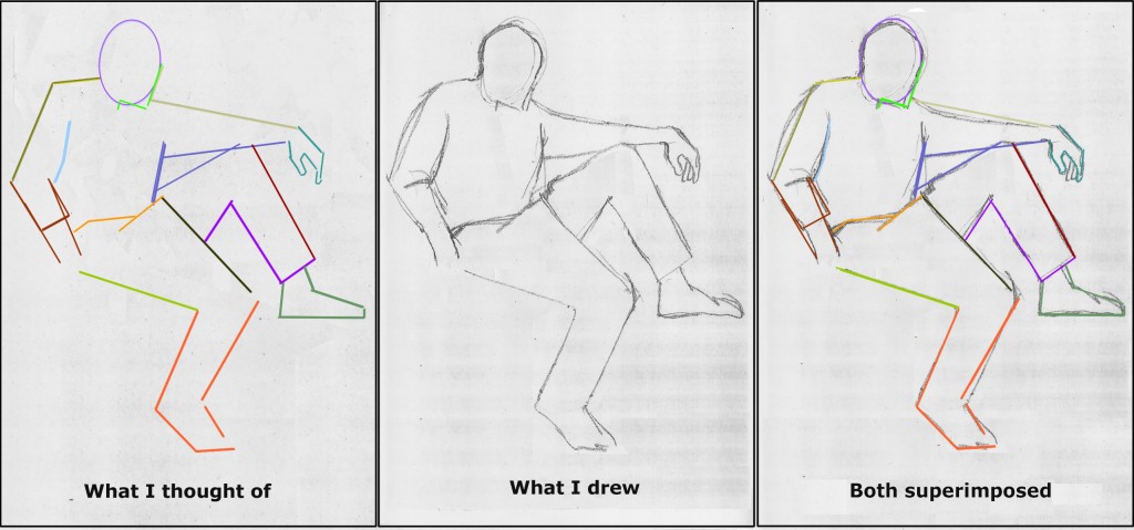
Now I drew in Don’s waist – or more accurately, the lines formed where the folds of his pants borders his shirt.  This is another series of those strange and complex lines that you can’t draw in any other way than by looking at the angles and forgetting all your standard expectations about what a waist should look like.
DonDugaColoredPathsStage18-19A

2-minute sketch of Don Duga

2-minute sketch of Don Duga

Last, I sketched in the opening of Don’s shirt along with its buttons.  You’re already used to seeing lines and angles.  For the buttons, look at them as pure ovals.  What is the shape and tilt of each oval?  Each is different from the others because each button is at a different place in the folds of Don’s shirt.  We’re seeing each button from a different perspective. So if you get each button-oval’s width and angle correctly, they will contribute a lot to conveying the shirt folds.  That in turn will begin to give your drawing the depth and detail that make it look 3-dimensional, even though you haven’t added any shading.

DonDugaColoredPathsStage20A

The hand on the left of the page is not my finest moment, so I haven’t described how I drew it.  It’s one of those details you leave for the end of your 2-minute sketch period, and time runs out.  This is a common occurrence in these quick sketches, one that only lots of practice helps you improve on.

You may be wondering about the detail in Don’s face and the folds of his clothing which is in my final sketch, but not discussed here.  This level of detail is the last phase of each life drawing.  I hope to get to talking about that soon.

Meanwhile, though, we’ve accomplished a solid, believable drawing of Don’s basic position!  Congratulations, and keep practicing!

Last but not at all least, I’d like to hear from users whether this lesson has been useful.  Are there parts that haven’t been clear?  Would more lessons like this be helpful, or does this one cover all the basics you need to know?  Are the visuals helpful as they’re done here, or can you think of another presentation that would make you feel the fun better?  Would more or less text work better for you?  Please let me know, preferably by clicking “Leave a Response” below to comment, or else by emailing me at abobroffhajal [at] gmail [dot] com.