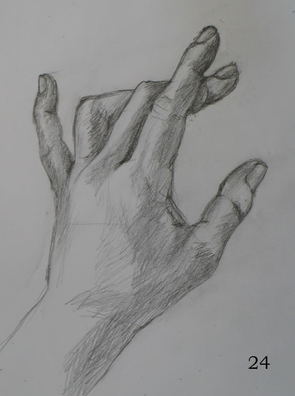
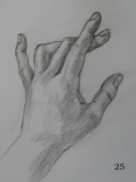
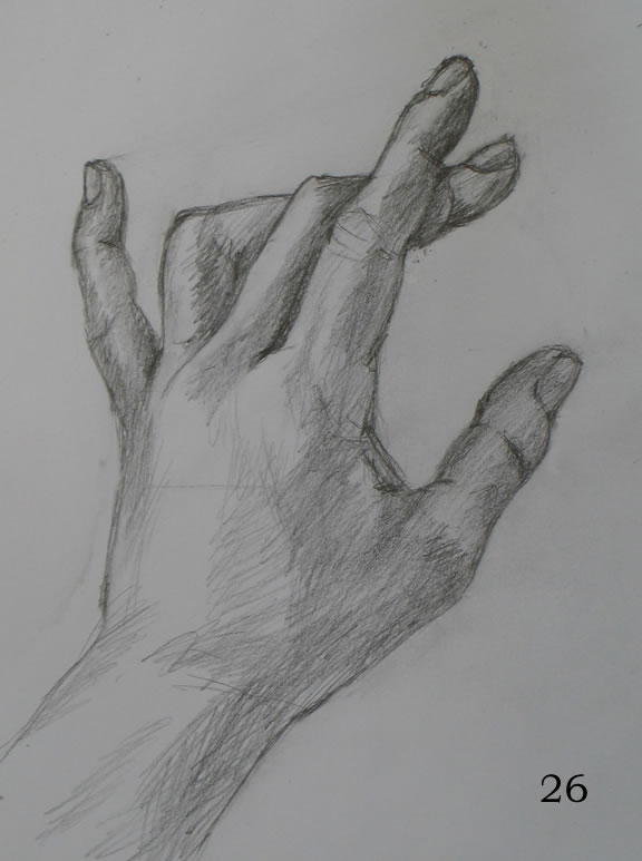
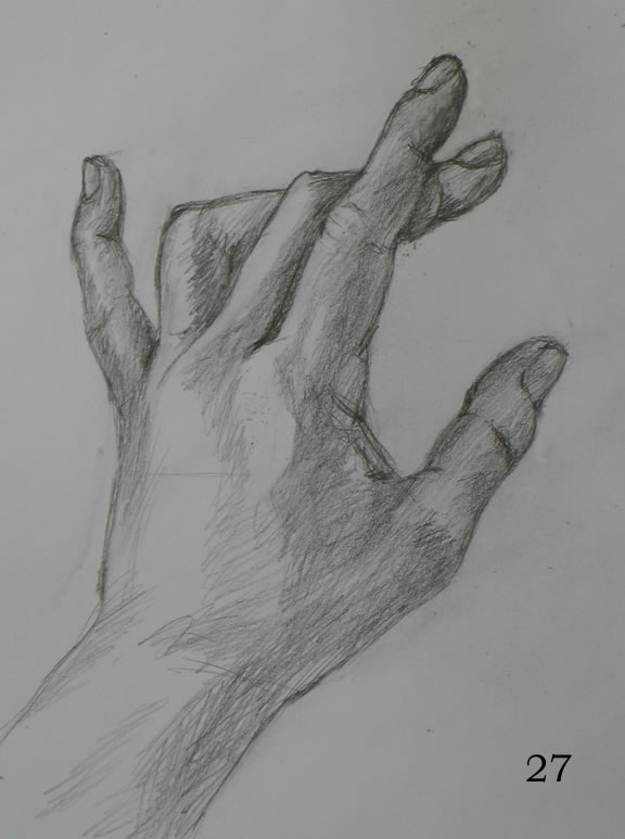
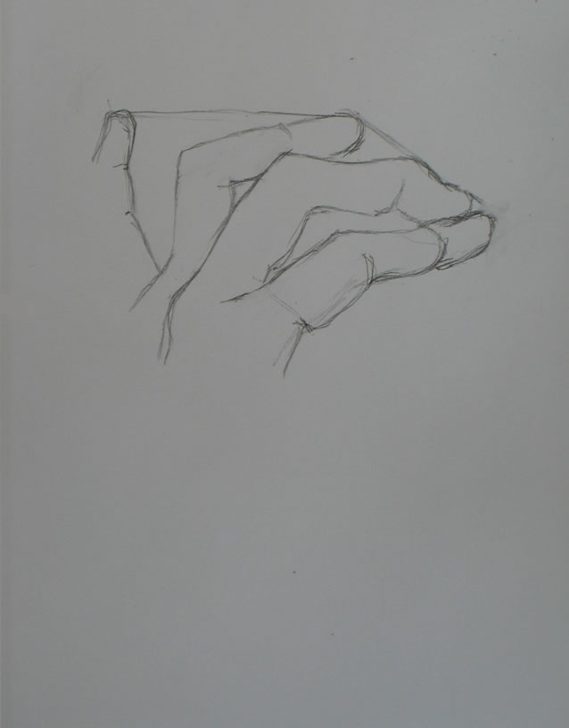
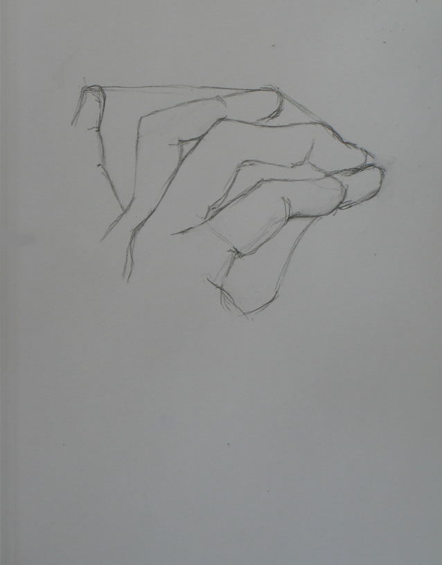
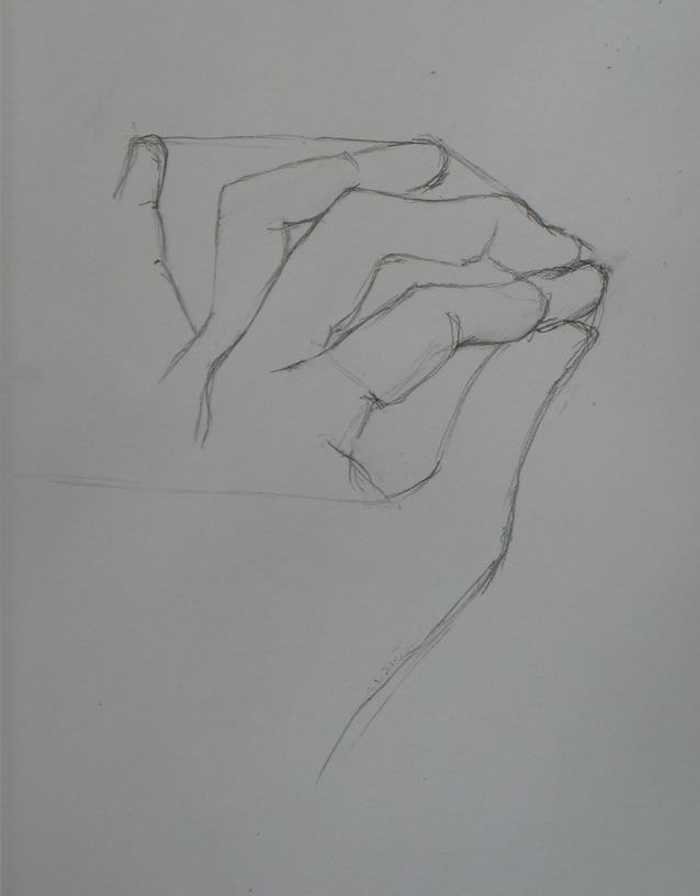
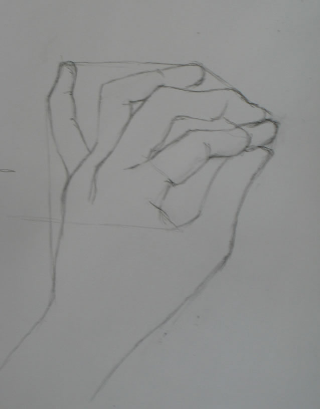
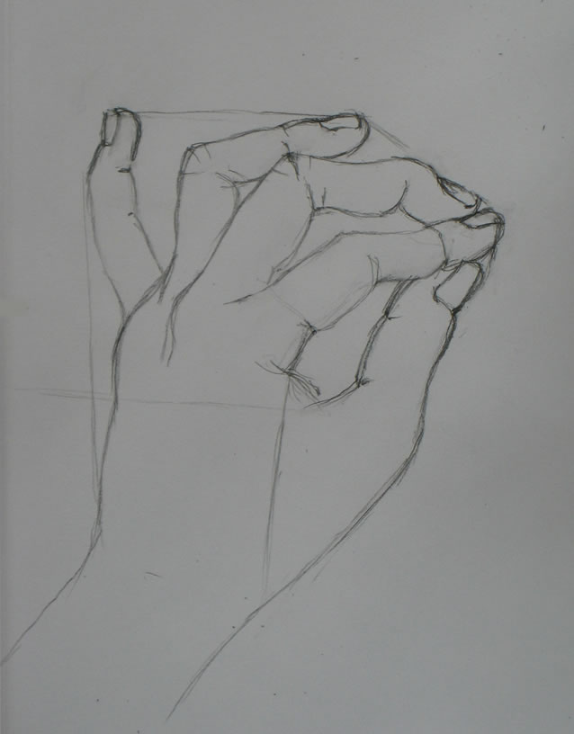
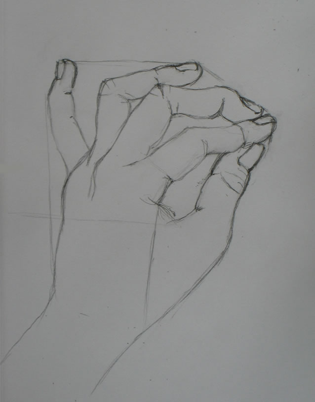
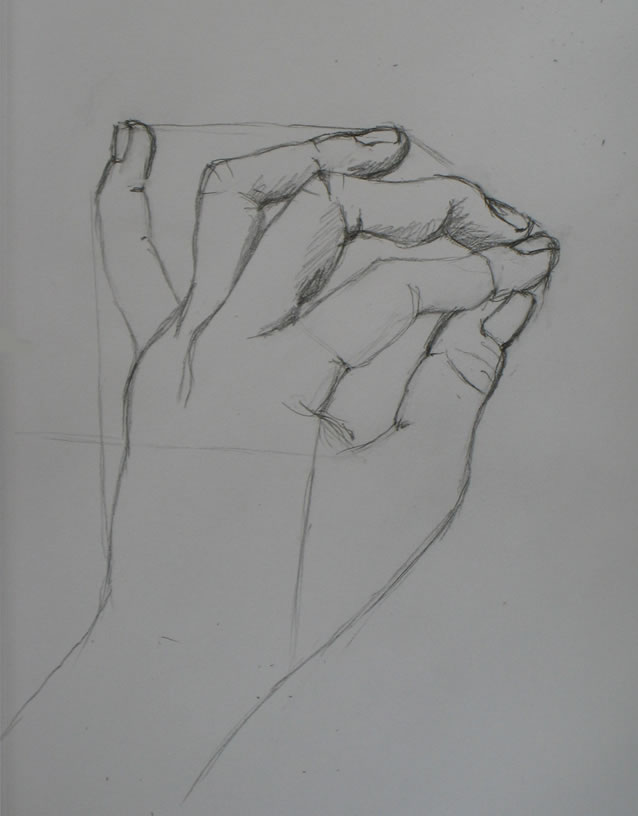
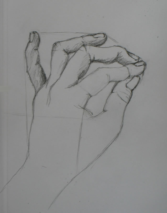
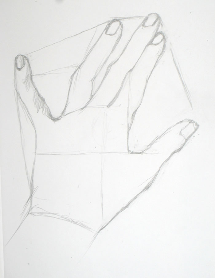
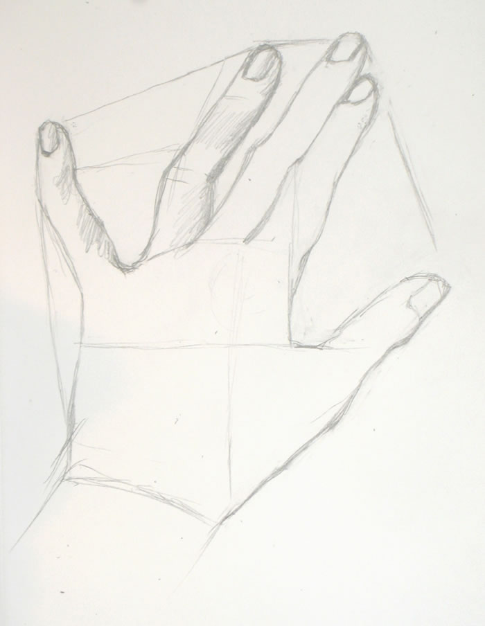
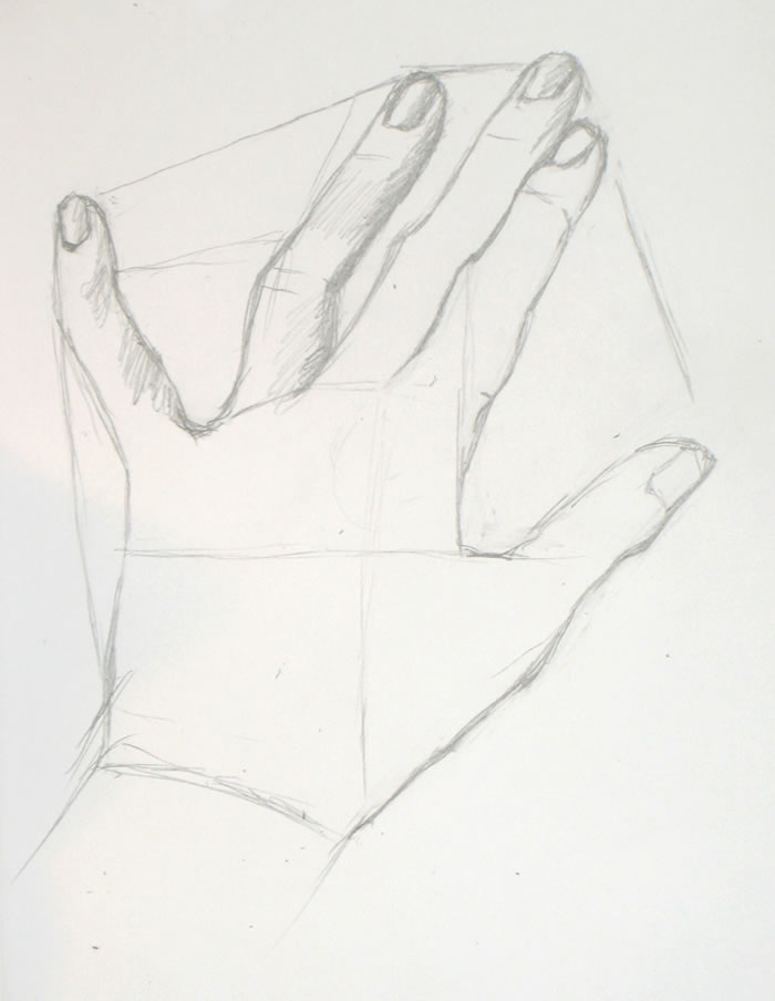
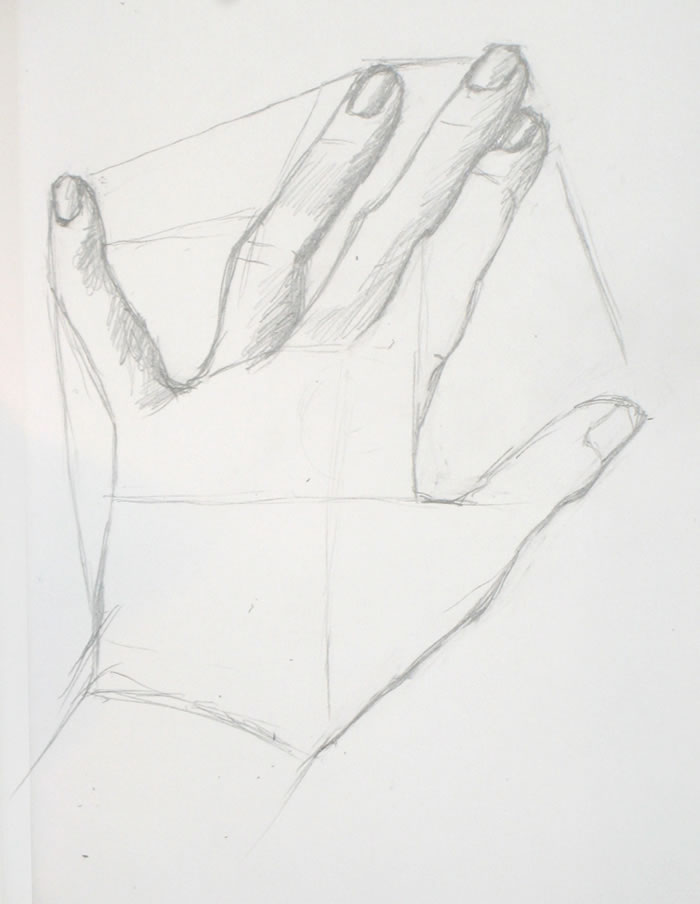
I’m no sailor but I know that when you’re on the open seas and using the wind as your driving force, the problem isn’t going into a headwind – even energy going opposite to your desired trajectory can be channeled in a useful way. The problem is when there is no wind, no motion…. You can’t leverage stagnation, but a gust in any direction can help you discover what you’ve been looking for all along.
“Be the Wind: What to Do When Things Aren’t Working” by Nicky Hajal, Tumble blog
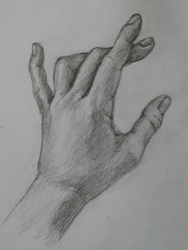
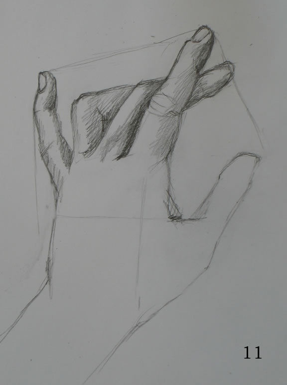
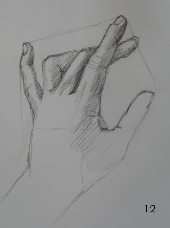
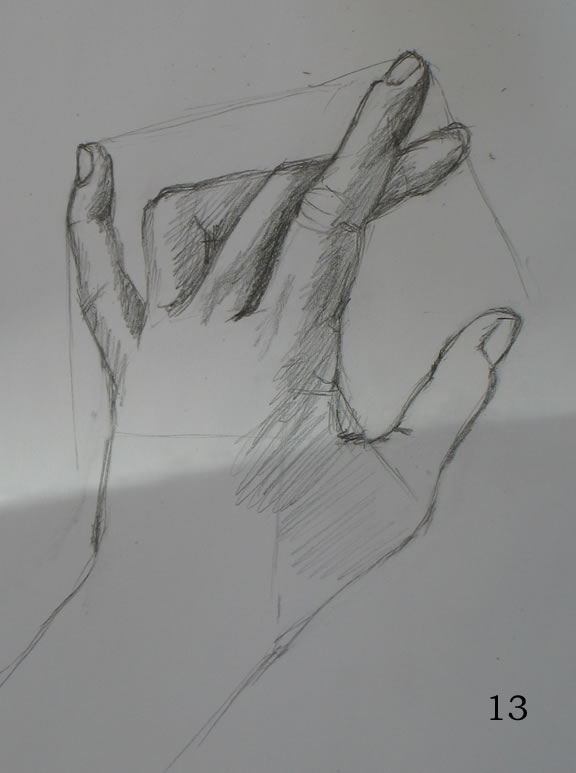
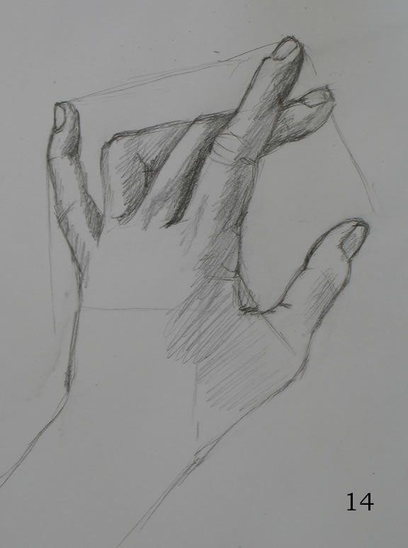
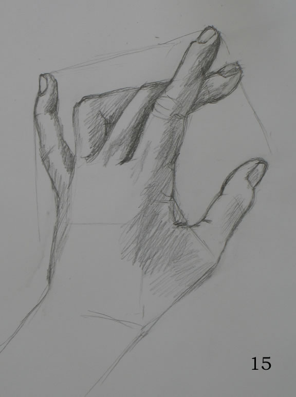
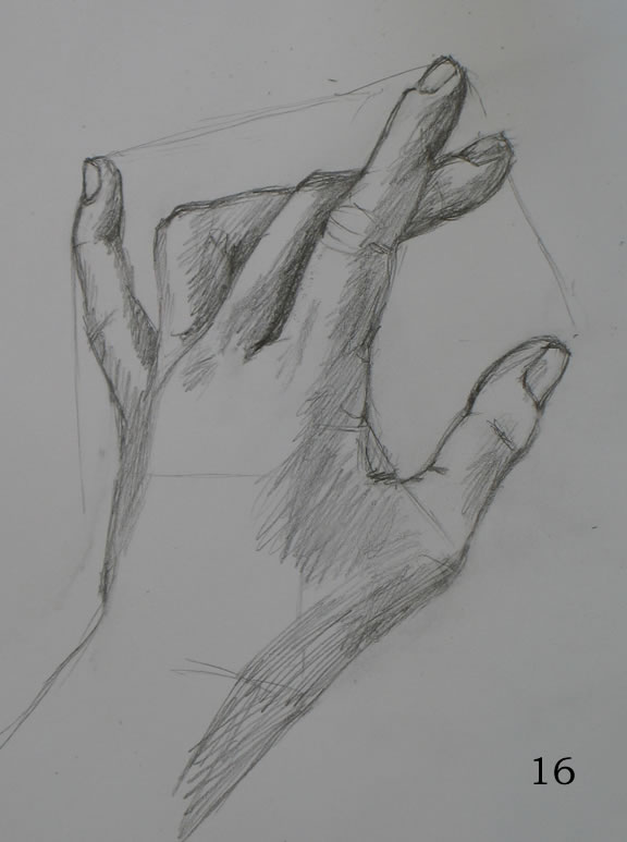
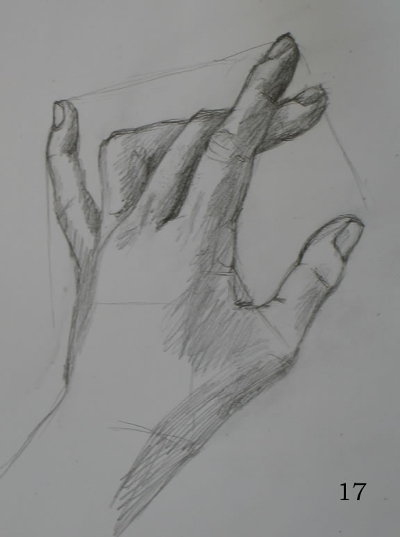
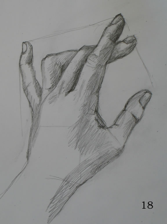
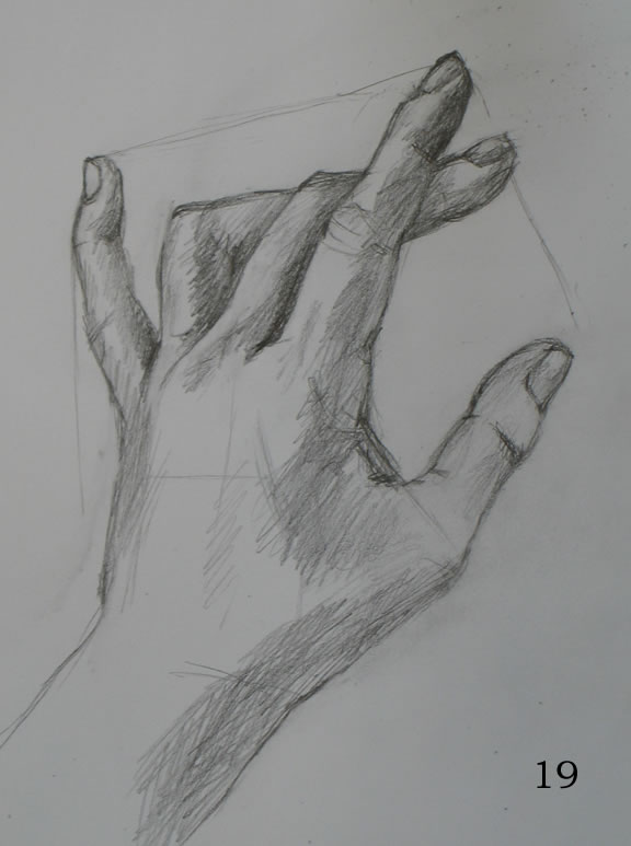
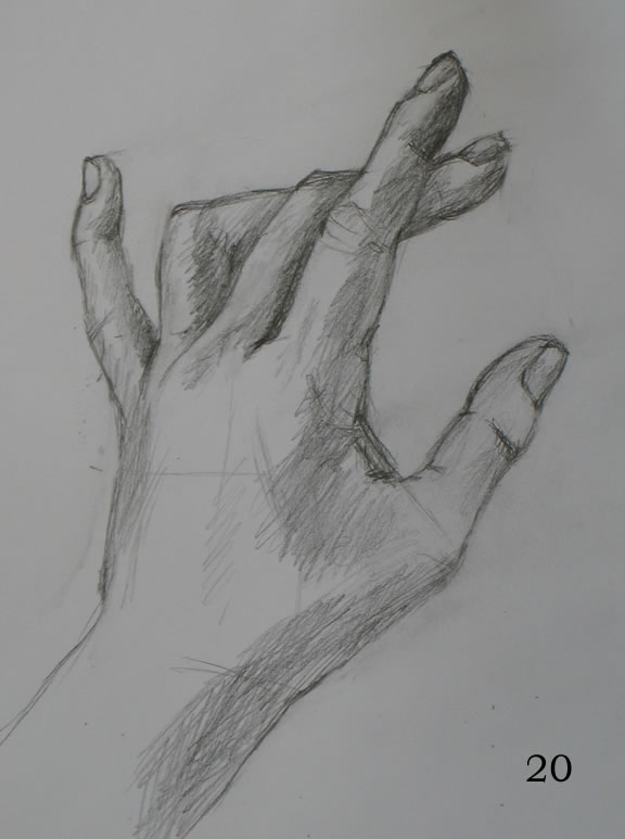
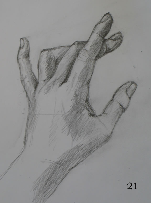
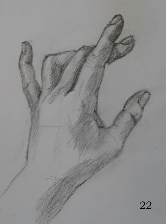
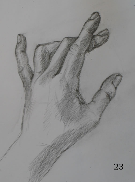
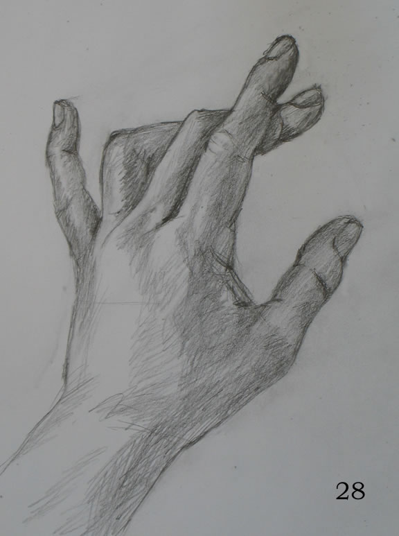
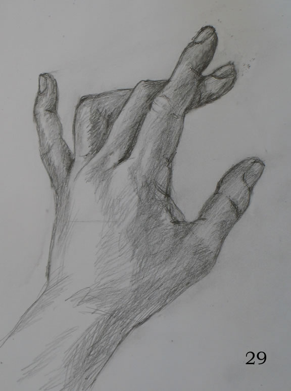
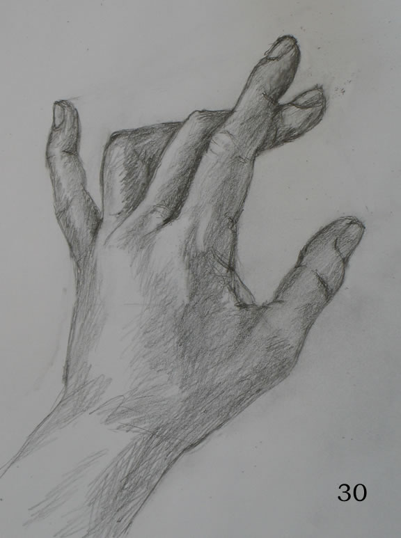
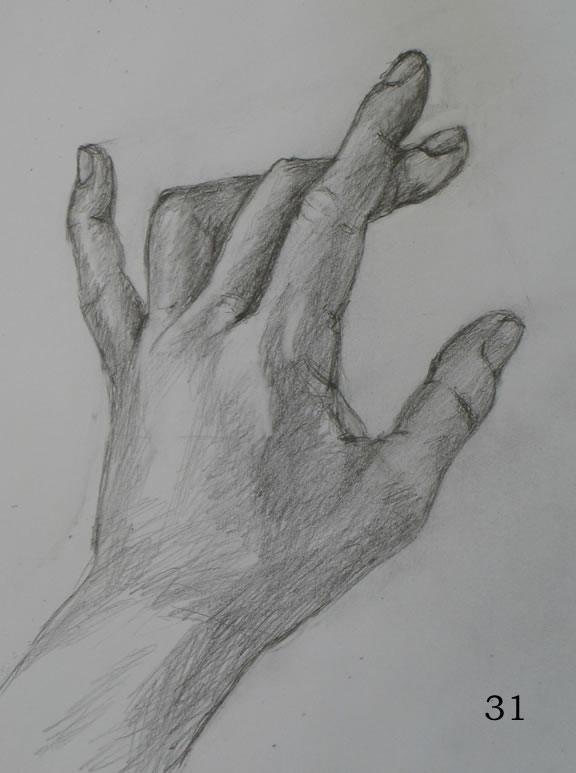
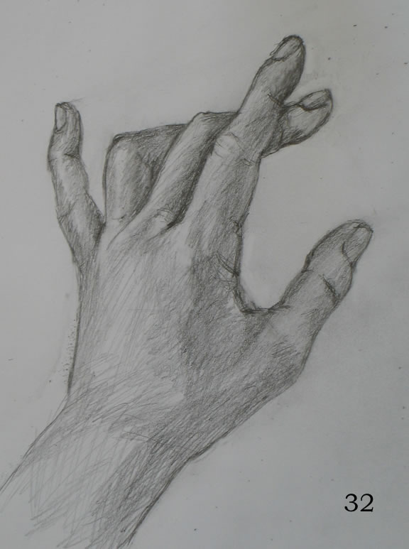
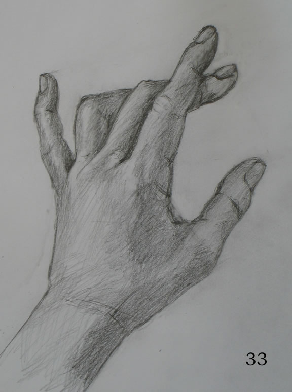
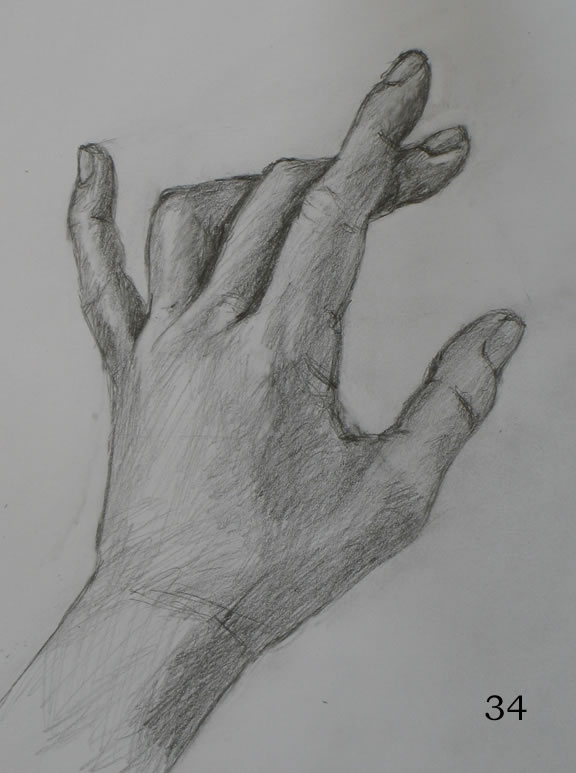
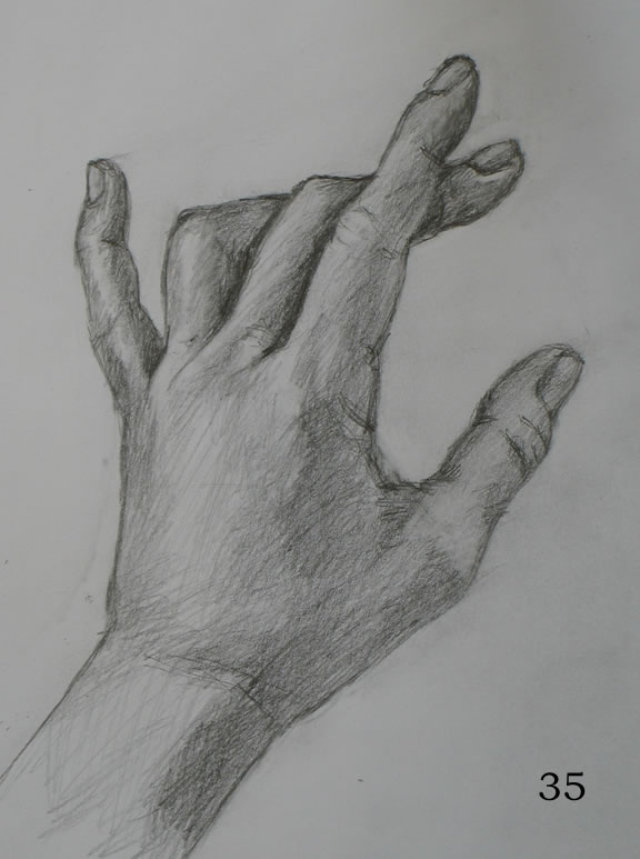
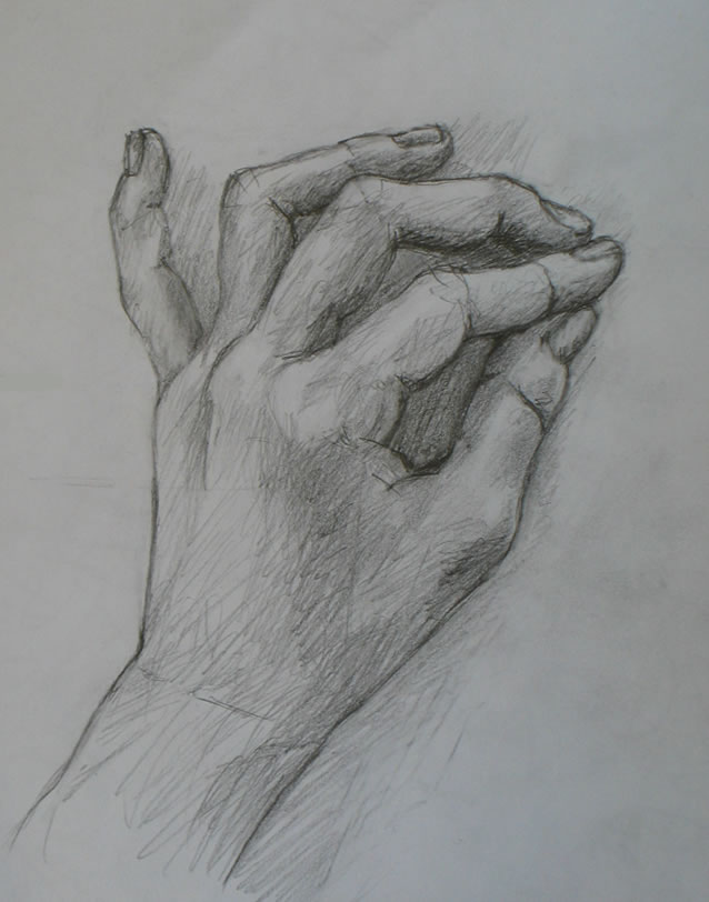
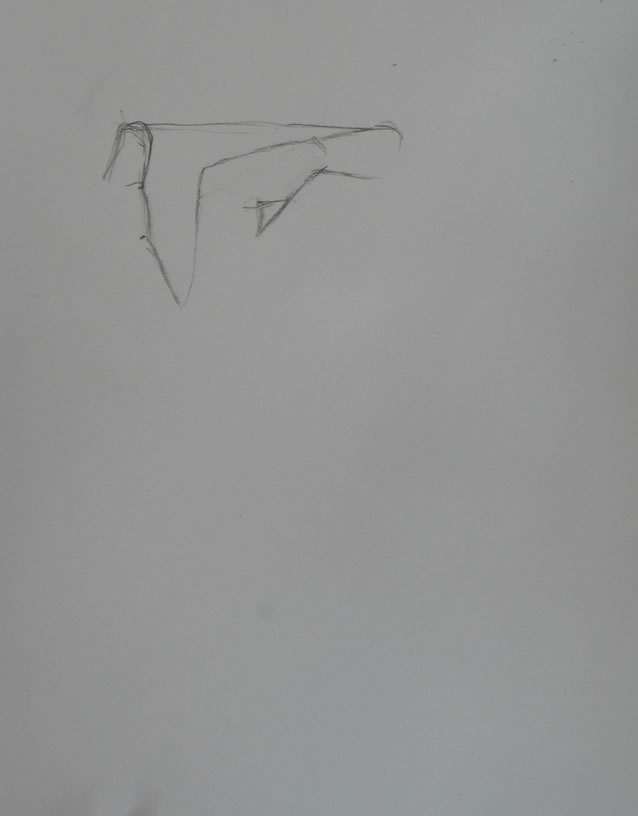
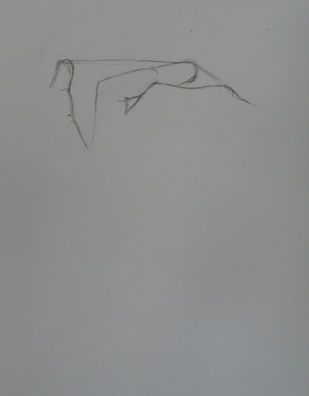
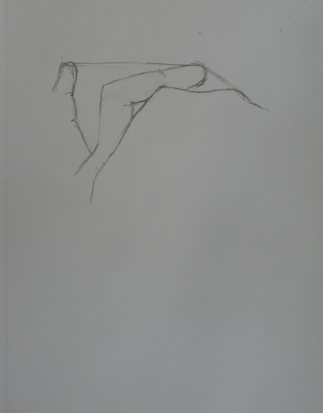
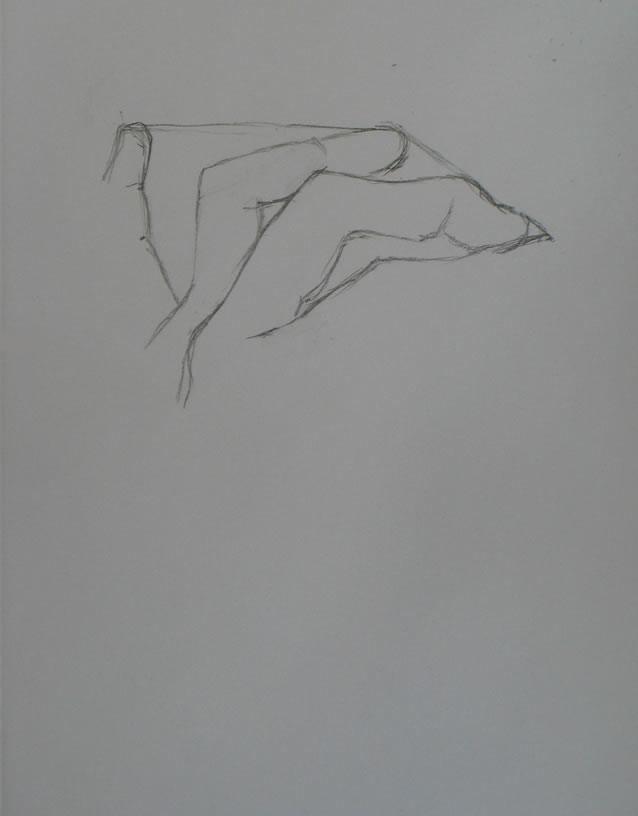
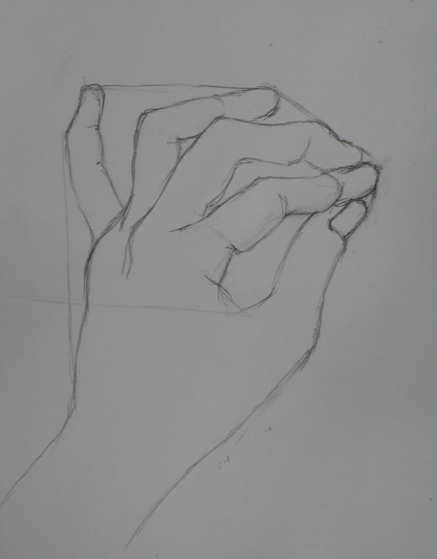
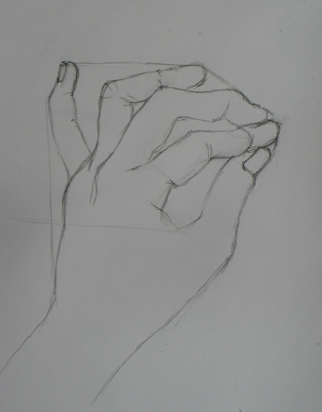
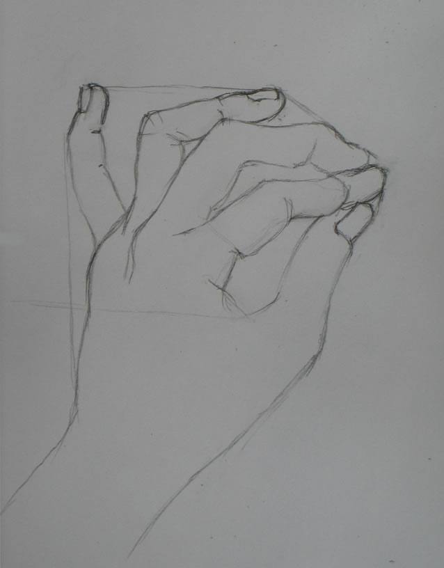
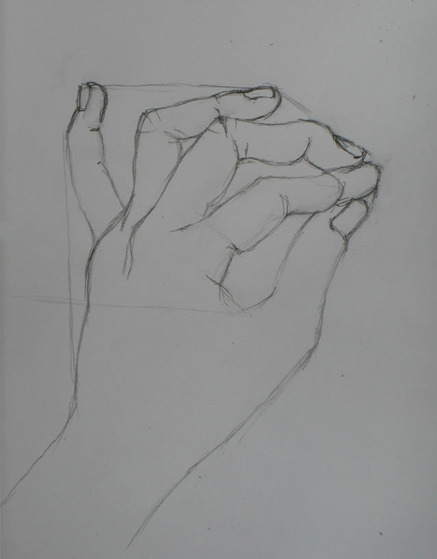
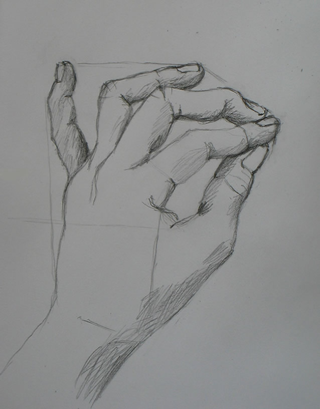
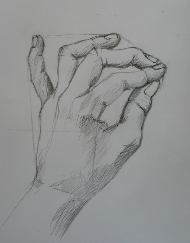
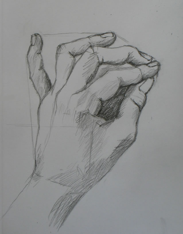
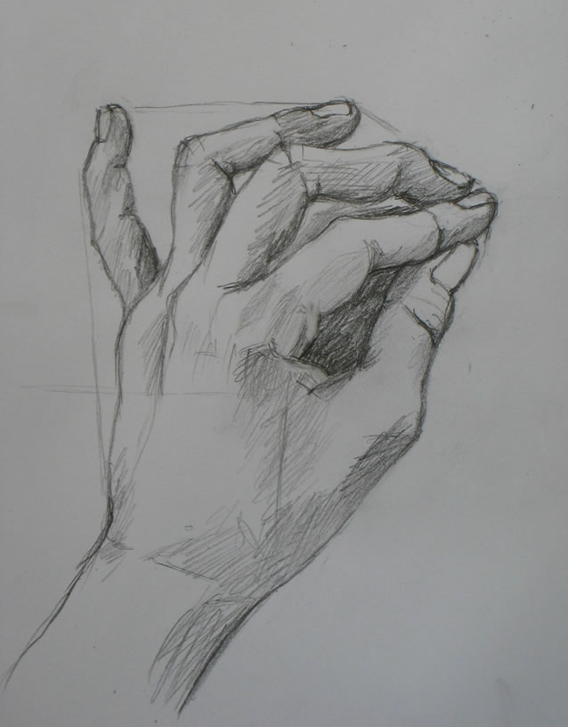
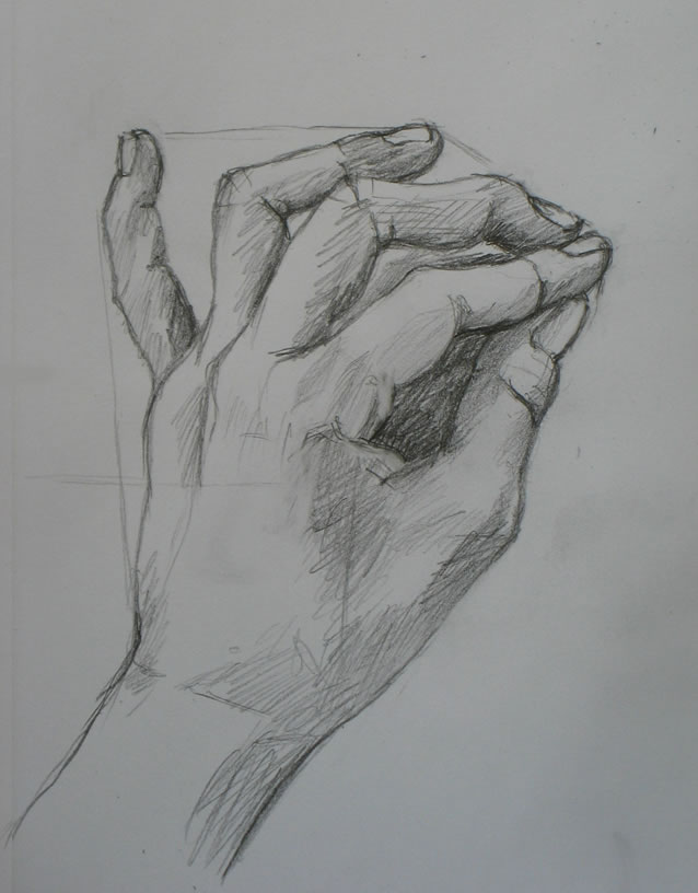
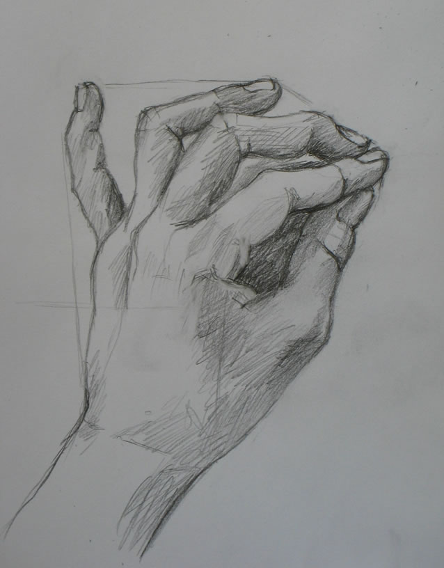
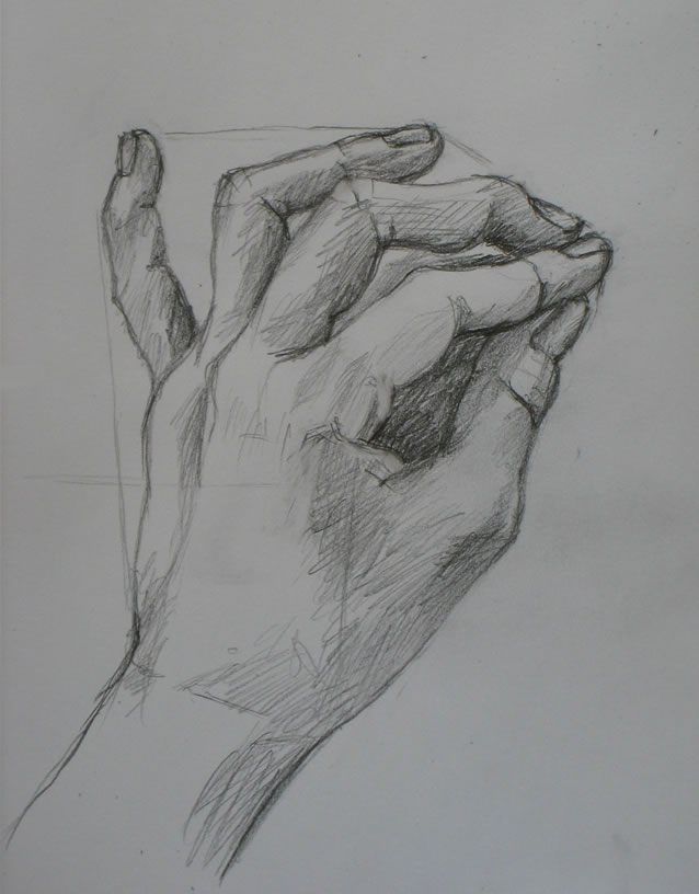
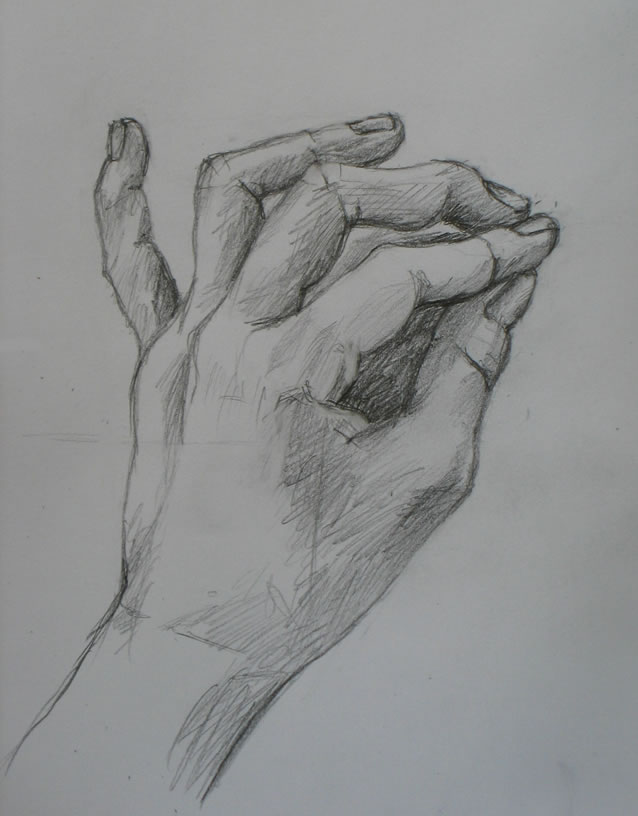
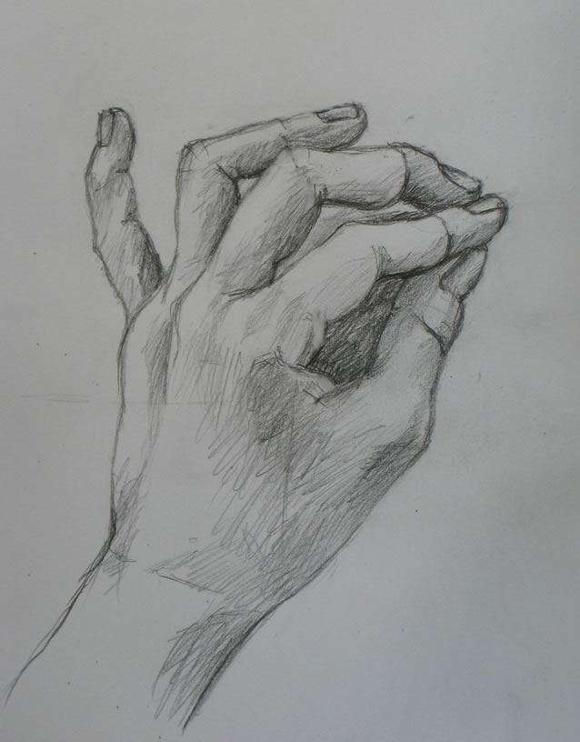
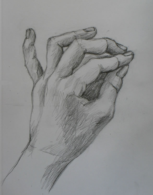
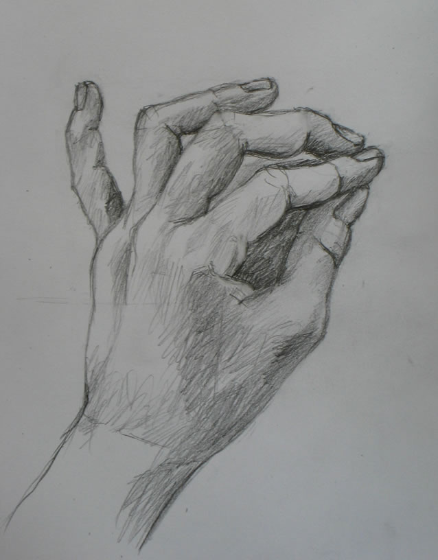
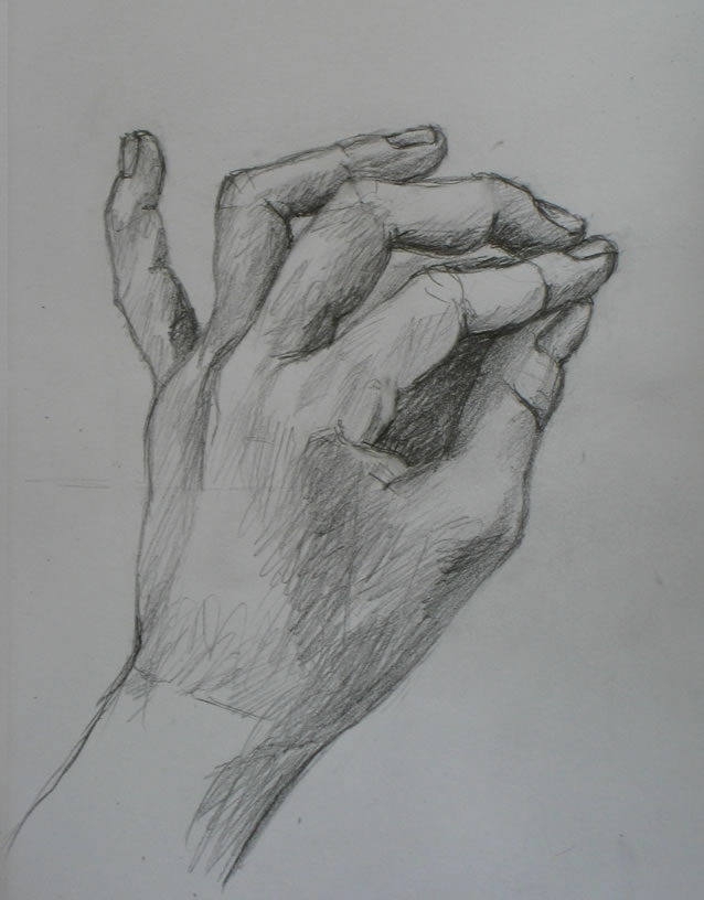
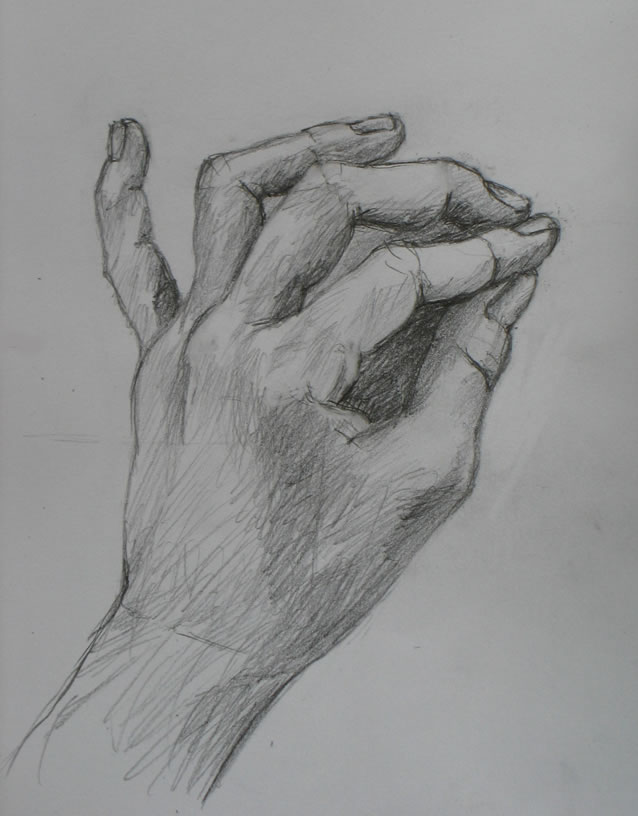
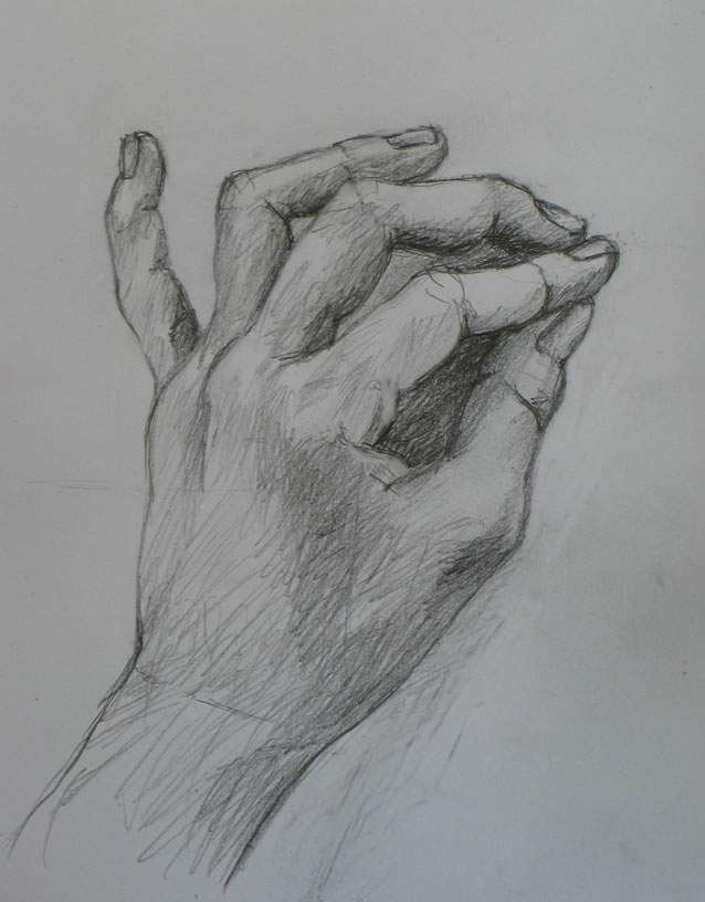
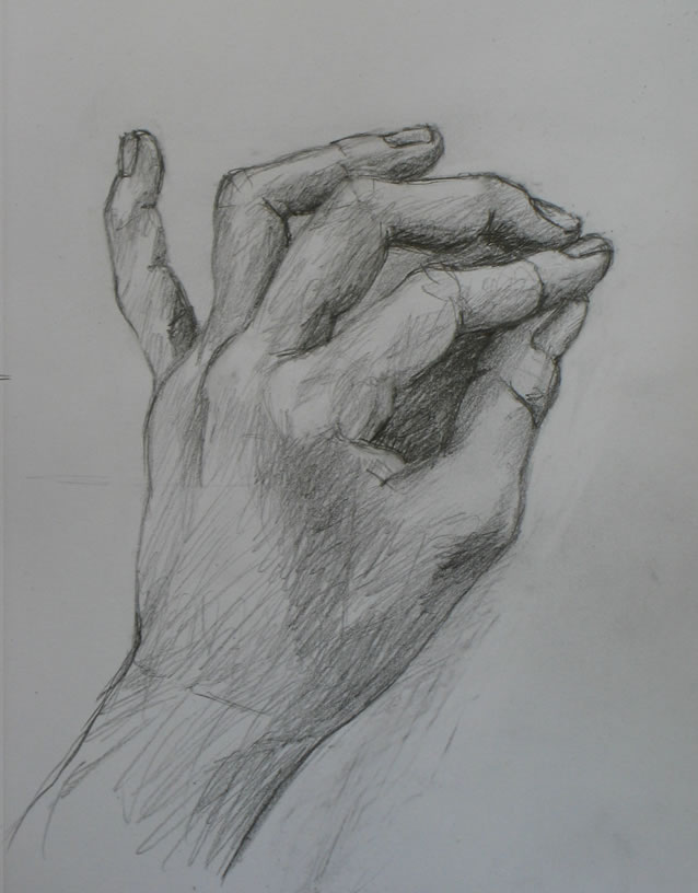
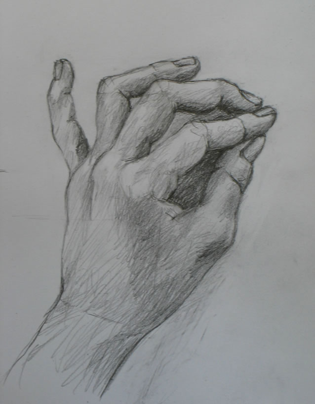
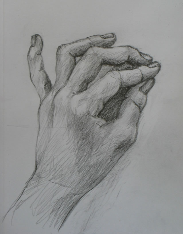
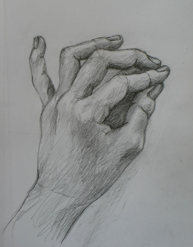
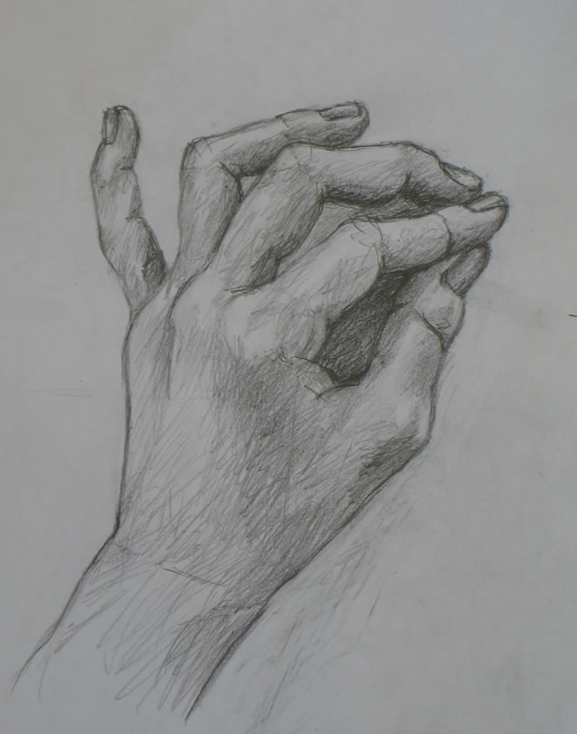
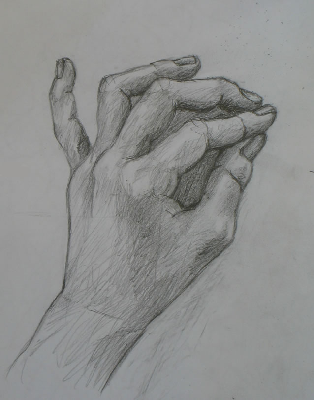
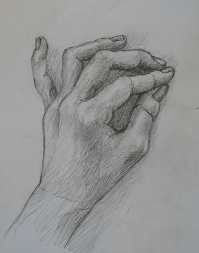
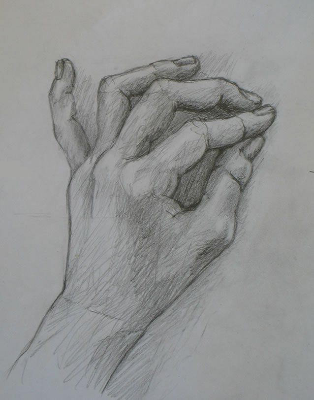
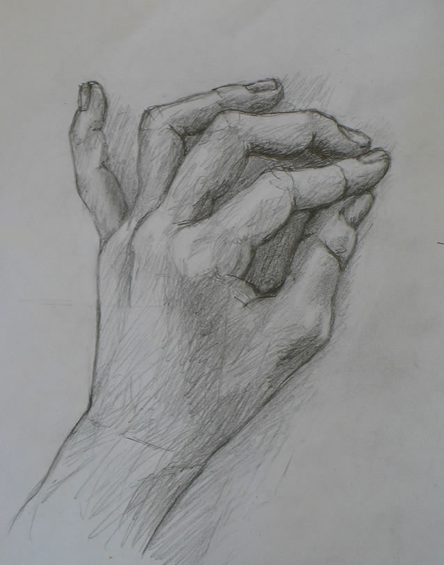
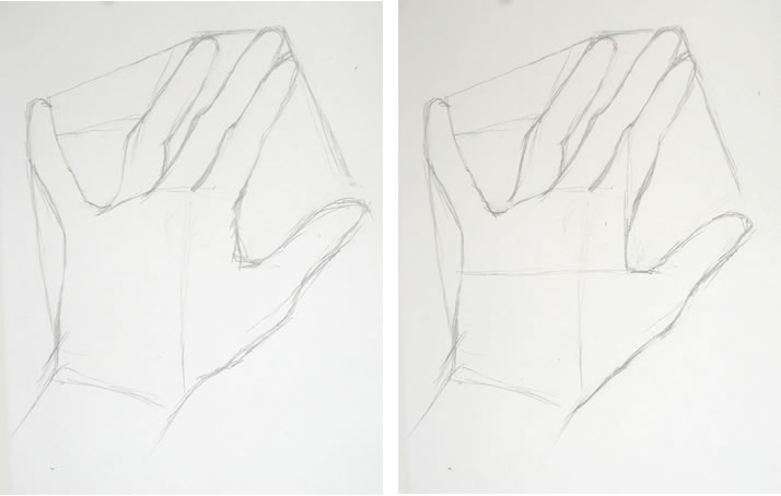
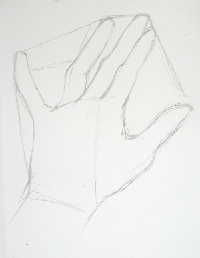
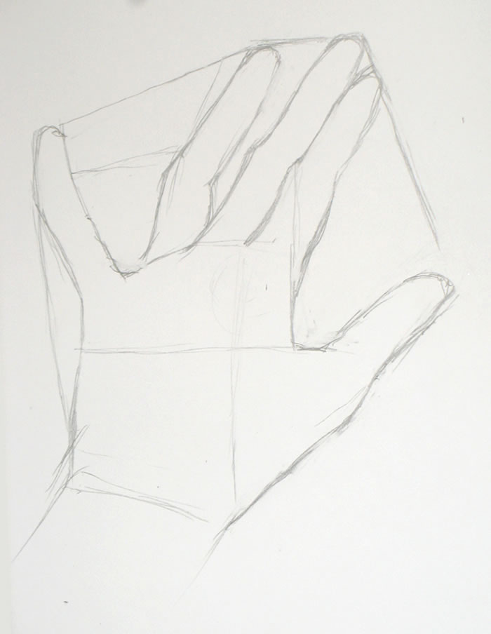
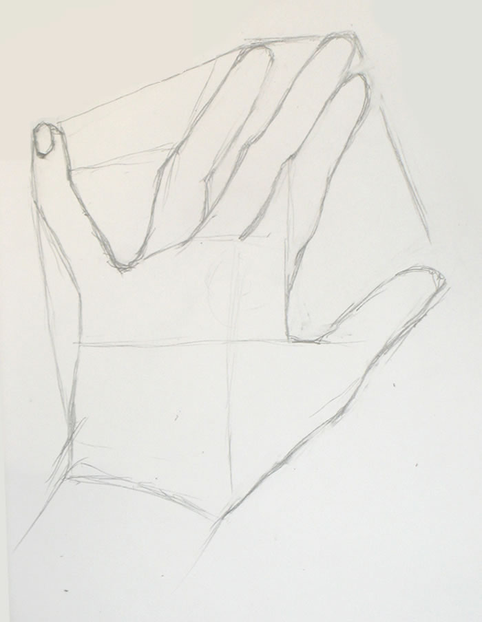
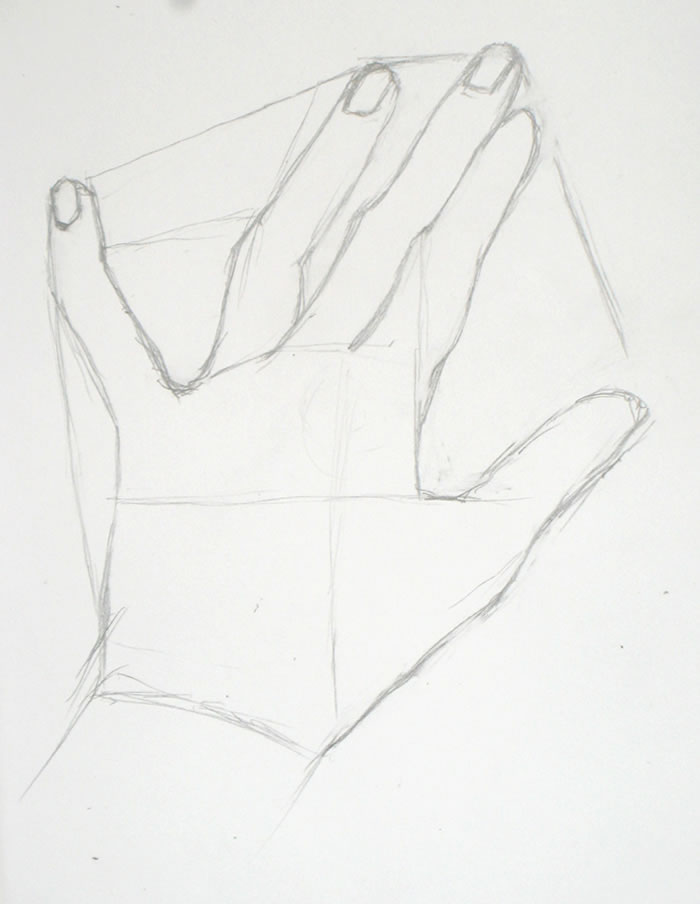
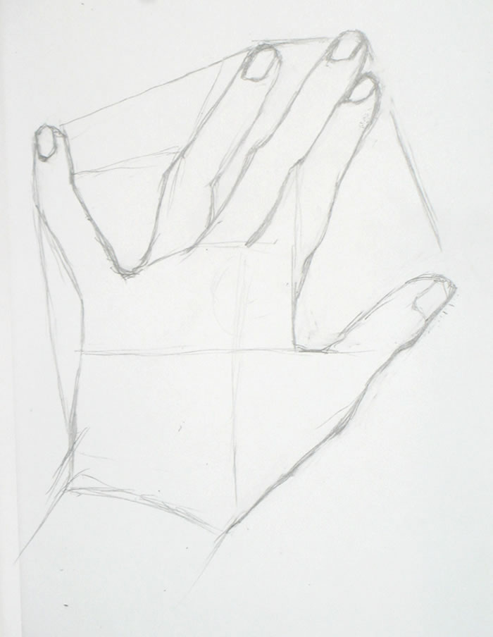
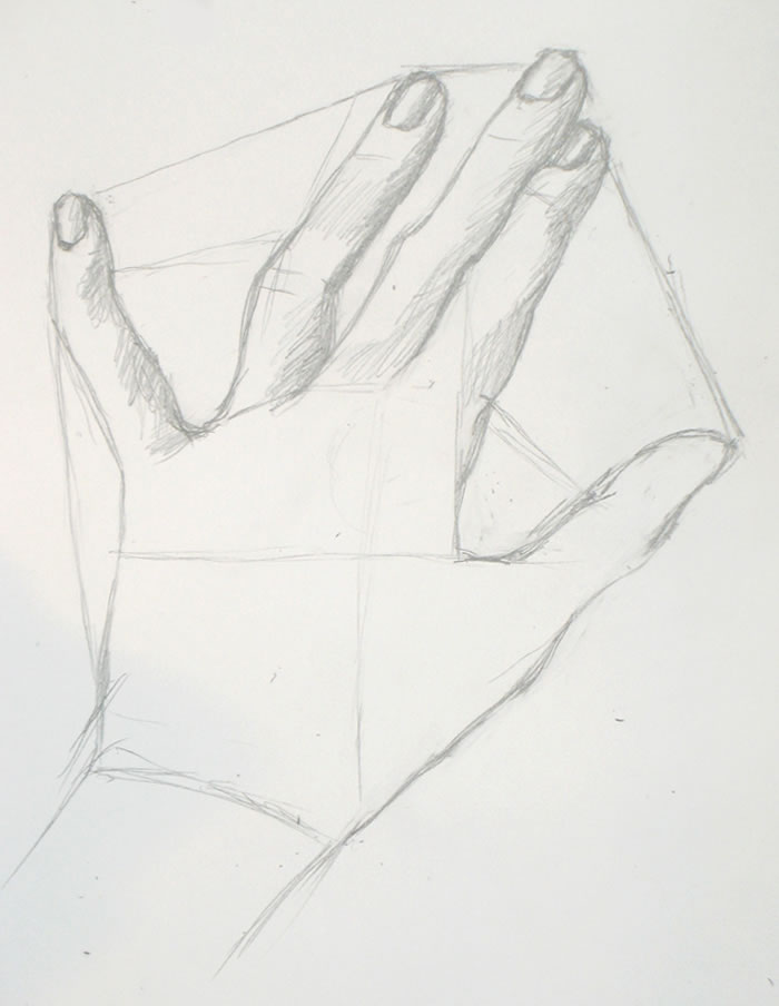
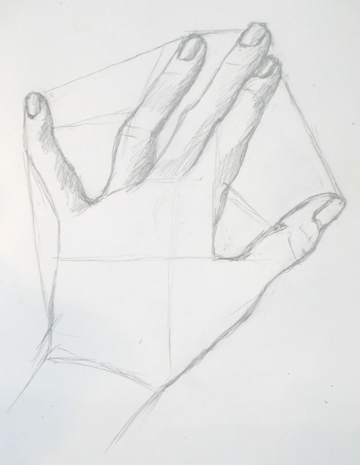
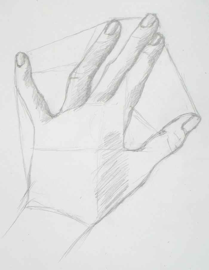
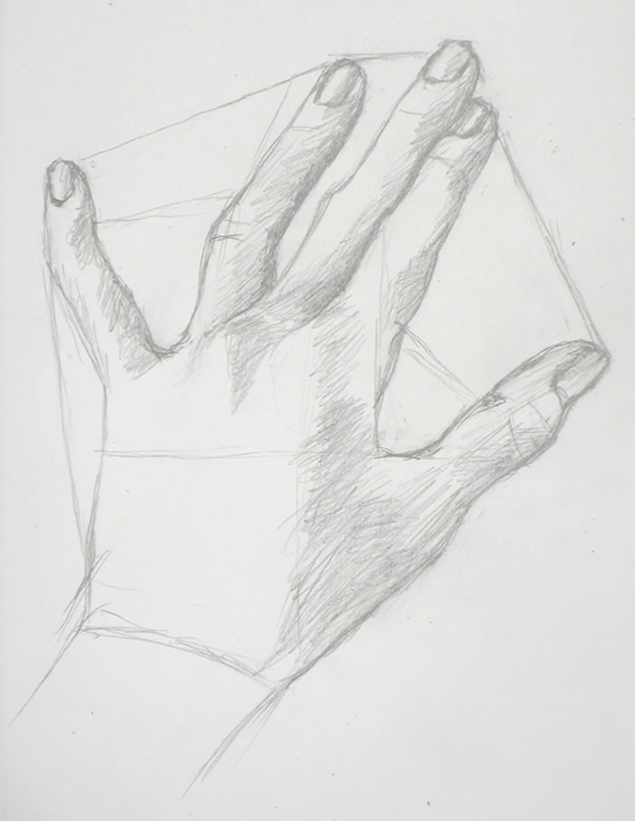
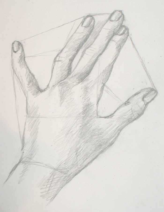
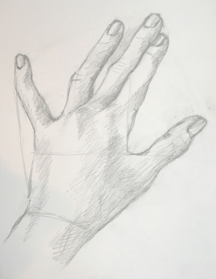
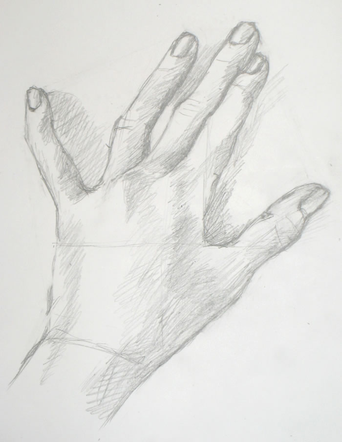
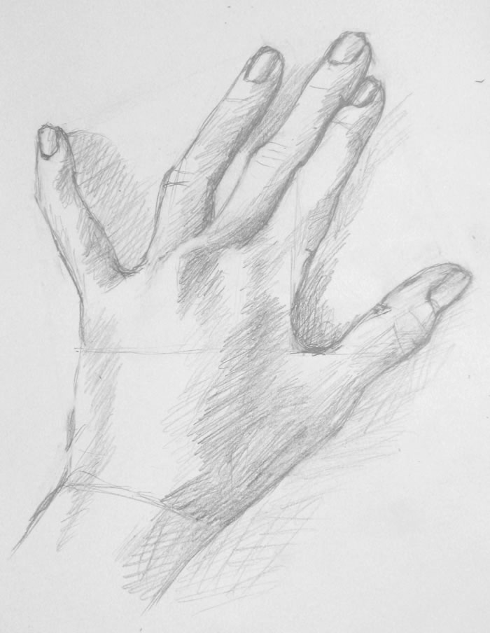
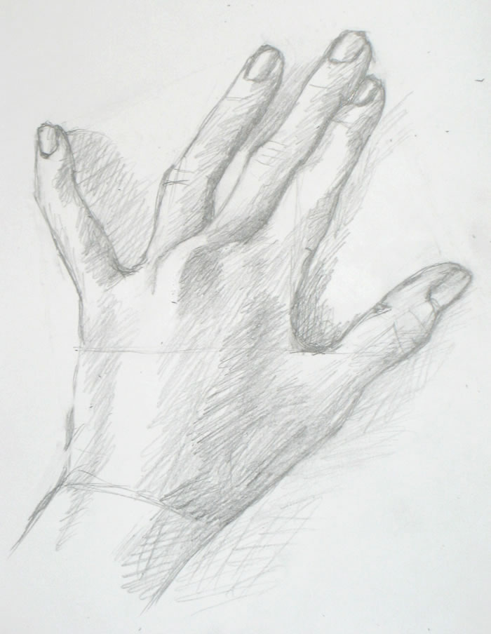
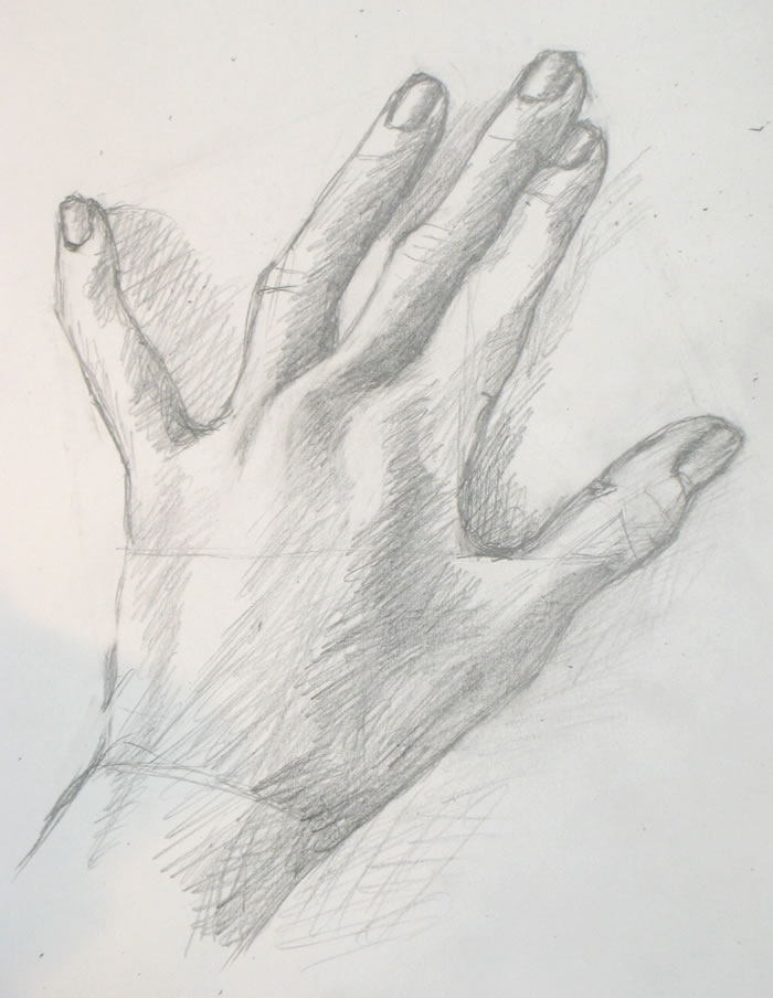
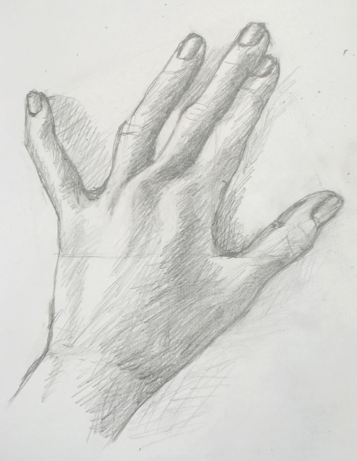
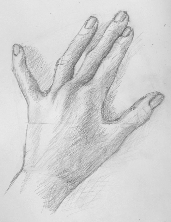
Final sketch for this week's drawing tutorial
I was not a happy camper while drawing today. Nothing was going right. It was a classic autumn day alternating dark clouds and bright sun, so the light I need to photograph my sketches kept changing. I couldn’t get my tripod positioned right. Once I started sketching, I felt that I had begun wrong and should start over. I fretted that this choice of hand position (right) was inappropriate for your fourth drawing tutorial.
So did I stop and start over? No, I kept moving forward, trying every trick in my bag to get the drawing back on track. And eventually it did improve – thanks not to a single brilliant insight, but to dozens of small steps as I slogged ahead. I won’t be showing this drawing at the Metropolitan, but it works fine.
I’ve learned over my years of doing art that when things aren’t going well, I simply need to keep working, moving forward. Eventually the drawing will get better. It’s a matter of time and determination.
A few weeks ago, I read the sailing analogy quoted above and immediately resonated with it. It’s absolutely true that sailors can move forward using wind in any direction, even a headwind. The real problem is when they’re becalmed, when there’s no wind at all.
So, too, when you’re drawing: each line you make will help you figure out what you need to do next. Even if that line turns out to be wrong, making it will help you understand where the right one should be. If you make five or ten wrong lines, use each one to learn what the right one is.
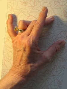
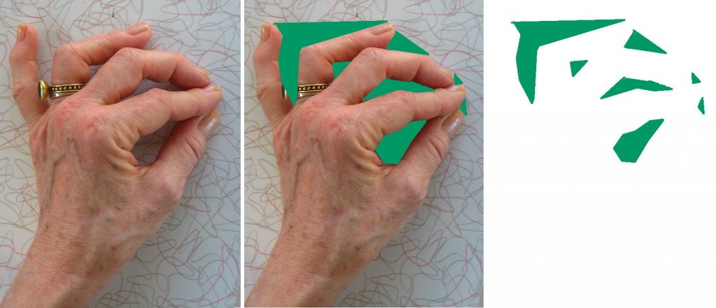
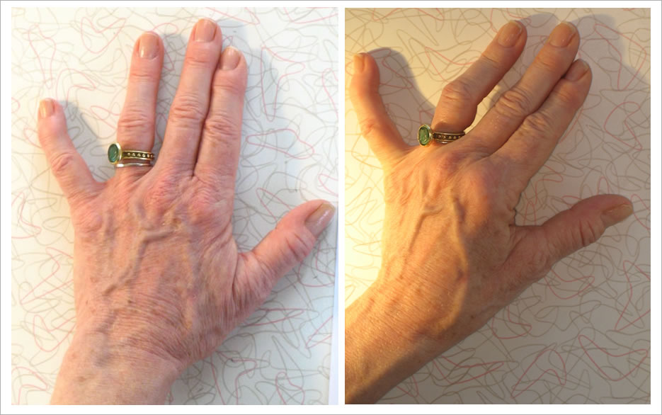
Rough position of my hand for this sketch. The photo was taken in somewhat different light than when I was sketching my hand.
Materials you need and setting up your work space
Please refer back to the relevant sections of Hand drawing tutorial one for this info.
Positioning your hand
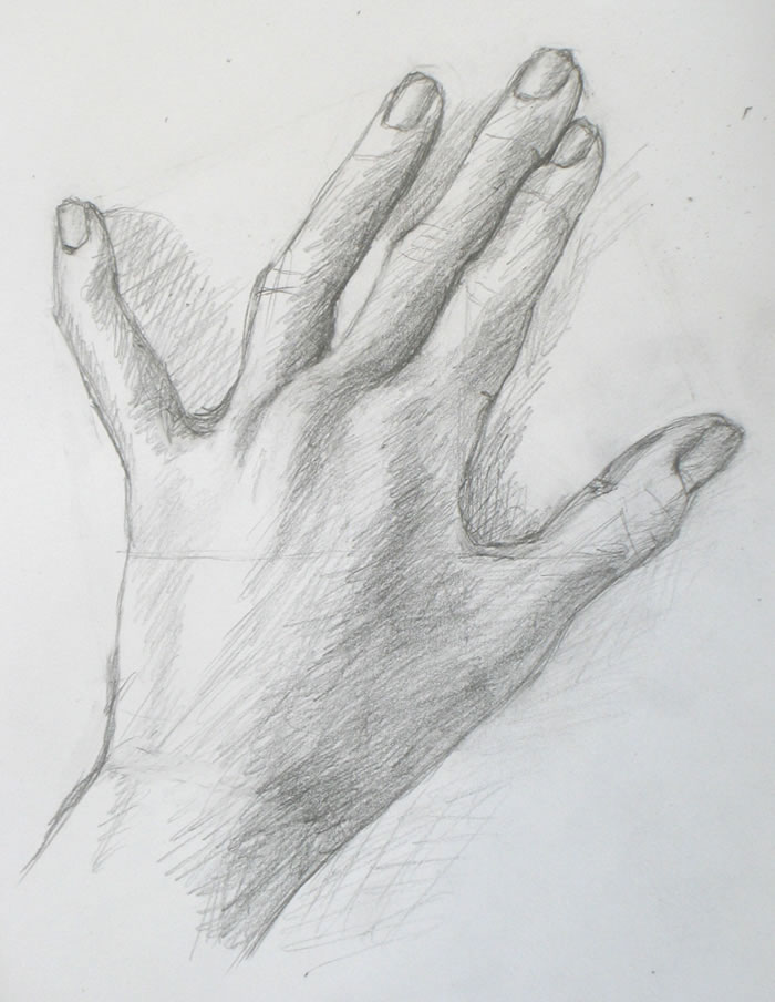
This hand position is somewhat similar to last week’s. The main difference is that I’ve raised my forefinger so that it appears to cross over the middle finger (of course it doesn’t actually cross over).
My goal here was for you to try a hand pose that doesn’t have the series of small negative spaces between the fingers that we’ve had in every tutorial till now. For this reason, this position will be more challenging than the first three we’ve sketched.
The many little steps I took to make this drawing work
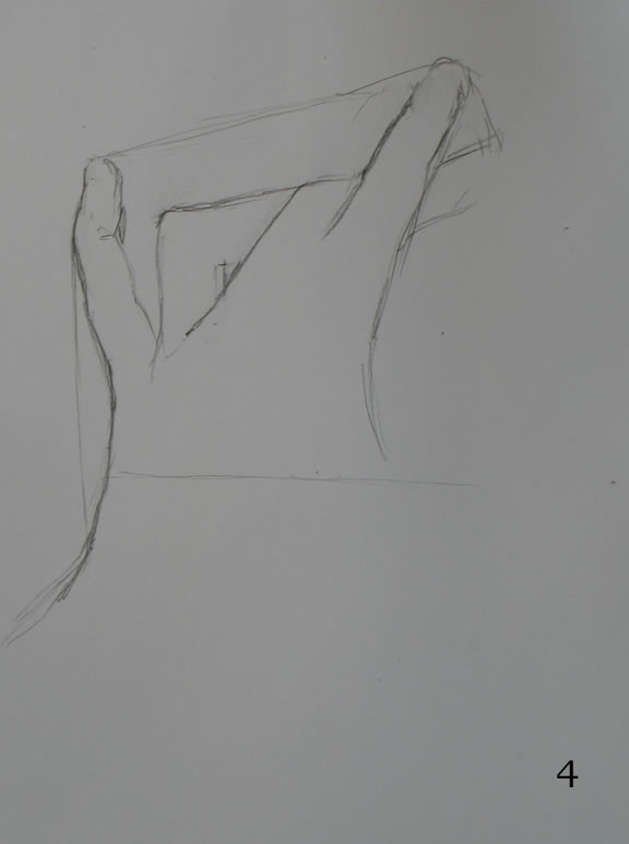
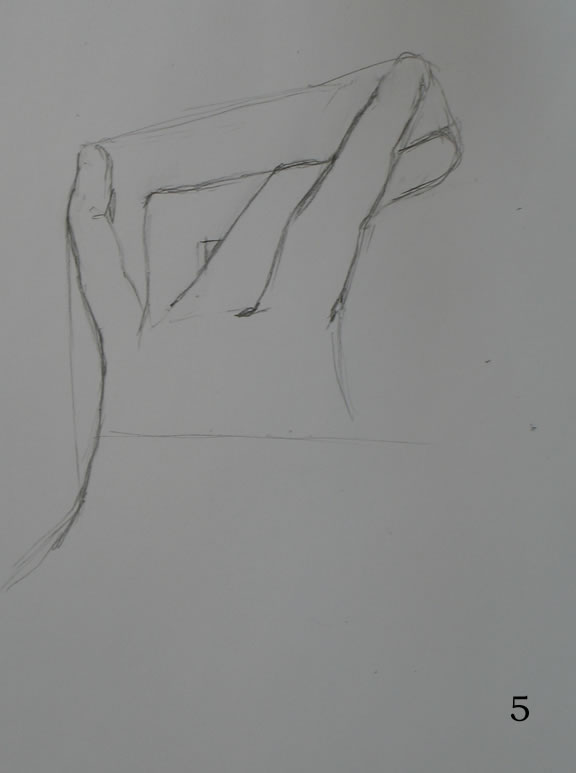
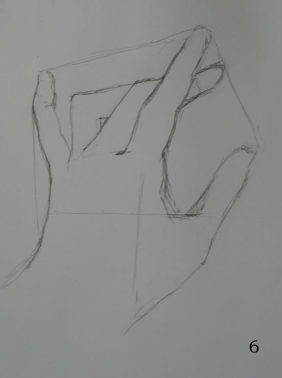
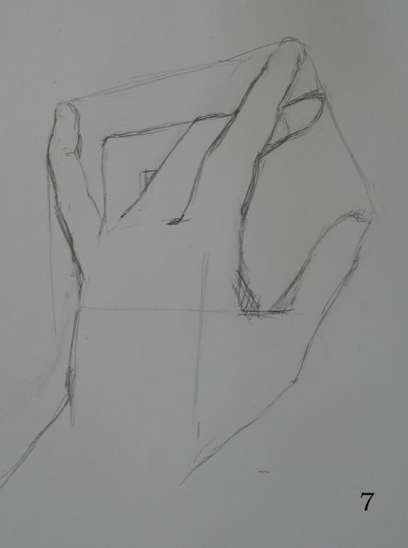
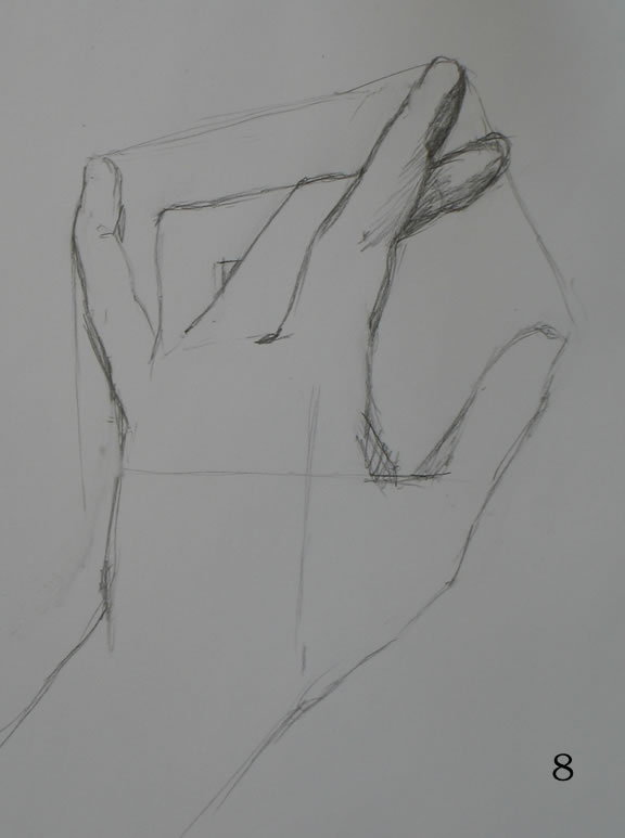
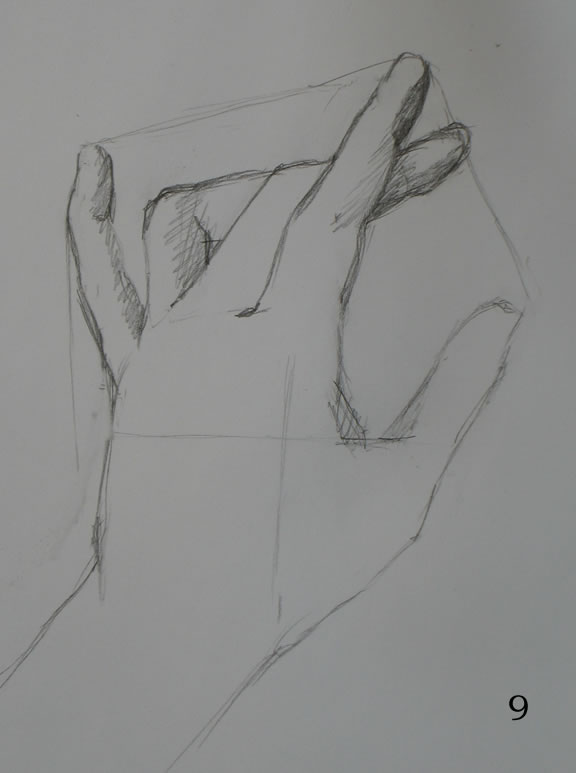
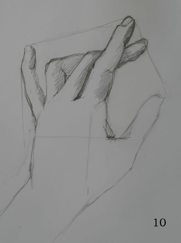
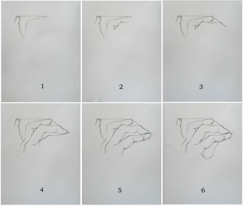
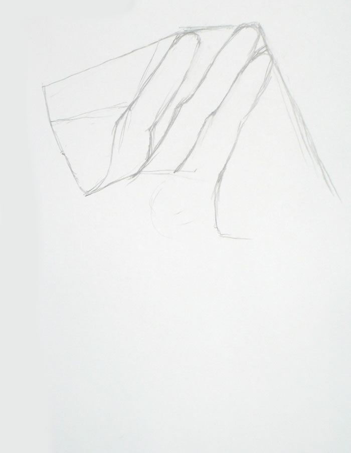
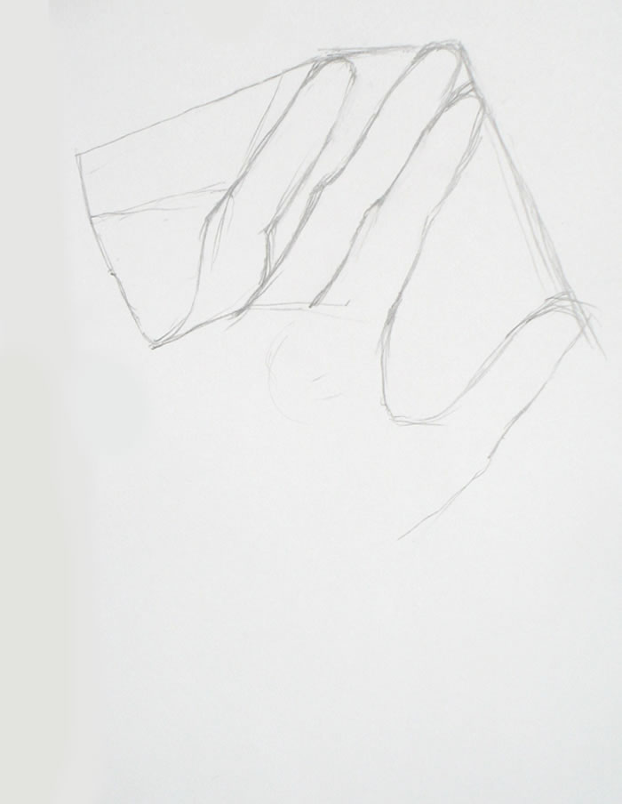
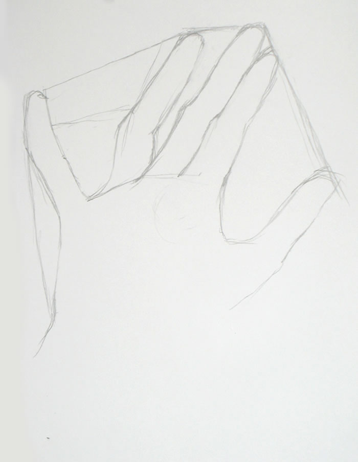
I think it will be easiest for you to see how I worked on this drawing if you go through the time-lapse video while reading my commentary. I’ve numbered each frame so you can easily match it to my description (beneath the video) of what I was doing.
You may want to open a second copy of this post in another window so that you can place video and text side by side.
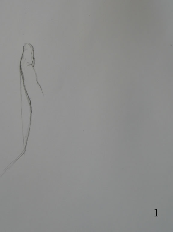
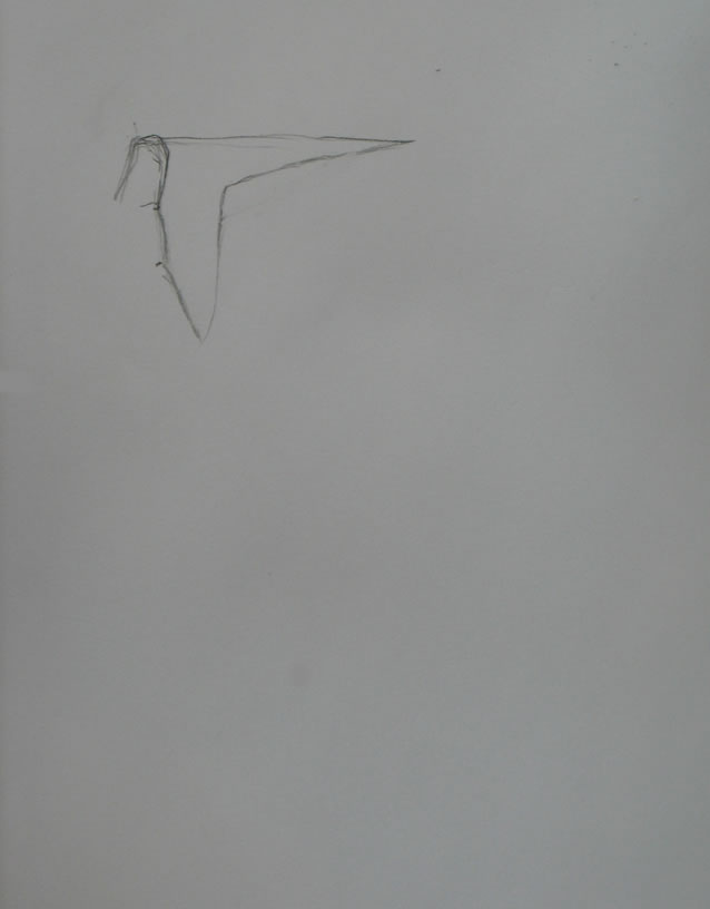
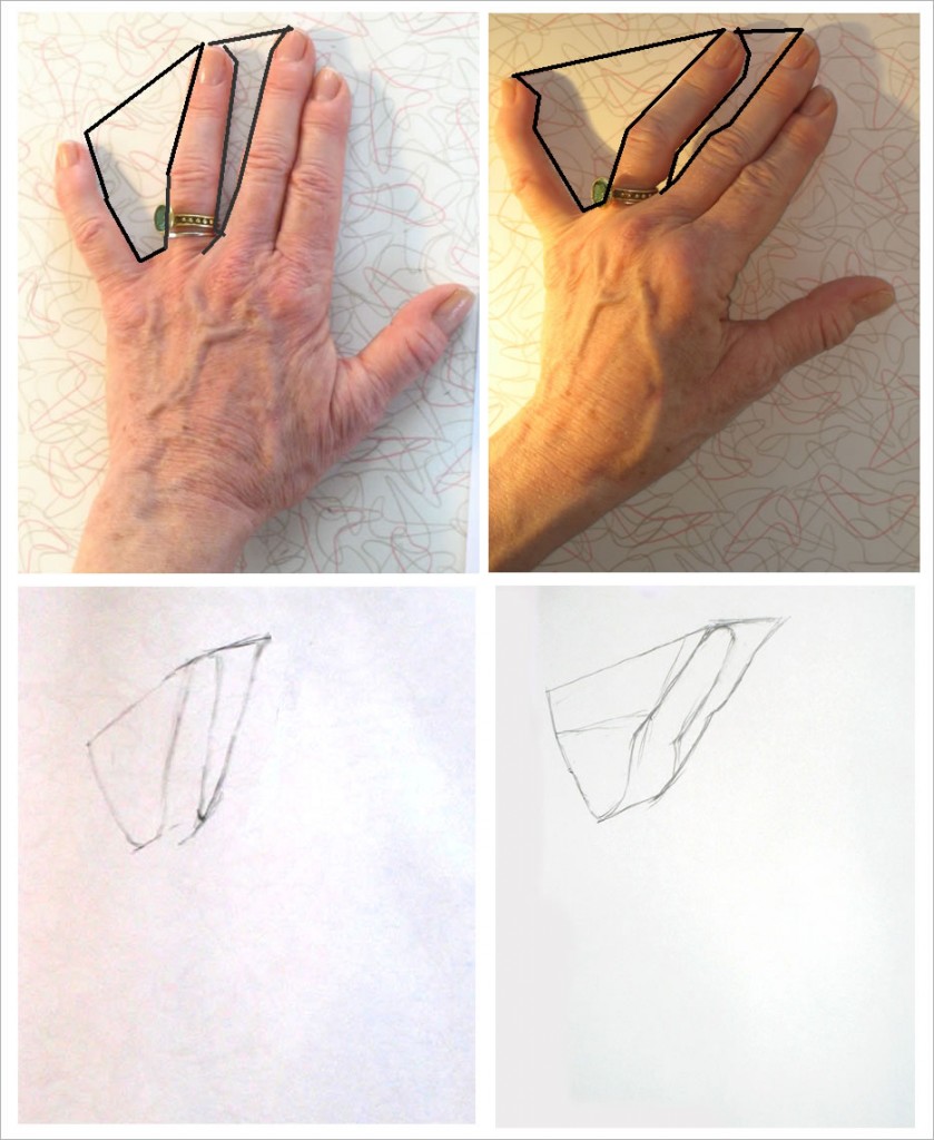
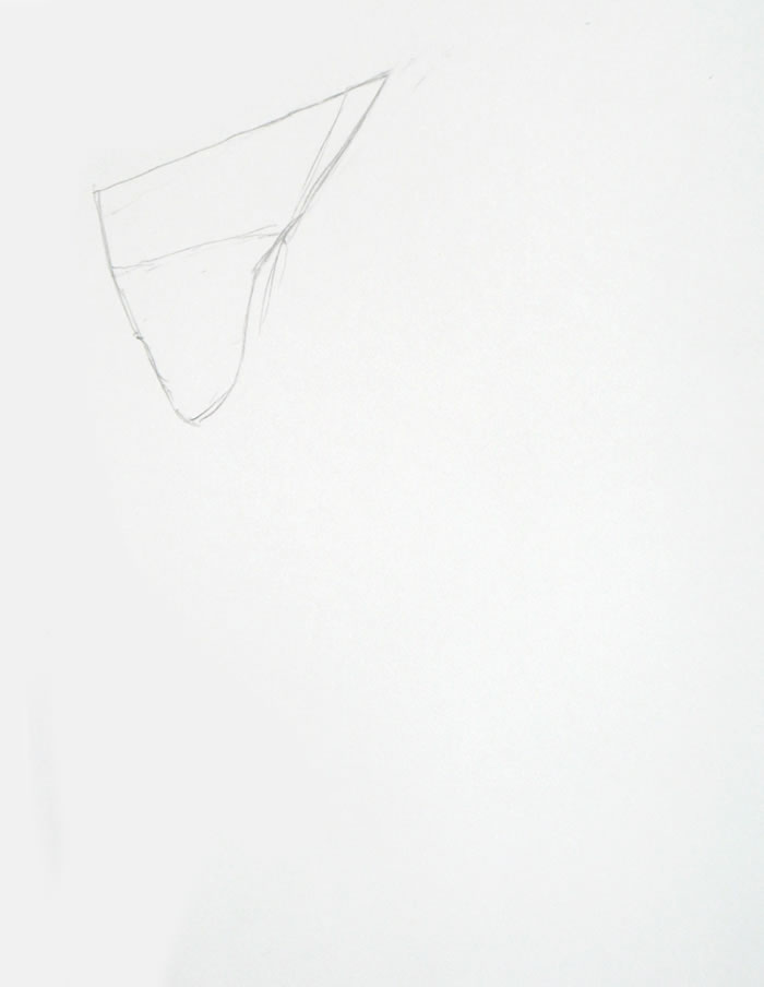
Frame #1: In earlier hand tutorials, I haven’t drawn this particular negative space – the flattened triangle formed by the edge of my finger and hand – till after sketching the spaces between each finger. But in Demo #4’s hand position, the negative space between fingers is much larger, hence not as easy to draw. So I start with an easier shape: the one at the left edge of my hand.
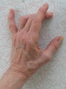
Approximate hand position for this sketch, in different light
There’s no rule about where you “should” start a drawing. Just start it wherever you notice an easily-drawn shape.
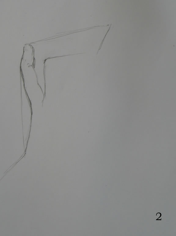
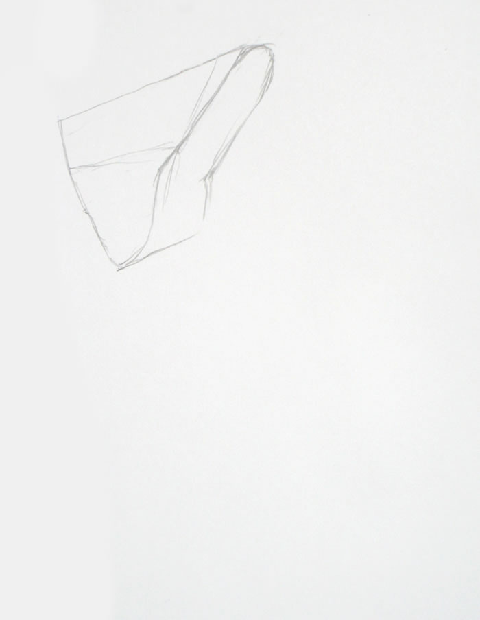
Frame #2: I begin sketching in the negative space formed by the pinky and forefinger at either end; an imaginary line connecting these two fingertips at the top; and the two bent middle fingers at the bottom.
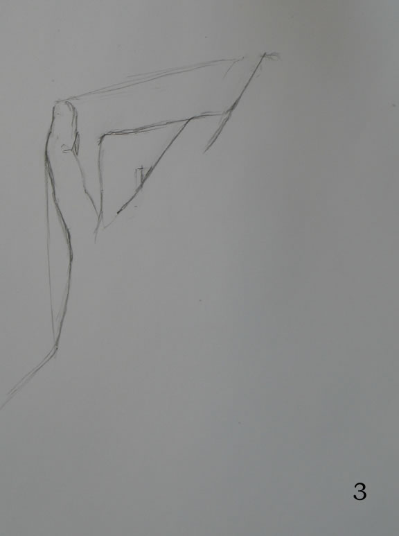
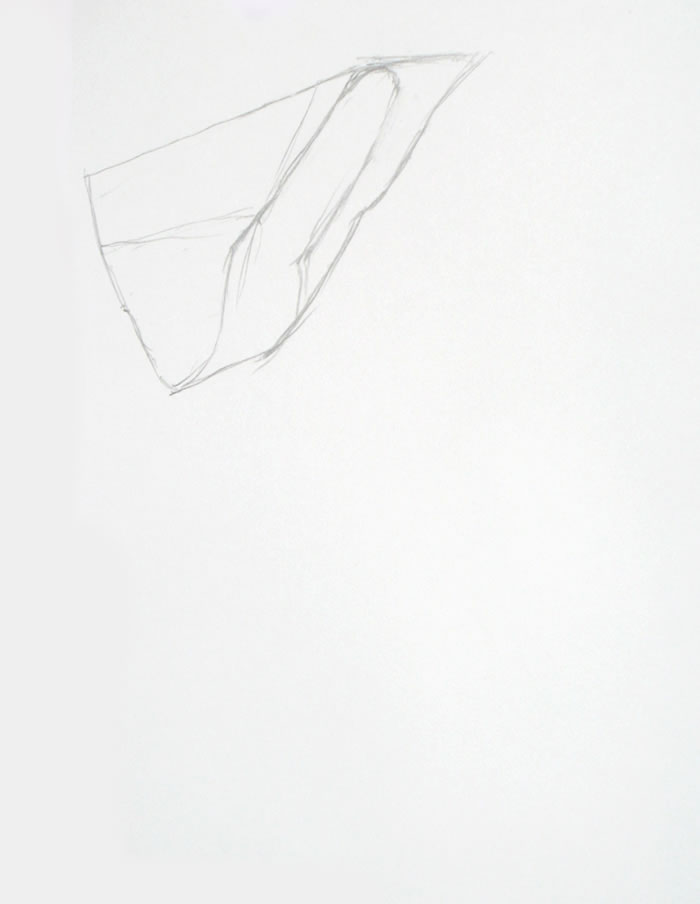
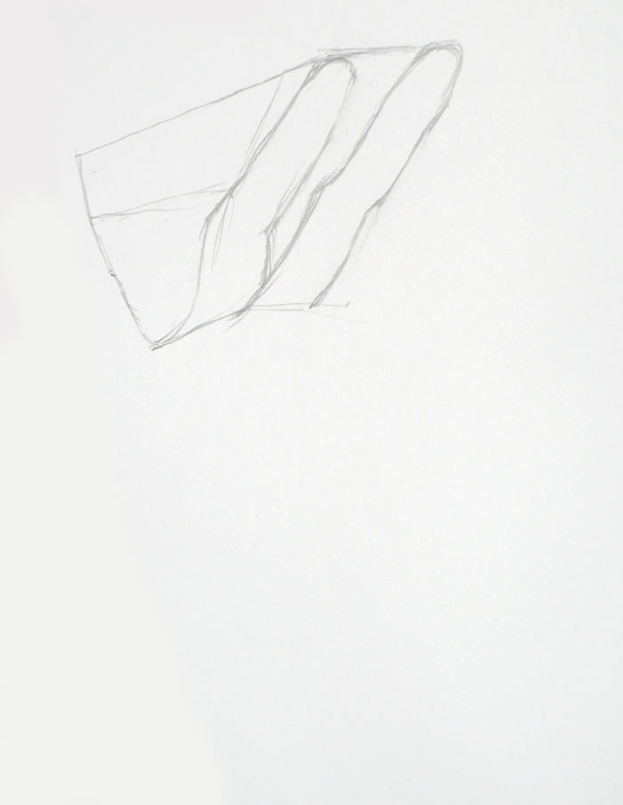
Frame #3: It’s hard to judge the correct size for a negative space this large. So to check the size I sketched in frame 2, as a measuring device, I sketch in a few lines of the middle fingers.
Frame #6: By this time, it’s clear I’ve gone off somewhere. The base of the hand I’ve drawn is much too wide.
Frame #7: So I check both sides of the hand and decide it was my Frame #1 triangle that was off. I erase the old left side of my hand and sketch in a new one.
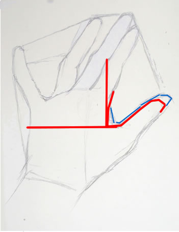
As I’m checking proportions, I realize I’ve also made the base of the middle finger too wide. Compare my sketch with my actual hand (photo above right). This error is in the very center of the drawing. To correct it, I would have to erase either the entire left or the entire right side of the hand I’ve drawn.
Arghhh! Should I chuck this drawing and start over? How can I publish a drawing that’s this incorrect when I’m trying to teach the right way to draw? But I’ve been having so much technical difficulty with the sun and camera equipment – it’s that part that I don’t want to struggle again with.
I decide to experiment with continuing this drawing. It’s not going to be perfect, but I realize that you may learn as much from how I handle a somewhat out-of-whack drawing than how I handle a better one.
Frame #8: Rather than agonizing more, I move on to shading the drawing as it stands.
Frame #11: To help disguise my “fat” middle finger-base, shading will be key. I’ll be paying close attention to it over the course of the rest of this drawing.
Frame #13: That darn bright sun suddenly appears from nowhere, sending a shaft of bright light across the middle of my sketch!
Frame #18: Here I make another mistake, which I didn’t notice till after I finished the drawing (so it’s still there in the “finished” sketch). I didn’t trust my initial drawing of the length of the pointer, which I had made accurately in Frame #3. Here I lengthen it slightly, and it gets too long. Oh, well!
Frame #20: I erase the guidelines I drew early on to help me determine the relative length of the various fingers – or, more accurately, the shapes of the negative spaces between the fingers. At some point during the shading of a drawing, these lines always become distracting, so I erase them.
Frames 21-35: I continue to try to make all the other proportions – wrist, thumb, middle finger tip – very accurate, to distract from that fat finger in the middle of everything.
I also work on fairly detailed shading, with a full range of darks to highlights. This gives a sense of 3-dimensionality, hence reality, that can fool the viewer’s eye into overlooking awkward proportions.
* * *
So sail on, artists! Keep moving through as many practice drawings as you can. Over time, this “wind” is what will get you to the destination you seek.
Your feedback on most and least useful elements of these tutorials
Are there particular parts of these lessons that you find really helpful? Others that you find a waste of verbiage? Let me know what you’d like more and/or less of by leaving a reply or comment below.
