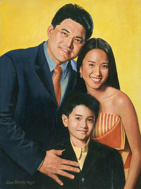
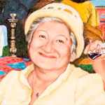
When the portraitist begins by focusing simply on the subject’s surface image, of course the tendency is to place it front and center. When one begins by thinking about the subject’s other qualities and other objects central to his or her life, a more complex composition may naturally evolve.
_____________________________________________________________________
In the Comments following my blog entry “Portrait Composition: Old World vs. New?” portraitist Alexandra Tyng provided a link to a portraitartist.com forum description of her process in painting her mother, the architect Anne Tyng (see Comments below). I followed up with a further question to Tyng on the portraitartist.com forum. My question related to both her portrait of her mother and that of the artist Edna Andrade:
“How did you make the decision to include an element that would necessitate placing the subject’s head relatively low on the canvas, with the element extending substantially above the head?”
Tyng wrote such an interesting response that I asked her permission to quote it here. She agreed. Here it is:
“To answer your question, I don’t ever think, ‘I’m going to try a portrait with the head placed lower in the composition.’ The placement of the figure comes about on an individual basis, and is a direct result of what I want to say in that particular portrait.
“In the portrait of my mother [an architect], I wanted to emphasize that she is a very small woman with large (great) ideas. I started imagining what a portrait of her would look like, and ideas came to me. She always made a lot of geometrical models that hung from the ceiling of her studio. She also designed some unbuilt structures, my favorite being the Philadelphia city tower project. I played around with ways to arrange these elements in the composition, which led to deciding on the dimensions and size and placement of her figure.
“With the portrait of Edna Andrade, it just naturally happened that she had a very large painting in her living room that I wanted to use for a background. To give a sense of the size and impact of the painting I needed to move it close to the picture plane. She had Victorian furniture (inherited from family) whose shapes echoed the shapes in the painting, and I thought it was an interesting play between her traditional Southern background and her very contemporary work. She wanted to be seated in the portrait so it just worked out that way. The way I arrange compositions is mostly intuitive. A lot of times I see something that will work, that says what I want to say. There are limitless possibilities for placing the figure in a composition.”
I felt it was instructive that Tyng started the process of determining the composition for these portraits by thinking through the more abstract qualities of her subjects, not just their physical appearance. I suspect many portrait artists – myself included – tend to begin with the surface image of the subject, rather than right-brain associations with other qualities of the subject – the small woman with great ideas building models she hangs from her studio ceiling. When the portraitist begins by focusing simply on the subject’s surface image, of course the tendency is to place it front and center. When one begins by thinking about the subject’s other qualities and other objects central to his or her life, a more complex composition may naturally evolve.
For Edna Andrade’s portrait, Tyng began with shape components first – their similarity in the modern painting in the background and Andrade’s Victorian furniture. This then became a reference to the more abstract qualities of Andrade’s traditional Southern background and her very contemporary style of painting. The complex associations between shapes generated a wonderful composition and portrait.
