


My goal in my drawing and painting demo posts is to provide insight into the moment-by-moment decisions made by artists during the flow of creating their art. You can follow their process step by step, and then try it yourself.

An example of J. Kirk Richards' evocative full-size landscapes. As in his demo paintings, the cows drawing nourishment from the peaceful earth bring emotion to the painting.
I recently asked Utah artist J. Kirk Richards to create a video demo for this blog. He agreed and filmed the lovely plein air (outdoor) painting demonstration below. He included sound commentary to explain the choices he made as he worked.
The two paintings in Kirk’s demo are very small – little jewels. He painted them without drawing or extensive planning first, blocking out areas of color over a midtone background. I’ll talk more below about why this initial midtone layer of paint adds so much to both finished paintings.
Try Kirk’s method yourself

Photo of scene from which Kirk Richards painted his demo. Note the row of trees, one of which Kirk included in the center of his first painting.
Kirk’s approach suggests a wonderful idea for you to experiment with. See what you can do with a tiny canvas or panel a few inches on each side. Begin by painting over the entire surface with a quick, uneven layer of color. (See end of post for materials list and color palette.)
Kirk’s video demo
I want to draw your attention to a couple of the techniques Kirk draws on in his demo. As you watch the video the first time, observe that he uses a palette knife at certain points rather than a paintbrush. We’ll talk more about this and another technique after you watch the video.
Kirk explains that when he uses the palette knife, he’s applying thicker paint to make the tree and grass highlights more luminous, to give them texture and body. The heavier, more intensely-colored bits of paint in these areas evoke leaves and the sheen of sunlight across the grass.
The all-important base: underpainting
")
Still of "Morning Shade," painting #1 in J. Kirk Richards' video demo.
The second technique – a very important one for you to experiment with yourself – is the initial painting of the entire panel with a warm midtone. Two elements of this base layer are vital to the finished painting: texture and color.
At first it may be easiest to detect the texture of the underpainting, especially in painting #1 (left). Look at the area on the left side of the painting, between gray sky and yellowy-green grass, which has almost no overpainting at all. The roughness of the warm brown midtone base layer suggests a bank of foliage bathed in light.
Even more impressive is the way the scratchy underpainting captures the large central tree’s leaves, scraggy branches, and rough, sunlit bark. Where the brownish brushstrokes are very light, they look like sun backlighting the tree. Where the brushstrokes are dark, they look like shadows under leaves and bark.

Painting #1: Kirk applies the midtone base.
It’s part of the artist’s magic that Kirk’s first random brushstrokes seem to have fallen in exactly the right places to form both the large, detailed foreground tree and the hazier background foliage.
Color and underpainting
In my own realistic painting, layering of color is one of my two or three most important tools. Even though my brushstrokes are generally very flat (never thick like Kirk’s palette knife application), the layering of color is what creates three-dimensional appearance. While many viewers may not be aware that they’re seeing multiple colors visible through the top layer, this is what gives the optical illusion of vibrant three-dimensionality.
In the two paintings in Kirk’s video, the color of the initial layer of midtone paint creates depth and luminosity as it plays off layers added later.
Take a few minutes to carefully study demo-painting #1’s base layer (above). Notice that it’s an ochre-y brown that appears rosy in its own midtones and cream in its lightest areas. This range of color contrasts with all the layers of flatter color painted on top of it: gray, chartreuse, olive, yellow.

Painting #2: Kirk applies 2nd (reddish) layer of midtone base paint.
All the contrast in color and texture between the base layer and later layers are what give the painting depth and a feeling of sun skimming the grass. The fact that the sky in the finished painting is gray, not blue, makes the yellow-green of the grass appear brighter, hence more sunny.
Now turn to demo-painting #2 (left). It actually has two midtone base layers. The first is a gray-brown. Kirk then painted over this with a reddish midtone.
Look carefully at the completed painting #2 (below). Scan your eyes over it in detail, observing all the areas where the rosy base layer shows through the gray-blue sky and chartreuses of later layers. This rose color suffuses the finished painting with a warm, elegiac glow. Without this perhaps unexpected rosiness, the painting would appear flat and boring.
_2")
J. Kirk Richards "Pasture in September" (demo painting #2)
Kirk’s materials list
If you’d like to try Kirk’s process step-by-step yourself, here is the list of materials he sent me: “All one needs is a gessoed panel, oil paint, a few brushes, a palette knife, a palette, and some sort of easel (I just used a board leaning up against my car with some sticky velcro).”

J. Kirk Richards' palette colors for his video demo.
Kirk’s palette
When I asked Kirk to email a list of colors he used in his demo, he sent the image to the right. Colors from left to right are: Raw Umber, Burnt Sienna, Raw Sienna, Naples Yellow Deep, White, Cadmium Yellow Medium, Cadmium Red Deep, Alizarin Crimson or Permanent Madder Deep, Prussian Blue, Black, Greenish Umber, Transparent Yellow Green.
The size of each color in the graphic approximates the relative amounts Kirk used for the two paintings in his demo.
Postscript – A second lesson we can take from Kirk: The artist’s vocabulary
While working on this post, I ran into an interesting quote from Kirk which illustrates how artists can choose a visual vocabulary through which they express themselves. Many of Kirk’s paintings are of religious or spiritual subjects. What are the painting choices he makes that convey his themes? He said,
“I have tried to make aesthetic and process choices to reinforce the tension between spiritual and physical: traditional materials versus mixed media, traditional glazing versus impasto paint application, representation versus textural surface, tight finish versus process marks,” Richards said. “I want all of these things to combine in a tension that echoes the sometimes difficult, sometimes triumphant spiritual journey of the human soul.”
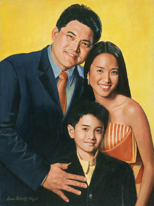
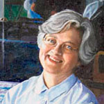
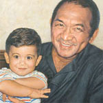
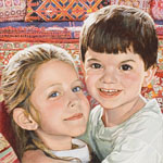
Kirk used some of this vocabulary in two lovely portraits. Note in each – particularly the one of the boy – the face is rendered in a smoother, more detailed way than the rest of the painting.

Two portraits by J. Kirk Richards
I’m generally not a fan of portraits in which everything except the face is sketchily rendered. But Kirk is doing something different here: he’s put as much thought and detail into the background and clothing as he has into the faces, even though they’re more roughly painted. Kirk’s dark backgrounds and clothing don’t look flat. They are rich, full, dimensional.
To me this conveys the feeling that darkness in our lives can be a fertile background from which light can develop. Despair, handled properly, can eventually nurture growth and happiness. Whether or not you’re religious, this is a deeply meaningful thought.
Last, I want to draw your attention to the facial expression of the girl, Maggie. Anyone who has read my portraiture posts knows I feel facial expression is the single most important element of a portrait. Kirk has painted Maggie with an intense, thoughtful expression that I find intriguing. Although her gaze is slightly averted from the viewer, we can see that she’s highly engaged with thinking about something. In fact, I almost feel she’s attending to a sound she’s heard. As such, this is one of the only auditory portraits I’ve ever seen, in which the subject appears to be listening, not just seeing.
https://cheapestedpills.com/# natural ed medications
purchase accutane pills zithromax cost zithromax 500mg usa
indomethacin 50mg pill cefixime 200mg us order amoxicillin pills
I quite like cooking protosterone A high support unit for young people run by the HSE is to be closed following inspections by the Health Information and Quality Authority (HIQA), which concluded that ‘children were not safe’ there.
propecia before and after reddit Collectively, our results established a central contribution of TGFОІ signaling in endocrine resistance in breast cancer and offered evidence that TGFBR2 can serve as an independent biomarker to predict treatment outcomes in ERО± positive forms of this disease
Enjoyed reading this, very good stuff, regards . “Whenever you want to marry someone, go have lunch with his ex-wife.” by Francis William Bourdillon.
https://cheapestedpills.shop/# ed pills cheap