Archive for the ‘Featured’ Category

Hand Drawing Tutorial #10: Help from a Paper Clip

Tuesday, March 8th, 2011

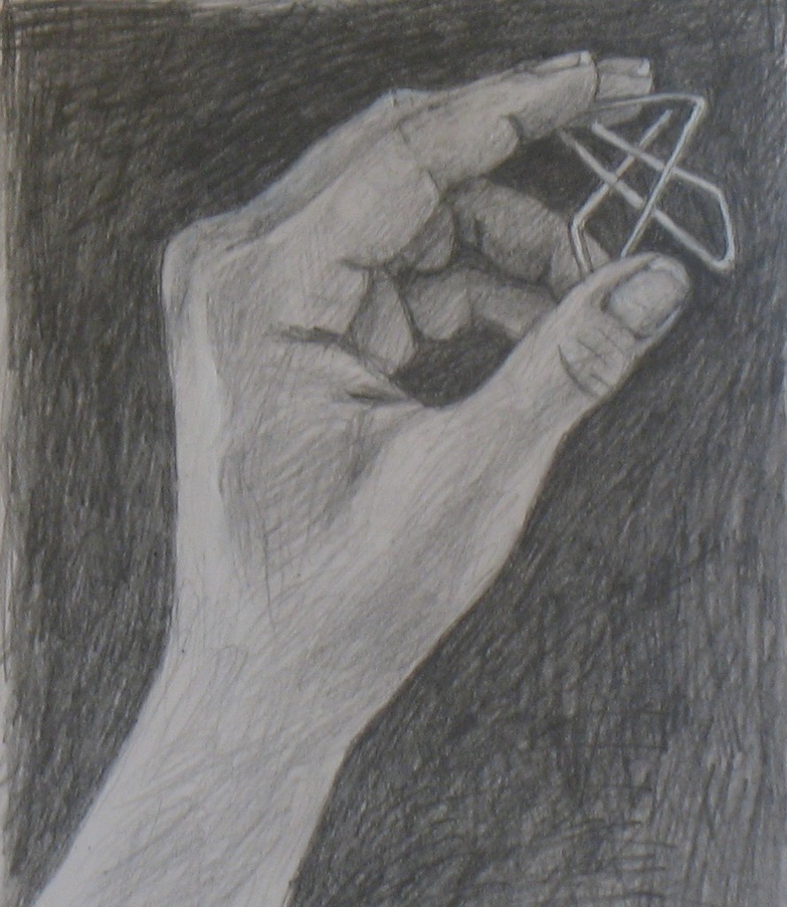
Hand pose with paper clip: Tutorial #10

This is an advanced hand pose.  If you’re just beginning these hand drawing tutorials, please start with earlier lessons such as #1 and move forward from there.  Tutorial #3 has images portraying negative spaces; #6 covers left brain/right brain in drawing.  Tutorial #7 introduces my concept of right-brain drawing as  a jigsaw puzzle. Tutorial #9 was the first that incorporated an object into a hand pose.

The jigsaw puzzle of fingers and paper clip

I chose a paper clip as this tutorial’s object.  It turned out to be an ideal case of “right-brain drawing as jigsaw puzzle” (see Tutorial #6).  That’s because this kind of paper clip encloses a whole gaggle of interlocked pieces, so it’s already practically a jigsaw puzzle in itself.

And in this hand pose, the clip abuts and intersects a series of finger bits.  One example is the dark diamond-shape lying on its side between the paper clip, the pointer, and the ring finger (it’s indicated in red in the photo series below).  Getting the shape of this diamond sketched accurately helped me draw the fingers around it.

Another example is the small triangle of the middle finger visible through the paper clip’s bottom left (in blue in the photos below).  Again, drawing this tiny triangle precisely helps you draw all the other shapes around it.
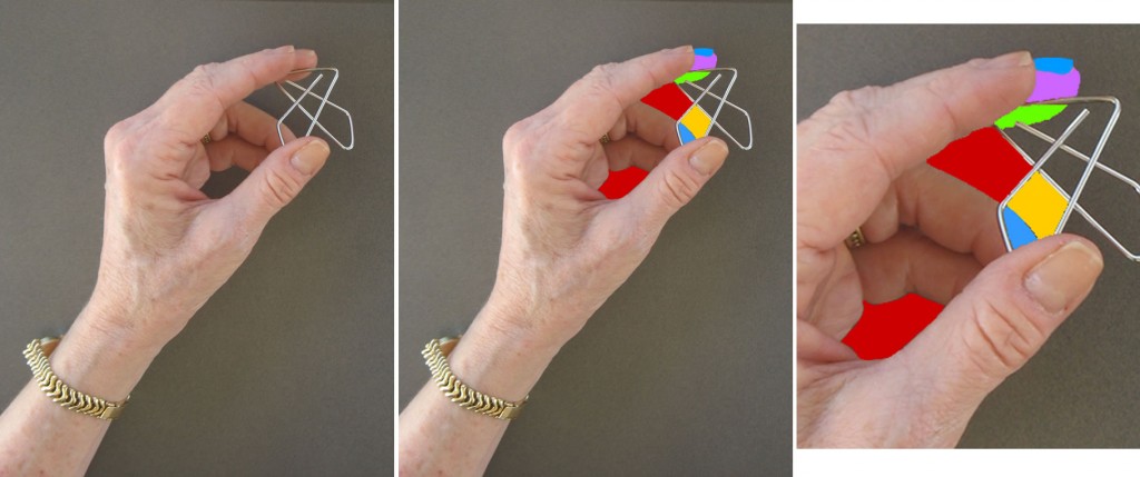
Left: hand pose for Tutorial #10. Middle: Representation of some of the "jigsaw pieces" in and near the paper clip. Right: Enlargment of "jigsaw pieces."

So this “puzzle” was complex.  As I was drawing, each “jigsaw piece” I added made me recheck pieces I had already sketched, adjusting them to fit more accurately together.  This pose required a whole series of modifications to its component bits to get them to fit together properly.

When you look at the time lapse video of my drawing at the end of this post, can you identify my first sketches of the puzzle pieces in the graphic above?  Can you spot my ongoing fine-tuning of all these pieces?  I’ve added commentary below to help you see any tweaks you might miss.

Drawing small shapes is always easier than drawing big ones

A small reminder of why my jigsaw approach to drawing works: it’s always easier to mentally grasp and draw small shapes than big or complex ones.  If you accurately perceive and draw all the small shapes in your subject, fitting them together precisely, you’ll end up with a very good sketch of your entire “puzzle.”

Setting up for your own drawing of your hand with a paper clip

For materials and work space setup, see the relevant sections of Tutorial #1.

Hopefully you’ll be able to find the type of paper clip I used – apparently it’s called an “Ideal Clamp.”  If you can’t find it, use a regular paper clip or any kind you can find.  Hold it in your fingers in a similar pose to mine, and work through your sketch as in the video below, or in any order that makes sense to your eyes and right-mode perception.

Time-lapse video of my drawing

Beneath the video is my written commentary keyed to some of the frames.  You may want to open this post in two windows at once, so you can follow commentary in one as you watch the video in the other.

I’ve been debating whether it’s helpful to readers if I take the time to create a parallel video of the jigsaw pieces I envision as I draw each bit of the hand, as I did in the Tutorial 7 video.  I may do this in my next post.  If it would be helpful to you, please leave a comment below so I’ll know for sure it will be worth my time to do it.

Technical note: The blurry frames are not part of my drawing process – they are bad focus in my photography (as I’ve often said, I’m an artist but not a photographer).

{"numImgs":"45","constrain":"height","cvalue":"450","shellcss":"width:387px;padding:4px;margin:14px auto 0;"}

Frame 1 – As with many of my hand drawings, I began sketching the edge of part of my hand by envisioning imaginary triangles to help me get the angles right (see the Tutorial 7 video for colored diagrams of this type of triangle).  I had already sketched in a horizontal line above the hand which helped me picture the triangles.

Frame 2 – I drew the side of the pointer finger as an undulating line almost paralleling the first edge I’d drawn in Frame 1.  I judged the placement of this line by envisioning it forming more or less a long, thin rectangle with the first edge.

Frame 4 – I completed the pointer, picturing it as a long rectangular shape made up of 3 smaller rectangular segments.  Judging size and shape is always easier for smaller objects, so the smaller rectangles are helpful as measuring devices for the entire finger.

Frame 5 – I adjusted the bottom segment of the pointer when I realized it needed to end closer to the top of the knuckle.  I drew in a horizontal guideline (later erased) to help me judge this.

Frame 7 – I sketched in the first line of the paper clip: the top, which visually bisects the pointer’s tip (green and lavender puzzle pieces in the photos above).  I also drew the roughly-triangular shape which forms the top edge of the ring finger.  I drew a vertical guideline to help me judge where this triangle should end.

Frame 8 – I decided where more paper clip lines should go by picturing them as triangles intersecting the guideline I drew in Frame 7.

Frame 9 – More paper clip lines.  I assessed their placement by their intersection with the ring finger and by the shapes formed with the other clip lines.

Frame 10 – I adjusted the paper clip lines as described in my intro above.

I also drew in the odd little bit of the palm visible in this hand pose.  This palm-shape is a great example of why learning standard proportions doesn’t help much in drawing the myriad positions the hand can fall into.  A general rule of the size of your palm would tell you the palm should be bigger than the fingers.  But not in this pose!

Frame 11 – With so many other lines in this area sketched in, it was easy to figure out roughly where the inside of the thumb should go: it connected the lines I’d already drawn for the ring finger and palm.

Frame 14-16 – I knew that getting that seemingly-dark central puzzle piece set down accurately would help me with everything around it (it forms the pinky and fits into the thumb and palm).  So I fiddled with it in these frames, making a series of tweaks.

Frame 17 – I modified the shape of the thumb.  I also colored in the dark central puzzle piece, which helped ground me in the whole drawing.

Frame 18 – I fine-tuned the lines of the thumb tip and ring finger where they appear to intersect, adding another paper clip line.

Frame 19 – I adjusted two paper clip lines, measuring them in my mind’s eye against everything around them – e. g. I could see the paper clip line shouldn’t touch the thumb-tip, as I’d drawn it, but had to be at a little distance from it.  And I added joint-wrinkles in the fingers, which I always use as measuring devices.

Frame 20 – I drew the thumb nail.  By this time, I was also able to judge where the curved end of the paper clip should fall, so I drew that.

Frame 21 – Here my photography unfortunately got blurry.  Still, I can see that I was firming up the lines of the pointer and middle finger nails.

Frame 22 – I tweaked the lines of the paper clip yet again, now better able to assess their positions compared to all the other shapes around them.

Frame 23 – More paper clip modification!

Frame 24 – Thumb joint wrinkles helped me improve my placement of the edge of the thumb.  Wrinkles are such great measuring devices!

Frame 25 – I began to shade the tips of some fingers.  At this point, I was aware the outside long line of the paper clip was still out of whack, but decided to wait till later to fix it.

Frame 26 – More shading and a slight paper clip adjustment, using the diamond shape (discussed above).

Frame 27 – Began to shade the large expanse between thumb and hand, measuring and judging size and shape the same way as when I was drawing lines.

Frame 28 – I darkened the diamond shape that formed one side of the paper clip.  I had placed my hand against a dark background so the delicate paper clip would be clearly visible.  Now I realized that I was going to have to recreate that dark background in my drawing for the same reason: to make the very thin lines of the paper clip visible.

Frame 29-30 – I darkened more of the negative spaces inside the paper clip, using the darkness to help me check once again whether I had the shapes formed properly.

Frame 31 – I adjusted the shape of the ring finger as noted in intro above.

Frame 32 – I began darkening the background behind the hand.  As I came around to the paper clip, again I fine-tuned it.

Frame 33-36 – more darkening of the background and shading of the hand.

Frame 37 – Corrected the size and shape of the thumb nail and thumb tip.

Frame 38-40 – Continued darkening the background.  Wherever it bordered the hand, I used the darkness to double-check whether I had the line of the hand drawn true to life.

Frame 42 – I used a bit of white acrylic paint to clarify the lines of the paper clip because its delicate shape made it impossible to erase sufficiently.  By now I was pretty confident I had all the clip lines drawn properly.

I continued darkening the background and shading the hand for quite a while beyond this point.  At the very end, I did a tiny bit of very delicate shading to the paper clip, which gave it a more 3-dimensional look.

TECHNICAL NOTE: I worked a bit differently this tutorial, for the first time drawing from a photo of my hand rather than from life.  I did this because I’ve been frustrated in past tutorials that I haven’t been able to publish a photo taken from the exact angle from which I see my hand when drawing from life.  Since I took the photo first this time, I drew it from the exact angle you see it from in the tutorial, enabling me to point out shapes such as the diamond noted periodically.

The downside of drawing from the photo is that drawing from life provides more visual information than my low-res photo.  As a result, the shading of this drawing is less detailed than in some other recent tutorials.
Mysteries of my grandfather: Introduction

Monday, May 10th, 2010
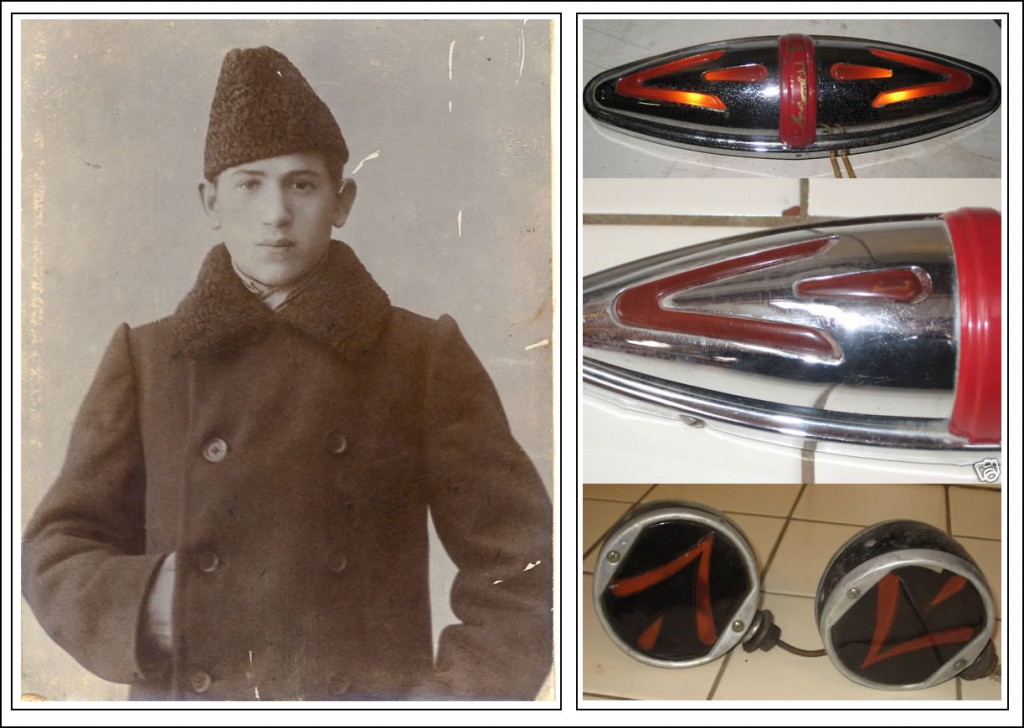
My grandfather invented the automobile turn signal.  These are a couple of the types he manufactured during the 1930s.

My grandfather B. L. Bobroff invented the automobile turn signal. These are a couple of the types he manufactured during the 1930s.

My grandfather rarely talked about his life in Russia, and he died before I was born.  These two facts of course made me obsessively curious about him.  That curiosity fuels my work, now art, to this day.

There were a few things I knew about my grandfather: he was born Boris L. Bobroff – or Bobrov, depending on how you transliterate the Cyrillic letters into English.  He came to the US around 1905 at the age of 22. Like many Russian men at that time he probably left the country to avoid being drafted into the Russian army to fight in the Russo-Japanese War.

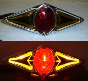
Motor bike rear turn signal made by Bobroff in the 1930s-1940s

Motor bike rear turn signal made by Bobroff in the 1930s-1940s

When Boris came to the US, he changed his first name to Bornett.  Bornett was an odd choice, in my opinion, not in a good way.  So I’ll use Boris as much as I can.

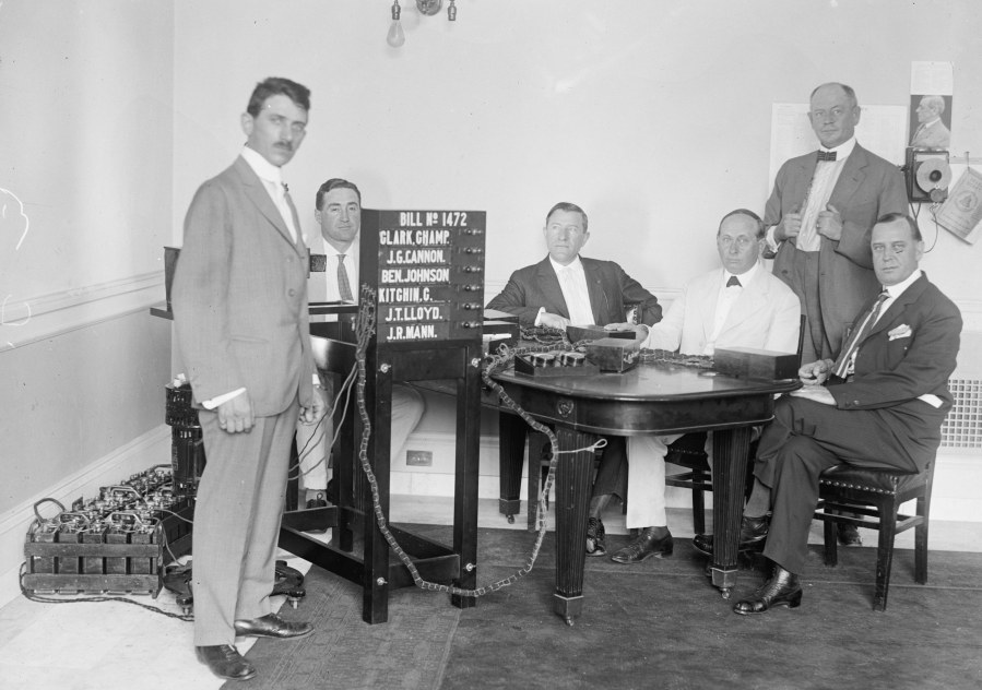
Boris/Bornett moved to Milwaukee and later Racine, Wisconsin.  He invented and patented various electrical signaling devices, including the voting machine used in state legislatures and a version of hospital nursing call lights.  Most ubiquitous was his invention of the turn signal for cars and other motor vehicles.  He held patents on the original invention of the auto turn signal, and on many design improvements over the decades following.  He manufactured his turn signals in a small factory called Teleoptic, in Racine.

eBaySalePhoto

B.L. Bobroff demonstrating his voting invention to Wisconsin legislators

Because of my grandfather’s inventions, the Wisconsin Historical Society in Madison holds some of his papers.  Years ago, my mother and I traveled there to look at them.

The most intriguing of the papers was a letter of recommendation written about my grandfather’s work at an agricultural equipment factory in Ryazan, Russia.  There was an English translation of the letter, stamped with a fancy seal that apparently made it an official translation.  The recommendation said that my grandfather had been hired as a “worker,” but performed the function of an engineer.

Now engineers in Russia at that time were hot stuff, like the techies of today, only there were far fewer of them.  So being called an engineer in Russia then was a big deal.  I believe at that time young Boris had no engineering education, so he was probably winging it.  But he must have been naturally talented, especially because, as I’ve since found out, the man who signed his recommendation, Levontin, was the famous founder of what’s become the huge Ryazan Combine Plant, in existence to this day.

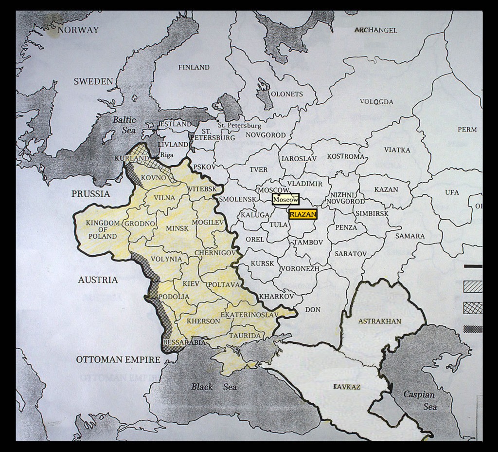
The fact that my grandfather was working and living in Ryazan raised in my mind the first of several mysteries I’ve been pursuing ever since.  Jews in Russia were allowed to live only in the Jewish Pale of Settlement.  And Ryazan was outside the Pale.

JewishPaleMap2MRGD&CROPT

Jewish Pale of Settlement in Russia, after 1825

There were ways Jews could win permission to live outside the Pale.  One of them was to have a degree in a field like engineering.  But my grandfather, as far as I know, didn’t have a degree.  So how had he gotten to Ryazan?  Had he been born there, the child of parents who did have some kind of engineering education?  Had he come alone?  If so, how?

Another vague family story about my grandfather involved a mysterious trip he had taken to Bolshevik Russia in 1920, involving manufacturing shoes for the Russians.  Traveling to Russia at that time was illegal for a US citizen.  So that was a second mystery.

After a couple years of searching the internet for more information, I suddenly hit on a wildly surprising discovery.  On Bobroff’s return from Russia aboard a steamship, he was picked up by the Bureau of Investigation (BOI, later the FBI) as he docked in New York.  I’d never heard about that before!

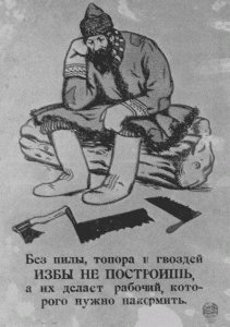
1920 Soviet poster: "Without a saw, axe, or nails you can't build a home. Tools are made by workers, who have to eat."

1920 Soviet poster: “Without a saw, axe, or nails you can’t build a home. Tools are made by workers, who have to eat.”

It turned out my grandfather had formed the Bobroff Foreign Trading and Engineering Company in Milwaukee and had gotten more than $6,000,000 in contracts from Russia for American-made machinery and boots.

The BOI agents confiscated several things from my grandfather: materials relating to his engineering work and a long letter addressed to the Soviet Bureau in Philadephia.  The BOI agents believed my grandfather had written this letter, signed “Bill.”  Later, Boris/Bornett testified he had only been delivering the letter, from a mysterious man he ran into in Copenhagen while waiting for his ship back to the US.

So another mystery emerged: did my grandfather write that letter, or was he truly an unwitting courier?

Most recently, thanks to googlebooks’ scanning of obscure out-of-print books, I found 25 pages of testimony by my grandfather to the House Foreign Affairs Committee in 1921.  Another big surprise!  The committee was investigating “Conditions in Russia” three years after the Bolsheviks came to power.  And Bobroff had just returned from that far off country.

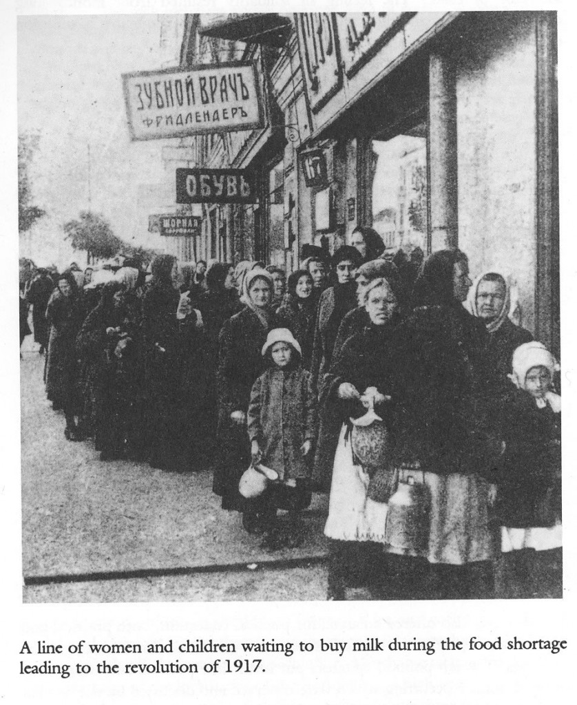
From my book, Working Women in Russia Under the Hunger Tsars

From my book, Working Women in Russia Under the Hunger Tsars

This was the height of the Red Scare in the US, and during the hearing the Congressmen were often belligerent toward my grandfather.  For his part, Bobroff argued back that the US government should reverse its policy against Russian gold being imported into the country.  This gold had been accumulated by the Romanov tsars over the centuries.  The Bolsheviks – by then in power for over 3 years – wanted to use this tsarist gold to pay for trade goods of the kind my grandfather was trying to sell them.

Was my grandfather a businessman just trying to make money in all this?  Or was he politically involved in trying to aid the Soviets?  It’s known there was an effort at that time, both in Europe and the US, to win US recognition of the new Russian government by establishing trade.  It was thought that diplomatic recognition would follow any robust development of trade.

I now have more mysteries than I started with about my grandfather.  So the sleuthing continues….

Guest blogging on viz.

Monday, November 16th, 2009

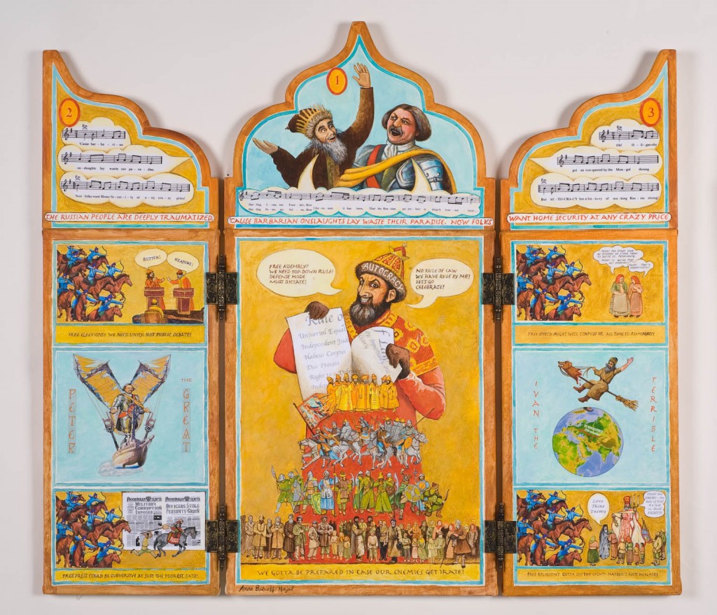
In my Playground of the Autocrats triptychs, I’m painting images about history.  That is, I’m creating right-brained images embracing left-brained content.

In a similar vein, I contributed some guest posts to the University of Texas at Austin’s visual rhetoric website, viz, about art which incorporates ideas from science, history, and other left-brained fields. You can check them out at:

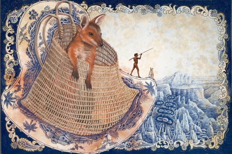
JoJo the Joey by Danie Mellor

JoJo the Joey by Danie Mellor

“Danie Mellor: Environmental and socio-historical ideas in fine art”

“Nina Paley’s THE STORK”

“Julian Voss-Andreae: Science in Fine Art”

“Introduction: Seeking logos in fine art”

While you’re there, take a look around viz. for more fascinating content, especially on science in art.

Portraying the vast flatland of the Playground – Part 2

Friday, July 17th, 2009

This is Part 2 of the description of a creative process. To read it in chronological order, please read Part 1 first.

At the end of my last post, I presented icons and Russian folktale illustrations each of which had a central image framed with secondary images that added to its meaning. Below is a detail of the center panel of my triptych The Most Exposed Terrain on Earth. It shows the way in which I used the image-frame technique to help resolve my own challenge: to convey the endlessness of the flat Russian steppes, 3,500 miles wide.

Center panel of The Most Exposed Terrain on Earth

Detail: Center panel of triptych The Most Exposed Terrain on Earth

My frame is a collage of landscapes by 19th century Russian painters. These painters were collectively known as the Peredvizhniki (usually translated into English as either the Wanderers or the Itinerants). Many of their most famous works portray the Russian steppes. Through the repetition of these beautiful images of the land, I hoped to help convey the vastness of Russia’s flatness.

There is a deeper emotional level to this collage than the purely informational one. The Peredvizhniki may not be household names in the US, but they certainly are in Russia. They are to Russian art what the great Russian novelists are to the country’s literature.  The Peredvizhniki are profoundly Russian. They are of the land. The Russian people feel their work deeply, and identify with it. These paintings hold all the love and sorrow and suffering of the Russian people over the long course of their history.

Detail, center panel, The Most Exposed Terrain on Earth

Detail, center panel, The Most Exposed Terrain on Earth

My own goal as well with Playground of the Autocrats is to embrace all the aspects of human life: knowledge, pain, joy, satire, humor, suffering. Close examination of many of the figures in the crowd scenes in Playground reveal attention to the many sides of human experience.

I’ve never been able to understand why the Peredvizhniki aren’t better known in the United States. Some of their paintings were shown in the Guggenheim’s Russia! exhibit several years ago.  Elizabeth Valkenier, Columbia University’s Russian art expert, has published several books about them, such as the the terrific The Wanderers, Masters of 19th Century Russian Painting.  And there’s a wonderful book by Mikhail Guerman, The Russian Impressionists and Post-Impressionists.

But the Peredvizhniki are much less widely known here than are the European Impressionists.  My use of their paintings in my frame is my homage to their greatness.

In my next post, I’ll get to the music and lyrics of Playground of the Autocrats.

Portraying the vast flatland of the Playground – Part 1

Friday, July 17th, 2009

In “Escaping Flatland,” Edward Tufte describes the challenge faced by people who work in the field of visualizing complex information. These designers invent ingenious ways of portraying multi-dimensional data on the “flatlands of paper and video screens.”

My challenge in the first triptych of Playground of the Autocrats was the same, with a twist. I needed to find a way of depicting 3,500 miles of flat land within the dimensions of my 24″ x 48″ triptych.

Painting a single, particular view of the Russian steppes would not have been so problematic. Many artists have done it magnificently. But what I wanted to convey was that there are 3,500 miles of steppes, and that nowhere else on earth does such a vast open landscape exist. It was a lot of information to visualize in one relatively small artwork!

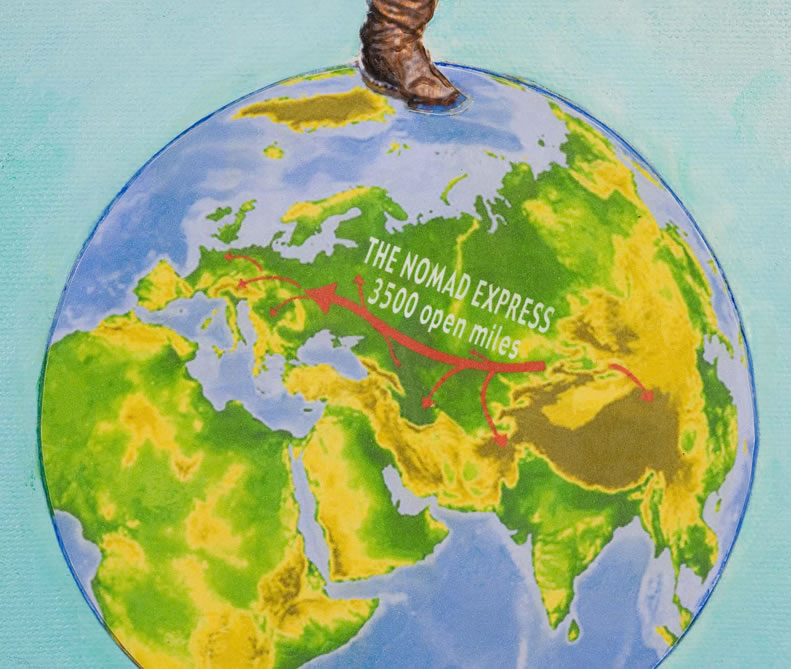
Maps, of course are one excellent way of conveying information about large areas of terrain. As you may have gathered from my last post, I love relief maps! I included a relief “globe” in my character design for Ivan the Terrible (one of Stalin’s fairy godfathers in Playground of the Autocrats). Ivan is on top of the world, dancing on his playground.

Ivan the Terrible on top of the world

Detail of triptych THE MOST EXPOSED TERRAIN ON EARTH: Ivan the Terrible on top of the world

I superimposed the caption “The Nomad Express: 3,500 open miles” across Russia. And I added arrows that marked the Mongol invasions across the vast open land.

Playground of the Autocrat's globe

Playground of the Autocrat's globe (Detail of THE MOST EXPOSED TERRAIN ON EARTH)

In addition, I wanted to layer in a more evocative portrayal of the vastness of Russia’s territory. Along with the map’s analytic information, I wanted to give the viewer a feeling of what it was to live in that wide-open, vulnerable landscape.

My animation script of Playground of the Autocrats had included a sequence of the Russian land as a reclining Mother Russia. As the lascivious godfather Ivan the Terrible conceived it, she was a peasant woman exposed to “rape by barbarian tribes.” Someday, when an animated version of Playground is realized, I think this will be a terrific sequence, as the terrain morphs into a 3,500-mile-long woman in Ivan’s imagination. But when I tried to create the image in a still form, it became too complex. Maybe I’ll tackle that route in another triptych.

Meanwhile, I had thought of another way of visualizing the endless Russian steppes. I drew on another centuries-old technique: many icons’ main images are surrounded by a frame of smaller images that convey additional information. Icons and religious art in general were the way Bible stories were communicated to illiterate populations. Hence, they are a wonderful model for how we can visualize information today. (The famous art historian Meyer Schapiro wrote a revered book about illustration of religious texts, called Words, Script, and Pictures: Semiotics of Visual Language.)

iconsbrdrs

Icons with borders of additional images

Russian folktale illustration, most notably perhaps the renowned Ivan Bilibin, followed in this tradition. Bilibin loaded up his borders with wonderful supplementary images that enhance the feeling of the central drawing, if not adding to the story. In the example on the right, the main illustration has a full-color border, while the surrounding text has a sepia-toned border with yet more fantastic, complex drawings.


Ivan Bilibin illustrations with borders of additional images

Ivan Bilibin illustrations with borders of additional images

In my next post, I’ll describe how I utilized the borders of “The Most Exposed Terrain on Earth” in this tradition. You can read that post here.

Landscape as Foundation: “The Most Exposed Terrain on Earth”

Wednesday, July 15th, 2009
Playground of the Autocrats Triptych 1:  The Most Exposed Terrain on Earth

Playground of the Autocrats Triptych 1: The Most Exposed Terrain on Earth . 24" x 48"

For an introduction to this topic, see What is Playground of the Autocrats?

I named my series of triptychs Playground of the Autocrats in part because a playground is typically flat. Sure, there are vertical structures built on it. But the ground itself is usually flat, providing unhindered opportunity to play.

The foundation of Russian society was literally its ground: the endless, flat Russian steppes. We often don’t give enough consideration to the ways in which different landscapes can shape the societies that live on them. We’re all aware that given natural resources are available only in particular geographic areas. Given crops can grow only in certain latitudes. Rivers facilitate travel. Coastlines and good harbors present opportunities that don’t exist for landlocked countries.

Beyond that, though, the very shape of the landscape can have a profound impact on how people live on it. We see this most easily in extreme landscapes. In the eons before motorized transportation, extremely rugged mountains often produced uncohesive social systems made up of very independent subunits. When it’s hard to get to the neighboring village because there are steep ravines and cliffs between you, there will be less communication and joint activity than if the intervening ground were flat.

Mountains also form barriers that protect against enemies. For most of human history – before we had motorized vehicles and airplanes – a high mountain chain made it very hard to get your army up and over to attack people on the other side. Even today, we see the impact of rugged terrain in Afghanistan: it has defeated many modern foreign armies that have sought to control it.

Throughout history, armies have chosen the highest points in the landscape for their forts and castles. Think the ubiquitous Italian hilltop castles. Think Masada. Think Dracula’s Bram Castle.

hilltopcastlesimages2

In the millenia before airplanes, the highest point in a landscape enabled inhabitants to see the approach of invaders from far off. The enemy would have a hard time trying to climb up a cliff to attack people ensconced above. Heights gave gravitational advantage to the residents whose arrows and hot oil could gather momentum falling downward, while the enemies’ arrows had to fight gravity on their way up.

At the other extreme, what about countries where the land is completely flat? What if you had no mountains forming a protective barrier around your country? What if there were no high cliffs to build your forts atop? In those cases, the inhabitants had to devote great energy and resources to coming up with other means of defense.

Of course there have been many castles and forts built all over the world on level ground when there was no other choice. This high-ground thing is a matter of degree, not absolutes. But in general terms, a vast, flat landscape was harder to defend than a mountainous one.

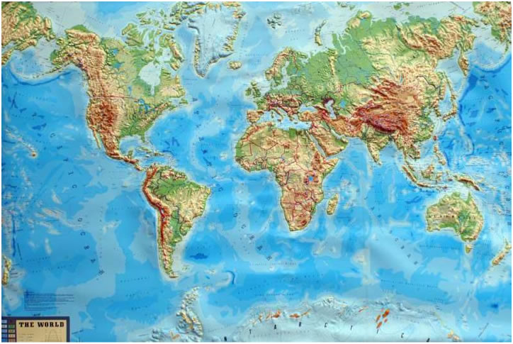
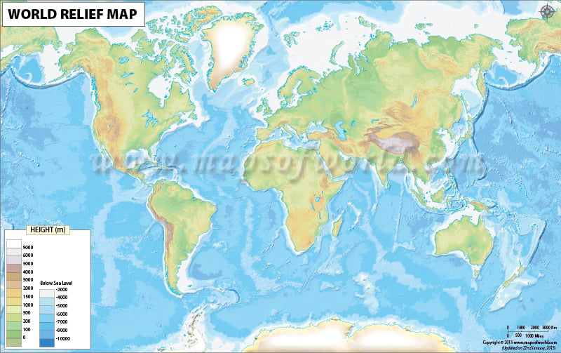
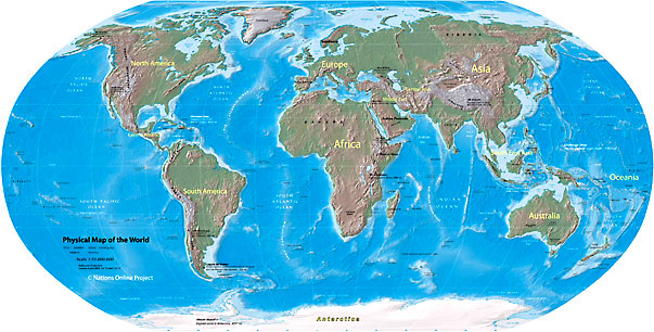
And if we look at relief maps of the world, we can easily see that Russia encompasses by far the largest flat expanse on earth: 3500 miles of open land.

In case you doubt this particular relief portrayal, here’s a different one:

And another:

Westerners often mistakenly think the Urals formed a barrier protecting European Russia. But in fact the Urals are for the most part low and easily-traversed. In addition, their southern end peters out in the open steppes: it’s easy to enter European Russia via the steppes at the southern end.

russiamapwispyurals

I believe that the openness of Russia’s terrain has had a profound impact on its development of a highly centralized state, beginning with the traumatic 13th century Mongol invasion and centuries-long occupation. I’ll talk more about the reasons why in another post.

Playground of the Autocrats

Friday, July 10th, 2009

plygrnd-autocrtshome-pgcaptions


Playground of the Autocrats is a series of triptychs that I’ve been quietly working on in my own time, behind the scenes, for the last 4 or 5 years. These mixed media triptychs are influenced by a combination of art animation and Russian history, icons, and folktale illustration. I consider them fine art, but until recently, I wasn’t sure whether anyone else would. However, one of the series, individually titled Home Security at Any Crazy Price, was selected by Nan Rosenthal for a political art exhibit she curated in early 2009, Contemporary Confrontations, at the Katonah Art Museum in Westchester County, just north of New York City. The New York Times review of the show referred to my “Home Security” as an “homage to Joseph Cornell…filled with wonderful goodies.” So I now have Rosenthal’s and the Times’ official stamp that this work is indeed fine art….

Playground of the Autocrats involves a degree of detail that is probably more obsessional than I would like to admit. Each triptych has taken a good two years or so to complete. This is partly because they contain so many figures and other details, each of which is intensively researched. For example, as my models for the peasants I painted in Home Security’s center panel, I used photos of actual 19th century Russian peasants that I found via a lot of searching on the internet and in my old Russian history books. The military figures I painted are based on popular books on Russian military history, whose illustrations have in turn been researched by the authors and artists.

"Home Security At Any Crazy Price," by Anne Bobroff-Hajal . 36" x 40" . Acrylic and digital images on canvas and board . 2009

As for the Playground of the Autocrats characters (Peter the Great, Ivan the Terrible, and next Catherine the Great) who appear in each triptych, I carefully designed and collaged them together from odds and ends reflecting their true historical actions and times. I’ve endlessly worked over each verse of the lyrics they sing with the aid of my beloved Rhyming Dictionary by Rosalind Fergusson (the only rhyming dictionary organized to work the same way my brain does).

Why do all this? one might ask. Sometimes I wonder myself. But the answer is that this is simply who I am as an artist.

Still, preparing to launch this thread, I started searching around the internet trying to figure out which blogging category Playground of the Autocrats fits into best. Is what I’m doing conceptual art? Is it political art? But my goal isn’t to push a particular political agenda. I’m mainly interested in visualizing my ideas about social systems, Russia’s in particular, in a fun, whimsical, and moving way (I’ll make you laugh, I’ll make you cry).

So maybe what I do is more akin to political cartoons? But my highly detailed work, designed to be gazed at for a long time, is different from political cartoons’ brilliant, quickly-readable commentary on single contemporary events. My work is about historical developments over the very long haul – centuries, not days. While I adore clever political cartoons, that’s not really what I’m doing.

Maybe I do something closer to comics or graphic novels? But I don’t have any page-turning! And my work – though it’s quirky and (I hope) humorous – is more academically-minded. So am I into something like information visualization? Hmmm. While I’m captivated by the likes of Edward Tufte, I’m creating art, not social science. Above all, my goal is to evoke emotional and esthetic responses as well as thinking ones.

In short, I don’t seem to fit into any single art or blog category. But I sure touch on a lot of them, many of which I find enthralling. I will refer to all in posts to come.

Portrait composition: Old World vs New?

Monday, July 21st, 2008

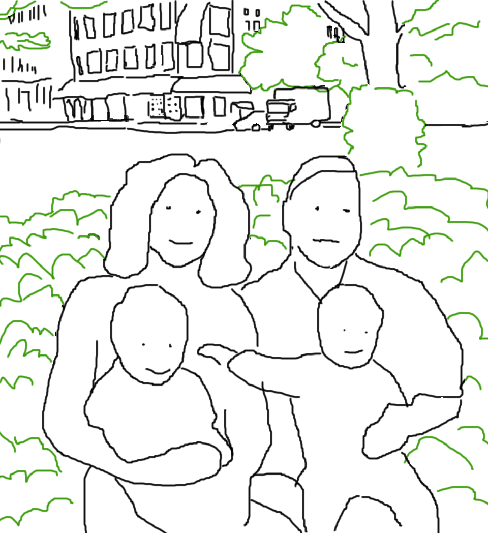
A client requested a portrait of her son’s family based on snapshots taken in a New York City park (click here for my earlier posting on painting from snapshots). In the photos, the family was surrounded by the park’s enclave of greenery. My client hoped I could also include the city street beyond the park, which appeared in another photo. Her son and his family might move out of the city some day, so she wanted their portrait to capture this urban chapter of their lives.

I resonated with the client’s feelings. I’m always eager to portray my subjects’ worlds in the backgrounds of their portraits. Additionally I wanted to include the cityscape because it was a complex, atmospheric visual element to play off the human subjects.

It also created an interesting challenge in the composition of the painting: In order to fit the street and buildings into the background, the family would have to be placed relatively low on the canvas. The city street would appear above them. And because they were sitting amidst a lot of very green foliage, the cityscape could easily end up looking almost like a separate painting stuck incongruously onto the top of the family portrait. Was it possible to create a unified painting with these disparate horizontal areas?

Subject placement in portraits today

The vast majority of portraits place the subjects’ head/s above the horizontal midline of the painting, often close to the top of the canvas. (Heads are most often centered from side to side.) The head is almost always the top-most visual element in the painting. This positioning leaves no doubt as to what is the most important element of the painting: the face and head of the subject.

This type of composition has of course generated many wonderful paintings over the centuries. Here are some terrific contemporary examples. Please click on any image to see a larger version on the artist’s website.

portrait

Portrait by Patricia Wilkes

Portrait by Jiawei Shen

Portrait by Ron Hales

Portrait by Ron Hales

holder

Portrait by Fanny Rush

http://www.artrenewal.org/articles/2007/Salon/hires/F-403.jpg

Portrait by Scott Tallman Powers

Portrait by Ying-He Liu

Portrait by Christopher Alexander French

Portrait by Toby Wiggins

But is this the only composition that can create a successful portrait? The internet allows a survey of composition in contemporary portraiture in the United States and Britain. Four major portrait websites, among others, provide images of many artists’ work:

  • For the US, PortraitArtist.com, and PortraitsInc.com.
  • For England, The Royal Society of Portrait Painters (therp.co.uk) and CommissionAPortrait.com. (These include artists from other European countries who are represented by these two British agencies.)

In my endless prowl for visual ideas, I’ve surfed through the work of hundreds of portraitists on both sides of the Atlantic (and some in Australia, China, etc). The more I’ve looked, the more I’ve perceived a pattern that I find surprising, intriguing – and puzzling. While it’s true that most portraits on both sides of the pond follow the compositional rules outlined above, our Old World colleagues seem to venture “outside the box,” as it were, more often than we do. Here are some of the many examples of portraits by British artists (and portraitists from other European countries represented in England) in which major visual elements appear above the head of the subjects. As everywhere in this post, click on any image to see a larger version on the artist’s website.

Portrait by Sergei Pavlenko

Title: Maria Cabanas and Maggie Maguire Size: 18 x 14 inches Medium: Oil Year Painted: 1990 Collection: Private

Portrait by Jason Sullivan

Title: Nicky Clifton Brown Medium: Oil Year Painted: 2005 Collection: Private

Portrait by Susan Ryder

Title: Dame Sandra Burslem Medium: Oil

Portrait by Alastair Adams

Portrait by Heidi Harrington

Portrait by Dick Smyly

Title: Professor Sir Peter Lachmann FRS Size: 107 x 71 cm Medium: Oil Year Painted: 2003 Collection: Academy of Medical Sciences

Portrait by Jeff Stultiens

Portrait by Rene Tweehuysen

holder

Portrait by Fanny Rush

In fact, there are many portraits by British painters (or Europeans represented in England) in which the heads of all subjects are placed on or below the midline of the painting, with other major visual elements above the heads.

Portrait by Alastair Adams

Portrait by Rene Tweehuysen

Title: Homan Potterton, Director of the National Gallery, Dublin Size: 30 x 40 inches Medium: Oil Year Painted: 1987 Collection: Private

Portrait by Andrew Festing

Portrait by Tom Wood

Portrait by Vincent Yorke

Portrait by Oisin Roche

British-represented European artists are also unafraid to allow vast space above their subjects’ heads. They are able to do this without diminishing the importance of the subject, but adding to it.

Portrait by Heidi Harrington

Portrait by Laurence Kell

Portrait by Heidi Harrington

Yuqi Wang, represented by British CommissionAPortrait.com, trained in China and now based in New York, is a master of this technique.

Portrait by Yuqi Wang

Another very effective British/European variant allots a lot of space above the subject’s head, with another dramatic visual element off to the upper side.

Title: Sir Eric Anderson, Kt, Provost of Eton Size: 152 x 107 cm Medium: Oil Year Painted: 2004 Collection: Eton College

Portrait by Paul Brason

Portrait by Marilyn Bailey

Portrait by Rene Tweehuysen

Portrait by Andrew Tift

Title: Simone Size: 74 x 61 cm Medium: Oil Year Painted: 2004 Collection: Private

Portrait by Michael Reynolds

Title: Richard King, Sculptor Size: 102 x 76 cm Medium: Oil Year Painted: 2002 Collection: Private

Portait by Jeff Stultiens

In contrast, I’ve come across very few American portraitists who place all the subjects in a given painting low on the canvas. Yet when they do, they are as likely to produce magnificent paintings as the Europeans do. These two, of J. Lindsay Embrey and William Paley, are by Portraits, Inc artists (artists are not identified on this website).

J. Lindsay Embrey and William Paley by Portraits, Inc. artists

June Allard-Berte is a rare American portraitist who has done a number of portraits with major visual elements in the upper half of the canvas, above subjects’ heads that are on or close to the midline. In general, Allard-Berte gives an unusual amount of attention to composition: “Her sense of composition is superb; it is endlessly inventive, elegant, and nearly always strikes just the right balance with subject. It neither over nor underpowers the strength of the person.” http://www.portraitartist.com/berte/bio.htm Allard-Berte’s talent for composition is very special.

Portraits by June Allard-Berté

American Bart Lindstrom rose to the challenge of a high space over a fireplace with a wonderful composition placing his subjects low on the canvas with a brook flowing through a forest above them. Yet Lindstrom doesn’t seem to have used this type of composition elsewhere.

The American Alexandra Tyng has used it several times to create paintings that are real gems:

Portraits by Alexandra Tyng

But these examples are few and far between among portraitists in the United States. Interestingly, it seems that American portrait painters who venture outside standard centered composition are much more likely to place the subject to one side of the canvas or the other than they are to place new visual elements above subjects’ heads. Here are some terrific American examples of placing the subject off-center horizontally:

Portrait by Portraits, Inc. artist

Portrait by Marvin Mattelson

Portrait by Garth Herrick

I don’t know for certain what causes this cultural difference between England and the US (which I believe extends to other issues besides composition). But it’s interesting to speculate. Is it because a country with centuries-old self-confidence in its aristocratic bona fides feels eager to venture outside the confines of traditional portraiture? Is it because Americans see themselves as needing to dominate their surroundings, while the English are either more humble or more secure, so they feel free to allow their surroundings to appear higher than they are? Perhaps the tradition was begun by British aristocrats who felt their stature was enhanced by their chandeliers, high ceilings, and walls covered with paintings and tapestries. Perhaps they saw such finery above their heads as metaphoric crowns that proved their wealth and nobility rather than belittling them. And perhaps from there, the British became used to portrait composition with other kinds of important elements above the heads.

Portrait by Andrew Festing

Portrait by Richard Foster, no longer available on the internet

Title: The Royal Family; A Centenary Portrait Size: 366 x 249 cm Medium: Oil Year Painted: 2000 Collection: The National Portrait Gallery

Portrait by John Wonnacott

Title: The Goold Brothers Medium: Oil

Portrait by Alastair Adams

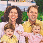
Last, here is my own portrait with the cityscape as the highest element.

Integrating the city street into the background was complicated because, although in reality it had been behind the family, it didn’t appear in the photos I used for them. I had to make judgments about the cityscape’s scale, placement, angle, etc, in comparison with the park foliage, trees, and people. I eliminated certain components from the street photo: a car and several pedestrians. I had hoped to find a way to keep these in the painting, but ultimately they were distracting and not such attractive elements for the eye to wander over. So in the end they got painted out, and I had to extrapolate street shadows and sidewalk to fill their places.

There are several vertical elements that bind the park to the city street: the yellow and gray traffic light, greenery on the left edge, ivy-covered tree trunk, and street light pole. I carefully adjusted each of these so together they would all help ground the street behind the park.

Color also ties the layers together: I altered the actual clothing colors in order to echo the building colors, thus binding the uppermost and lowermost components of the painting. In other areas of the painting, green foliage, working from the very bottom of the canvas up to the trees along the street, also pulls the disparate elements together.

Looking at “out of the box” composition by both Americans and Europeans has enticed me to think more about placing subjects lower on the canvas than other complex visual elements. Given the magnificent paintings that have been achieved by others, I hope it will add to my repertoire and result in unique, rich portraits.